I have added another gauge chart next to the line chart for HBD in savings.
The line chart for the HBD savings was also an addition, but it took the wholes space in width and was somewhat asymmetrical to debt line chart and the debt gauge above it.
With this addition the two set of charts, for the debt and for the HBD in savings are now symmetrical. Mobile friendly look is also enabled.
I'm just thinking should I make the charts for HBD in savings in a separate tab ....
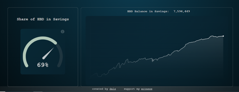
A 69% of the HBD supply is in savings at the moment. This is calculated from the HBD supply excluding the HBD in the DHF that is almost 11M and 7.5M HBD in savings. A info icon is in place explaining this.
If you have any issues or suggestions add them in the comments.
Very :)
It's good number and seems majority of people on hive wants to reap the 20% APR. This is great.
Nice addition!
As feedback, maybe you should add a caption for each chart. I understand what both of them represent, but maybe others won't.
Ok, thanks!
Congratulations @dalz.shorts! You have completed the following achievement on the Hive blockchain And have been rewarded with New badge(s)
Your next target is to reach 34000 upvotes.
You can view your badges on your board and compare yourself to others in the Ranking
If you no longer want to receive notifications, reply to this comment with the word
STOPCheck out our last posts: