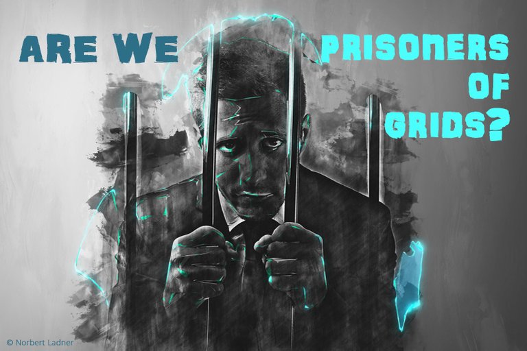
English:
... I really think so. If you look around the web, all pages look basically the same. This is the consequence of using grids. These grids are used almost everywhere, but especially in templates and in CMS. This leaves little room for creative layouts, especially as it is desired by the customers. At least that's the case with my customers.
Unfortunately, the use of web fonts is still not fully exploited, although it is a variety of possibilities. Previously only 3-4 fonts were used.
Of course, the grids make the design easier for different devices. Responsive web design is very helpful. But countless tests are still required for each display.
Sometimes I wish to be back in the times of Adobe Flash. There were some very innovative and interesting pages.
But there is a new trend called "broken grid" or "asymmetrical layout". These designs are eye-catching and help motivate users to refer to the most important parts of the site.
Paired with colours, shapes, textures, expressive use of fonts and dynamic imagery, the designer is able to grab the user's attention and focus on content and CTAs (call-to-action).
In addition, you can increase the user experience even with well-designed images.
However, it is not so easy to sell this layout (because unfamiliar) to a customer.
Your opinion and experiences would interest me.
German:
... Ich glaube schon. Wenn man sich im Web umschaut sehen alle Seiten im Grunde gleich aus. Dies ist die Folge der Verwendung von Raster (Grids).
Diese Grids werden fast überall angewandt, vor allem aber in Templates und in CMS. Dies lässt wenig Spielraum für kreative Layouts, zumal dies auch von den Kunden
so gewünscht wird. So ist es zumindest bei meinen Kunden. Leider wird auch die Verwendung von Webfonts noch nicht voll ausgeschöpft, obwohl man damit eine Vielzahl von Möglichkeiten hat. Früher wurden nur 3-4 Fonts verwendet.
Sicherlich erleichtern die Raster das Design für unterschiedliche Devices. Das Responsive Webdesign ist dabei sehr hilfreich. Aber es sind trotzdem unzählige Test für jedes Display erforderlich.
Manchmal wünsche ich mir die Zeiten von Flash zurück. Hier waren ein paar sehr innovative und interessante Seiten entstanden.
Aber es gibt einen neuen Trend der "Broken Grid" oder "asymetrisches Layout" genannt wird. Diese Designs sind auffallend und tragen dazu bei, die Nutzer zu motivieren und auf die wichtigsten Teile der Website zu verweisen.
Gepaart mit Farben, Formen, Texturen, ausdrucksstarker Verwendung von Schrift und dynamischen Bildern kann der Designer so die Aufmerksamkeit des Benutzers gewinnen und ihn gezielt zu Inhalten und CTAs (call-to-action) führen.
Zusätzlich kann man die User Experience noch mit gut gestalteten Bildern erhöhen.
Allerdings ist es nicht ganz so einfach diese Vorgehensweise (weil ungewohnt) einem Kunden zu verkaufen.
Ich werde versuchen bei dem Redesign meiner Website ein solches Layout zu verwenden und das neue Design hier vorzustellen.
Eure Meinung und Erfahrungen würden mich interessieren.
This post has received a 3.13 % upvote from @drotto thanks to: @patternbot.
Great post... I am very familiar with the usage of templates and tools that help you design yet at the same time the limit your ability to design. sort of an oxy moron if you as k me! Keep it the interesting content...
Thank's Paul. Appreciate your comment. And you are right, it's realy a sort of oxy moron.
Posted using Partiko Android
yay... very much so... people want ease yet they want uniqueness as well. So creating a tool to do the work usually means boxing in your options... :)
I totally agree, Paul. And this leads to this uniform design on the Internet. Another reason is that the customers want to pay less and so the designers are forced to use these tools.
Bingo! :)
To the question in your title, my Magic 8-Ball says:
Hi! I'm a bot, and this answer was posted automatically. Check this post out for more information.