I am a draftsman by training, not a graphic designer. Nonetheless, as a librarian, I have found myself thrust into the world of graphic design. I make posters and handouts for library events, infographics for social media, and so forth fairly frequently. Most of the time, I can manage with Microsoft Paint3D and Canva, but every now and then, I want to do something those tools just aren't suited to handle.
When @crosheille announced she needed a logo designer, I decided I'd use her request as an opportunity to finally learn how to use some of the tools GIMP offers to better effect. This post won't be a full tutorial, but I'll try to link to most of the resources I used to learn on the job, so to speak.
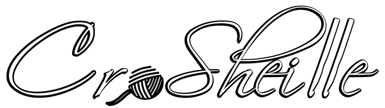
I have never used Adobe PhotoShop, and while I have dabbled in GIMP (GNU Image Manipulation Program), I only know the most basic functions. Skipping over a lot of intermediate steps for now, I made a file with several layers for different versions of this new logo. Black, white, and color gradient text. Black and white outlines. Lots of ways to make different versions for different needs. I was inspired to make this variety due to my experience using the logo options from my library district on different images and backgrounds.
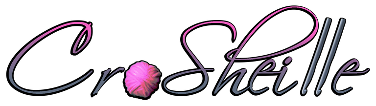
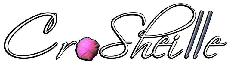

Logos on a background for better visibility of white and black outlines:
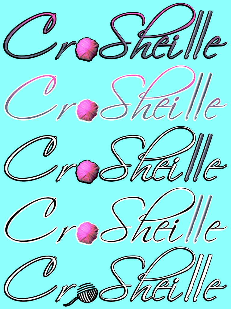
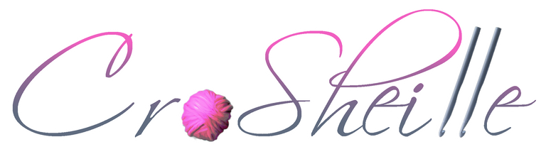
Depending on whether you're using dark mode, the images on the left might look a bit off in your web browser window. The different versions are also illustrated on a colored background to the right. That last logo uses this image instead of the pink yarn ball, and just a plain white layer made with a mask from the crochet hooks as a simplified version. I think it needs more work, but I wanted to just see how it looked.
Getting to that point was a tedious process. Learning a new program is never easy, so I also leaned heavily on Paint3D at first. Since GIMP is Free and Open-Source Software (FOSS), builds are available for almost any operating system and hardware, plus the community is very active and there are many tutorials. I therefore started with this yarn image and this crochet hook to start learning how to isolate elements from images and remove backgrounds.

But then, after my first clumsy mockup, I had an idea. I asked CroSheille to send me a photo of a ball of her own yarn to integrate and make the logo more personal. Plus it gave me a start to the overall color palette. I also started dabbling with color manipulation on the crochet hooks at this point.
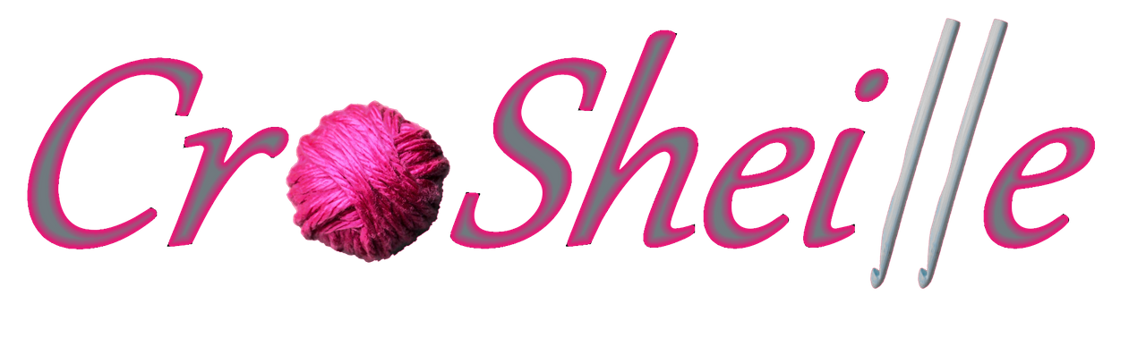
Further feedback led me to download the Scriptina font by the apparently-defunct Apostrophic Labs font foundry. All the information I can find suggests it was released under some form of Creative Commons or similarly permissive license, and while I don't much care for IP laws, I don't want to create trouble where none existed or create new conflicts anywhere. If you're looking for fonts, verify licenses to avoid trouble in the future!
I also used this Youtube video to learn how to make the yarn ball look more like an illustration and less like a photo so it would fit better with the overall design. That element was edited separately. Parker Photographic on Youtube also has a very informative channel I'll need to study further. I like the way information is presented, although I did find myself skipping through explanations of stuff I already understood from my CAD background.

At this point, I was ready to try going all the way just using GIMP. That meant learning how to find the different commands I needed to manipulate layers so I could add and edit elements in a non-destructive fashion and create all those versions I showed off at the start. It's all just one file with layer elements copied for different variations that can all be turned on and off as needed.
Are you ready to go on your own deep dive? It looks like CroSheille has a logo she likes and is done with her contest, but feel free to try to out-do my efforts here anyway. Maybe you'll even learn how to make your own graphics to personalize your own blog posts and HIVE profile. Show off your own variations and inventions in the comments below!
Some background music I like for creative endeavors like this:
I am glad you did this post. It is inspiring how you took the time to learn and put those learnings into practice with the creation of these logo variations.
I think you really did a great job on the final touches.
You did good by listening to my feedback and then delivering those changes as I wished. The colors turned out really pretty. I am glad you used this opportunity as a GIMP practice for yourself and I’m sure you will dive into it even more now.
I was really amazed at how fast my request was answered and I surely didn’t expect to already have the design I was hoping for. I’ll be sharing that design real soon.
Once again I thank you for giving this a go as I really appreciated the personal touch you added with my yarn ball and how you worked to make it blend in with the art.
For some reason the tip function wouldn’t work for me so I sent a tip of appreciation for your efforts to your wallet ;)
The tip is much appreciated, as was the feedback. Nothing frustrates a designer more than a client who won't be specific, and even if you weren't technically a client, you were very helpful in the course of this project.
Awesome glad to know. I’m glad I could be helpful in the process :)
Thank you ~
That's cool! Maybe the game group should come up a logo too.
I'm pretty sure that logo would just be a pile of corpses. I don't think they'd even bother writing a Deadpool-style name-taunt with them.
Well, maybe for the current game. I need to frame the Urban Arcana game to be a bit more... "Heroic" and less "Mercenary".
We are literally mercenaries in this campaign, though.