Hey there fellow steemians. In the past week I have been tasked with two fun projects. The first project was to come up with some banners to hang outside our business. On site, we have a screen printing/t-shirt business, a sign business and a market for selling bags/etc for a farmer's market and flee market that is, too, on site. We have quite a bit of traffic that comes through for the markets, which in turn, helps our sign business and t-shirt business. However, we haven't had any good signs or banners hanging outside to market (pun intended) ourselves in a bit. So we decided, since we purchased a new printer (Roland VG 540) to take advantage of it and print some banners.
The first banner design I came up with was for the t-shirt business, for that is what I personally deal with the most. Here's what I came up with:
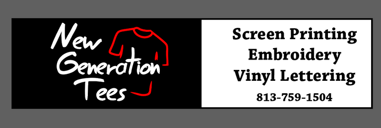
I wanted it to look similar to our business cards, yet still say what we do. Simple, yet elegant.
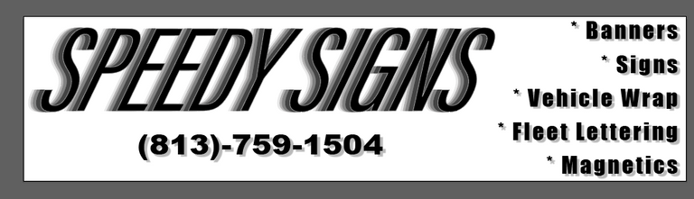
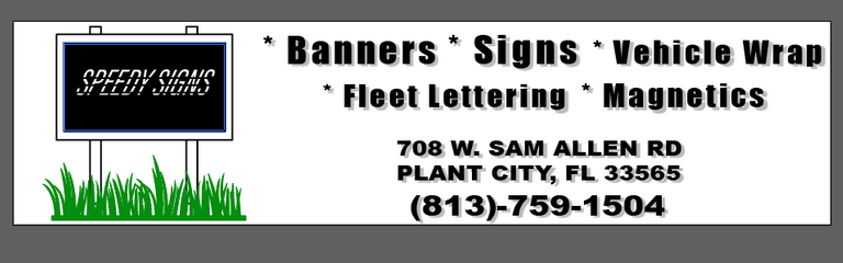
The next designs I came up with was for our sign business. The first one I wanted to play off the idea of "speed", ergo the word speedy signs looks like it is in movement. Yes, I could have went basic, as you will see with a later banner design, but I wanted to add a little flair to it. On the second design for the sign business, I wanted to create a sign with a stake in the ground, yet stretch out the explanation of what we do across the banner, taking up more space and making it look more uniform. I think it came out pretty well.
The last banner idea was for our bag shop. As I previously mentioned, this one is sort of basic, but it tells the potential customer exactly what we have. I spruced it up a tad by adding a drop shadow, but not much else. I think the explanation is sufficient enough in this case.

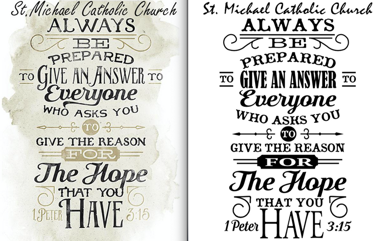
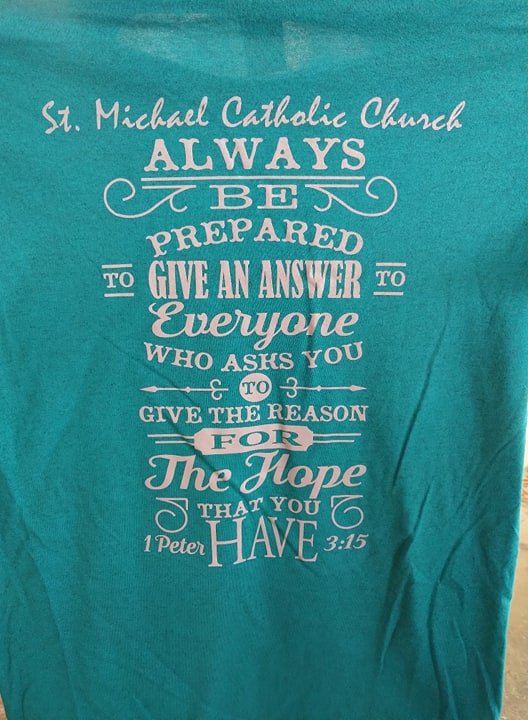
The next project I worked on this week was for a Catholic Church down south of us. They wanted 315 shirts and wanted me to redo a design they found. When this happens, I have to find the exact fonts that design incorporates in order to make the design identical. When doing this, the best sites to use are either fontsquirrel.com or whatthefont.com. They both allow you to take a screenshot of the questioned font and try to find a match.
In this scenario, I was not able to find every font. I did the best I could to still make the design look the same, without the tattered paper look in the background. On the left is the original font design and on the right is the one I did. They said they still really liked it and the picture below is the final product. Art is fun!
Thanks for stopping by and reading about my art. Look forward to sharing more with you guys! Creatives unite!
Congratulations @jgullinese! You have completed the following achievement on the Steem blockchain and have been rewarded with new badge(s) :
You can view your badges on your Steem Board and compare to others on the Steem Ranking
If you no longer want to receive notifications, reply to this comment with the word
STOPVote for @Steemitboard as a witness to get one more award and increased upvotes!