A while back I was invited to a comic-con in the Netherlands around X-mas time and thought I'd make a small collection of Arsenic Lullaby X-mas comics as an exclusive. I had the comics, just needed a cover. Cover are a nice change of pace from laying out a full story. Thought I'd take you through the "process" of making it up. ( I hate the term "process" it seems really pretentious.) Apparently my brain was so grateful for a breather that it spilled out a lot of usable ideas. Maybe too many-
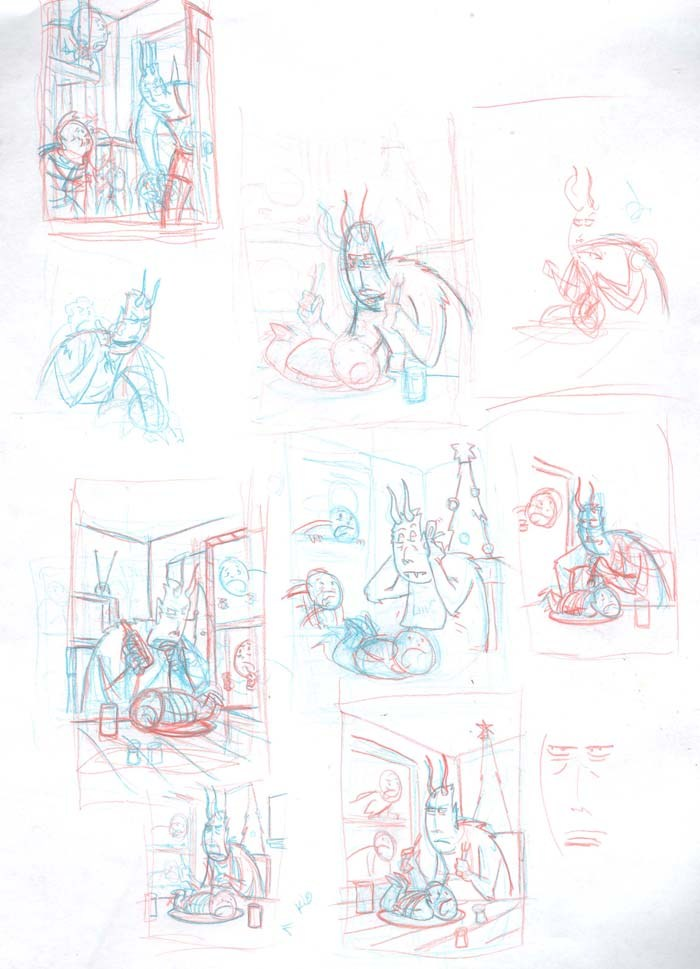
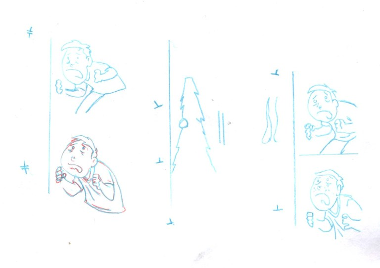
There’s some decent ideas there…but nothing quite grabs me.
This has some merit too, but I dunno. Lemme polish just a bit and see…
Nah, It’d make a nice print, but as a cover…meh.
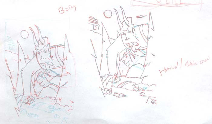
This next one is interesting. The problem with it, as is the problem with a lot of rough sketches, is that once you start to refine them they lose their charm/life. The sketch is good as a sketch but it’ll have impossible anatomy or perspective that is visually good but technically way off. One thing that makes my “style” unique is that the figures are cartoony, yet precise and live in a precise world. I use legit vanishing points religiously…as opposed say Dr.Seuss where the backgrounds are as wild and cartoony as the figures. I’ve never been comfortable with that for some reason…I need to have the backgrounds technically sound. That makes converting a sketch into a polished illustration…tedious. Sometimes you can nail it by screwing around and using a series of vanishing points/horizon lines to capture the visual impact of the original sketch-
Once you start down that road, you are teetering on the whole thing being B.S. and you might as well not even use any vanishing points…and it just becomes a crap shoot of trial and error until you convince yourself you have the foundation for an illustration that has life and charm but is still technically sound.
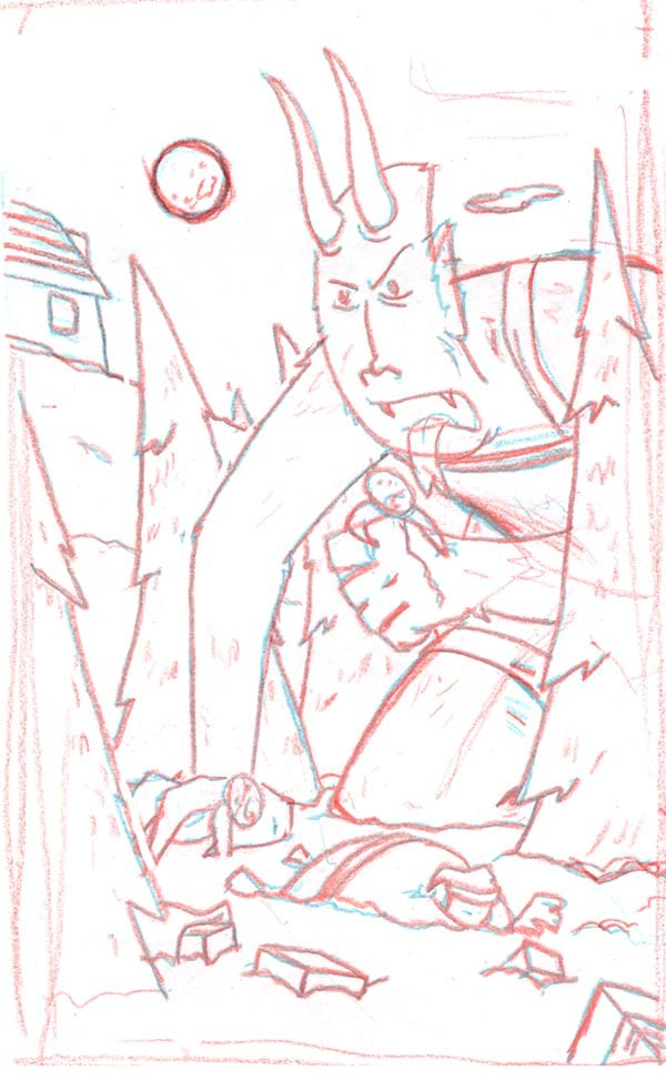
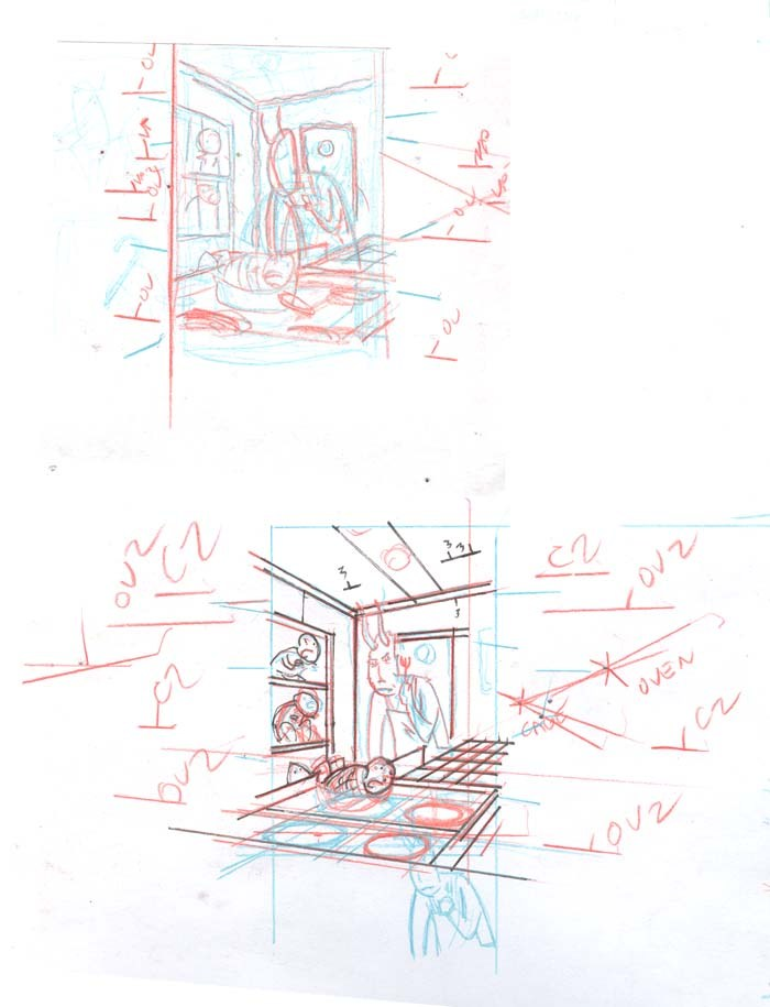
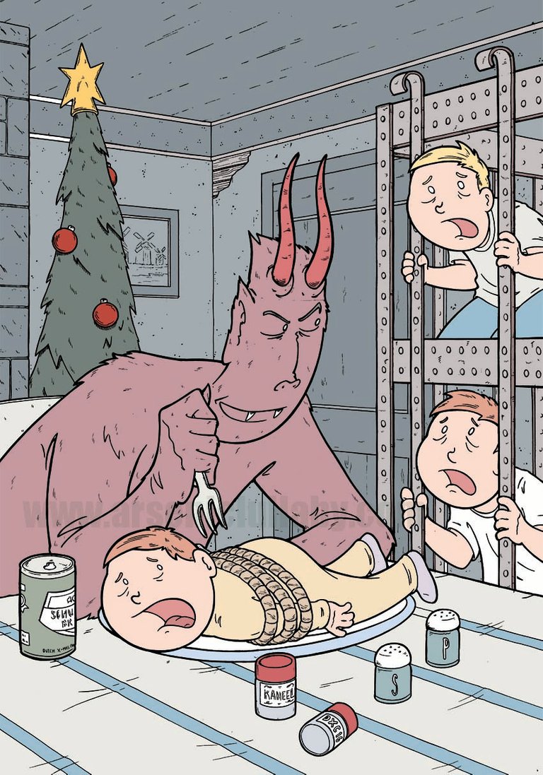
In the one below the cage and walls have one horizon line/set of vanishing points and the oven and table have another.
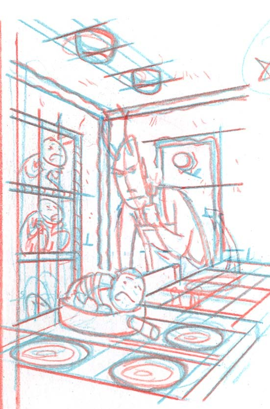
Then you continue on and realize the figures also only looked good because they were wrong, and once you draw them correctly they sort of lose that special something.
That whole thing to me is sterile and devoid of the charm the first scribble had. Life could be brought back to it in the inking, but the more I look at it…this is also not so great of a cover. I’d be a nice print and I’ll probably finish it for that.
SO…back to random Ideas…
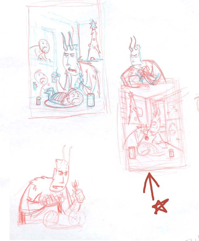
Yeah….that one (with the arrow) ! That’s the one. It’s captures the imagination, makes you want to know what’s going on. More than the others, you look at it and you see a scene…not an illustration. The one on the upper left is good too, but it’s a little to standard. It doesn’t have the danger and sick delight that the other one has.
But will it hold up when I refine it?
Yeah…I’d say it does. And if I can nail the expressions right on inking…this’ll be good.
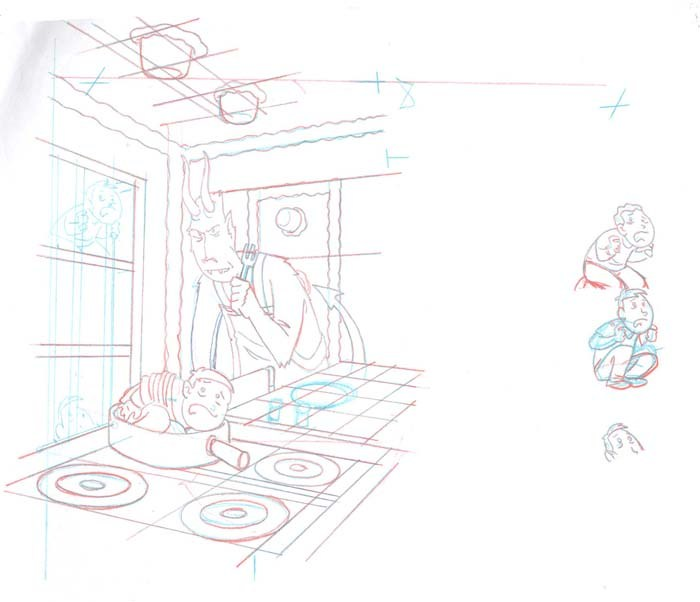
Played around with the terrified kids a bit…
They still look terrified even when refined. I drew it out and am working on final pencils now…then I’ll ink the bastard, color it and we’ll have ourselves a respectable cover for the Dutch X-mas Con! (sorry these pics are crappy, I’m good at drawin’ stuff, not photographing it)
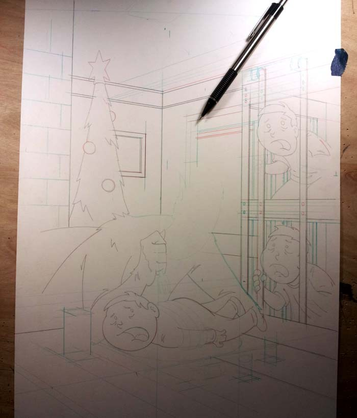
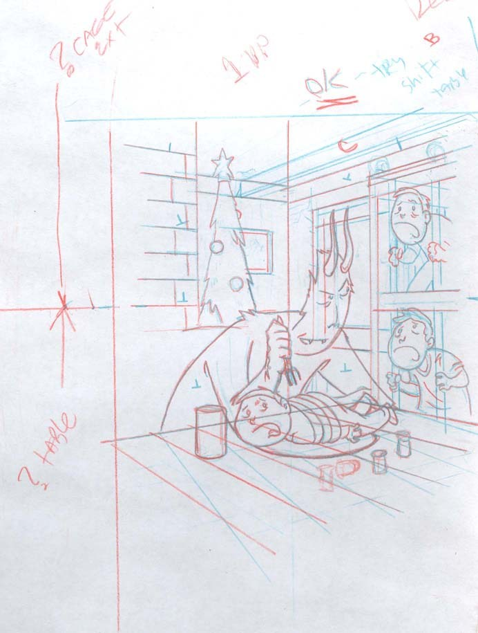
Sometimes the stuff you fret over just works out all by itself when you go to final pencils. Krampus’s hand for instance. I wouldn’t have bet it would have turned out so well so easily but it did.
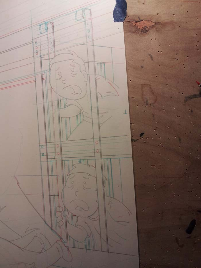
The curls on the top of the cages however…those ain't gonna be any kind of fun to ink.
Eventually...it got done
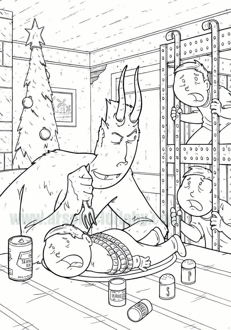
and colored
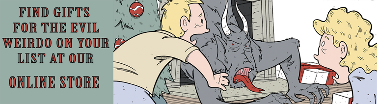
I have this available as a print on my online store, along with some other Krampus prints, original artwork and the usual Arsenic Lullaby treasures! Coupon code _humbug- good for 25% off entire order! (if you wanna use steem just lemme know - on discord as - ArsenicLullaby#2207 or email douglaspasz-at--arseniclullabies.com )
https://www.arseniclullabies.com/store/index.php?id_category=17&controller=category&id_lang=1
https://www.arseniclullabies.com/store/index.php?id_category=17&controller=category&id_lang=1
I love seeing the 'process' as we might think artists just go straight to the final idea. It seems you agonise over stuff we wouldn't even notice.
Did you mean to use the #slothicorn tag?
ops, yes I did. a little agonizing on correct spellings of hashtags next time, eh? haha
Nice, Doug ! Love the humour and the step by step ! The expressions on the finished coloured version is amazing :D
#comics
Thanks #comics I think Krampus's expression lost a little bit between the sketch and finished one, but the kids got way better, hahaha
This post was shared in the Curation Collective Discord community for curators, and upvoted and resteemed by the @c-squared community account after manual review.
@c-squared runs a community witness. Please consider using one of your witness votes on us here
Thank you!
Humor of these drowings are great.
I love It!
Posted using Partiko Android
Hey, thanks!
I loved seeing how you worked through which one to finally use! It is certainly a cover that would draw me in!
hey thanks! I thought it was the best of the bunch/had the most potential. I went back to a few of the others after awhile and they just never grabbed me enough to make them into a finished piece