For now let’s look at a new Arsenic Lullaby comic, and I’ll give you some behind the scenes insight on it- the making of it, the constructing of the joke itself in comic book form.
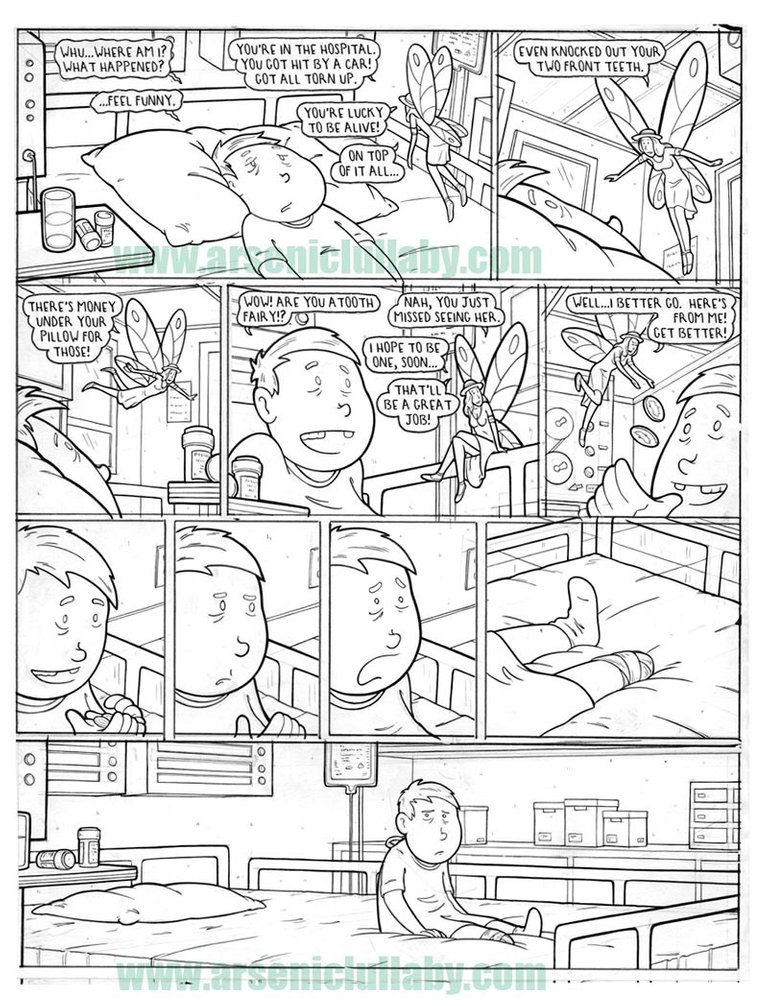
Okay, so…the kid thinks he’s getting money for his front teeth but then realizes his foot has been amputated and the money is for that. Eh…solid, but not the funniest thing I ever came up with. Some jokes though, serve a larger purpose. This is to be in a collection of 60 some odd pages of Arsenic Lullaby and it will serve to break up the rhythm. Much like telling jokes in stand up comedy, or playing live music, you have to keep the crowd from getting used to what you are doing or there won’t be the same punch.
The most important part of this joke and possibly the soul reason it made the cut is that last panel. After 30 or 40 pages of a reader laughing at horrible things they can become..numb to it. (see my blog for previous examples of the kind of jokes I'm talking about if you are new to me comics) That last long panel with nothing but the kid looking at you…that serves to remind the reader that there are victims here, that these things are awful…for someone. That’ll ” cleanse the pallet ” as they say, so that they can be jolted into laughter in other parts of the book.
That’s that’s the why. Now for the how.
The difficult part about this one is that it is a joke that relies on one visual- the missing foot. If you read the first panel and happen to notice the panel with the foot…well, the joke is spoiled. ( keep in mind, that this is made for a book…so you can’t rely on readers only seeing the first two panels and then scrolling down. The reader sees everything at once…trick is to (hopefully) keep them from noticing such a detail until you want them too. You do what you can to hide a visual when it’s the punch line in and of itself.
I stuck it in the mid-right side (where often your hand would be…this one will be on a even numbered page for that reason). I made the panel pretty uninteresting visually and the lines lead the eye to the panels to the left of it or down. The three panels of the kid’s face help with timing but they also reduce the tendency of the readers eyes going to where the main characters eyes are looking (in this case to the leg/stump). If it was just one panel of him looking, the reader’s eye would naturally be lead to what he is looking at. The repetition of that image neuters that and also makes it more boring visually.
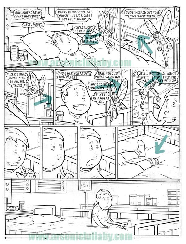
In an attempt to keep fleeting glances at this page focused on the top two panels I have the fairy’s posture go in an eye leading circle around the top of the page. In the image below with the arrows, you can see I did my best to lead the eye with - where the fairy is looking, what direction she is headed/hovering, and the tilt of her posture itself as a "implied line". In some cases…people will still happen to see his amputated leg. (Shrug) You do what you can…and besides, the long panel at the bottom is what matters.
I also toyed with the idea of breaking the last panel into three panels. They would have all been the same shot (just the section of the last panel with full view of the boy and his missing foot) One with him looking into his hand at the money, the second with him looking at his missing foot, the third with him looking at the reader. This might have hid the ending better but would not have had the same impact as the long lonely panel as it is now. It would have not been as pathetic and sad. and since that was the point (and to me funnier), that's how I did it.
When I get stuck or have a decision to make, I have to remember what the point of the gag was, what about it is the core of the "funny".
That's all for now.
More soon, so follow me if you wish. and if you want more now, you can always go to my website www.arseniclullaby.com. There are plenty of comics there and a "randomizer" page which will keep giving you random one page comics.
Later!
Aaah what an interesting post ! Very enlightening, the thought process that goes into pulling a page together! The way you guide where the eyes should focus and how the panel flow from one to another is very thoughtful... Great post~
upvotes
Love this detailed layout analysis. I’m currently reading the book Panel Discussions: Design In Sequential Art & Storytelling, and it’s like you just added an extra (twisted) chapter. Thanks!
I have a bunch of blogs on laying out panels. the hows and whys ...I'm half assed deciding on what I want to do here on Steemit. I'm thinking once a week maybe have a how to blog or inking video or some sort of feature that shows the making of what I do. I dunno yet, as it is I probably post too often (shrug, it's fun here though)
I love hearing about the thought that goes into this. In this case it's about building to the punchline. I've read some short stories like this where I consciously covered the last paragraph to avoid seeing it too soon. In this case I didn't look ahead anyway.
It's a constant concern- hiding the punchline. Sometime I get lucky and can put the panel with the jolt as the second or third from last and have the last be a reaction that doesn't give away anything specific.
Like this one here, the punchline is set back from the last panel you'd look to.
This post was shared in the Curation Collective Discord community for curators, and upvoted and resteemed by the @c-squared community account after manual review.
Congratulations! this post got an upvote by @steemrepo and was manually picked by the curator @for91days to be added on STEEM REPOSITORY, simply comment "YES" and we upload it on STEEM REPO Website.
Want to know more about the Steem Repo project? Contact us on Discord
YES
I definitely laughed at this one! I wasn't expecting it at all but after I saw the missing leg I understood right away, haha.
excellent! If it made you laugh then I did it right.