Last week I popped up a post asking for your help in deciding which one of my lovely pieces of Original Spidey Comic Book Cover Art to get all spruced up in a fancy new frame. Well, the clear winner with 3 votes while others got 1, was this gem by Marco Checchetto. It’s the cover art to his variant cover to Amazing Spider-Man #74…or #875 Legacy numbering. Stupid Marvel…
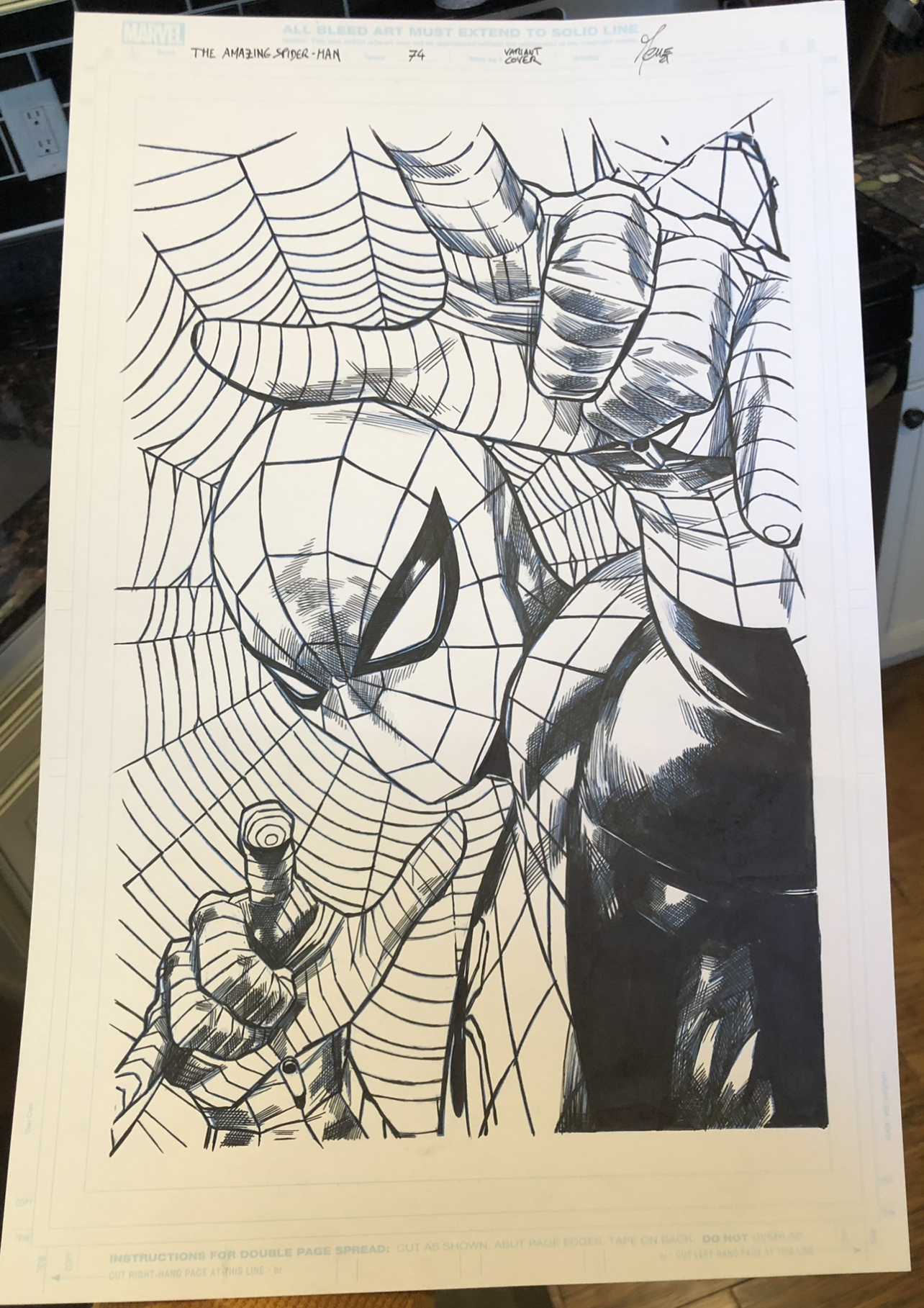
Here’s the published version for reference. Obviously there’s a lot of deep blues and reds here, so I incorporated that into my framing decision.
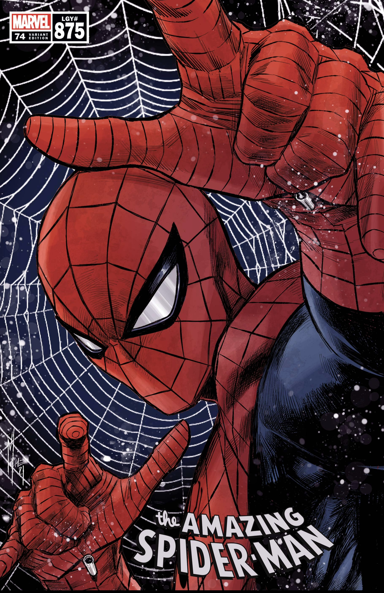
Usually I try to use some element or aspect of the published piece as inspiration in the framing choice. With this one being kinda simple in its color schemes, I decided to just stick with Spidey’s colors.
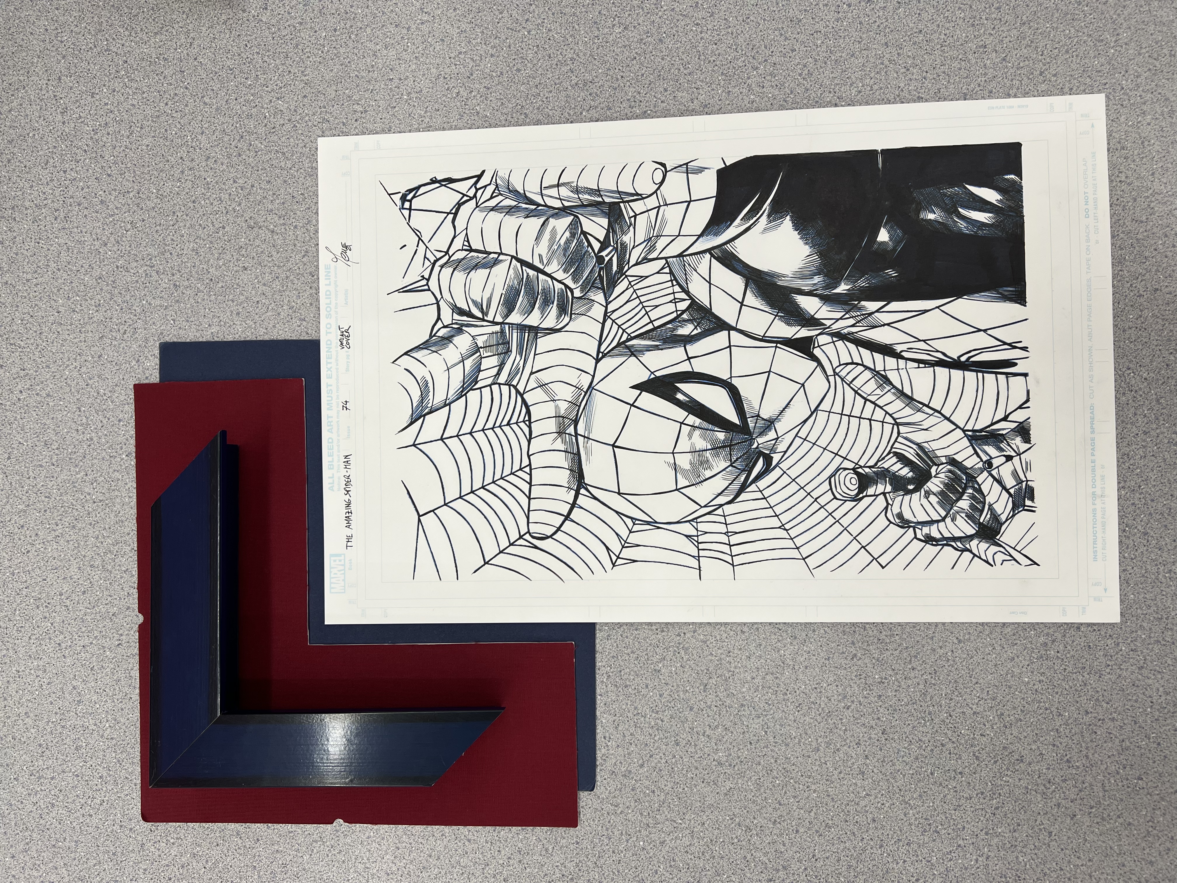
I decided on a flat deep blue, and textured red matte with a thick glossy blue frame to house it up. It’s going to look sharp as hell, especially since Marco utilized Blue Line Pencils in the piece which you can see little accents of throughout. The actual frame is the same exact one that I used to house my Alex Ross piece last year…except it’s blue instead of red. See?
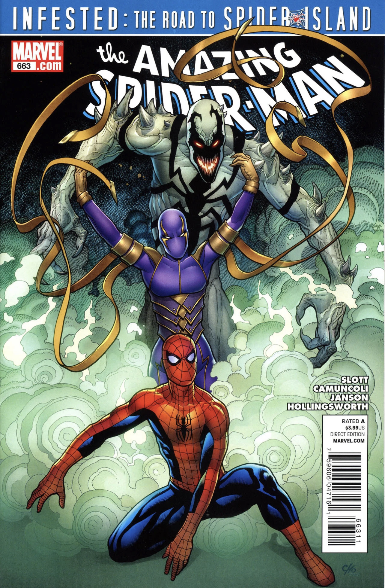
As for the other piece getting immortalized in museum glass, my lovely wife was kind enough to treat me to the frame job on this mofo. It’s the oversized cover art to Amazing Spider-Man #663 by Frank Cho!!!
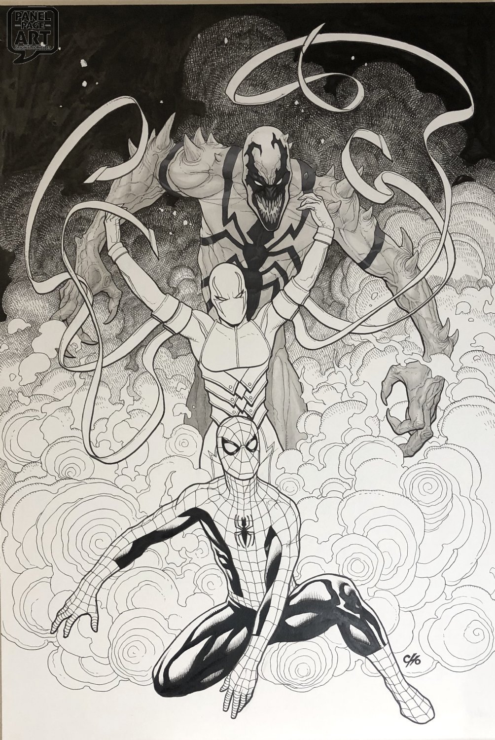
Now this one I had a little fun with. It features Spidey, Anti-Venom, and Wraith surrounded by beautiful clouds of blue/green smoke. Wraith’s purple and gold suit really pop on this and I wanted to utilize that.
While some could mistake her to be a Laker’s fan…AND while the Lake Show can lick my butthole, I am a fan of that color scheme. Especially since none of my frame jobs have taken advantage of that color scheme as of yet. Well, no time like the present!
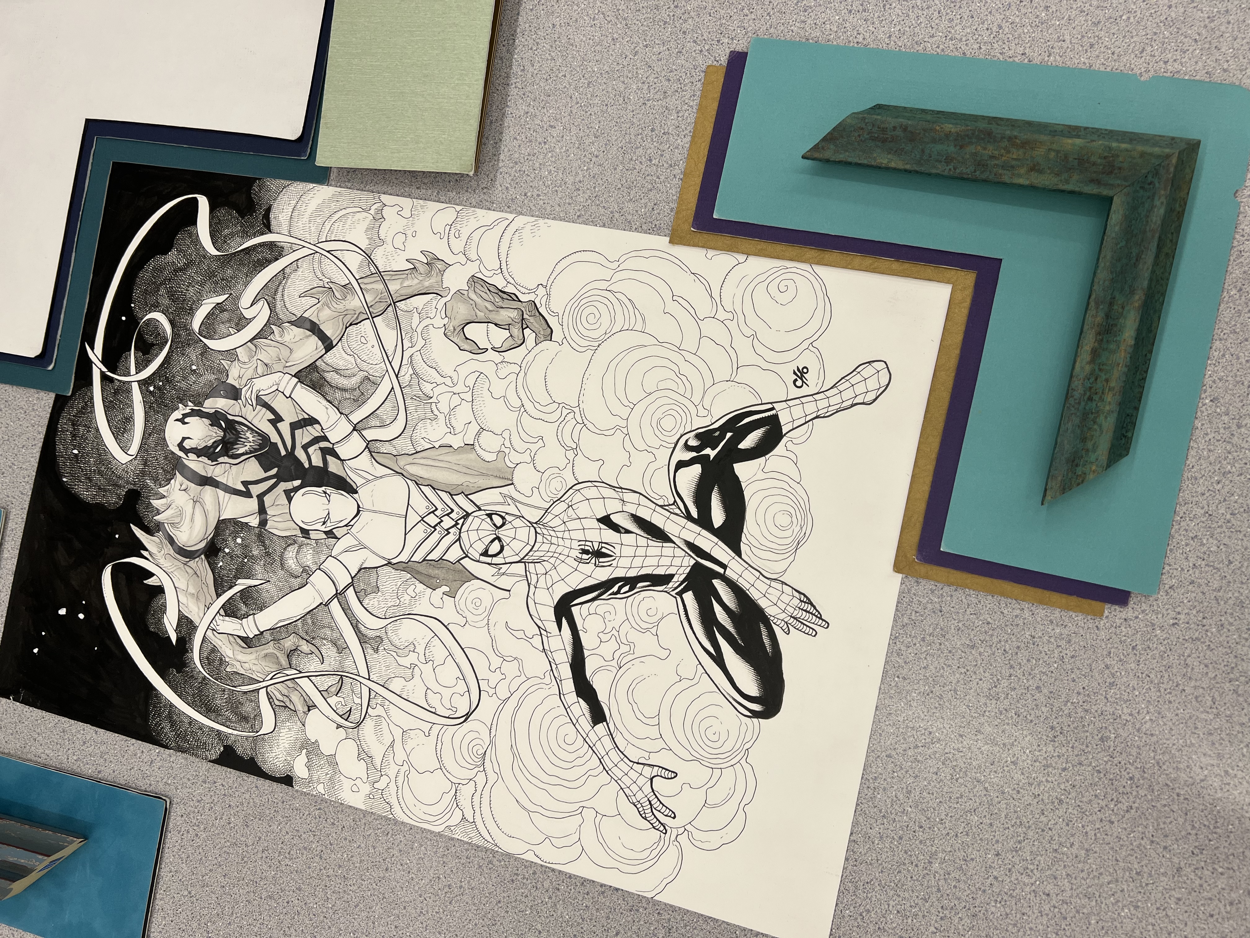
I didn’t want it to be overpowering, but I liked having it accent the piece a bit. That’s why I chose both the purple and gold matte’s to lay under the main teal one. The frame is a brushed teal/blue green that exposes a bit of a bronze ish/gold tint that I thought would fit perfectly. I can only do so many red and blue jobs…
I always have a great time trying to find these beautiful one of a kind works, their new forever homes. These should be complete sometime next week. I’ll be sure to pop up the finished product here to share with you all once they are all completed.
Thanks for taking a moment to share my nerdy excitement.
Blewitt
These are truly FANtastic works!
You blew my mind, blewitt!!!!
Thank you so much. I love being able to shows off these amazing pieces to folks that appreciate it. I just wish I had the talent to do what these artists can create.