I've been getting back into post-production and color grading work. I've been trying to expand my skill set and work in different areas of color grading. I connected with a cinematographer in London named Jacob Cameron Hill (https://www.jchvideography.com/) who does Commercial and Fashion work. I reached out to him and asked if I could do some colorwork on some of his footage to which he agreed. Here are the results of the first one.
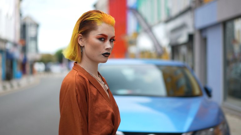
As you can see overall this doesn't look bad at all but it's a bit flat and has lots of white in the background and it could use a little extra color.

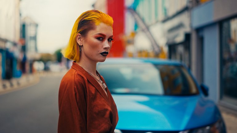
This is the after and it has a different look and feels to it now. That's what color grading does. It gives off energy and emotion to the picture. I wanted to go for a warm and just a touch of a vintage vibe.

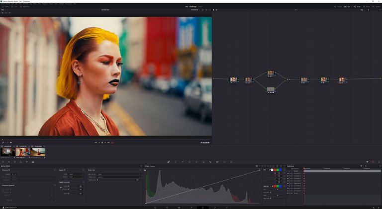
Here is a preview of my workflow. As you can see its actually pretty simple overall. I really didn't want to overcomplicate it.
