Back in 1995, Microsoft's WORD software added a nifty feature called a "tooltip" which appeared in a little box above the cursor when a user hovered the mouse over a tool on the toolbar. In the twenty-five years since, many other software developers added this to their software. Eventually, web developers began to add tooltips to website designs as well. They can be very helpful to users by showing additional information when hovering their mouse over various items on the site.
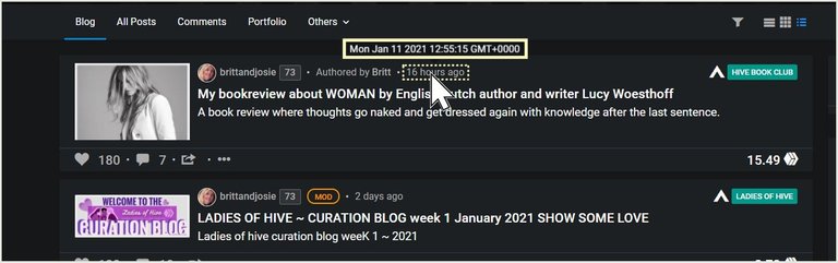
The following screenshot from the PEAKD front-end to the Hive blockchain shows how helpful a well-placed tooltip can be for showing additional information. Hovering over the area I've shown as dotted reveals the information in the solid box, way above the pointer:
HOWEVER, I am seeing a trend that is making the tooltip much less helpful... 😬
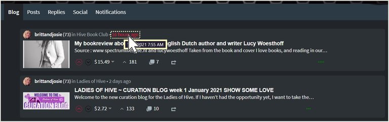
For the entire twenty-five years tooltips have existed, I have always seen them displayed above the cursor on the screen where they are easily visible, as shown above. In recent months, however, I am seeing more and more websites displaying the tooltip box literally beneath the cursor so that the cursor is actually hiding some of the information in the box. The screenshot below from the Hive.Blog front-end to the Hive blockchain demonstrates poor placement of the tooltip, hidden beneath the cursor. GOOD LUCK trying to read the month and date in that box with the cursor hiding it. 🙁
Sadly, Hive.Blog is just one of the dozens of websites I have seen that are doing this lately. It's being done on non-Hive sites as well as Hive-related sites, so it is a disturbing web-wide phenomenon.
This is definitely a disagreeable departure from the rational convention of the past twenty-five years of the use of tooltips. I cannot quite fathom why this is being done, nor why the developers, themselves, have not noticed they're hiding information. Perhaps most developers don't actually use the sites they design? Surely, I am not the only person who has noticed this! 🤔
Please, developers, stop doing this and return the tooltip to its rightful position above the cursor so that information is not obstructed! Not only will us users thank you, but your reputation as developers will improve as well. Please make sure the front-end teams see this! Thank you!
֎
I don't know exactly whom to tag to be sure they see this post. Hopefully, the following people will find this feedback useful, or will at least share this information with developers who will find it useful. Please pass this on! Thank you!
 😊
😊SOURCES
1 Wikipedia: Tooltip


12-Jan-2021
That's native tooltip provided by browser/os you are using. With js/css, it could be improved to custom style...
So, the @peakd interface is changing the tooltip via CSS, then, to how it should look, but Hive.Blog is not...? Interesting! 🙂
peakd has changed default behaviour, hive.blog, (ecency as well) is using default behaviour, so changing that should be easy. Just need to make sure, it behaves same on different screen sizes without causing issues.
That is great info to know! Thank you for the response! ⭐️
It's true. Good observation. I hope someone will read this. Well, if there's one thing I can say to developers in defense, it's that not all developers can be designers at the same time to maximize a user-friendly interface.
Your post has been voted as a part of Encouragement program. Keep up the good work!
Try https://ecency.com and Earn Points in every action (being online, posting, commenting, reblog, vote and more).
Boost your earnings, double reward, double fun! 😉
Support Ecency, in our mission:
Ecency: https://ecency.com/proposals/141
Hivesigner: Vote for Proposal
From within Firefox browser on hive.blog it reflects below but clear of browser, no GMT time. In Firefox to peakd reflects above day, date, with full hour, minutes, seconds and GMT time.
One gives more detail, both are clear of cursor. Have a wonderful day @thekittygirl and thanks for pointing out the little useful places to find details.
!WINE
Cheers, @joanstewart You Successfully Shared 0.100 WINE With @thekittygirl.
You Earned 0.100 WINE As Curation Reward.
You Utilized 1/3 Successful Calls.
WINE Current Market Price : 0.000 HIVE
Thats why i don’t use it and look up elsewhere if and when i need that info, but it would for sure be great if it was even more clear, that way i wouldnt have to leave the page, and thanks for using me in the screen shot hahahah hidden extra free publicity. Hope all the devs will leave a comment saw karma took te lead already, one down a few to go.
This post has received a 100.00% upvote from @fambalam! Join thealliance community to get whitelisted for delegation to this community service.
That does get frustrating and I know exactly what you are talking about!