It was time to start my Travelling sketchbook, filling the first pages with inspiration drawn from books, magazines, photographs, words and images from the internet, before completing and including a small piece of stitched work around my theme: Fashion.
We had about a month for the assignment and I found I needed all of that to collect and organise my ideas and complete the work. I was swamped with different feelings: on the one hand, acute performance anxiety, and on the other, complete joy and flow in the making process. The anxiety disappeared every time I started working on what I was doing.
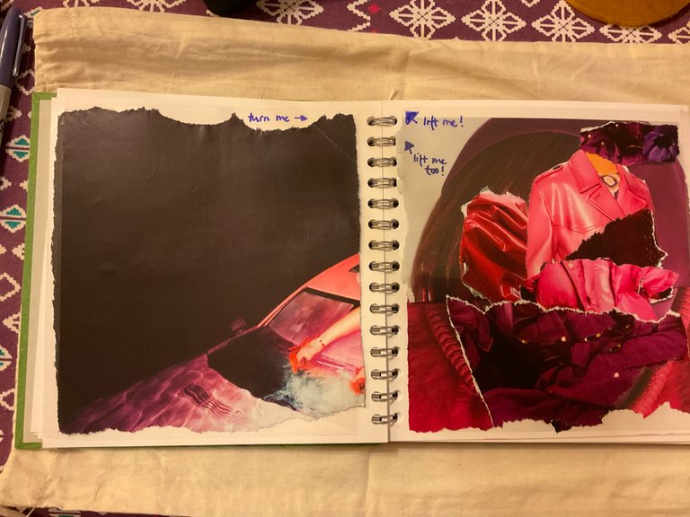
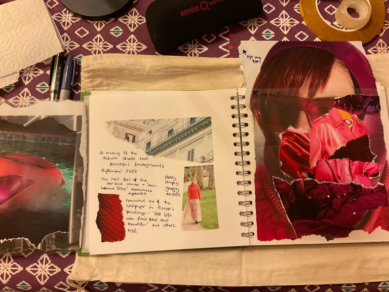
Many of the images I chose for my inspiration pages came from the September 2022 of British Vogue with Linda Evangelista on the cover. There was a feature about her inside, including her experiences with a cosmetic intervention which had gone wrong. I found it disturbing that her neck and jawline had been taped or were covered by scarves and snoods to hide the side effects of the cosmetic work. She talked in the article about fashion shoots presenting a fantasy or dream. I wondered about disassociation, one of the many complexities of fashion.
Other images came from Rowan Magazine No 72.
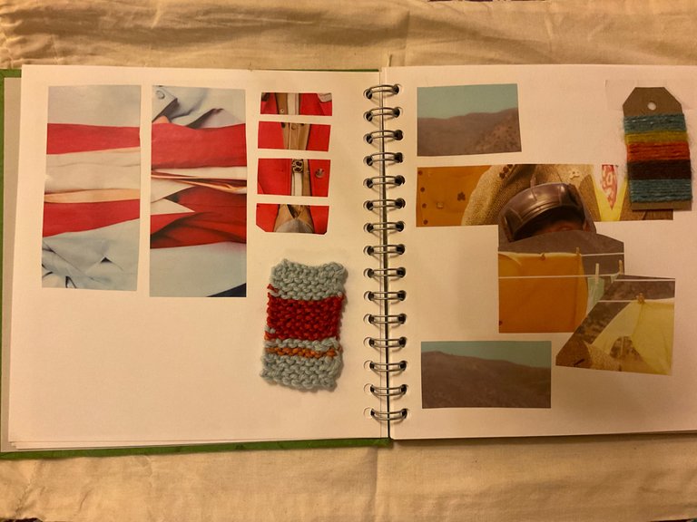
Double page exploring combinations of colours. I've cut up the images to focus on the colours and their proportions.
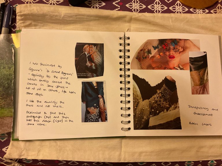
I chose themes for pages starting with collections of images around a colour, and moving through colour combinations, transparency, cutouts and layering, embellishment, structure and texture.
I have a problem with yellow - I rarely use it, so I deliberately sought out images with a range of yellow palettes. The right hand page in in the image above was one of the results. It was interesting cutting up the image, because I began to realise there were far more colours in the image than the clothes the model was wearing, including a minty-green pair of socks.
This became the page that interested me most, and generated several ideas that I wanted to explore. The little stitch and wrapped samples are ideas about how the colours in the images could be used together. Again, the one on the right interested me most, although the very pale blue on the left is also interesting.
Fixing the images in the sketchbook proved the most frustrating and time consuming task. I started using Spray Mount which went everywhere, the force of the spray scattering my carefully arranged images and taking ages to dry.
I tried double-sided tape, which worked well for paper images, but it proved impossible to remove the backing paper from tape attached to the fabric samples. Finally I resorted to sellotape and placing the final sample in a cellophane bag. Even then, fixing the cellophane bag involved tweezers and endless patience.
These pages were an experiment using acetate overlays to create different versions of the same images, and on the right hand-hand page, compare and contrast two different images in the same colour range.
As an experiment, I'm not sure how well the images above work. I took acetate sheets, used for printing overheads (do people still use those)? The sheets were cut to size, then fixed with a sellotape hinge to the sketchbook page at the outer edge. Masking tape would probably have been better to create a hinge but I only had an acid yellow tape - great for house-painting, not so much for a discreet fixing in a sketchbook.
The images on the left hand acetate, taken from a double-page spread, had lots of noir resonances - Sunset Boulevard and other films made around that time, especially with the ghostly edges of the swimming pool tiles. I also loved the range and richness of the colours.
Creating the inspiration pages was a good exercise for really looking at images. (That was emphasised by the recent Balenciaga debacle, and some of the questions it raised).
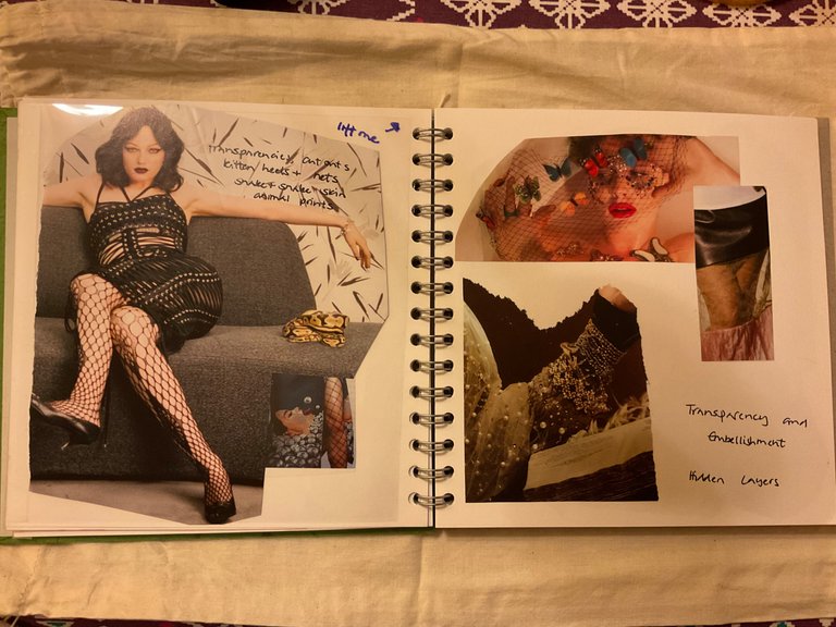
On the left, one of the pages about transparency and, on the right, moving into the pages about embellishment.
I used an acetate overlay again on the left hand page and this time the experiment worked better, with a clearer relationship between the top and bottom layers. These pages are moving into the darker end of the fashion continuum with some of the images coming from a shoot about fetish wear.
Although there was a darker undercurrent running through much of the September edition of Vogue, in sharp contrast to the more wholesome images of the Rowan magazine (see the pink jumper and lace skirt in the previous image).
Left-hand page: the layer under the acetate. The top image is a photograph by Steven Klein.
The Steven Klein photograph is from a collection published by Phaidon.
More in this Art Unplugged article with some of the famous images in the book.
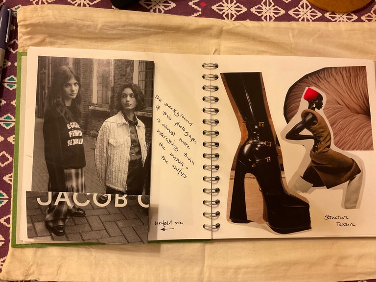
Left hand page with a folded image. The background is richly textured and I liked the inter-relationship between the background and the models. The right hand page looks at structure.
I used folding on several pages to retain more of the image (there was a lot to pack into a limited number of pages) and to explore different visual effects like layering. I was pleased with how the three images came together and seemed to echo each other on the right-hand (and last) inspiration page. Playing with them, cutting away paper here and there, they moved from three disparate images to having some themes and commonality.
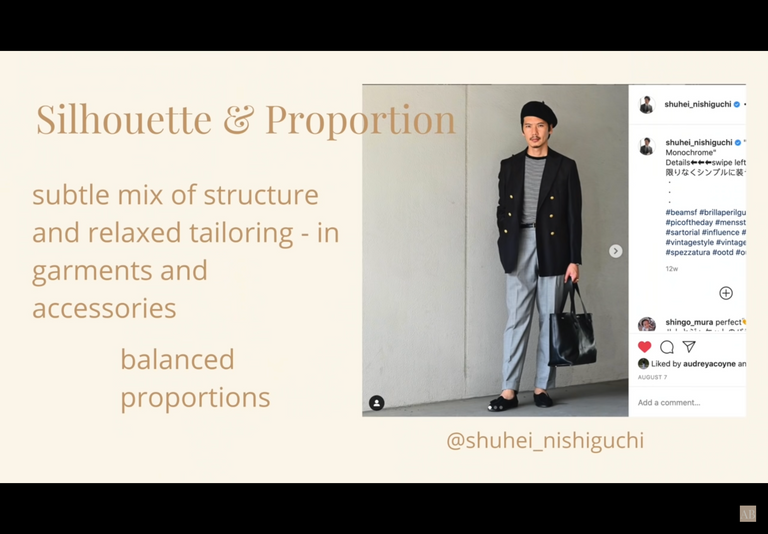
Alyssa Beltempo has a regular Shop your Closet video, where she analyses the style (design) elements of a look.
This video featured Shuhei Nishiguchi and an often fashion typical black and white colour palette. I liked the relationship between the black accessories - hat, shoes, bag - topping and tailing and framing the outfit; and the tension in the clean lines and contrast between the black jacket and the striped top and grey trousers.
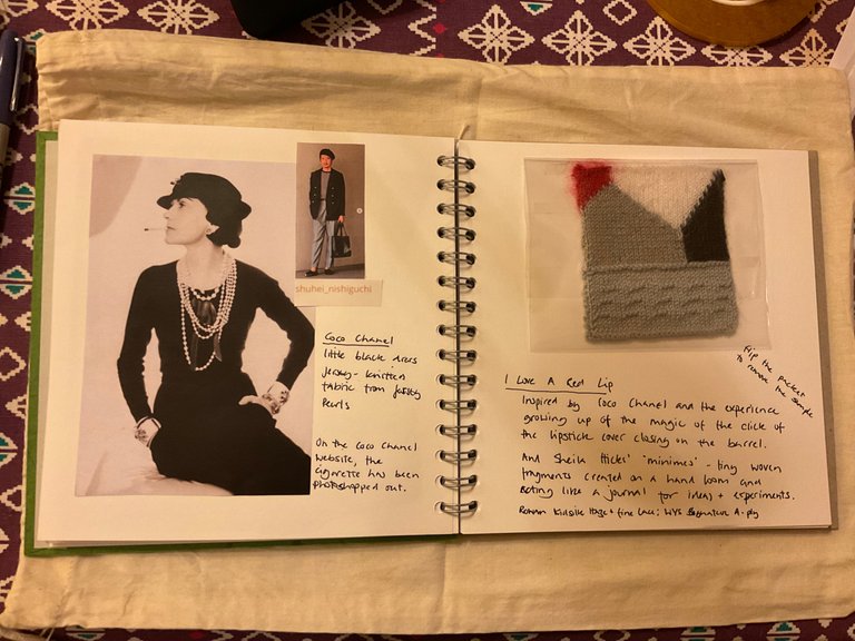
I found this image of Coco Chanel long ago and it's haunted me ever since, before I even knew who it was in the image!
I wanted to capture fashion icons in my sample - the red lip, the little black dress, Coco's pearls. (I learned that knit fabric is known as jersey because, after the 1939-1945 war, when many things were scarce, Coco sourced knitted fabric from Jersey). And from Shuhei's image: the strong, clean lines, sharp contrasts and limited colour palette.
The sample is hand knitted using intarsia, a technique for colour work that I had never tried before, mainly because of the challenges of maintaining an even tension across the different colours. I was inspired by Sheila Hicks' minimes:
"Beginning in the 1950s on trips to Latin America Hicks made many minimes - small sample weavings acting almost like a sketch book of ideas and inspiration. She continued this practice on her travels throughout her career. Hicks felt these helped her to build connections between art, design architecture, decorative arts and craft. I loved these. They are like mini masterpieces." Hippystitch: Sheila Hicks at The Hepworth, Wakefield.
Visually, I was pleased with the experiment and pleasantly surprised that there was little puckering from the intarsia (the sample was blocked). There are a few technical details I would do differently another time, but as an experiment and something where I had an initial drawing but otherwise was free-knitting, it worked.
The sample was knitted using three different yarns:
Kidsilk Haze: (70% mohair, 30% silk) colours Scarlet (715) and White (612).
Fine Lace: (80% alpaca, 20% wool) colours Noir (934) and Pigeon (950).
Signature 4 ply: (75% wool, 25% nylon) colour Dusty Miller (129).
Kidsilk Haze is like knitting with fairy wings, it's so soft and delicate; the Fine Lace has a beautiful sheen, I guess from the alpaca.
Knitted using 2mm fixed circulars.
I'm recording my thoughts and ideas as I work on the assignments in the Travelling Books series. My main motivation for taking part in the project is to build my creative practice - just doing things, playing with paper and paint and shapes and colour and trying out different experiments using materials, tools and techniques from knitting.
Background to Travelling Books
News from my sewing group: Travelling Books


wow! this is such a complex project! it's not easy. I probably wouldn't have made it. you are very goal oriented!
Haha - until I get distracted by strawberries 😁
This is awesome!! I just recently thought about "collaging" and how much fun I used to have doing it, reading your post now it really spoke to me, such a fun way actually to gather and collect ideas. While I read I just wanted to grab a magazine and start doing so myself..haha
You really inspired me there! (gonna keep that in mind!)
I assume in...
...Ill read more about why or when you started doing this practice? So I am off to read this one:)
Oh and for the glue, what about a glue stick? I find they usually work pretty good.
Glad you enjoyed it and were inspired! Collage is great fun, it's interesting how ideas come out of it.
Yes, a glue stick is a good idea, thank you 🙂
Greetings @shanibeer, a very original idea to organize your projects, the notebook is a real treasure, the notes and samples very explanatory, I really liked your plan.
Happy start of the week!
Thank you, I'm glad you liked it 😍
To you, too! ❤️
Ho Ho Ho! @shanibeer, one of your Hive friends wishes you a Merry Christmas and asked us to give you a new badge!
The HiveBuzz team wish you a Merry Christmas!
May you have good health, abundance and everlasting joy in your life.
To find out who wanted you to receive this special gift, click here!
You can view your badges on your board and compare yourself to others in the Ranking
Check out our last posts:
Thanks @hivebuzz
All best wishes to you and your team 🎄
You're welcome
May we ask you again to renew your support for our proposal? We really need your help!
All you need to do is to click on the "support" button on this page: https://peakd.com/proposals/248. It won't cost you anything!
Merry Christmas to you and your family 🎅
Done - thank you for the reminder 😍
Thank you for your support @shanibeer, much appreciated! ❤️
Dear @shanibeer,
Your support for the current HiveBuzz proposal (#199) is much appreciated but the proposal will expire soon!
May we ask you to review and support the new proposal so our team can continue its work?
You can support the new proposal (#248) on Peakd, Ecency,
Thank you!
Dear @shanibeer,
Your support for the current HiveBuzz proposal (#199) is much appreciated but the proposal will expire soon!
May we ask you to review and support the new proposal so our team can continue its work?
You can support the new proposal (#248) on Peakd, Ecency,
Thank you!
What a fun and happy project. I am sorry I am late for voting. I have been on the road a good bit as of late.
I had heard of Linda Evangelista's surgical problems. Very sad.
Congratulations @shanibeer! You received a personal badge!
Many thanks for attending the last Hive Meetup in United Kingdom.
Check the #HiveUK, #TeamUK or #HeamUKMeetup tags for related posts.
You can view your badges on your board and compare yourself to others in the Ranking
Check out our last posts:
Support the HiveBuzz project. Vote for our proposal!