
Welcome to the daily analytical report about the Hive blockchain.
All the information presented in this report are based on the data collected from the blockchain until 2020-03-21 midnight UTC time. The goal of this report is to provide you with a clear view on what is happening on the Hive blockchain.
1. New users
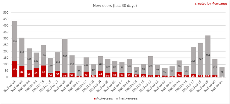
This chart shows the number of newly registered users on the blockchain and how many of them became active.
Warning: the chart is kind of dynamic! A user can register one day and become active a few days later. Therefore, the number of active users on a specific date may change from day to day.
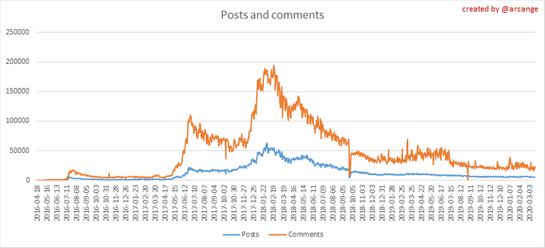
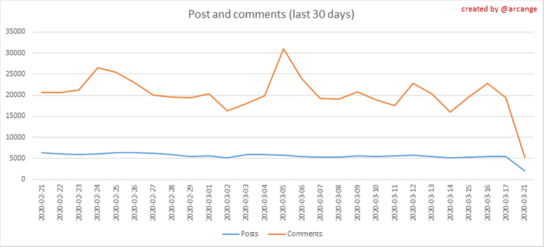
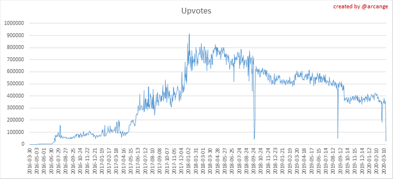
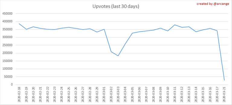
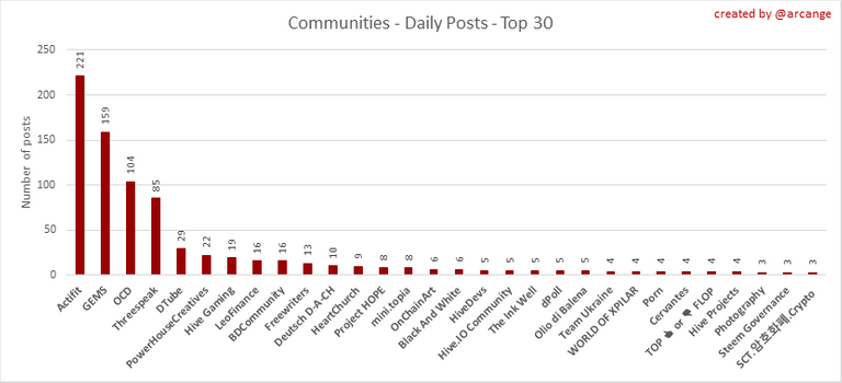
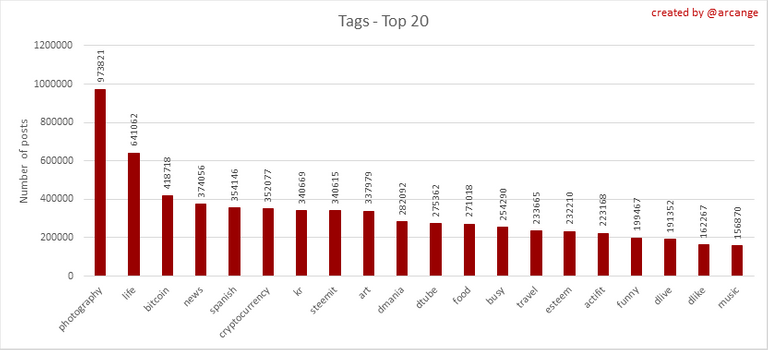
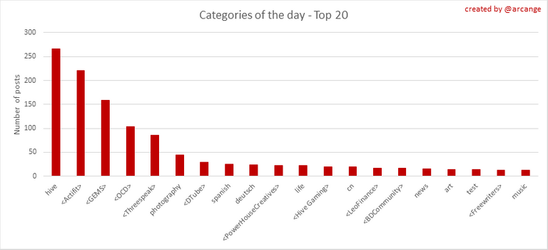
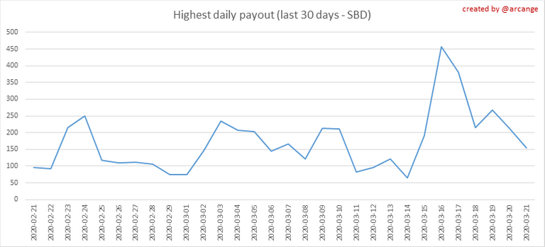
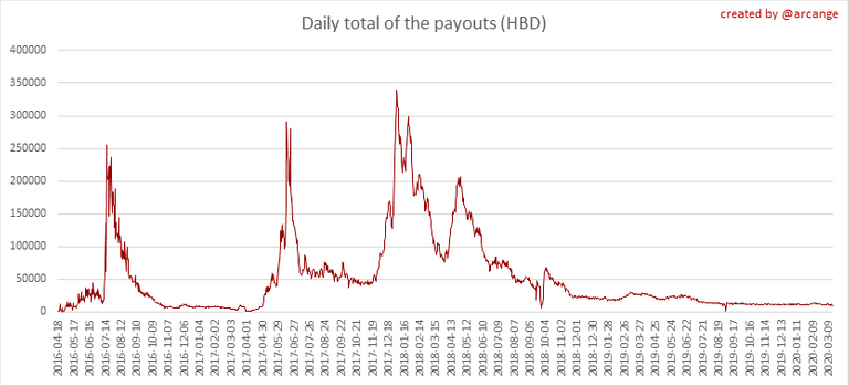
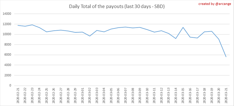
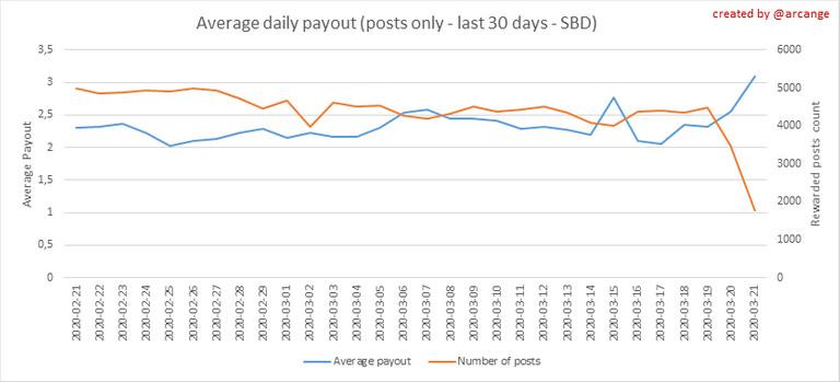
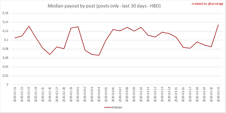
This graph shows who created new accounts during the last day. In this graph, the orange line shows the total number of registered accounts. These graphs show the activity of users over time and in more details for the last 30 days. They use the same definition for active user as stated above. These graphs show the evolution of posts and comments for the whole blockchain lifetime and for the last 30 days. These graphs show the evolution of curation (upvotes) for the whole blockchain lifetime and for the last 30 days. This graph shows the number of daily transactions. This give you an idea of the whole activity on the blockchain. This graph shows the distribution of the top 15 types of transactions by number of operation performed on the blockchain. This graph shows the communities with the most subscribers. This graph shows the most active communities by published posts. This graph shows the most active communities by published posts last day. This graph shows the tag has been the most used for publishing posts for the whole blockchain lifetime. This graph shows the tag has been the most used for publishing posts last day. This graph shows the number of users according to their Hive Power. This graph shows the distribution of Hive Power cumulated per account level. These graphs show the maximum reward paid on a post (or comment) for each day (whole blockchain life and last 30 days). These graphs show the total of the distributed payout (posts and comments) for each day. These graphs show the average and median payout per post for the last 30 days. I hope you find those stats useful. If you would like to see different stats, feel free to drop me a comment. Your feedback is more than welcome. Thanks for reading.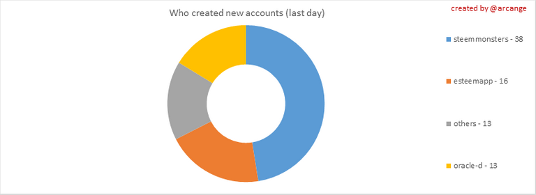

The green line shows how many of them have been active at least once (by active users, I mean those who made at least one post, comment or upvote). They are included even if they become inactive later.2. Active users

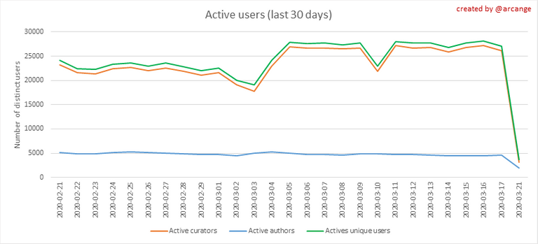
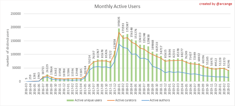
The last graph is a monthly summary of the active users. It allows you to compare values from the Hive blockchain to those one usually published by other social networks.3. Posts And comments
4. Curation
5. Daily transactions
![]()
![]()
6. Communities and Tags


7. Distribution
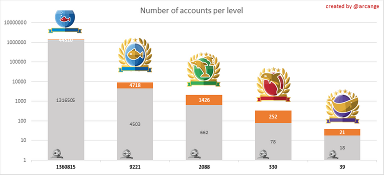
The grey portion of each column indicates how many accounts are inactive (see above for the definition of inactive).
The grey portion of each column indicates unused Hive Power by inactive accounts (see above for the definition of inactive).
Below each column you will also see a ratio to all existing Hive Power.8. Payout evolution
Good report to see on Hive!
Thank you @birdinc.
BTW, You have done an amazing work with the exchanges. Kudos!
It will be so fascinating to see the spike downward and watch activities resume as normal... and then spike way up! (I predict.) Thanks for the stats @arcange.
I guess everything will be back to normal next week. Usual hardfork effect =)
Great to see these on HIVE!
Thank you @revisesociology
Awesome been wanting to see these reports and track how the activity from the fork plays out.
Thank you @shmoogleosukami.
The hardfork generated a lot of work. It is not a small task to redo or update the work of several years in short days.
I'm slowly catching up... 😅
@arcange will be there a hiveboard?
Yes, something similar will be restarted
that would be fine. 😉
Great work with the statistics.
It is very interesting to see how Hive will develop.
Maybe a comparison to the development on Steem in a month would be very good :)
@tipu curate
Upvoted 👌 (Mana: 3/6)
Thanks for tracking all the numbers. I will be happy to see those fish disappear! 😁
Thanks for all you do @arcange. 😊
Hi Arcange,
Just an idea from my side: could you maybe make some posts about the Hive Statistics vs Steem Statitics? Number of users, new accounts, posts, comments, etc?
Would be very nice to see trends on these statistics. To see the reality in numbers where the community is most active.