Here's a brief statistical report on the health of the Hive Blockchain from an external, market-based perspective. It shows how Hive is doing in comparison to other crypto-currencies.
The raw data has largely been collected from https://coinmarketcap.com/ and then compiled into various charts for reference.
It's always good to take a step back and see how Hive is doing compared to the general crypto marketplace. Is it gaining or losing ground? Is there cause for hope or cause for concern. Looking at the fundamentals gives us a good idea as to whether money, and hence value, is flowing into or out of the blockchain and what that means for the general outlook.
Here are the stats for the last 90 days up until 7th July 2022.
Essential Stats:
Cryptocurrency Rank: 126
Market Dominance: 0.02%
Today’s Price: $0.4799
1 year ago: $0.2999
2 years ago: $0.2178
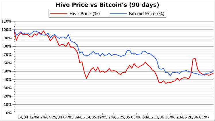
Chart 1: Hive Price vs Bitcoin’s
A price comparison chart plotting the price of Hive against Bitcoin, shown as a percentage change over 90 days.
Comment:
The first month shows that Hive and Bitcoin are locked together fairly consistently, but as we enter the bear market, Hive plummets for much longer before leveling out.
This doesn’t happen in the second dip, however (around 7th Jun), and notwithstanding the spike on the 28th, Hive has managed to recover to reach the same level as Bitcoin over the 90 day period.
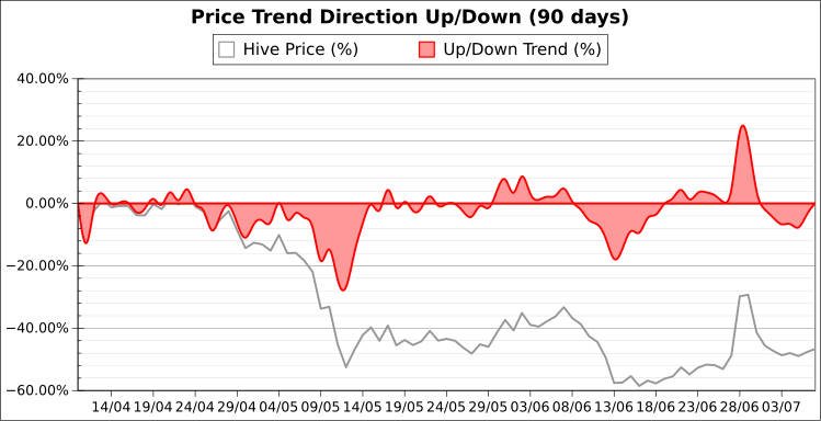
Chart 2: Hive’s Price Trend (Up or Down)
This shows the general up/down trend in Hive’s price. The areas above zero show where the price is trending upward, and those areas below zero show where the price is trending downward.
It is calculated as the percentage-change in Hive’s price compared to the average price of the previous 7-days, and the y-axis registers the strength of the trend.
Comment:
We obviously have two main negative runs in the 90-day period that push the price lower. There are barely any forays into positive territory, except for the large spike around the 28th Jun.
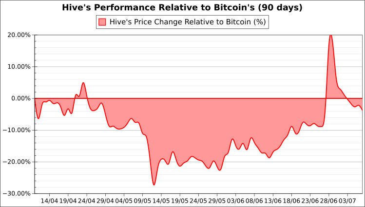
Chart 3: Hive’s Performance Relative to Bitcoin’s
This chart plots the performance of Hive’s price in comparison to Bitcoin’s. It shows which one has risen or fallen in percentage terms over the course of 90 days.
Where the areas are above zero, Hive’s price has gained ground on Bitcoin, by either rising faster or falling slower. Those areas below zero show where Hive has lost ground on Bitcoin by either rising slower or falling faster.
Comment:
So even though the previous chart showed there were two distinct downward pushes in this bear market over the last 90 days, this graph shows that after the initial divergence from Bitcoin into negative territory (around 8th May), it has been a consistent upward trend, slowly gaining lost ground back on Bitcoin, until we converge once again at the end of the 90-day period.
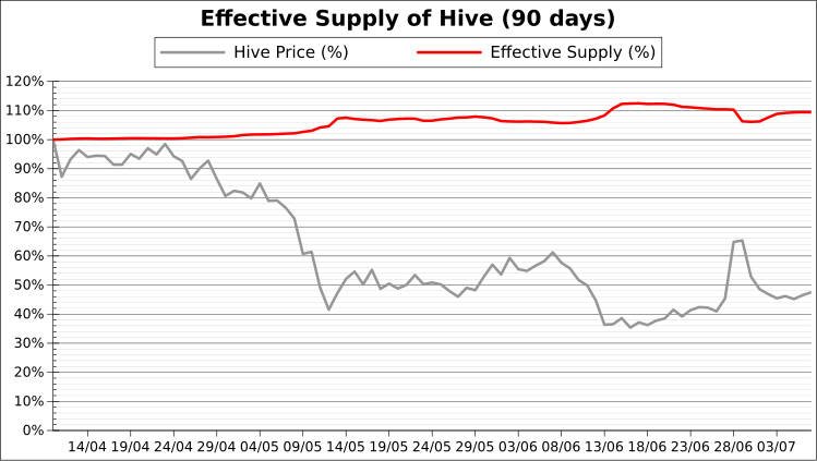
Chart 4: Circulating Supply of Hive
The circulating supply of Hive is determined by dividing the current marketcap by the current price. This will show effectively how much Hive is available on the markets.
This is displayed as a percentage change so it can be displayed alongside the current Hive price for reference.
Comment:
As the price of Hive goes down, there is a general divergence from the supply. Supply seems to go up in a significant way as the price falls, though often the peaks in hive supply occur after the price has already fallen quite a way.
Interestingly, the supply drops when there is the 28th Jun spike in Hive, which further confirms the inverse trend between price and supply. Was this due to Hive being burned?
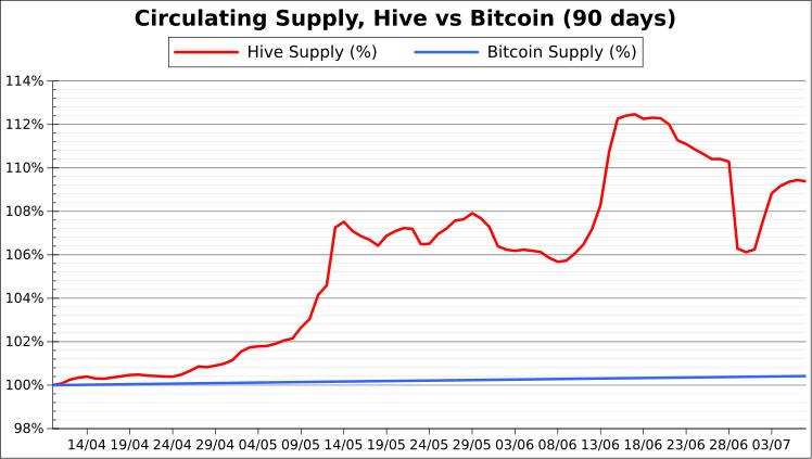
Chart 5: Circulating Supply, Hive vs Bitcoin
The circulating supply of both Hive and Bitcoin are displayed together for comparison (as a percentage change).
Comment:
We see that Bitcoin’s supply has steadily increased at a constant and predictable rate, but also at a rate that sees less than 1% growth over 90 days. By contrast, the supply of Hive fluctuates in a more pronounced way, as much as 12% in a 90-day period.
That Hive’s supply shot up at around the times that the crypto-markets were falling may go some way to explain why Hive experienced lower lows in price (%) than Bitcoin. When you add an increased supply to an already falling demand this tends to push price even lower.
Chart 6: Trading Volume as Percentage of Marketcap
There are often large fluctuations in price that coincide with high volumes of trading. Showing the raw volume prices might not reveal a great deal by itself without a reference point, so this chart shows the trading volume as a percentage of the current marketcap for a given day.
This is determined simply as volume / marketcap, with the value given as a percentage. For most of the time, the volume traded on a given day is just a fraction of the total marketcap value, but there are certainly times of note where the volume can even exceed the marketcap value. These are significant.

Comment:
What dominates this chart is the massive spike in volume on the 28th Jun coinciding with the marked spike in Hive’s price. What exactly went on during this period is still uncertain to me - who was heavily investing in Hive and why - but the volume for that day stood at 168% of Hive’s marketcap value. To me that’s extraordinary.
The second largest spike is at 28% of marketcap which occurred on the 7th Jun. This coincided (or helped to precipitate) the second dip in this 90-day period. Before that, the price had been steadily creeping up, so perhaps the price had finally reached a significant ceiling, triggering people’s sell orders.
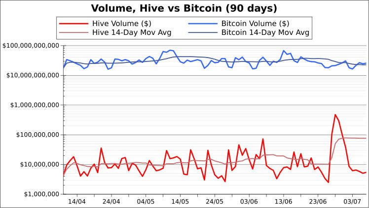
Chart 7: Trading Volume, Hive vs Bitcoin
For reference, we have a chart comparing the volume traded on Hive vs Bitcoin. We can sometimes discern patterns of like trading activity that may be a consequence of forces effecting the crypto-market as a whole, or just Hive as an individual blockchain.
This chart’s Y-axis has been displayed in logarithm form, since the gap between the two is so large.
Comment:
Volume charts are always so choppy, but if trends are to be found at all, a moving average might tease it out. As we can see, Bitcoin has been holding at around the $30 billion mark, whereas Hive has shown an upward trend, starting at $10 million and doubling by 8th Jun to $20 million.
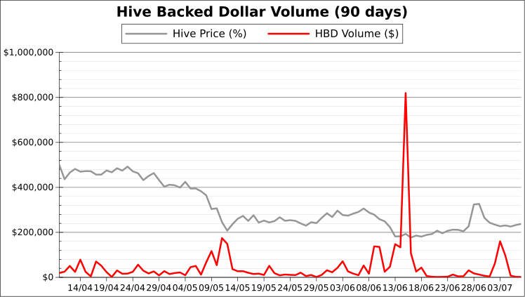
Chart 8: Trading Volume, HBD
Because Hive is so inextricably linked to the Hive Backed Dollar, I have included a chart that compares activity in HBD trading compared to the price of Hive.
Where there are spikes of HBD trading volume, there can often be marked changes in the price of Hive, since value is being exchanged between the two.
Comment:
This chart is dominated by a massive spike on 14th Jun, which coincides with a halt in the falling Hive price and a period of stability.
The other two notable peaks lie on 10th May and 2nd Jul, happening after two other price slumps. These may signify people deciding to shift Hive over to the safer HBD, and it could also show people seeing Hive’s low price as a good time to move their HBD back into Hive.
Chart 9: Marketcap, Hive vs Bitcoin
It is important to always keep one eye on how Hive compares to the rest of the crypto-market in base terms, and so it is useful to use Bitcoin as a benchmark. Of course, Bitcoin’s marketcap dwarfs that of Hive by a factor of over one thousand. But, ever the optimist, there may come a time when Hive’s popularity reachesa tipping point and begins to make ground on some of the bigger crypto coins.
This chart’s Y-axis has been displayed in logarithm form, since the gap between the two is so large.
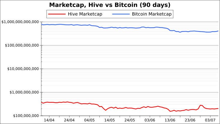
Comment:
*Hive’s price plummet halted on 12th May at around with a marketcap of around $150 million and since then the rot has stopped and the marketcap has slowly (on the whole) risen, approaching the $200 million mark.
This is counter to Bitcoin, which has demonstrated a steady fall throughout the 90-day period from $800 billion down to $700 billion. A promising sign for Hive.
Chart 10: Ratio of Hive’s Marketcap to Bitcoin’s
This chart explores whether Hive’s marketcap is gaining or losing ground on Bitcoin’s. This is a general guide as to the health of the blockchain in comparison to the rest of the cryptocurrency sector. In a bearor bull market, blockchain marketcaps may all be moving in the same general directions, but are some pulling away from others?
Here we can see if the current market trends are effecting Hive more than the crypto-king Bitcoin.
Areas that lie above zero show where Hive’s marketcap is either growing faster or shrinking slower than Bitcoin’s. Area’s that lie below zero show where Hive’s marketcap is either growing slower or shrinking faster than that of Bitcoin’s.

Comment:
This chart makes it easier to spot the change in Hive’s marketcap trend against Bitcoin. We see that the turning point was on 12th May, after Hive plummeted much lower than Bitcoin (in percentage terms). From this point onward, Hive has recovered ground on Bitcoin. Hive’s marketcap, as a ratio of Bitcoin’s has risen by 66%, from a low of around 0.03% to what it is now at roughly 0.05% of Bitcoin’s marketcap.
Observations:
It is always, of course, a complicated picture. Hive took some heavy blows during the first slump of this 90-day period, falling lower as a percentage than Bitcoin did. Since then it has recovered ground and has even enjoyed a massive spike in price, which is always good at grabbing the attention of cryptocurrency investors.
Whether the timing of Hive’s increase in supply helped or hindered Hive’s overall health during this time is open to interpretation. I myself will need to do more research into the mechanisms and policies behind Hive supply before I can form an opinion. But if the supply increases when the demand is already on the decline, this will tend to push the price even lower.
When Hive begins to lose ground on the rest of the crypto pack, it naturally starts to drop off the radars of potential investors and users, which can (potentially) trigger a feedback loop.
All in all, however, the marketcap seems to be displaying a hopeful trend.
Great collection of data and the analysis of that data is simply great 👍👍
Hey, thanks! I really appreciate that. It was fun to compile :)
Nice summary and comprehensive graphics. I'd say Hive is doing pretty well 😊
Thanks! Yes, looking at it I'm pretty optimistic seeing how Hive has recovered faster than Bitcoin in recent weeks.
Congratulations @mattbrown.art! You have completed the following achievement on the Hive blockchain and have been rewarded with new badge(s):
Your next target is to reach 30000 upvotes.
You can view your badges on your board and compare yourself to others in the Ranking
If you no longer want to receive notifications, reply to this comment with the word
STOPSupport the HiveBuzz project. Vote for our proposal!