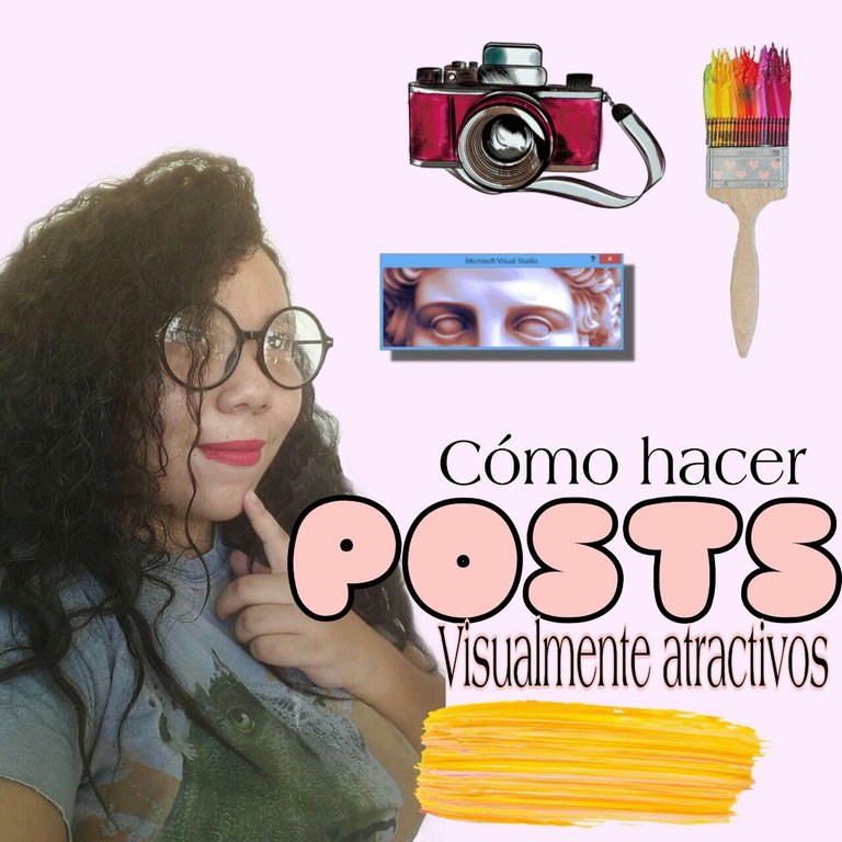

¿Qué hace que un post sea de calidad? Algunos dirán que el contenido, otros dirán que las fotos. La verdad es que esto de hacer blogging es todo un arte que no se centra en un solo aspecto, y a diferencia de las editoriales que cuentan con personal especializado para cada actividad (redacción, edición, diseño, fotografía, maquetado) los bloggers cumplimos con la característica de que hacemos todo por nosotros solos. Por eso siempre he dicho que ser blogger es una experiencia retadora pero también de mucho aprendizaje porque se aprende un poco de todo.
Así que traer contenido de calidad es una combinación de muchos factores que terminan creando una obra maestra. Por eso es que en el post de hoy quiero compartirles varios tips para que puedan hacer publicaciones visualmente atractivas que eleven la calidad de su contenido.
Los seres humanos somos visuales, y mucho más en esta era de las redes sociales. La belleza suele ser un sesgo cognitivo que nos guia a tomar decisiones de todo tipo, incluido el contenido que vamos a consumir. Piensa por un momento: ¿Qué preferirías leer tú?: ¿Un post desorganizado, con errores ortográficos y sin imágenes o una publicación visualmente estética? La respuesta es bastante obvia, así que para que nuestro contenido alcance un mayor número de personas este debe ser agradable a la vista.
¡Acá te enseñaré como lograrlo!
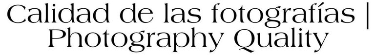
 Imagen de
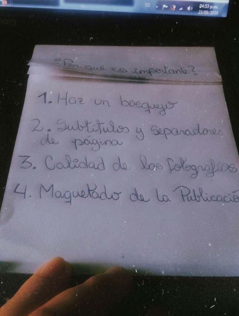
Yo nunca escribo directamente en Hive al hacer mis posts, siempre escribo en mi block de notas y de allí lo paso a Hive, ¿Por qué? Esto me da la oportunidad de visualizar que es lo que quiero. Normalmente voy escribiendo y voy haciendo anotaciones sobre que fotos voy a colocar, en que espacio del párrafo las colocaré, etc.
Te recomiendo tener un bosquejo previo sobre que puntos tratarás en tu post y seguido a eso empezar a construirlo tal como si fuera una casa.
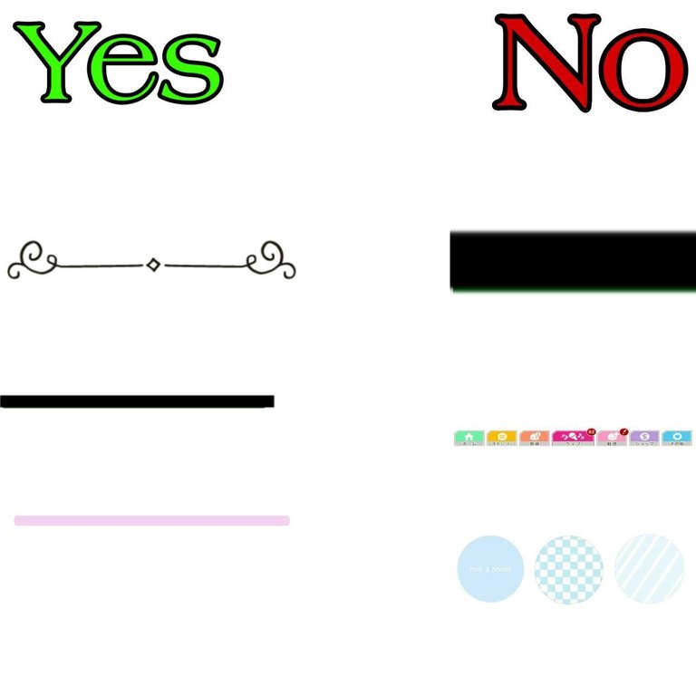
Estos trucos le dan un toque mucho más bonito a tus publicaciones. Los separadores de páginas nunca los he usado, sin embargo la ventaja de los mismos es que te permiten hacer una distinción entre los diferentes puntos de tu post y al mismo tiempo son una linda decoración. Por supuesto que estos no deben ser exagerados ni abarcar mucho espacio, pues esto restaría calidad visual a tu trabajo.
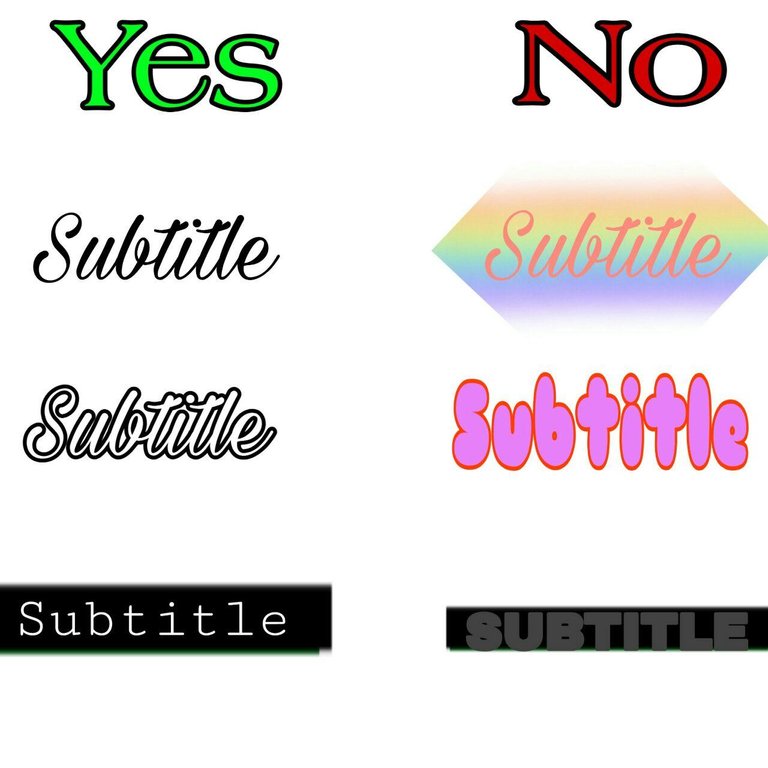
Un consejo que te doy con los subtítulos es hacerlos en fotografías tal como lo estoy haciendo yo en este post. Esto te permitirá escoger la tipografía que desees, el color de la letra e incluso si deseas hacerle algún detalle...
Pero ¡hey! Cuidadito con esto que trabajar con tipografías tiene su truco, así que sigue estos consejos:
- Usa el mismo tipo de letra en todos tus subtítulos
- Asegurate de que el fondo sea compatible con el color de la letra (Si el fondo es oscuro debes usar color claro y si el fondo es claro debes usar color oscuro)
- Yo recomiendo ser bastante minimalista en cuanto a esto para obtener un trabajo mucho más limpio. Lo mejor es usar los colores blanco y negro, con una tipografía bastante simple.
¡Esto es FUNDAMENTAL! Hay muchas cosas que puedes hacer para que tus fotografías tengan mayor calidad visual. Así que presta atención...
A la hora de capturar:
Asegúrate de tener un fondo bonito y ordenado. Verifica que no haya nada que pueda estropear la foto, y sobre todo verifica la Iluminación. Puedes usar la luz natural de alguna ventana pero recuerda que esta no debe venir desde atrás de la modelo u objeto pues de esta manera se dificulta la visualización de la fotografia.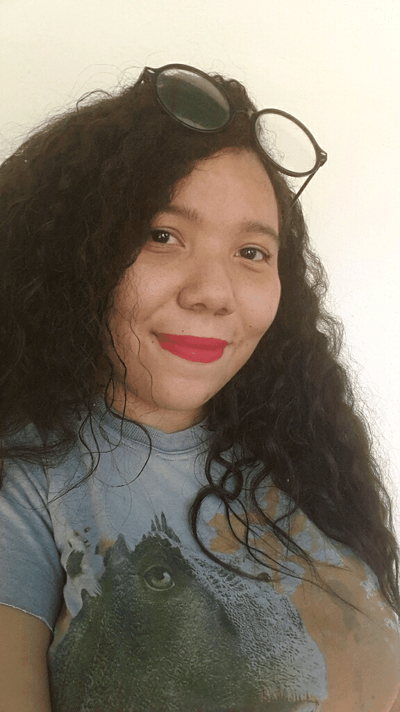
Haz una portada para tu post:
Considero que esto es algo super necesario que debería hacer todo el mundo, ¿Por qué? Pues la portada es la primera imagen que se verá en tu publicación, y puede hacer la diferencia entre que una persona haga click para leerla o se vaya. Por eso la portada debe ser llamativa, reflejar tu estilo y dar un adelanto de lo que la persona encontrará en la publicación.
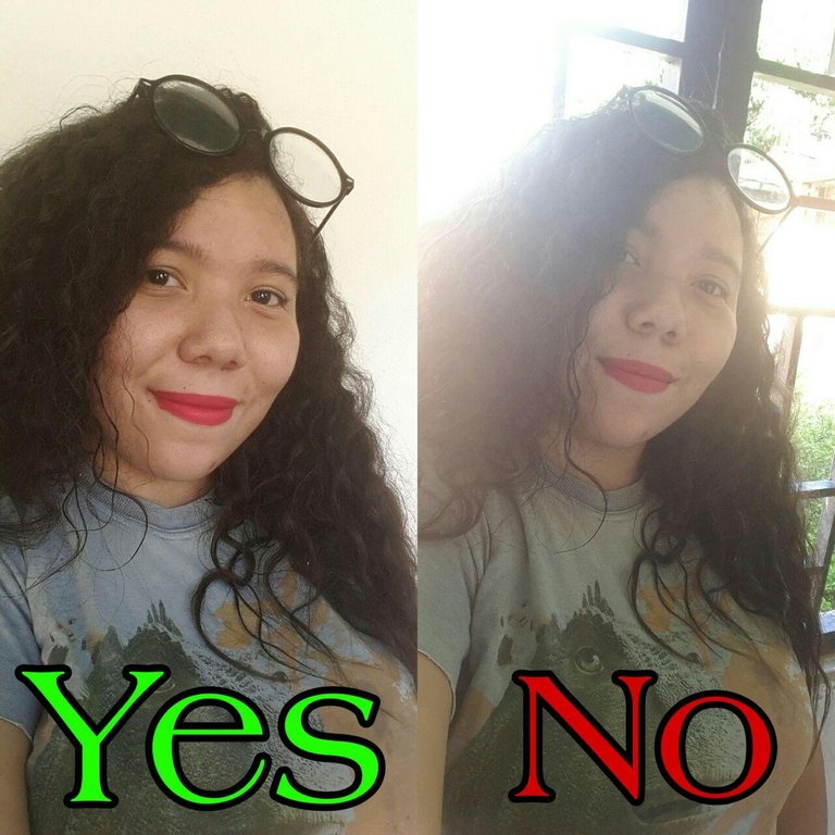
Edita tus fotos:
La edición te permite corregir ciertos defectos en tus fotos y hacerlas lucir más profesionales, además de que puedes darles una estética personal que vaya acorde a tu estilo. Yo uso PicsArt para editar mis fotografías, pero hay otros editores muy buenos incluso online como es el caso de Pixlr, VSCO y Kuji Cam ¡Los recomiendo un montón!
El GIF muestra la diferencia de una foto sin editar y una foto editada. Observamos mejora en el color, y una estética que refleja mi estilo.
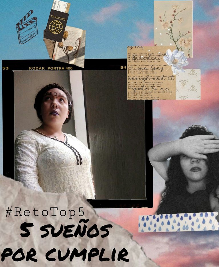
Esto es un arte super importante que yo aún no domino por completo, pero allí voy aprendiendo cada día más. "Y ¿qué es eso Oriana?" Pues, el maquetado es la manera en la que estructuras tu post para la vista del público. Les mostraré maquetados que me encantan:
Para hacer un maquetado genial, te recomiendo estas cositas:
(aunque estos consejos van para mi también jajajaja)Inspirate en otras personas:
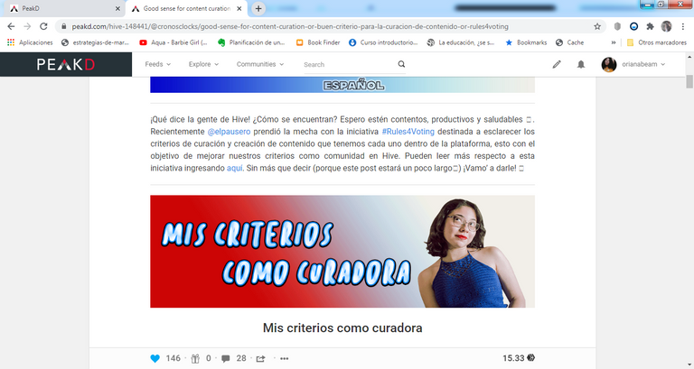
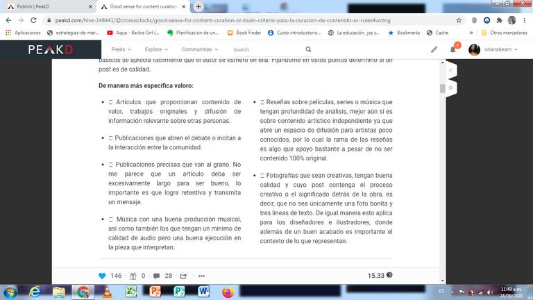
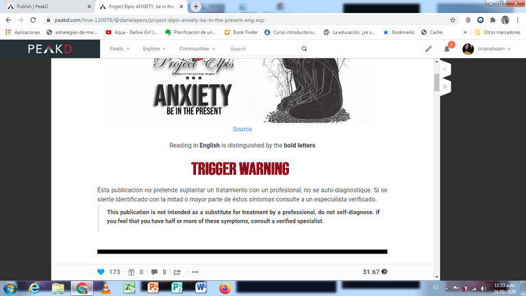
Yo he aprendido mucho leyendo los posts de otros. Ver como estructuran sus publicaciones bien sea en dos columnas, por segmentos o a manera de libro me ha dado ideas para aplicar en mis propias publicaciones... ¡Explora el trabajo de los demás!Aprende de HTML y Markdown:
A mi en realidad no me gusta hacer esto, por eso publico utilizando PeakD que me facilita mucho la vida con eso. Sin embargo, si tu utilizas Hive.Blog para publicar y te animas a entrarle a esto de los códigos te dejo un tutorial muy completo que leí hace tiempo haciendo click aquí. Esto te permitirá cosas básicas como escribir en negrillas, en cursivas, hacer tus posts en dos columnas, citar autores, usar fuentes, etc.Bien chicos, eso fue todo por el post de hoy. Espero que les haya gustado y que todos estos consejitos les sirvan a la hora de hacer sus publicaciones...
Recuerden: El éxito en todo lo que hagan está en el esfuerzo que le pongan...
¡Pónganle amor a sus publicaciones!
Se despide,
O R I A N A.
SOBRE MI: Hola, soy Oriana. Me encanta hablar sobre arte (sobre todo cine y fotografía), crecimiento personal y temas sociales. Te invito a seguirme en mi Twitter y en mi Instagram para enterarte de todo el contenido que esté planeando y ver más contenido cool. ¡Gracias por visitarme!

What makes a quality post? Some will say the content, others will say the photos. The truth is that blogging is an art form that does not focus on a single aspect, and unlike publishers who have specialized staff for each activity (writing, editing, design, photography, layout) bloggers comply with the characteristic that we do everything by ourselves. That's why I've always said that being a blogger is a challenging experience but also one of much learning because you learn a little bit of everything.
So bringing quality content is a combination of many factors that end up creating a masterpiece. That's why in today's post I want to share several tips for you to make visually appealing publications that raise the quality of your content.
Human beings are visual, and much more so in this age of social networks. Beauty is often a cognitive bias that guides us to make decisions of all kinds, including the content we are going to consume. Think for a moment: What would you rather read: a disorganized post, with spelling mistakes and no images, or a visually aesthetic publication? The answer is quite obvious, so for our content to reach a greater number of people it must be pleasing to the eye.
Here I will show you how to achieve this!
I never write directly to Hive when I do my posts, I always write in my notebook and from there I pass it on to Hive, why? This gives me the opportunity to visualize what I want. Normally I write and make notes on what photos I will place, in what space of the paragraph I will place them, etc.
I recommend you to have a previous sketch about what points you will deal with in your post and then start building it as if it were a house.
These tricks give a much nicer touch to your publications. I have never used page dividers, however the advantage of them is that they allow you to distinguish between different points of your post and at the same time they are a nice decoration. Of course, these should not be exaggerated or take up too much space, as this would detract from the visual quality of your work.
A tip I give you with the subtitles is to make them in photographs as I am doing in this post. This will allow you to choose the typeface you want, the color of the letter and even if you want to make some detail ...
But hey, be careful with this, working with typographies has its trick, so follow these tips:
- Use the same font in all your subtitles
- Make sure the background is compatible with the font color (If the background is dark you should use light color and if the background is light you should use dark color)
- I recommend being pretty minimalist about this to get a much cleaner job. The best thing is to use the black and white colors, with a quite simple typography.
This is FUNDAMENTAL! There are many things you can do to make your photographs have a higher visual quality. So pay attention...
At the time of capture:
Make sure you have a nice and tidy background. Check that there is nothing that can spoil the photo, and above all check the lighting. You can use the natural light from a window but remember that it should not come from behind the model or object because this makes it difficult to see the picture.
Make a cover for your post:
I think this is something super necessary that everyone should do, why? Because the cover is the first image that will be seen in your publication, and it can make the difference between a person clicking to read it or leaving. That's why the cover should be eye-catching, reflect your style and give a preview of what the person will find in the publication.
Edit your photos:
Editing allows you to correct certain flaws in your photos and make them look more professional. You can also give them a personal look that suits your style. I use PicsArt to edit my photos, but there are other very good editors even online like Pixlr, VSCO and Kuji Cam. I recommend them a lot!
The GIF shows the difference between an unedited photo and an edited photo. We see improvement in color, and an aesthetic that reflects my style.
This is a very important art that I have not yet completely mastered, but I am learning more and more about it every day. "And what is that Oriana?" Well, the layout is the way you structure your post for the public's view. I will show you mockups that I love:
To make a great layout, I recommend these little things:
(although these tips go for me too hahaha)
Be inspired by other people:
I've learned a lot by reading other people's posts. Seeing how they structure their publications either in two columns, by segments or as a book has given me ideas to apply in my own publications... Explore the work of others!
Learn from HTML and Markdown:
I don't really like doing this, so I publish using PeakD which makes my life much easier with that. However, if you use Hive.Blog to publish and you are encouraged to enter this code I leave you a very complete tutorial that I read some time ago by clicking here. This will allow you to do basic things like bold, italics, make your posts in two columns, quote authors, use fonts, etc.
Okay guys, that's it for today's post. I hope you liked it and that all these little tips will help you when making your publications...
Remember: The success in everything you do is in the effort you put into it...
Put love in your publications!
Good bye guys,
O R I A N A.
ABOUT ME: Hi, I'm Oriana. I love to talk about art (especially film and photography), personal growth and social issues. I invite you to follow me on my Twitter and on my Instagram to find out about all the content I'm planning and see more cool content. Thanks for visiting!
Excelente post, voy a ponerlo en práctica 😊😊😊
¡Me alegra que te gustara! Mil gracias por leer...
Congratulations @orianabeam! You have completed the following achievement on the Hive blockchain and have been rewarded with new badge(s) :
You can view your badges on your board and compare yourself to others in the Ranking
If you no longer want to receive notifications, reply to this comment with the word
STOPDo not miss the last post from @hivebuzz:
¡Me encantó tu explicación!
Creo firmemente que la organización de ideas es elemental para crear una buena publicación, porque siento que las personas buscan algo que sea fácil de leer y a la vez divertido, por ende, uno como creador de contenido en Hive, siempre debe buscar algo nuevo y diferente🤩 Tu publicación es muy bueno, quisiera que mi hermana @sabriflores leyera detenidamente pues es importante para ella🥰
¡Me alegra que te gustara! Y si, tienes razón. Esto es buscar siempre cosas nuevas y creativas...Es como un juego.
Muchas gracias por los datos
Fue un placer, gracias a ti por leer.
Me encantó todo lo que aconsejas en ésta publicación, por lo general nunca hago bosquejos y es esa la razón por la cuál tardo tanto en publicar, pero ya luego de leerte creo que empezaré a aplicarlo hahaha. Y gracias por mencionarme. ♥ Muchos abrazos.
Jajaja, es una buena idea. ¡Gracias a ti por leer!
Hola, soy nuevo en Hive, y de verdad que esta publicación me encantó, apenas estoy dando mis primeros pasas, pero lo que escribes acá me parece genial, intentaré poner en práctica algunas cosas según me vayan saliendo, muchas gracias, un abrazo!
¡Me alegra que te haya gustado! Muchos éxitos en tus publicaciones
¡Tocaya, gracias por la mención! Lo aprecio full 💜
Me gusta mucho este tema, como dices somos seres visuales y con las redes más aun. Me contenta que más personas se han hecho conscientes de la importancia de la estética en lo que hacen, pues sin duda tener una buena imagen visual es algo que capta la atención de las personas.
Tu post está muy cool, me encantaron los títulos hechos con fotitos 🌈, ese esfuerzo lo aprecio mucho porque como yo también lo hago y se que requiere tiempo, o bueno, por lo menos a mi me toma rato decidir siquiera la tipografía y el color jajajaj ¿No te pasa? 🤣. También están muy buenos los ejemplo que colocaste en el área de separadores y tipografías, se entiende clarito cuales están buenos y por que los otros no 😊.
Te felicito, te quedó muy lindo y la información esta buena.
PD: Hace unos meses también pensé en subir una serie de posts con tips y eso, pero luego me sentí insegura y no subi nada daklsgjah 🙈 Ahora viendo tu post tal vez me anime a subir mi aporte 😅
¡Hola tocaya! Si, definitivamente es algo que toma bastante tiempo pero es super fundamental. Oye, me encantaría que subieras esas publicaciones...
Creo que nos ayudaría mucho a aprender a todos.
¡Qué buen post, Oriana! Es bastante útil para usuarios que están comenzando en la plataforma.
Yo disfruto muchísimo cuando me siento frente a la computadora a realizar las publicaciones, puede que mis posts no sean los mejores pero siempre me esfuerzo en mejorar un poco más. En mis comienzos cometí pequeños errores jaja, pero los he ido mejorando con el tiempo y ahora sé qué debo hacer y qué definitivamente no debo hacer. Para mí una publicación visualmente atractiva es bastante importante. Particularmente no suelo hacer bosquejos para las publicaciones (los bosquejos lo aplico más que todo en las fotografías), porque siempre tengo una estructura mental de lo que quiero que hacer y voy trabajando conforme a eso...aunque creo que tomaré esta idea de los bosquejos en las publicaciones a ver qué tal me resulta.
Me encantó tu post, está súper bien trabajado y se nota el esfuerzo que dedicaste para elaborarlo 💛. Gracias por tu aporte, Ori. Saludos y un abrazo enorme para ti!