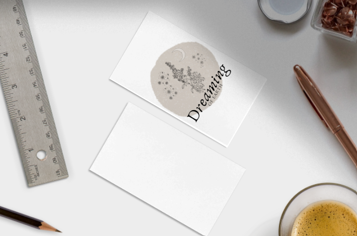
I've been playing around with a new logo for my natural deodorant and herbal teas that I make, because I hated the logo I had before. It's mainly for fun, but I do want something that speaks from my heart and also looks good on a sticker, right? I'm not a graphic designer, but I do love to play around with these things. Using CANVA, I came up with the following logo, and would love your advice and help!
The name itself is a word I often play around with - to me, a 'dreaming' is not just a night dream but something one actively does, like imagining a story, a life, an entire history or future. Dreaming of earth to me is creating a world into existence, of making a garden from the soil, creating possibilities through meditation, play and creativity, but it's also that feeling of seeing the entire picture - the worms, the mountains, the oceans, the animals, the plants, the people, all as one. In the centre of the logo is mugwort, a plant known to help with sleep and dreams but also is a plant of the moon, and an ally of woman. The moon of course influences all. I like the name - I've been playing around with words for this for a long time and this came to me today.
What I'm unsure of is the colour, the lettering, and the way the letters hang over the edge - that wouldn't work in dark mode. On balance, I do like the long as it is, but the overhang is bothering me. What am I missing? How could I alter it?
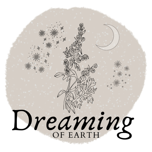
Image 1
If you're viewing this post in dark mode, you'd see my concern.
And is the colour okay - or is too wishy washy? The colours for this particular circle are muted - cold blues and steel greys.
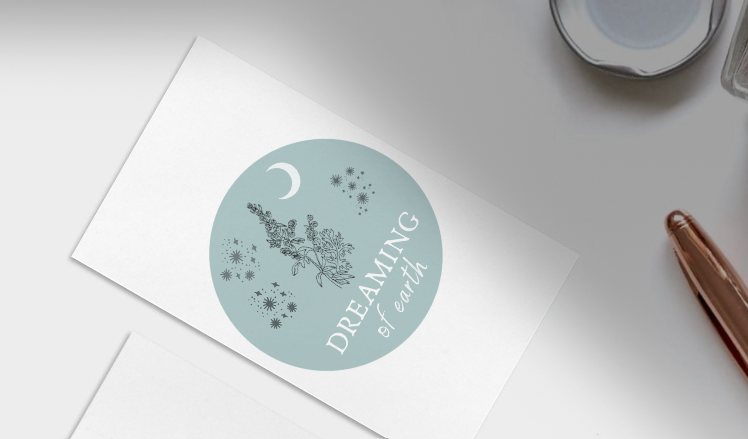
Here's the image again with a blue tinge, and the letters in a slightly different arrangement. Again, I have a dark mode issue. But that's irrelevant on a label.
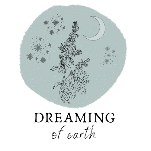
Image 2
As I'm writing this post, my husband is talking to me about sleeping bags and tents again. I pretended to listen to him last night. He's now pretending to be interested in fonts. This is EXACTLY why I'm asking HIVE. At least I might upvote your feedback, which is more than my husband gets for pretending to be interested in my logo...
Of course, if I was worried about dark mode, I could just have a different version of the logo, right?
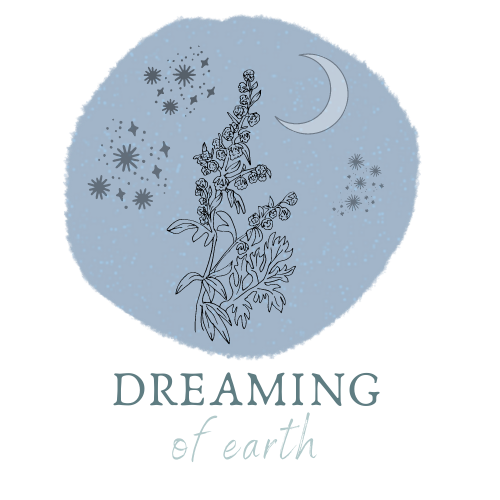
Image 3
Funny how you play around with these things and you end up with the image you like the best anyway. But now I'm worried about how it'll work on a sticker! As in, fitting it on a circle tin, which I put my deodorant in.
So maybe I should do a more circle circle so it aligns better, and put the text within the circle?
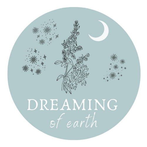
Image 4
Ah! Help! I need your advice!
Be so grateful for your assistance!
With Love,
Are you on HIVE yet? Earn for writing! Referral link for FREE account here
Image 1 :
i like this one because the herb seems to spring from the words.
But yes dark mode messes it up a bit .
In image 2 and 3 the words seem to far from the picture to me , feels disconnected in some way .
Image 4 :
Sharp and clean looking with that edge , you could change that back to blurry to point out the dreaming a bit . But a logo that people will remember must have a sharp edge or border .
My suggestion would be to put the word dreaming on like a smile , like it follows a imaginary 3D ball . With the D and the G of dreaming near the stars and the A down below the herb . It would make it all more dimensional and give more focus on the herb .
Just my humble view on it , for it's already a nice logo for what it stands for , at least i could not find any hidden meanings in it as i do with many other existing logo's and signs .
I hope my input was a bit helpful :-)
That's soo helpful! Thanks! I've got to the point I"m going cross eyed! Sadly it's harder to do fancy things like curved letters on CANVA and I'm not skilled enough to use GIMP or photoshop. My dream is that some clever person will do it for me!
Well with your permission ,.... just give me a minute ;-)
Just for example did a fast morph ,.. messed up the letters a bit , use this to compare the layout .
Oh wow - you are soooo clever!!!!
Gimp is not that hard to learn ,.. it's like mspaint with some extra's ;-)
Yeah, I can't even use mspaint lol.
I think I'll keep it straight - it appeals to my Libran need for balance a bit better, but I do love your idea!
It's your creation , so yes it needs your style ,... where you might try to enlarge the word dreaming just a bit to make it advertise the brand a bit more .
Where i do think "Dreaming of Earth" is a catchy brand name for deodorant or tea but also can see the humor when you would call it simply Riverflows ;-)
anyhow , may your products flourish and bring you good profit :-)
I like the containment within a circle - I think the 'neatness' of the shape works better for a logo than a misshapen circle. I've taken the liberty of adding a lil' border and making the background transparent. Just out of interest and in case it appeals :)
OOOH, I like that - that's a clever idea! Hard for me to do in CANVA - I really need to work out GIMP one of these days! Thanks so much - it doeslook moon like, as @litguru said!! Cool beans.
This looks amazing @barge.
Love the bluish colour appearing at the brink of the circle.
This design version gives the circle a nice spherical shape that is reminiscent of planet earth. It also softens the edges with the blue halo. Nicely done @barge and @riverflows
hi! i am not a designer but rather a pre-press specialist but I am fond of 'playing with fonts' too, and making lay-out / typography is my job.
printing intention / use cases is the sufficient part in evaluation of the logo design.
I didnt understand completely how are you going to use it. (is printing of the paper labels a case here?)
I love all the color solutions you have came up with
#1 is much preferrable for me, both in terms of the color, used fonts and... uh, composition.
I would say so: a new version would be perfect, made from adjusted #1 (with the colors you choose from #2, #3 or #4 versions). what I would adjust, is the font / title composition
I dont have same font as yours, and didnt produce a version I'd call final or ready to present, this is just a sketch to show an adjustment to your #1 to display what I mean.. to show the compostion. I'd pull the title even more upwards (yes, it is overprinting the plant, i let it go so!) and add some font play relying on the contrasts (little "of" vs EARTH)
Hope you find it useful!
i gotta go #4..while i like the asymmetrical style of 2 and 3, i think #4 has less negative space, which would be better on a sticker!
It's definitely the sticker thing that's making me go for 4!!! Thanks so much for your input, honestly, it really helps!
image 1 or image 4 are nice color wise. They say blue is the color of healing? How about using another font you might like better. I trust your taste. Maybe bold for dreaming and of earth seams ok in a similar font. Maybe everything smaller and a slightly thicker stroke on the outlines? Or simply reduce the size to leave more margins or reduce the number of stars on the top left patch of stars or reduce its size. These are all only ideas. Thank you for sharing. This is so exiting!
It's so tricky... I've tried loads of fonts and now I don't know what I want haha!!
I think it's great. Maybe reduce the size of the stars and spread them and then fit the entire thing so there is more empty space around the design?
I'll try that, thanks!
Have a logo design contest. The one you like the best is the winner or you could run a poll with your readers as judges. I love the font on design one. I also like the background but am curious about the color, I don't really have a preference.
that is not solution - until all the participants would be invited by riverflows, and their tastes (guaranteed) match her's. otherwise it easily will be the case when she's suggested 10-25-100 logos which all doesnt match her aesthetics.... smth like that. I hope you understand my thesis.
Thanks - I liked that font too. I'll try it in the last circle design and see if that works. Like this?
Not too keen on the contest, as @qwerrie said below. I kinda like to create myself, but I do love the input of others!
yes, this one is ok. proportionate and harmonious composition.
personally, I was attracted more by the edges like in #1, but of course both variants are possible (and creating edges like #1 is near to impossible in the real printed labels)
That is all right, it was an idea.
I like it. Is this the funal edit?
I really like 4. I looked them over few times and 1 was also one that I like but 4 really makes me smile when I see it. And just one thought that came to me when I was looking at 4 is that one of the spots with stars is a bit darker and sticks out somehow. Takes away the attention a little bit, maybe make it a bit smaller a fade the color and the word earth might be bold or a bit bigger... just my point of view. Its beautiful anyway. 😊
It's really good you spend your time on this, if you do that sometimes, you will surely improve on your design, and later you can consider helping people by monetising it or you do it for fun — any which way it appeals to you.
I'd consider all! And you did a great job in all. But the fourth image appeals more to me wonderfully. You might may consider changing the font coloured text to something that would make it stands out from others — probably a coloured text or another colour which is not too flashy.
Stay blessed @riverflows
Thanks a lot! I think number 4 is a winner - I'll try it in a darker font as well!
Like this?
Yeah, lovely. 🥰🥰🥰 It's lovely that way, but you could make the text pops out more @riverflows
Manual selection by @qwerrie.
Thanks so much @qwerrie!
I love image number 4. It´s neat and the design is so simple but inspiring!
Thanks so much! I think I'm leaning to 4 as well!
Congratulations @riverflows! You have completed the following achievement on the Hive blockchain and have been rewarded with new badge(s) :
Your next payout target is 28000 HP.
The unit is Hive Power equivalent because your rewards can be split into HP and HBD
You can view your badges on your board and compare yourself to others in the Ranking
If you no longer want to receive notifications, reply to this comment with the word
STOPTo support your work, I also upvoted your post!
Definitely #4. I like that you tried a different font down in one of the comments, because I thought the same thing, but comparing the two, I like the original #4 better. The word jumps out more.
I think I prefer that to - it's the one I"m going for. Sorry @edprivat
Good day river, great artwork .
Image 4, is perfect. I get that listening but not really listening thing with the hubby. I practice it all the time😃
Hahahahah it's how you survive marriage !
You have that right, if I actually listened to the hubbster all the time, I think I would have to show him how "nuts I really am".😁
I like image 4 a lot. I like the 'circle' circle, it looks cleaner to me and I think that would work well on a sticker. You can always play around with the proportions if you feel like the text is too small/big in relation to the image. I think it looks good though. Maybe reduce the size of everything a bit so there's a bit more space? Just a suggestion if you feel it's worth trying out. But really, great work!
Thanks!!! I think this is the final one?
I think it looks great ⭐️ Thank you for sharing 🙏🏽
This really inspires me to do some designs myself. I need several ones for my coaching business and I could also spice up my blog here on Hive a bit 🙂
Image 1 is my fav, I cannot explain why. I think the brand just pops out better, and anyone that think differently of me, is wrong 😄
Hello ... I love that you are making your design personally I think it is important since it carries something of you, your stamp, your creativity. I like them all .. I think there are very good elements: pastel tones, black details like stars, flowers. The combination of the sources. Here I give you a tip: thick letters help not to get lost in printing, if they are very thin and very light colors it can be lost. The black color will help you play with the typography. There is another application but it is by phone that allows you to download fonts from Dafont (paradise). It's called Posters, you download it and it's easy to use. The application itself brings many elements and allows you to install fonts. I also have a question, will you write the name of the product on the label? Because it seems to me that this is your brand, correct me if I'm wrong.
Yes, it's the brand. The new version has darker colours - here it is. What do you think? Do you think it should be bolder?
So the idea is to make a sticker, but the product name will be written on a card that goes with it. That means I don't have to have a printed label for tea, and another for deodorant etc. It' sjust for homemade stuff so that's okay. But that's a good thing to think about too!!
Because I don't wnat to spend money on two or three sets of labels for the deodorant, and then for herbal teas and salves etc.
I like it, it is delicate and subtle, it highlights the plant in the "dream". 💙 the letters below "of earth" make it thicker or bolder because there are fine lines that you can lose.
I really like those details, because it also allows me to work with different materials for packaging
I liked 4 far better than any of the others. it would make a good label, especially for a round tin.