| Hoy vamos a crear una función muy de moda en estos tiempos que es la de activar el modo claro/oscuro en nuestra página web, usaremos React con su Framework Next.js para ello. |
Crearemos una carpeta en el escritorio de nombre toggle-dark-mode/
Una vez creado la carpeta navegamos hacia ella y ejecutamos
npm init --yes
Instalaremos los siguientes modulos:
npm i react react-dom next react-ios-switch
Es momento de codear
Crearemos una carpeta public/ y crearemos nuestras rutas (.js)
public/index.js
import Layout from "../components/Layout";
import Head from "next/head";
const index = () => {
  return (
    <>
      <Head>
        <title>
          Modo Oscuro | Claro en  Next.js  | Jfdesousa7 | tupaginaonline.net
        </title>
      </Head>
      <Layout>
        <div className="main-container">
          <h1>Toggle Dark Mode Next.js !!</h1>
        </div>
      </Layout>
    </>
  );
};
export default index;
public/about.js
import Layout from "../components/Layout";
import Head from "next/head";
const about = () => {
  return (
    <>
      <Head>
        <title>
          Modo Oscuro | Claro en  Next.js - About | Jfdesousa7 | tupaginaonline.net
        </title>
      </Head>
      <Layout>
        <div className="main-container">
          <h1>About</h1>
        </div>
      </Layout>
    </>
  );
};
export default about;
public/portfolio.js
import Layout from "../components/Layout";
import Head from "next/head";
const portfolio = () => {
  return (
    <>
      <Head>
        <title>
          Modo Oscuro | Claro en  Next.js - Portfolio | Jfdesousa7 | tupaginaonline.net
        </title>
      </Head>
      <Layout>
        <div className="main-container">
          <h1>Portfolio</h1>
        </div>
      </Layout>
   </>
  );
};
export default portfolio;
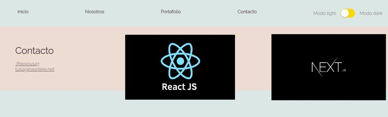
public/contact.js
import Layout from "../components/Layout";
import Head from "next/head";
const contact = () => {
  return (
    <>
      <Head>
        <title>
          Modo Oscuro | Claro en  Next.js - Contact | Jfdesousa7 | tupaginaonline.net
        </title>
      </Head>
      <Layout>
        <div className="main-container">
          <h1>Contact</h1>
          <br></br>
          <p><a className="link" href="https://hive.blog/@jfdesousa7">Jfdesousa7</a></p>
          <p><a className="link" href="https://tupaginaonline.net">tupaginaonline.net</a></p>
        </div>
      </Layout>
    </>
  );
};
export default contact;
Crearemos un archivo _app.js que es donde importaremos nuestros estilos personalizados
public/_app.js
import '../styles.css';
// This default export is required in a new `pages/_app.js` file.
export default function MyApp({ Component, pageProps }) {
    return <Component {...pageProps} />
  }
Crearemos en la raiz nuestro estilo .css
style.js
@import url('https://fonts.googleapis.com/css2?family=Raleway:wght@300&display=swap');
:root {
  --font-family: 'Raleway', sans-serif;
}
*,
*::before,
*::after {
    margin : 0;
    box-sizing: border-box;
}
.theme-dark {
    --dark-text: #292929;
    --dark-background: #2F4550;
    --light-background: #586F7C;
    --accent: #b8dbd9;
    --button-border: #b8dbd9;
    --light-text: #F9F8F8;
  }
.theme-light {
    --dark-text: #5E4B56;
    --accent: #dbe7e4;
    --button-border: #5E4B56;
    --dark-background: #DBE7E4;
    --light-text: #5E4B56;
    --light-background: #EDDCD2;
  }
body {
    font-family: var(--font-family);
    background-color: var(--dark-background);
    color: var(--dark-text);
    height: 100vh;
    transition: all ease-in-out .7s;
}
nav {
    background-color: var(--dark-background);
    color: var(--light-text);
    padding: 2em;
  }
  nav ul {
      display : flex;
      justify-content: space-between;
  }
  nav ul li {
      list-style: none;
  }
  nav ul li a {
      cursor: pointer;
      color: var(--light-text);
      font-weight: 800;
      text-decoration: none;
  }
.main-container {
    background-color: var(--light-background);
    padding: 4rem
}
.link {
    color: var(--light-text);
}
@media screen and (max-width:412px) {
    nav ul {
        display : flex;
        flex-direction: column;
        align-items: center;
        gap: 1em
    }
}
Componentes
components/Header.js
import Toggle from "../components/Toggle";
import Link from "next/link";
const Header = () => {
  return (
    <nav>
      <ul>
       <li>
          <Link href="/">
            <a>Inicio</a>
          </Link>
        </li>
        <li>
          <Link href="/about">
            <a>Nosotros</a>
          </Link>
        </li>
        <li>
          <Link href="/portfolio">
            <a>Portafolio</a>
          </Link>
        </li>
        <li>
          <Link href="/contact">
            <a>Contacto</a>
          </Link>
        </li>
        <li>
          <Toggle />
        </li>
      </ul>
    </nav>
  );
};
export default Header;
components/Layout.js
import { useEffect } from "react";
import { keepTheme } from "../utils/themes";
import Header from "./Header";
import Head from "next/head";
const Layout = ({ children }) => {
  useEffect(() => {
    keepTheme();
  });
  return (
    <>
      <Head>
        <meta name="viewport" content="initial-scale=1.0, width=device-width" />
      </Head>
      <Header />
      {children}
    </>
  );
};
export default Layout;
components/Toggle.js
import { useEffect, useState } from "react";
import { setTheme } from "../utils/themes";
import Switch from "react-ios-switch";
export default function Toggle() {
  const [checked, setChecked] = useState(true);
  const handleOnClick = () => {
    if (localStorage.getItem("theme") === "theme-dark") {
      setTheme("theme-light");
      setChecked(false);
    } else {
      setTheme("theme-dark");
      setChecked(true);
    }
  };
  useEffect(() => {
    if(localStorage.getItem("theme")){
      if (localStorage.getItem("theme") === "theme-dark") {
        setChecked(true);
      } else {
        setChecked(false);
      }
    }else{
      setChecked(true);
    }
  }, []);
  return (
    <div className="light_dark">
      <label>
        <span className="">Modo light</span>
      </label>
      <Switch
        onColor="black"
        offColor="gold"
        checked={checked}
        onChange={handleOnClick}
      />
      <label>
        <span className="">Modo dark</span>
      </label>
    </div>
  );
}
Crearemos dentro una carpeta en la raiz llamada utils/ un archivo con dos funciones
utils/themes.js
export function setTheme(themeName) {
    localStorage.setItem('theme', themeName);
    document.documentElement.className = themeName;
}
export function keepTheme() {
  if (localStorage.getItem('theme')) {
    if (localStorage.getItem('theme') === 'theme-dark') {
      setTheme('theme-dark');
    } else if (localStorage.getItem('theme') === 'theme-light') {
      setTheme('theme-light')
    }
  } else {
    setTheme('theme-dark')
  }
}
Puedes probar el modo oscuro/claro en el link de abajo
click en el enlace https://dark-mode-jfdesousa7-next.herokuapp.com/
Y con esos amigos llegamos al final del tutorial, espero que lo hayan disfrutado y ¡hasta la próxima! |