Going to go over the third poster/cover for a secret comic book project/collaboration I've been working on, the details of which I'm not at liberty to fully disclose yet.
Did I ever mention that illustrating covers are often like trying to shovel 10 pounds of stuff into a 5 pound bag? I did? Good. Because lost along the way over the time comic books have been published is the concept that a cover should your capture the imagination. It should not only catch the eye of the casual observer but get them to want to know what is going on and what they story is about...in short make them want to read the book. That can, to take the romance out of it, require a lot of visual information.
There are covers out there that are masterfully drawn and inked, but do not accomplish this at all. Like this for example-
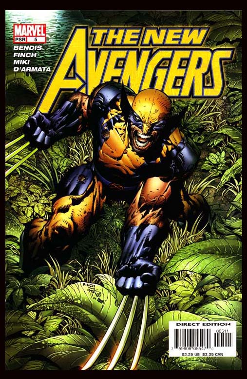
gee whiz that looks cool. what is happening in the story? why should anyone gaf? I don't know and the cover isn't telling us. Wolverine is getting ready to fight, I guess and he's in the wilderness of some kind.
THEN however there are covers like this...
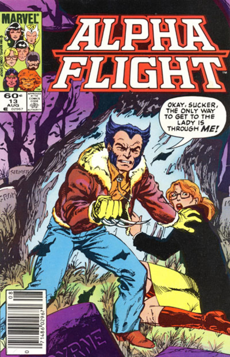
THAT tells us some stuff. He's protecting some woman, he's not in costume so it seems like they were both caught off guard, she is terrified and they are in a cemetery at night. Could be a supernatural enemy?! I dunno but this makes me think an interesting story is unfolding.
Not having been present at either preliminary discussion of the making of these covers ( if there were any), I'm guessing the first guy didn't get much input, or ask for any. And the second cover was based off a specific scene in the comic and had specific aspects ( visual info) to use or make use of.
Back to my cover...Without explaining the story I can tell you is it loosely based on a scene and the initial request for this one was five of the main characters in a specific place, and a laundry list of crypids (mythical and/or urban legend type monsters).
...Five characters, plus chupakabras, lizard men, moth men, yetis, two kinds of aliens, big foot, weindigo...and I forget what else. Like...wtf...a comic book cover is only 10.25 x 6.5/8 inches.
I told the man in charge "yeah...I'll see what I can do"...in a tone which conveyed that I was absolutely not going to do all of that, because it would be a giant mess. and he replied "great" in a tone which conveyed it better be good if you're blowing off half of what I want in there.
That initial request is an example of someone asking for something without trying to picture it in their head. This happens quite often, hell even I'm guilty of it sometimes. Pro tip to you writers out there...sketch your idea out. Even if is is just stick figures. Try to sketch it out and get a grasp of what is or is not possible in a static image. Even if all you can draw is stick figures it is at least putting your brain in the gear of dealing with the information you want...visually. and Pro-tip to you illustrators, if you get an "everything but the kitchen sink" type request, ask for such a sketch. Most of the friction that goes on in the creative process comes from two pros not considering or understanding the job that the other one has to do. Asking for a sketch will help get you all on the same page.
I roughed out a few ideas and sent this over...
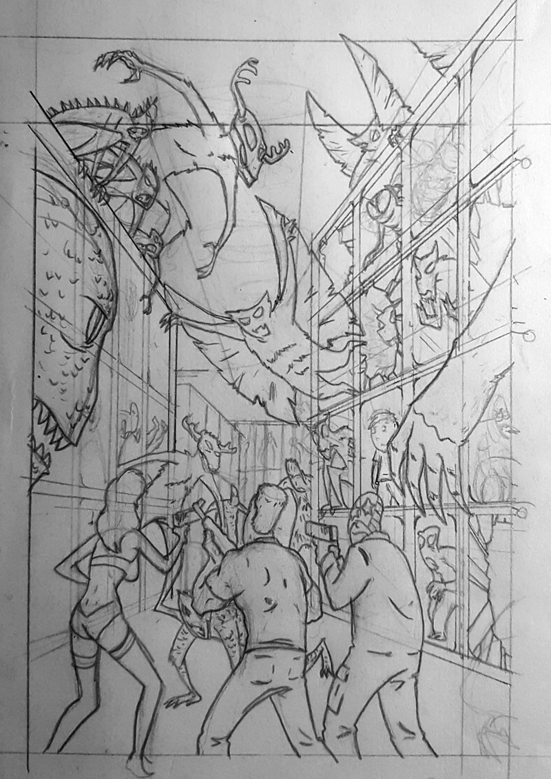
The composition will keep it from becoming too much of a mess, and I fit in three out of five of the main characters. We both agreed it was decent and any more than this would be too much.
So, now to work on that composition and get the vanishing points and perspective correct to keep it from being too busy.
*vanishing point simple explanation in diagram below)
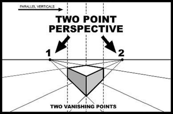
Technically the view of this scene would have one vanishing point in the center, where things on the left and right would align with. But that...as I have mention in previous blogs, makes for a very forced and uncomfortable composition. So, I'm spreading things out a little, widening the field of view by having things on the left and right going to different vanishing points.
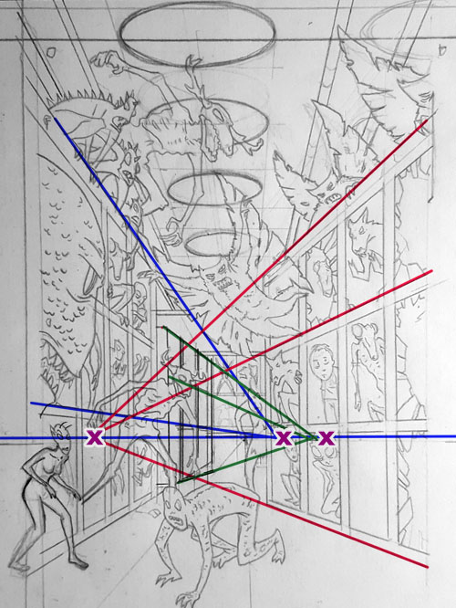
Note the third vanishing point that is titling the second set of pods on the left juuuuust a little to help bounce the eye around. Let's take a look without the marks...
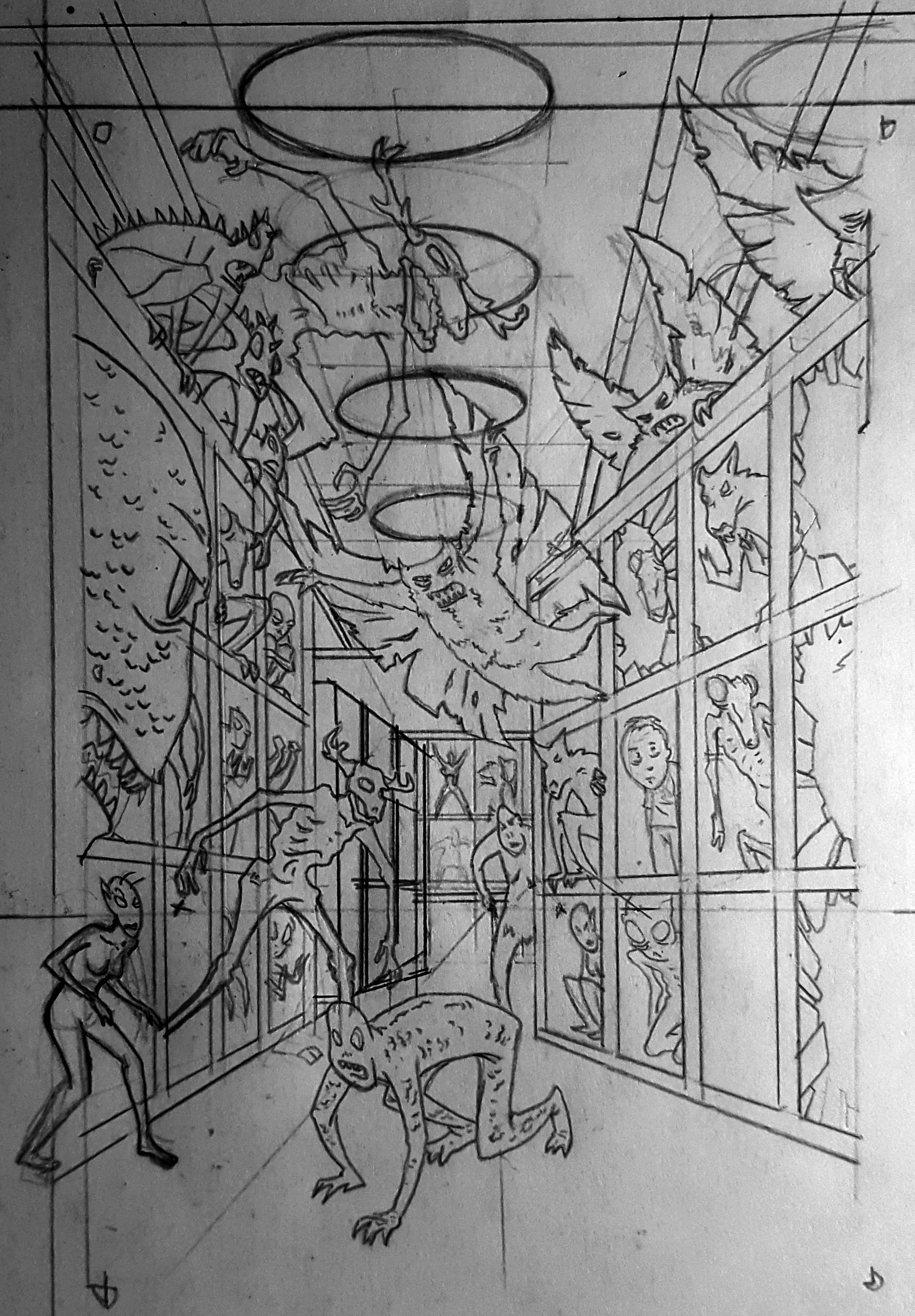
Pretty good, a little cluttered but I think I can alleviate that with some inking techniques. Now to see about fitting those main characters in. I drew them out separately and will move them around a bit until they work.
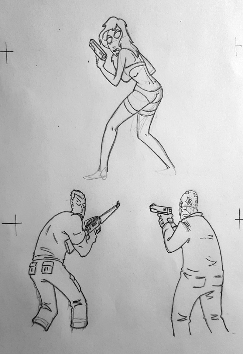
That'll work. There's a few things I did with the placement of the characters that help the composition...but I'm not telling you. Sometimes you keep things to yourself...proprietary techniques I'll call 'em.
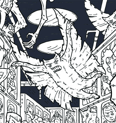
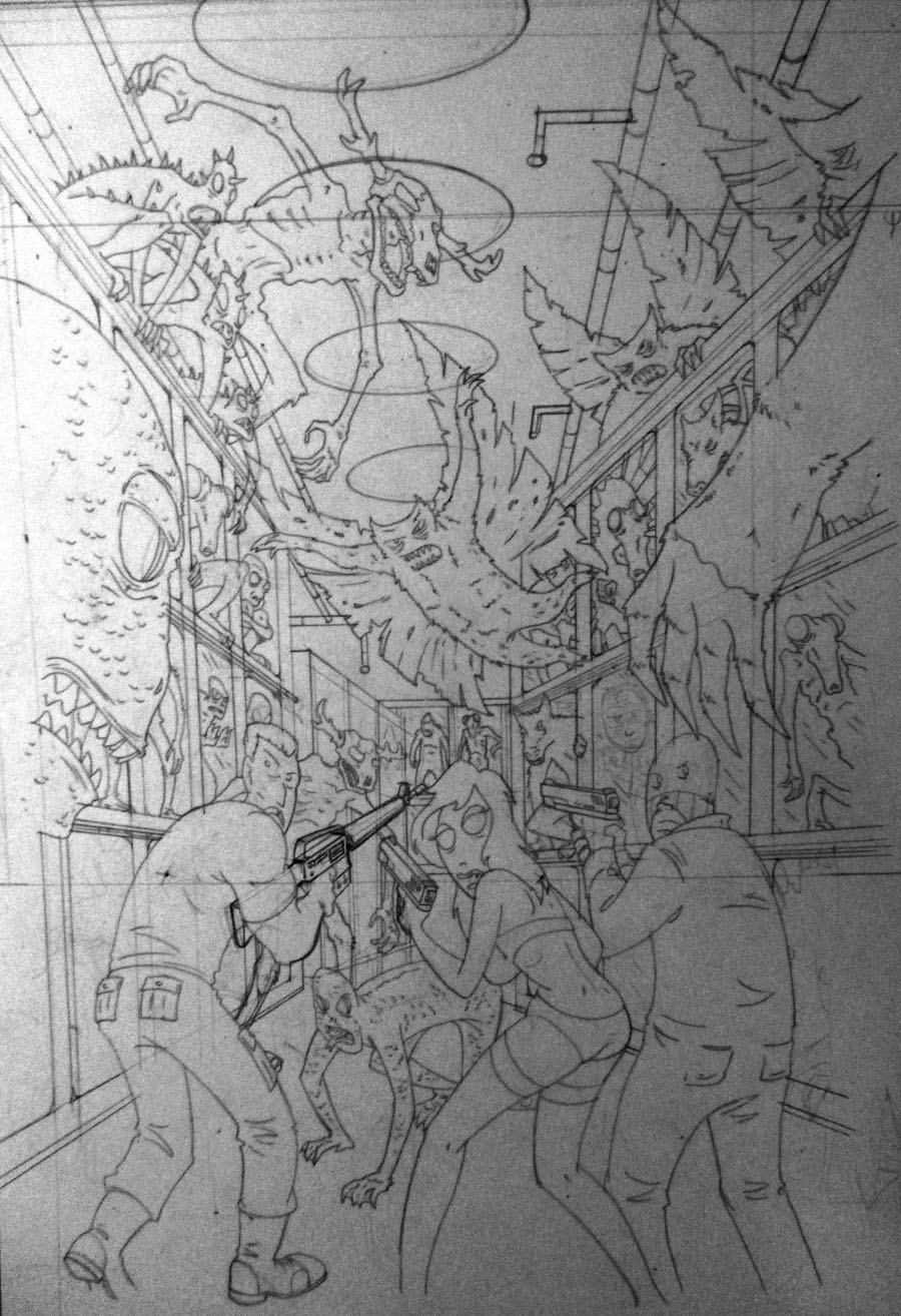
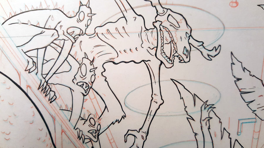
But that's basically the final pencils, and few odds and ends have to be added ( like the creatures in the closest pods on the left and right) but I'm gonna need to see how well the inking separates things before I know how much detail I can add to whatever is in there. So...onto inking...
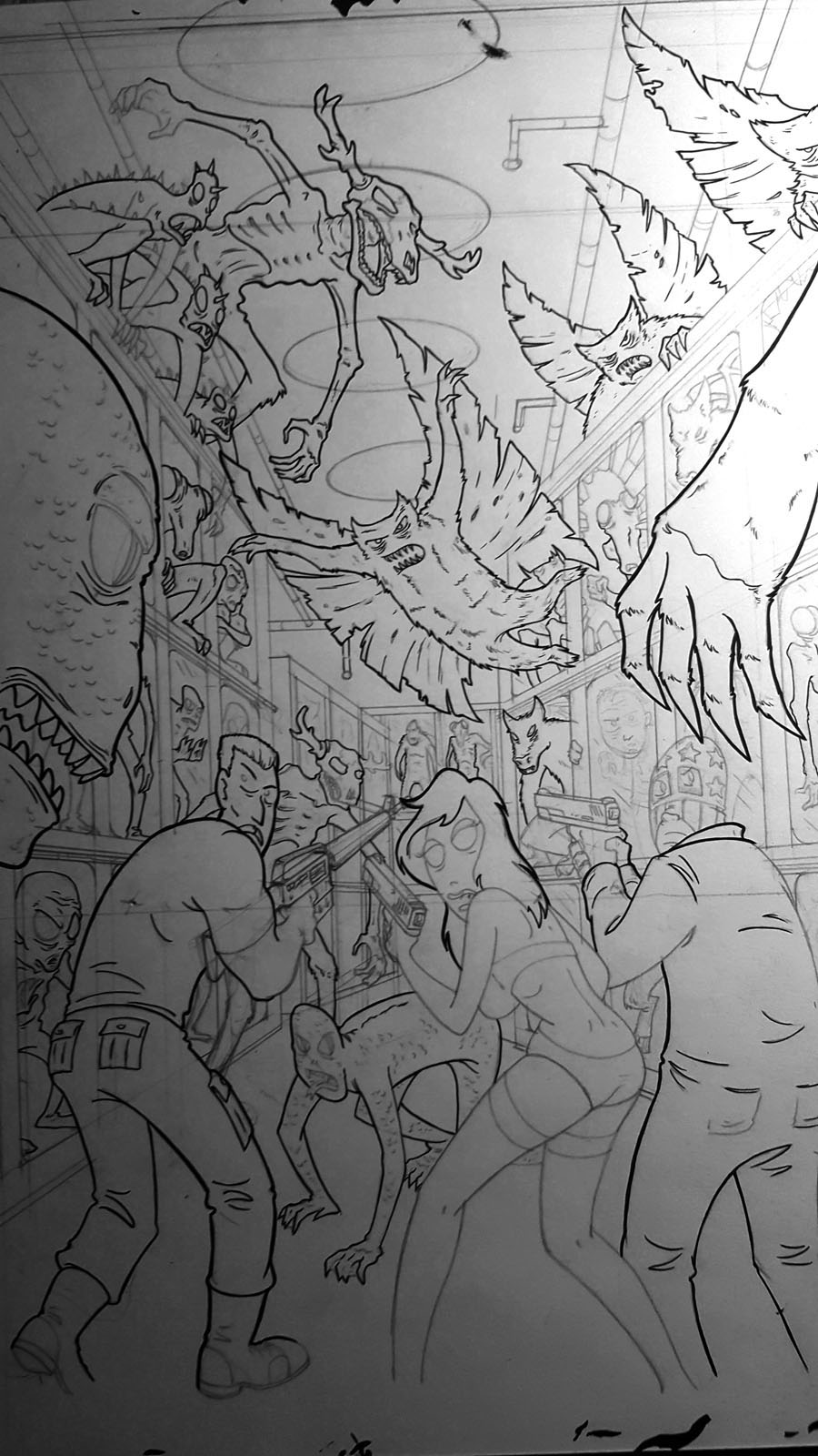
hmmm....looking okay, let's do some more, maybe try some broken glass and see how visually cluttered that will be.
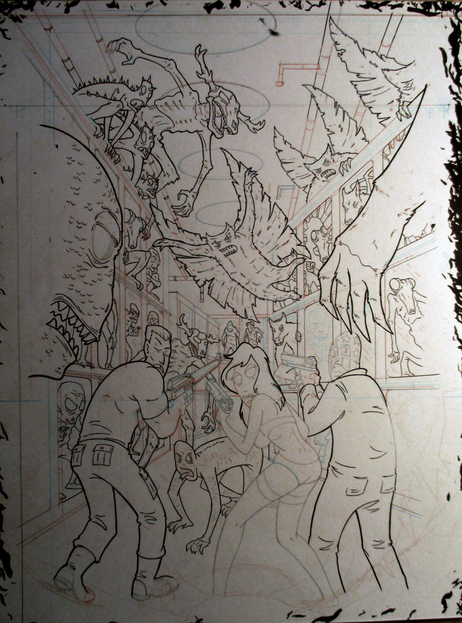
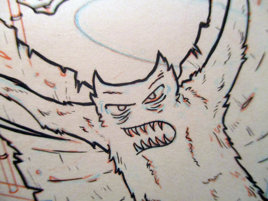
Yeah, that's okay. You can just barely make out some sketched lines on the bottom (near their feet). Those are where I am going to add some elements in the far foreground to give it some more depth. That will allow me to add creatures in each of the closest pods without taking away from the focal importance of the central figures. and..I kind of forgot to keep taking progress pictures at this point so...here's a few close ups and then the final inks...
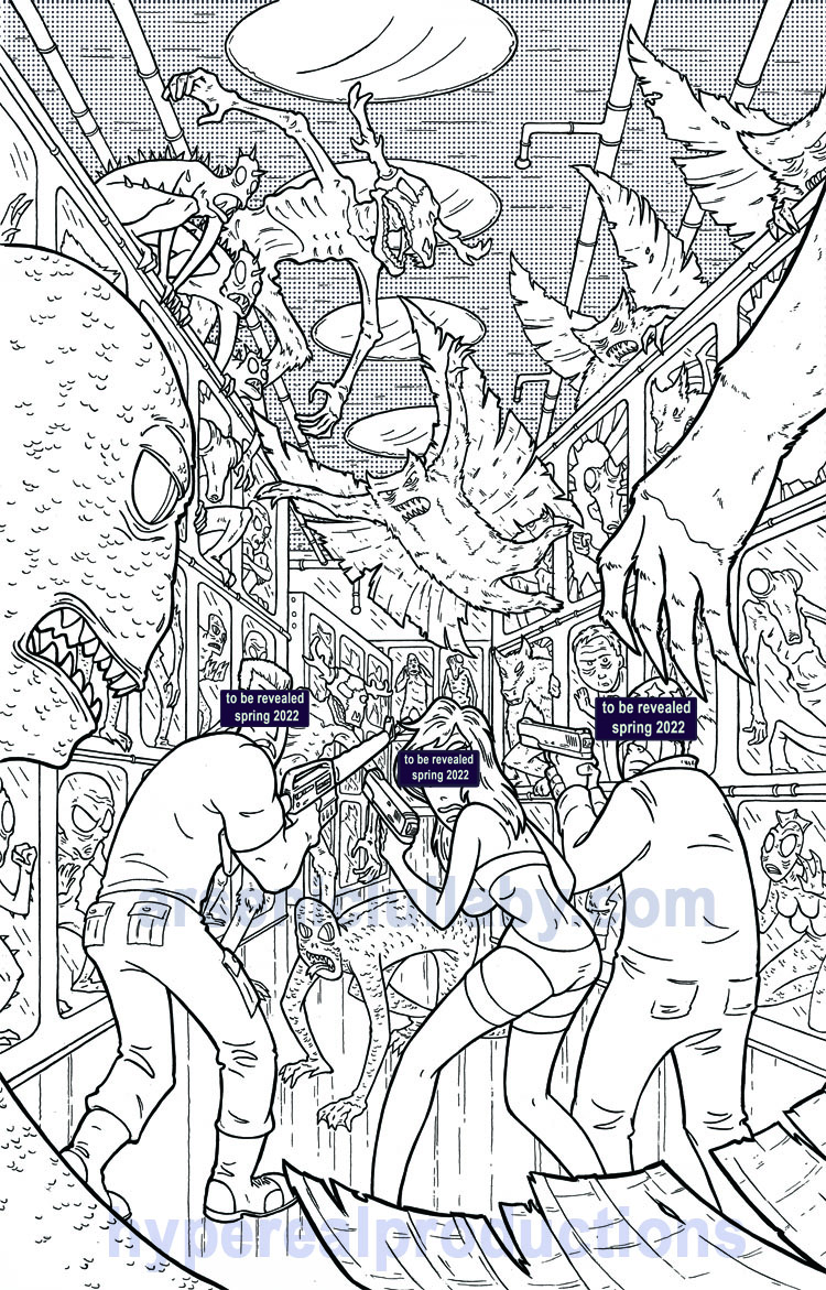
It's pretty decent, it's the colorist's problem now. More info on the project soon-ish
...and THAT is all for this time.
As always, homebase is here
https://www.arseniclullabies.com
NFT work here-
https://nftshowroom.com/arseniclullaby/gallery
https://makersplace.com/arseniclullaby/
Here are the other places to find me...my use of them is fluid, inconstant, susceptible to the whims and shifts of the paradigm
Torum-https://www.torum.com/u/arseniclullaby
Instagram- https://www.instagram.com/arsenic_lullaby_official/
twitter- https://twitter.com/arsenic_lullaby
bitchute- https://www.bitchute.com/channel/arsenic_lullaby/
youtube- https://www.youtube.com/user/arseniclullabycomics
i wanna color this…excellent linework!
thanks! Maybe one of these days I should put out some b/w files for people to try their hand at coloring my work. Yeah, I think I'll do that. ...stay tuned I guess
Your content has been voted as a part of Encouragement program. Keep up the good work!
Use Ecency daily to boost your growth on platform!
Support Ecency
Vote for new Proposal
Delegate HP and earn more