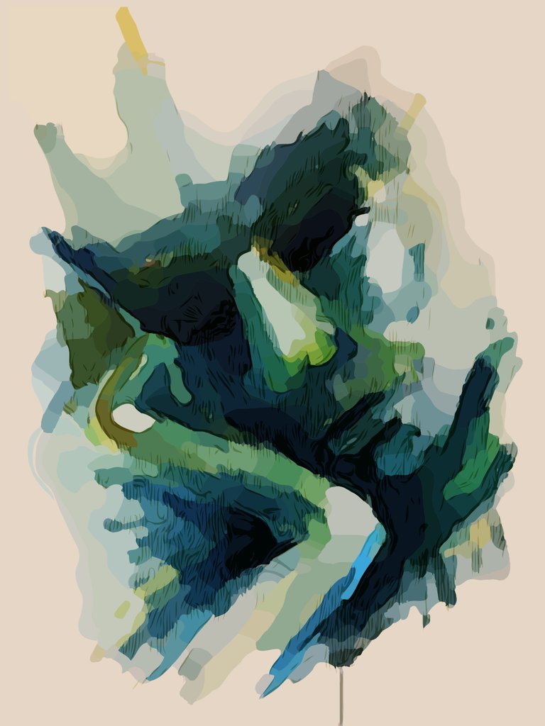
This Monday I painted a portrait. Or rather a head of an imaginary man; it wasn't meant to resemble anybody. The sole intention was to paint human sadness.
The painting was done with acrylic paint on textured paper. I only used a few blue and greenish colors. No bright yellows and reds, obviously.
I painted it all by heart, no picture and no model present. Although the proportions were not right, it kind of did something to me.
I've vectorized the image and reworked it just a little in my computer. I kept the drip, cause it kind of fits in.
I think it is sad. I'm happy... 😌
I just wanted to share it with you guys to hear what you think!
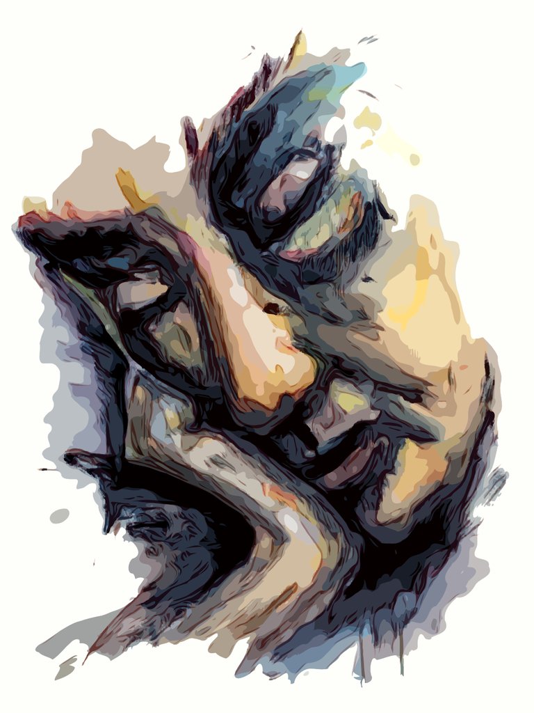
EDIT: 1 week later!
It's about one week later and I did a second study. Nearly same composition, different color palette and more contrast.
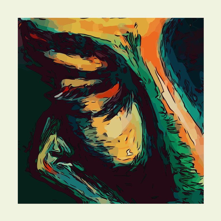
EDIT TWO: Again 1 week later!
Again one week later and I did the third study. Composition on square canvas, different color palette, but most important: more focussed and close-up.
The result is nearly abstract now. Let me know what think!!
Beautiful textures and colours!
Thank you for your comment, appreciate it!