

Because coins always have two sides... 😉
Porque siempre las monedas tienen dos lados... 😉
This image was made with the Ibis Paint X program and today I share a video of the step by step.
Esta imagen fue realizada con el programa Ibis Paint X y hoy comparto un video del paso a paso.
SKETCH / BORRADOR
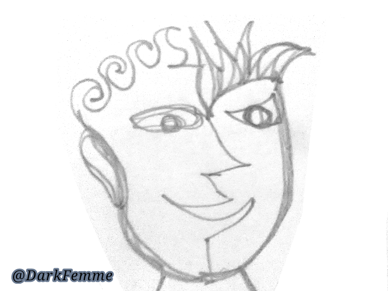
I took a piece of a reused sheet and in a small box I started to do what my fingers did in a drawing, the only condition that I set was not to lift the 2B graphite pencil until the design was finished. *To this kind of art is called continuous line drawing.
Tomé un pedazo de una hoja reutilizada y en un recuadro pequeño me dispuse a hacer lo que mis dedos hicieran en un dibujo, la única condición que me puse fue no levantar el lápiz 2B de grafito hasta finalizar el diseño.*A este tipo de arte se le llama dibujo de línea continua.
LINE ART / LÍNEAS BASE
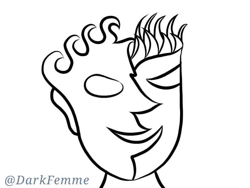
After taking a photo of the previous sketch, I erased the parts that I did not need from the outside of the sketch and began to draw with the brush "strong ink" the basic lines that delimit the design.
Luego de tomarle una foto al boceto anterior, borré las partes que no necesitaba del exterior del boceto y comencé a trazar con el pincel "tinta fuerte" las líneas básicas que delimitan el diseño.
THE FACES / LAS CARAS
For the faces it was much more work, because I had to say which colors to use and well a wolf helped me (@abneagro) -although his choice of colors made my life a bit complicated... Because they were two strong colors.
Para las caras fue mucho más trabajo, porque tuve que decir qué colores utilizar y pues un lobo me ayudó (@abneagro) -aunque su elección de colores me complicó un poco la vida... Porque eran dos colores fuertes.
EYES / OJOS
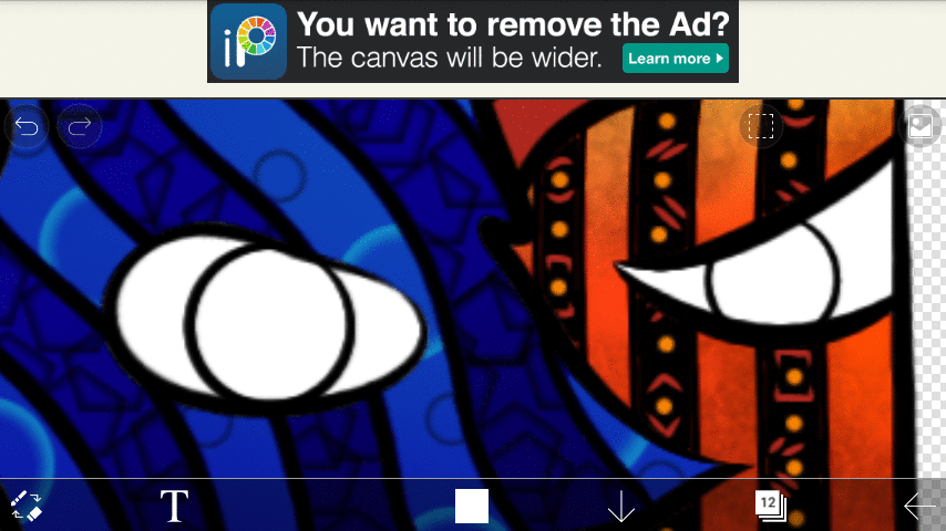
For explain how to make the eyes, I would have to do it with this gif because the detail would be less complicated.
Para explicar cómo realizar los ojos pues tendría que hacerlo con este gif porque sería menos complicado el detalle.
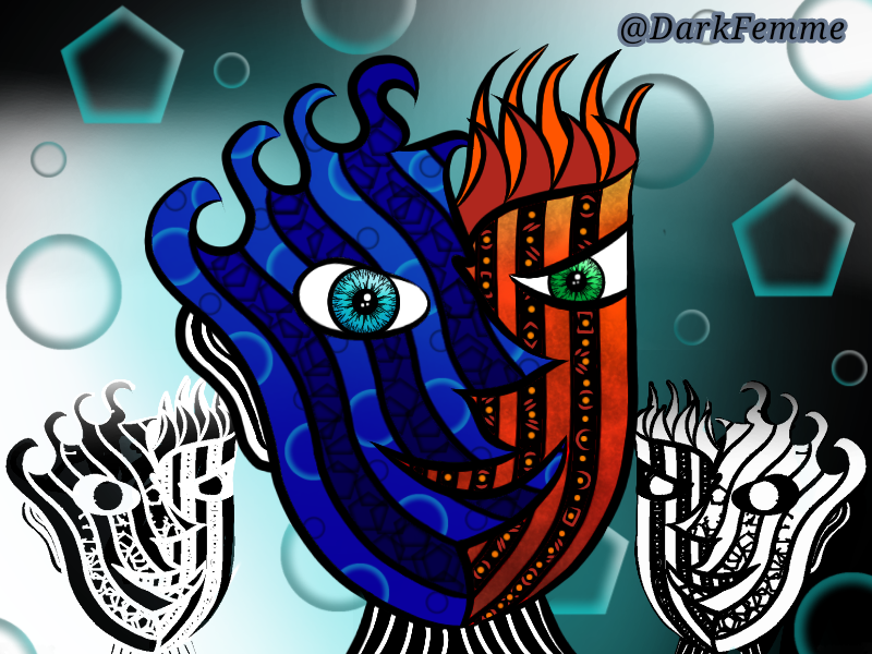
FINAL ART / ARTE FINAL
All that remained was to add the background, varying with the turquoise, black and white colors, duplicating the main image and extracting the base lines and then inverting the colors and placing them on the opposite side of the image.
Here is the definitive design so you can better appreciate it with details:
Solamente faltaba agregarle el fondo, variando con los colores turquesa negro y blanco, duplicando la imagen principal y extrayendo las líneas bases para luego invertir los colores y colocarlas del lado contrario de la imagen.
Aquí está el diseño definitivo para que lo puedan apreciar con más detalle:
This video was edited with the free application of Ciberlink, Power Director and the .MP3 file used is by Audio Library -copyright free- to listen to it in full
Este video fue editado con la APP gratuita de Power Director de Ciberlink y el audio usado es del Audio Library de YouTube, libre de derechos de autor, para escucharla completa
| Good Vibes by MBB |
| https://soundcloud.com/mbbofficial |
| Attribution-ShareAlike 3.0 Unported (CC BY-SA 3.0) |
| Free Download / Stream: |
| http://bit.ly/2Lbe6vD |
| Music promoted by Audio Library |
Twitter: https://twitter.com/FemmeDark
Instagram: https://www.instagram.com/dark.femme.box
Discord: DarkFemme#3243
Telegram: @DarkFemme
All dividers, video, cover and signature are my own. // Todos los separadores, el video, la portada y firma son de mi autoría.
Original content that will be published on other networks with the same username. // Contenido original que será publicado en varias redes con el mismo nombre de usuario.
▶️ 3Speak
@tipu curate
Upvoted 👌 (Mana: 16/32)
Tks a Lot for tour support!
Ajaa... Vi una mención jajaja. A la final el dibujo te quedó bien y tal como comentas, te sirvió para liberar un poco el estrés que arrastras en el día a día. De igual manera, el uso del vídeo y gif le da un toque mas creativo a tu post, que sin lugar a dudas se puede ver muuchooo en la forma en la que maquetas tus post, siempre te quedan geniales.
Ahora dices que el pobre lobo te complica la vida :( jajaja
Cada día voy mejorando pero aún me falta por aprender...
Bueno me complicas te los colores jijiji pero las complicaciones le dan un toque especial a la vida, así no nos aburrimos jijiji