This is a really long post with lots of images. However, considering how much time it took to paint this, I really wanted to do the painting justice. ^^
I've done a lot of less detailed art so far, but I really felt inspired to make this painting. This inspiration kept me going hour after hour, especially when I felt stuck.
I'm still holding the giveaway on Twitter, (you'll need ETH wallet if you win). I've asked my sibling to help me pick the winner, since there are so many cool entries already. ^^ The other 2 editions of this painting are open for bidding ^^ I won't rush this auction since I'm quite attached to this painting <3 The giveaway ends in a few more hours (4-5 from now) ^_^
Full Story: https://knownorigin.io/gallery/206300
Click the small expand button to read the full thing.
I work a little chaotic, following my inspiration :) I actually thought I could preplan this drawing like other "professional" artists do, but it just didn't feel right for me. my brush strokes felt rigid, and lifeless, and it didn't feel fun. I added perspective too soon and that just make feel me too self conscious about mistakes. So, I decided to go back to my method of colors> composition> details> values. I'm really surprised how well this is working for me, no matter what I paint (including portraits even).
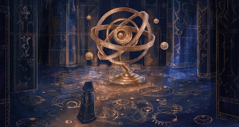
I've been researching a lot art with shiny/gold effects and I really wanted to try it out. I started with actual gold hue, but I didn't like it. Personally I've always preferred Pink gold over traditional yellow one. I used color balance to get a more gentle color, I find Color Balance much more useful than Hue/Saturation adjustment. I've noticed the paintings and colors look more unified and blended together. Also once you get a hang of it, it's much easier to control.
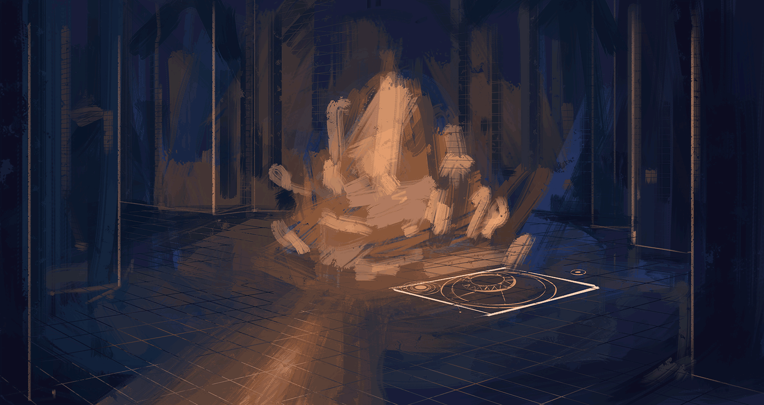
I tried to make the constellations as varied as possible but also balanced. I've gotten more comfortable painting circles in perspective thanks to this painting- The Spiral Fountain. I used the perspective grid as a part of the painting so it looks like tiles, but the secret is- it helped me draw the circles ;) You essentially need to fit a circle in a square that's in perspective, you can see the example above. I eyeballed most of the circles after that, and when any felt "off" I'd fix them and check the grid. Initially it took me a while to get the right perspective that I wanted, but it was worth it later. My first perspective was too wide so it didn't feel grounded, so afterwards I used a separate layer so if I change my mind, I don't have to spend half an hour fixing my mistakes. The important thing to remember about perspective is the horizon, I prefer keeping it at eye level, but if you put it higher or lower you can get interesting effect: lower horizon= looking down at something also sometimes called bird eye view. Higher perspective= looking up at something, great if you're drawing a tiny character, or a massive building.
I tried to not overfill the floor with details, because it can get confusing for the viewer. I used a flat color, but later I'll blend the details with the background more, only accentuating some areas. I achieve the reflective gold by using a separate layer and a mask. I painted lighter and darker "bands" vertically. The stronger the contrast, the shinier it will look. Also I added the little 4 globes so that the place looks more magical, since they're floating in the air on their own.

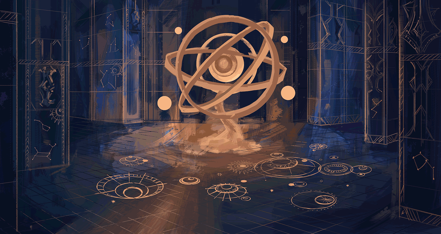
A couple of weeks ago while doing some research, I discovered that this globe kind of thing is called Armillary, I highly recommend checking out some pictures, they're all so gorgeous! I considered animation but I don't know where to begin, I still need more practice. I felt a simple glow effect wasn't enough and I've noticed gif-s tend to compress art quality.
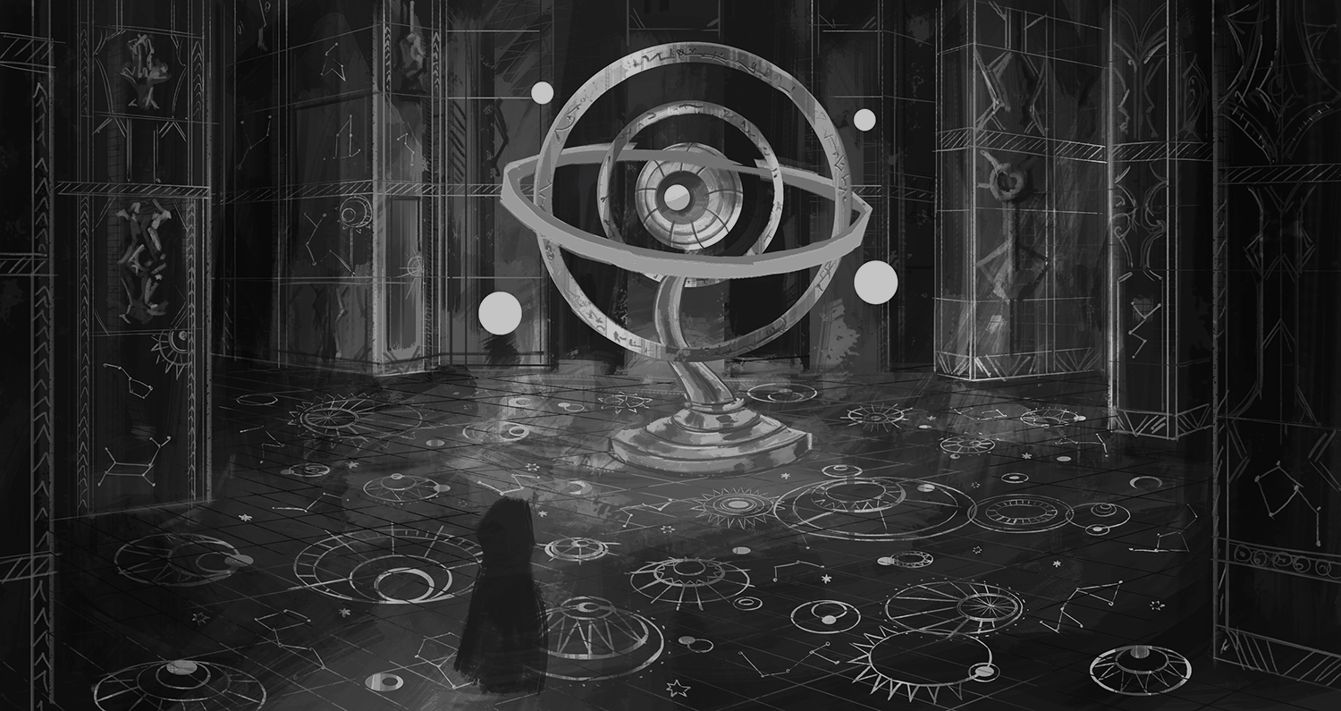
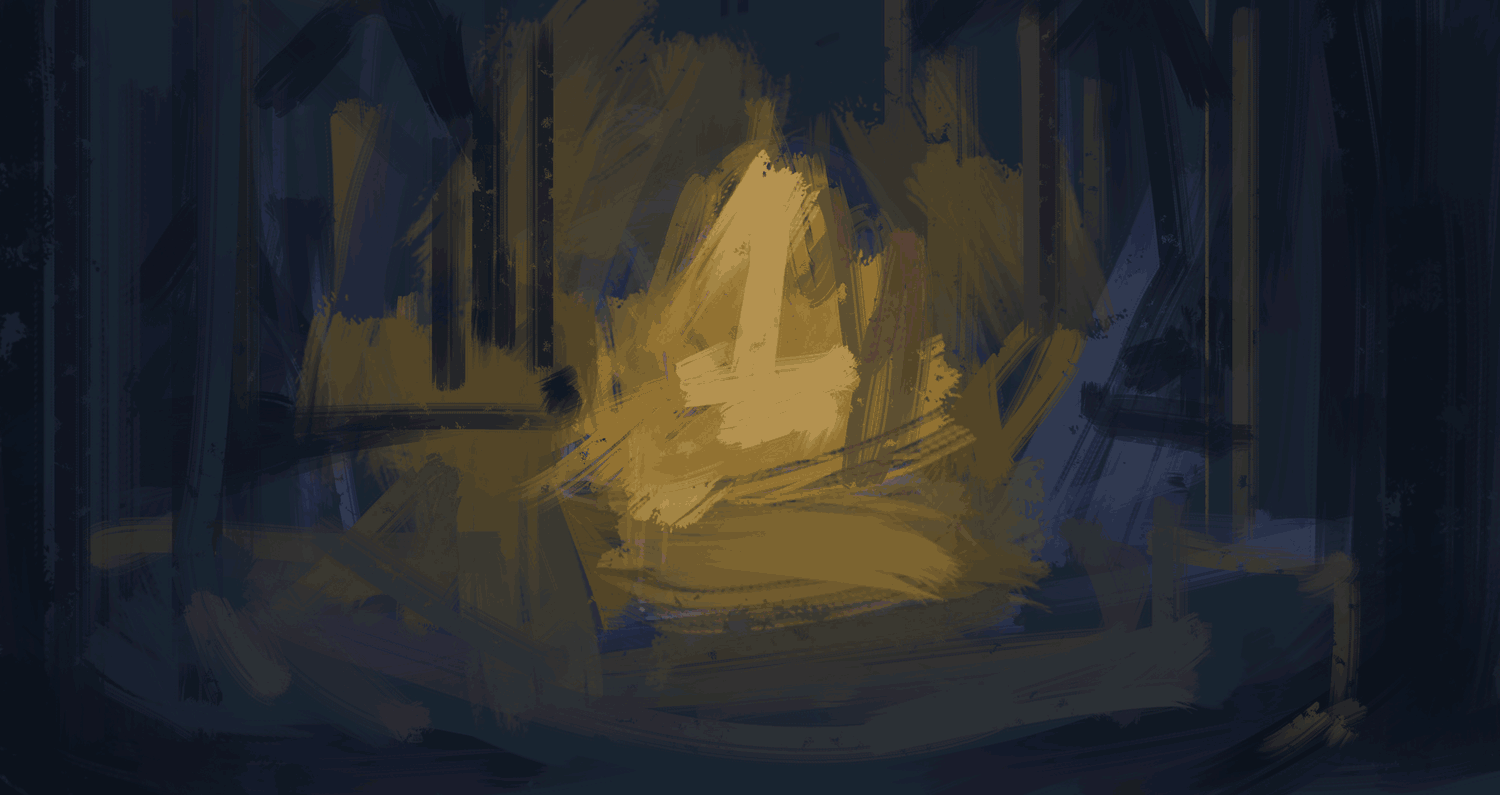
Checking values- This part is easy but sooo important. I use a black layer set to "color" layer adjustment. Then I use overlay, multiply and brightness/contrast to make the painting more readable. Above you can see me testing various contrasts that affect the composition and focus greatly. The colors are basically the same but their brightness is different.
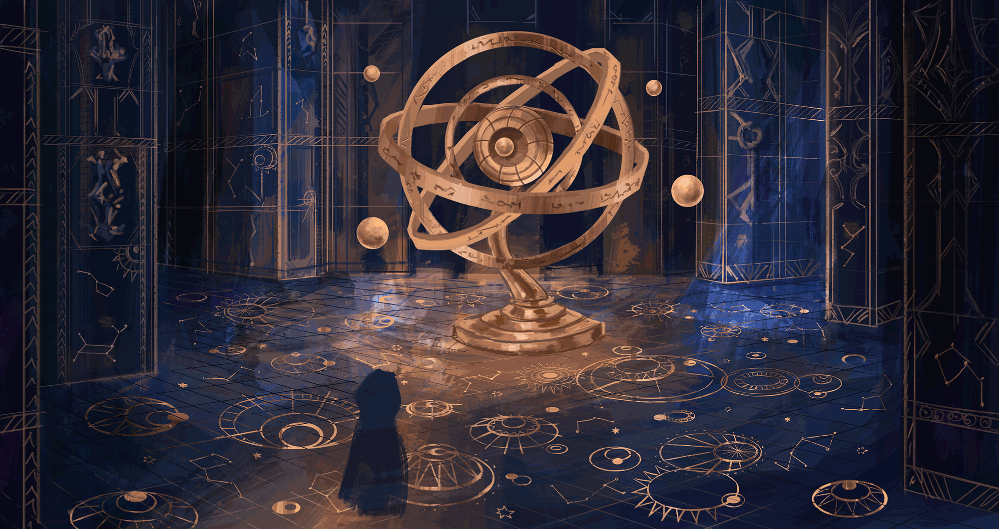
Details- little details like the blue light in the background, really make the painting look more complex. Details take the art to the next level, but it's important where you add details. I kept the walls vague, because I didn't want them to be the focus. I also removed some of the contrast on the floor details, so it's not too distracting. Last, but not least, I added the Armillary reflection on the ground, to make the floor feel even more shiny. It's barely noticeable at a first glace, but one you see it, it really fits.
Feel free to ask any additional questions, I'll do my best to reply ^_^ I might be afk for the following couple of days, so I'll catch up once I'm back.
Ps. You can check out this painting in the #sheart exhibition here: https://www.cryptovoxels.com/play?coords=E@108E,6U,349S
And check the rest of the awesome artworks while there ;)
I'll probably make a post just about the exhibition next week when I'm back ^^
Dragon head winners: my blog: @atlantiss ; Pixelart community: @ykroys
Thank you so much for checking this post out <33333
Woooow 💙💙💙
This is looking really amazing!!!
Are you gonna keep working on it? 🙌🙌🙌🙌
Thank you!! This artwork is done. However continue the series- definitely! :D
Oh can't wait to see the next ones 💙
The next ones are probably cute (slightly animated) clouds xD I already finished the art in the past weeks, but haven't shared yet :D Or more of Forest Spirits (I published one, there are 3 more). I hope to make 1 big art like this per month, but no promises. I'll try to keep looking for more of that inspiration xD
Of course is good to set goals but not to push oneself too hard for not killing the enjoyment of doing art.
This is inspiring, thank you Kris! 🤩🤩🤩
Yupp, I can't wait to share the clouds, they're so cuteee xDD
This is amazing! The level of detail on the piece is far from the works I've seen you done before. I may have missed a lot of paintings like these when I was away from the blockchain so this one is a first for me.
Thank you <3 You didn't miss, this is my first one so detailed!! :D Stepping it up a notch xD The next posts will be less detailed, while I work on the next big piece hahah. A nice balance of relaxing and challenge ^_^
What a great time to be back on the blockchain XD
Keep up the good work! :D
Thank you, indeed!!!
Congratulations @kristyglas! You have completed the following achievement on the Hive blockchain and have been rewarded with new badge(s) :
You can view your badges on your board and compare yourself to others in the Ranking
If you no longer want to receive notifications, reply to this comment with the word
STOPThis is what modern art is. Not a black square on a white canvas. You are extraordinarily talented.
Thank you <3 ^^ I think modern art is the variety :D
This post was shared and voted inside the discord by the curators team of discovery-it
Join our community! hive-193212
Discovery-it is also a Witness, vote for us here
Delegate to us for passive income. Check our 80% fee-back Program
Thank you very much!
wow, that is the most wonderful artwork that I have seen, the attention to detail, the management of colors and values, it's magic, mysterious, fantastic...
I cannot find enough words to describe the feelings that it causes to me, it makes me want to submerge to that world and and see it all with my own eyes.
Thank you so much <333 ^-^
I do too, this one surprised myself even xD
Thank you for the tip! <3
Hi friend @kristyglas
What beautiful work. I saw it and it immediately captured my attention and admiration.
Excellent.
A big hug
Thank you very much <3 Hug ^_^
Been amazing to see how much you've been improving in such a short time, this is an excellent piece.
Reminds me a bit of that raid in wrath of the lich king.
my only pet peeve would be the head, looks a bit oddly straight line at the top, but maybe just cause I don't know if he's wearing a mask of some sort under or its anatomy. xD
Ahh the head was bothering me too xD I was hoping I finally got it passable after 5 tries hahaha
Thank you :D
I haven't played much but the cinematics are just insanely good, some give me chills, including lich king one. So thank you for the awesome compliment ^_^
I remembered what it was called now :D ulduar!
Looks like Little Adventurer picks up more glyphs for their cloak the further along into the adventure they go ;D
This part of this building looks pretty fantastic, must be quite a sight for Little Adventurer and anyone else tagging along for the ride.
Also there's loads of different methods for achieving any given end result because people work differently, and some will work better for others no matter how desperately people want the one that works for them to be the one true method XP
Yup!! :D I wish I could work on bigger canvas xD my pc doesnt let me haha
True for methods, the posts aren't steb by step tutorials, but rather work together, to show the differences and how I keep trying more things till I find what works for me ^^ I do hope some tips I share are helpful for any method of painting
Great work!
Thank you ^_^
I really like it!
Thank you!
Welcome!
Thank you very much :D
A part of the process is methodical, I think I found a process that works for me even without making any plans.
This is just wonderful! :) :)
Thank you!!
This one is next level! Waouh I'm speechless, you just blasted through the skies of art! Getting closer to that graphic novel again hehe!
Thank you <33 xD yeah this one impressed myself, I really hope I can keep it up and it's not a one time luck haha. I just need to be more patient ^_^
Hi @kristyglas,
It is a very impressive painting as well as the animation. Your method really works very well, it seems that you are discovering order itself from chaos. Congratulations.
Thank you very much ^_^ I really hope I am!
Congratulations @kristyglas! You received a personal badge!
You can view your badges on your board and compare yourself to others in the Ranking
Yay :D
Well done @kristyglas👍🙂
I think I need to make my regular reminder that you, sir, are awesome, and your artwork is even awesomer! This sort of reminds me of playing a game called Trine, a lovely sidescrolling puzzle adventure game, with beautiful atmosphere. I don't want to sound picky, but that globe would look cool if you made a GIF of it moving... Just saying ;-D
Thank you!! xD Yeahhhhhhhh I'd love to see it animated, but not to do the animation myself hahahah I can't even imagine where to begin animating this xD
:D Thank you very much! I believe I played Trine 2, it was fun :D I love puzzles, I really should find time to play 3 and 1 if I haven't
Lol, adding some animations to it would be amazing. I think I've played Trine up until 2, as even something as relatively simple as 3 could easily melt my potato of a laptop. I'll put that on hold for now 😁
<3