Here in Argentina, we're going through a quarantine that it's going to last, at least, 100 days, in other words, what we knew as mental health flew off the window, unlike me that I had two job interviews during the first week of the quarantine, but now even if it would finish tomorrow, I wouldn't have where to go.
With all this free time I started to develop an online portfolio for my web designs and digital marketing projects (I have a bachelor degree in Marketing) but I noticed how stressful developing while we're getting through these times can be when you don't know even if it would be useful for anything. I realized I had to make something more relaxing, more useful for my emotions even if it wasn't for my wallet. That's why when my father showed me an online course about watercolor portraits and asked if I was interested in taking it, I didn't doubt accepting his offer.
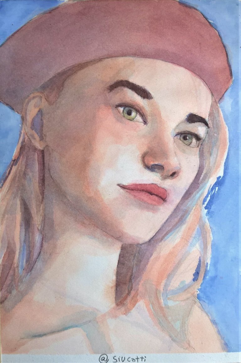
This painting came off as a practice/final project for this course, I made the process a little more detailed than usual because I wanted to show you what I've learned. The teacher covers several subjects about the starting sketch, the details that make a photo suitable for a portrait (lighting, noticeable skin features, etc.) and explains a technique that he thinks achieves more realistic skin tones, more alive or natural than mixing a "skin" color in the palette.
Grisaille
The technique called grisaille emerged in the fourteenth century and it consists of using grey tones or monotones. The teacher decided to apply this concept to watercolor in a very interesting way, through the use of successive layers of cold and warm tones. Let's check it out.
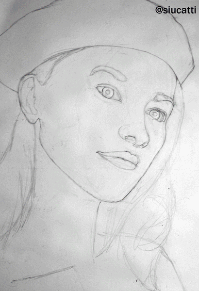
Sketch
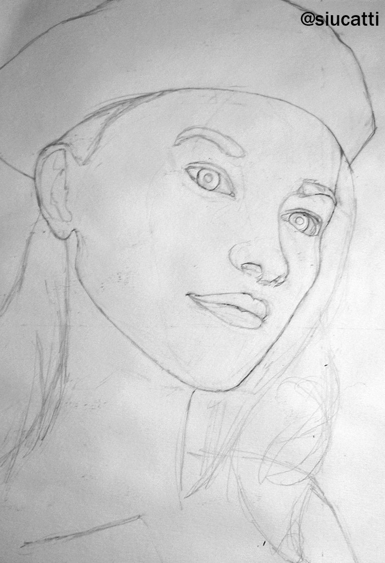
I chose a photo (link) that I considered right for the details needed with this technique (different shades of light and shadow, marked features). The teacher suggests using a watercolor paper of at least 300gms. I have to confess I've never used paper of that weight related to how expensive it can be and the difficulty of getting from the local stores nearby I usually buy from. But this technique called my attention and I will be getting the suggested paper for a next try.
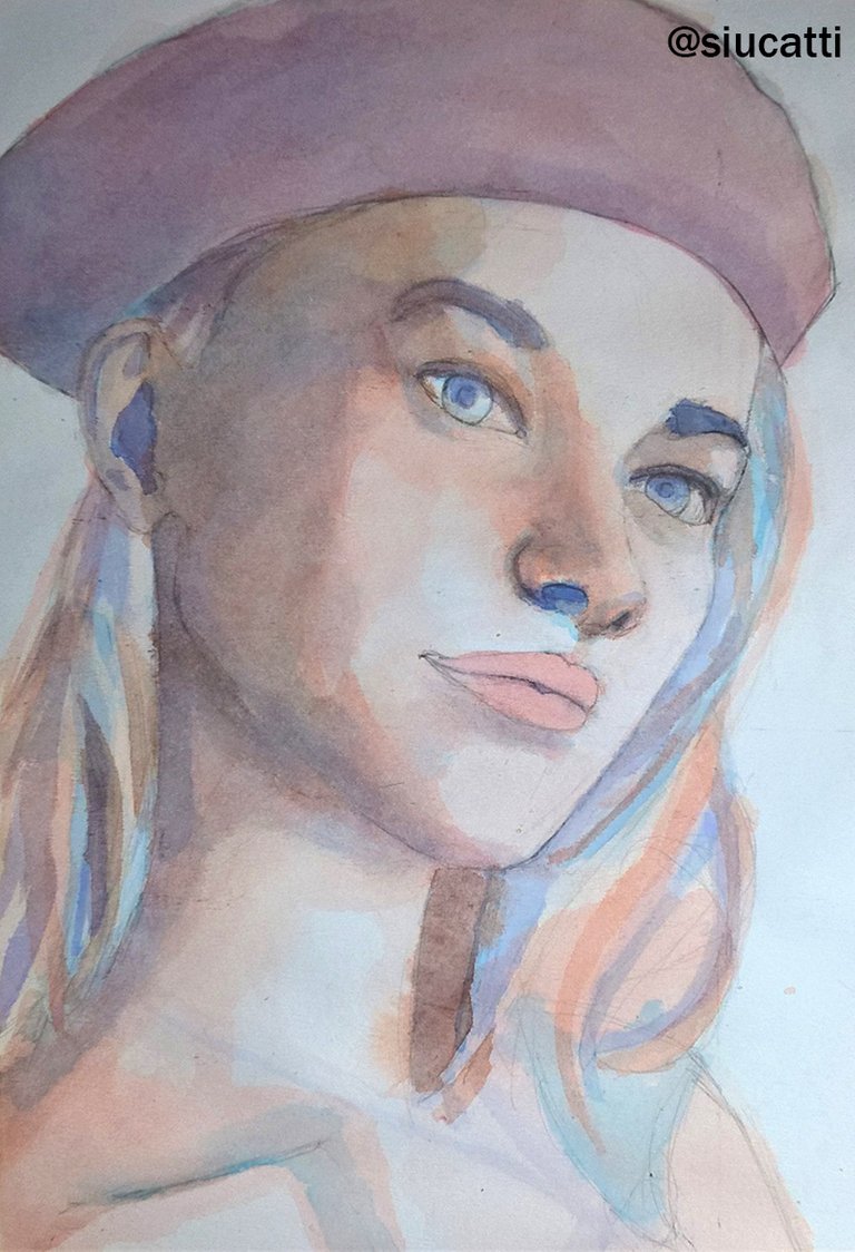
STEP 1: Cold tones
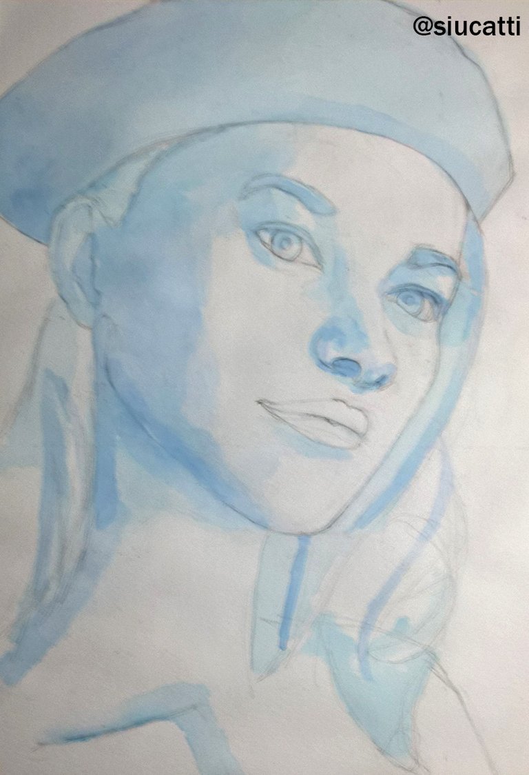
The teacher explained two methods: One applying green tones and combining them with reds, and another with blue and oranges. I chose to work with bluish tones but because I don't have experience using it for skin I think I applied too much for the shadow of the face, it became too intense, and that over complicated the next layers of the painting, beyond the fact I used a lower grammage paper. It was very interesting to me that the teacher recommended to apply it also on the hair.
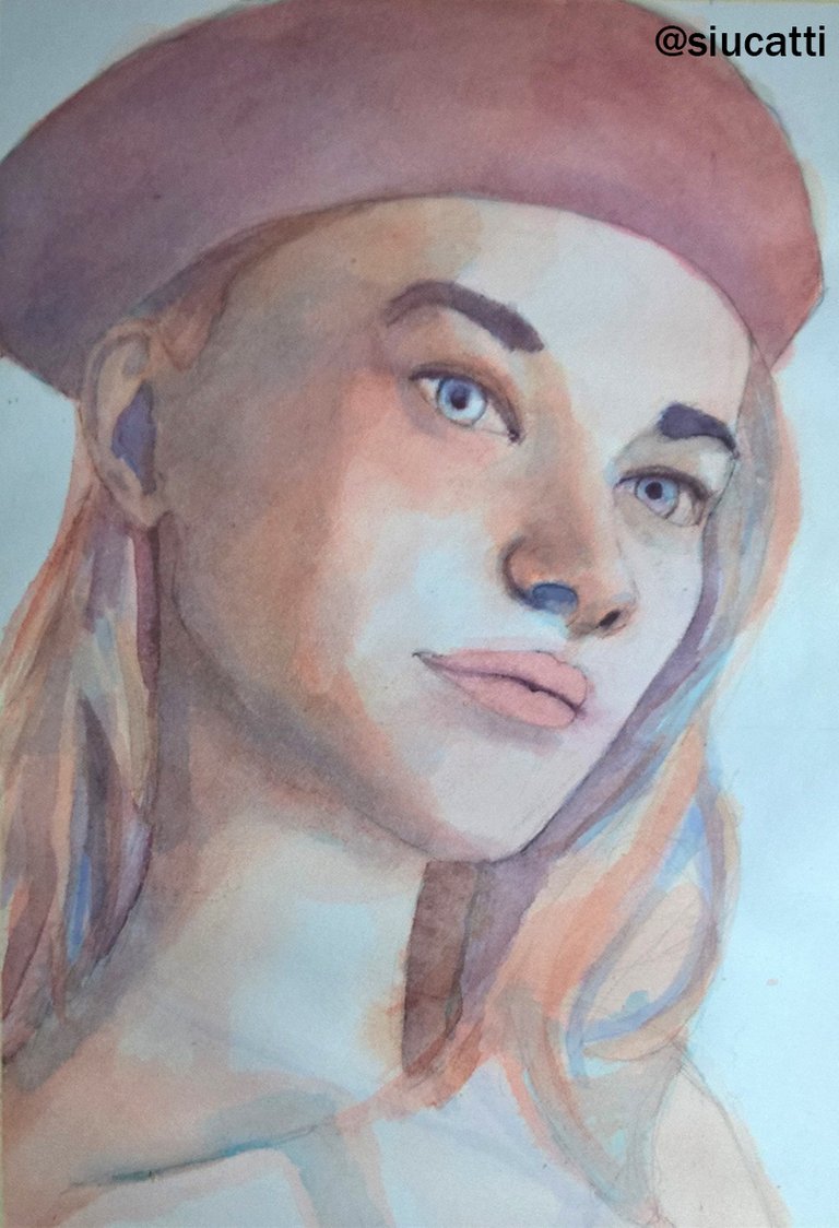
STEP 2: Warm tones
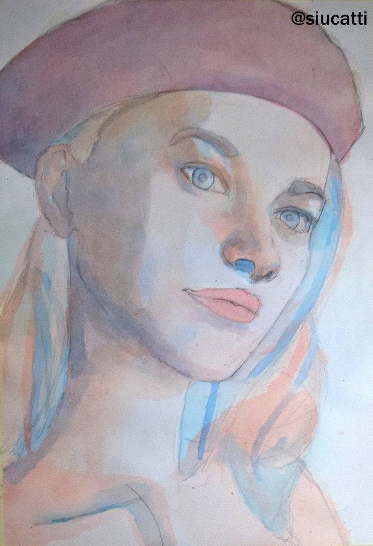
In this layer, I applied orange tones and the 'skin' tones immediately emerged. I also used crimson for the hat and a mix with orange for the lips.
STEP 3: Nexus color
This is essential, the teacher uses a purple or violet color to adjust tones and turn them more neutral. If the painting became too cold after the first layers, he would mix purple with reds, and if it was too warm, with blue.
STEP 4: First layer of adjustments
Mixing brown tones (he uses Raw Umber) with purple, I applied it to a layer in the hair, shadows of the face, eyebrows, and pupils.
STEP 5: Corrections and STEP 6: Last adjustments and background
(I didn't take a photo for this step, sorry!)
This time Payne's grey is used, mixed with warm tones, I used it again on eyebrows, lashes, pupils, lips. Also, I added reddish tones to contrast for the skin and the hat in areas that were too pale.
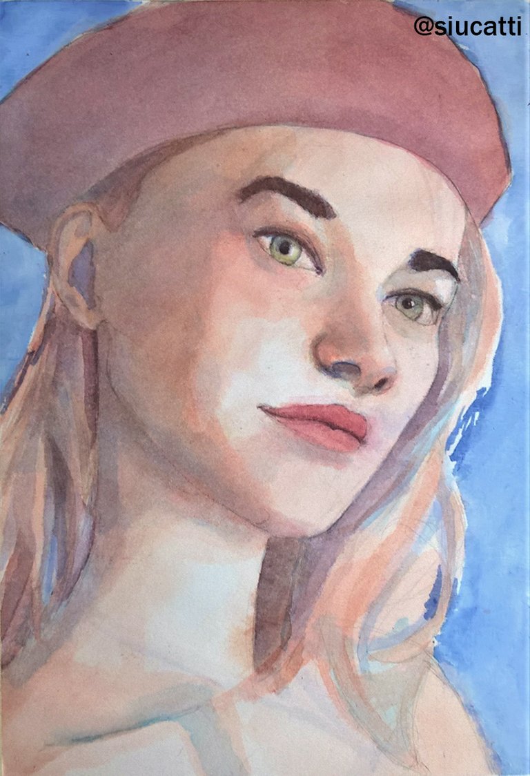
Here I painted the color of the eyes, more darkness to the eyebrows and lashes. With the background, I defined the hair and the strands of hair became more detailed. In general, I think it's a nice artwork which could have been even better if I didn't fail using the cold tones but oh well, I learned from it.
Final Comments
As a conclusion, I think it's a really interesting technique, great for portraits but I think when I paint illustrations I will keep going back to my old style, especially when the character is more involved in what happens in the background and is not the center of the action.
This is the link to the online course
I hope you liked it!
Damn straight I did! This is a beautiful portrait. I'm in the process of teaching myself how to paint, but perhaps I should consider a professional course. Seems to work wonders for you. Excellent!
Thanks man! I appreciate your words. It always helps to learn new techniques, it's refreshing when you got used to do the things in a certain way.
It's really a beautiful portrait, really well done! ^_^
Thank you, Silvia! Coming from you it means a lot!
Thank you, blacklux! I'm glad you liked it.
Shared on Twitter #posh
👋 Hi @siucatti, I was flipping through the blockchain and stumbled on your work! You've been upvoted by Sketchbook / a community for design and creativity. Looking forward to crossing paths again soon.
✅ Join the Sketchbook Community
Thank you! Yes, I'll absolutely check out the community.
Hello friend, happy day, and congratulations, this watercolor is really wonderful.