Hey Hive!
We're back again with another Art Attack! If you're new to the series, this is where I share my paintings and the process behind them. A behind-the-scenes look at my artwork, if you will. This is not to say that I'm very good at art, or that I'm a professional in any way. In fact this is the opposite, and serves as a reminder to how I first started, and lets me track my progress too!
What a happy coincidence that I wrote about our Valentines' Day dinner just yesterday on my foodie series, because today I'm sharing the process behind my Valentines' Day present/art piece I did for Sean!
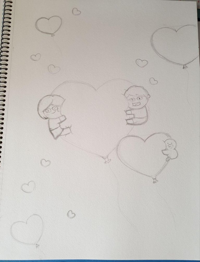
Truthfully I was initially quite stumped on what to get for Sean and when I decided that he actually didn't really need anything atm I wanted to draw him something but I had no ideas. Until... 3 days before Valentines' Day, I saw this cute LINE Friends wallpaper!
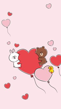
I think I came across it on Instagram when Uniqlo was advertising the new LINE couple shirts they just launched. There were a few other wallpapers too but I really liked this one so I decided to paint something based on it.
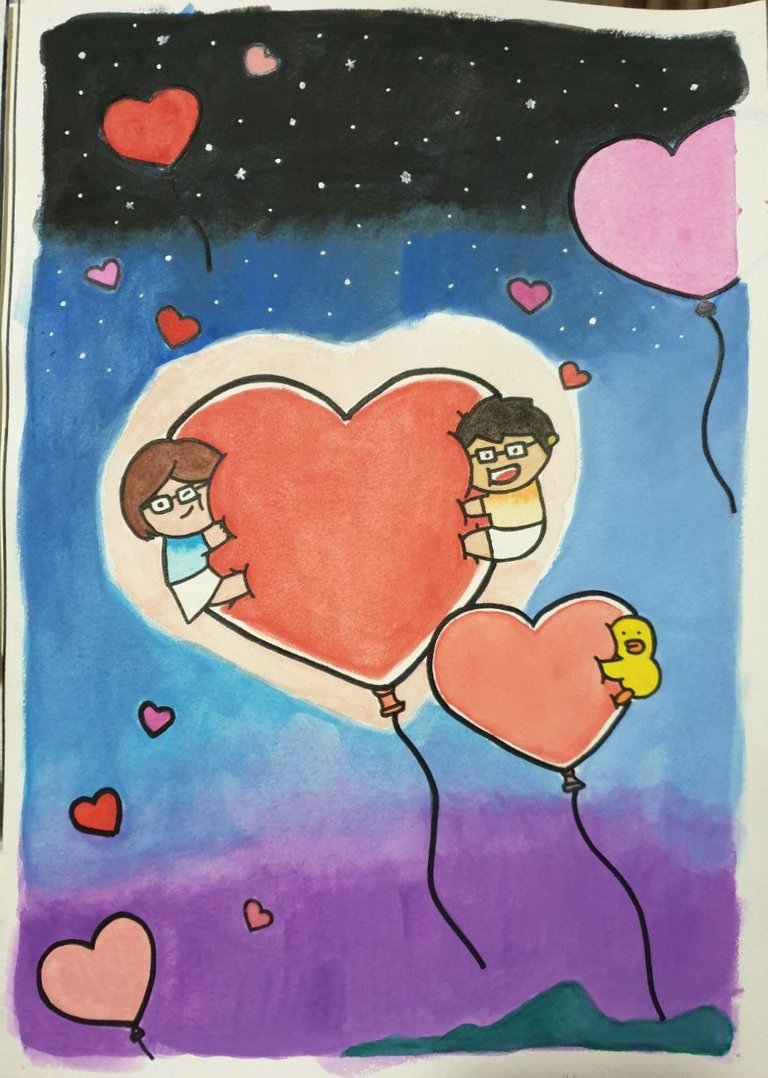
Both of us really liked Sally but I thought I'd change Brown and Cony into characters of us and this was what I came up with:
I was inspired by HJ-Story to create these cute character versions of us! I come across his pictures on facebook and stuff from time to time and they're always so cute and wholesome. I always wished I could draw like him.
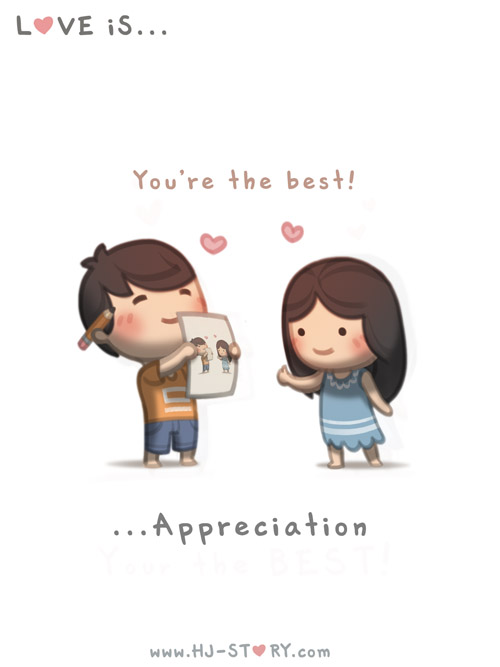
This is pretty much Sean every time I show him my art. 😅
But I think I did pretty okay. And they do somewhat look like us which was good.
I kept it simple because I didn't have much time since I only had 3 days and I could only work on this when Sean was at work (this was back before quarantine).
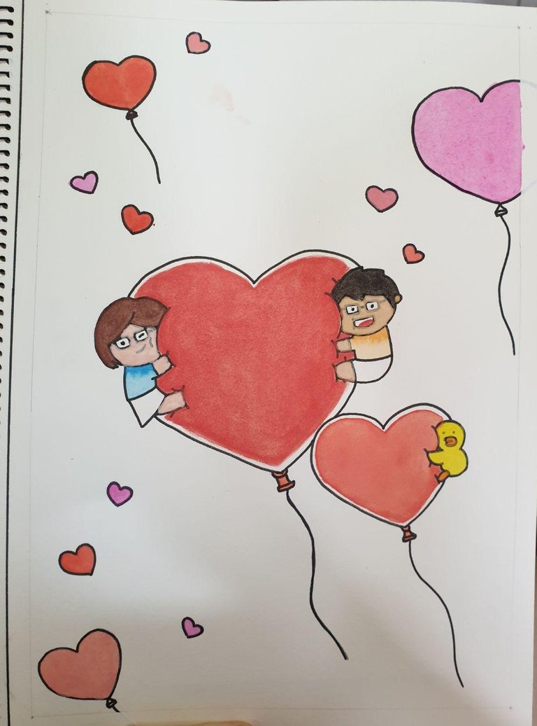
So I kept the hearts the same colour as the picture and for our shirts, I went with an ombre blue and orange like I did for our wedding portrait!
For the background, I didn't want just a solid colour like the wallpaper, so I thought of painting a simple night scene with black, blue and purple.
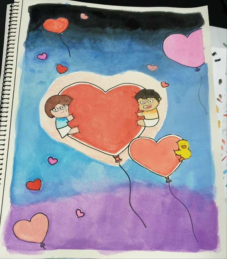
I thought it was a good idea until I actually started painting, because unfortunately it wasn't blending in as well as I had hoped. But I tried my best and eventually the purple was just too striking so I decided to cover the parts that wouldn't blend with a mountain, so it would look like the balloons lifted off from the peak.
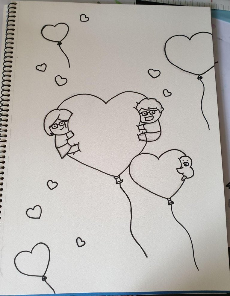
After outlining once more, this was the result:
I think overall it looked pretty good, considering it was pretty much my first time working with such dark colours. And I think the white border really gave it an artistic look.
The good thing was that Sean really liked it! He said the border made the piece looked spray paint-esque; I'm not entirely sure what that means but I'm so glad he liked it!
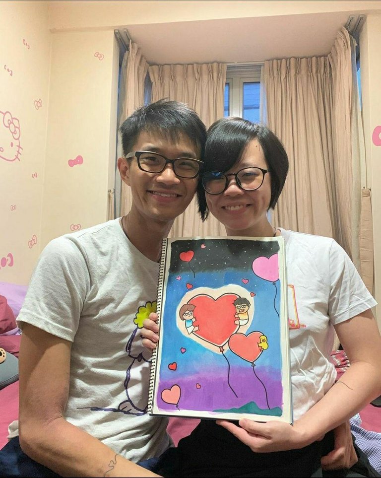
Btw that room is a rental I didn't put those Hello Kitty stickers.
I really liked how this piece turned out, especially the characters I did for us! I'll definitely draw these characters again for sure!
Thanks for reading!
To find out more about me, check out my intro post here!