I did a few progression shots of this project I completed and wanted to share the journey! As we progress through you will kind of get to experience some of my indecisiveness with how this was going to play out.
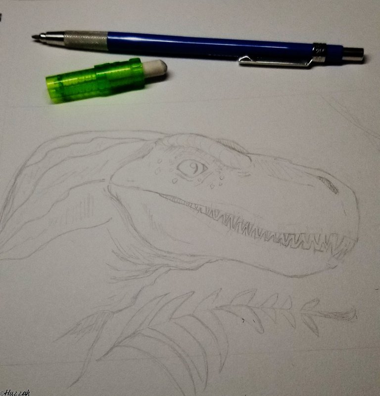
The first step is whipping up my carnivore of choice. I didn't think to take progression shots of this phase at the time (althooouugh- that is something I can do next time). This fellow was not based on any particular real species. 100% franken-dino (If I had to guess it would be a mix of some Utah Raptor and a whole lotta Rex)
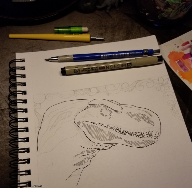
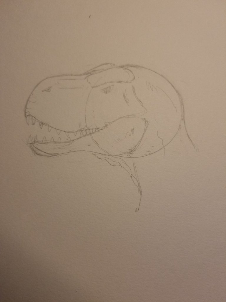
It all starts with a doodle, a pencil doodle to be exact. Now, let me tell ya'll: pencil doodles are my jam. They're lighthearted, nobody gets hurt or gets stuck with an error that is permanent (and trust me my eyes will zone in on that mistake every time). Overall a good time.
Ink, on the other hand, is a whole other ball game and it's here after inking the outline that I decided the colorful jungle-esque vibe I had in mind wasn't going to quite play out how I pictured. So, I decided at that moment that we were now going to play with a more linear "line art" style.
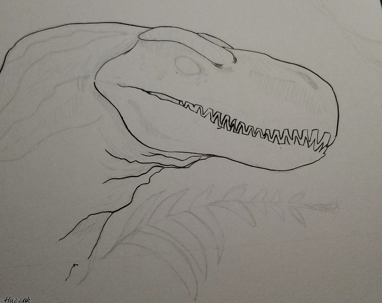
After completely erasing the plant the page felt so empty so I sat and deeply pondered about how I was going to approach this (definitely wasn't procrastinating on D.buzz).
I finally ruled out watercolors. Cool, a decision made...except I still don't have anything to accompany our dino friend on his journey to completion.
Not wanting to let go of the natural fauna vibe I decided to go with a frame of sorts. Inspired by the frame styles used by tattoo artists and working some foliage in, I was feeling happy with the rough sketch I had thrown down. It felt like it was coming together. Now to start inking shadows.
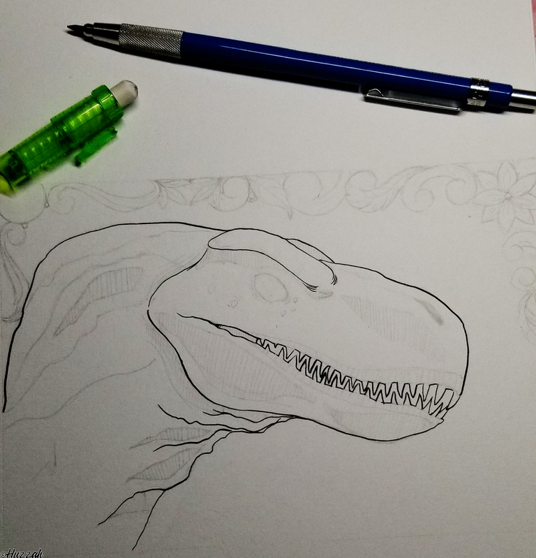
It was about here that I was like "WHAT IS HAPPENING" but I was committed to the horrifically straight lines and followed through. This is the point where we have hit what I fondly call the "ugly phase". Bare with me. Hopefully, the end is worth it.
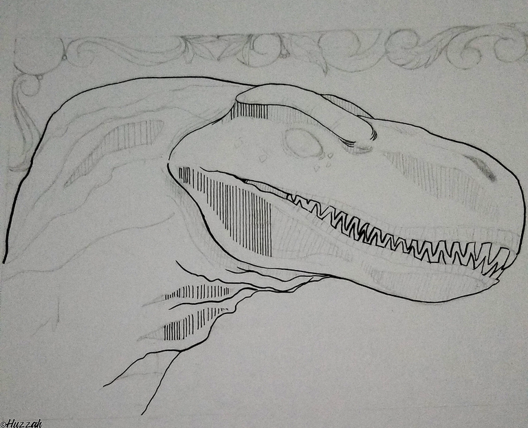
After finally working through the face and neck I needed to work on ANYTHING else that wasn't a straight line so I allowed myself to get sucked into the fun flowing lines of the frame.
Intermission
The frame was complete but it was necessary to take a break to appease my desk goblin. It yells at me till it gets the attention it desires.
It's time for details and by details, I mean freckles and creases! Wooooooh. Sprinkle them all over the place, all over the neck and face.
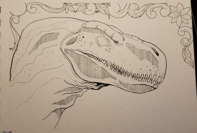
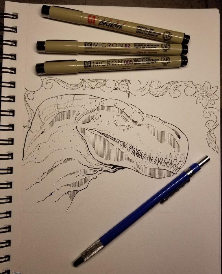
Now place into the oven and bake for 15 minutes. Tadaa Finished product.
Tools Used
-Micron 005, 02, Brush Marker
-Deleter Pen w/ #4 Black Ink
-Staedtler 2H Led
(Pupils are for suckers, haha)
Ultimately I am happy with the result, I learned a lot which is always the goal!
This looks really nice! I'm a really messy person and inking scares a lot. It has butchered many of my works before x_x But yours turned out really nicely! The vertical lines are perfect addition for that tiny texturing ♥
I appreciate your kind words! <3
I stayed away from ink for the longest time for that very same reason. It's interesting, now that I think about it I realize that what actually built my confidence with it was stippling. It allowed me to in a way dip my toes in ink and feel like I still had complete control of the image. The mistake of a single dot placed too heavily or close together quickly gets lost in an image of 100s of dots.
Oh my, stippling, my worst enemy x_x I was never patient enough to actually put individual dots... It's really nice that you found comfort in it!
Thank you. Haha, it's a turn my brain off and zone out style.🤣
Its like a happy floral pattern around a deadly vicious predator. I dig it.
Oh, snap! That means a lot coming from you! I've seen some of your wonderful NFT work floating about. Amazing job on both the Music of Life and D.buzz logos!
Aww thank you so so much that comment like TOTALLY made my day!!
This is pretty cool. I have always tried to start making dino illustrations in the past but never got to it. Their very form looks awesome to draw just from the shapes of their skulls. And you remind me of the times when I used to draw my content first on paper, ink them, and then have them scanned for photoshop adjustments before posting.
Nice touch on the frame, something on my list of wanting to apply to my works but also never got to. I'm a sucker for gothic styled frames and mix of Celtic styles too.
Thank you so much! One of my favorite things to fixate on is the muscles on these behemoths. The jaws specifically are weirdly one of my favorite places to detail.
That is why this piece was so irregular for me- as I had decidedly filled that space in and couldn't use it for my normal level of depth.
Funny you mention scanning projects in as I was just talking about that the other day. Felt so "old school" for not knowing of a modern method (other than converting to digital art completely).
I would have to blurt out "samesies!" in regards to the frame. I have a tattoo that uses a victorian style frame. Can't stop, won't stop framing, Haha. 😆
I know there are a lot of artists that still do this method and can use a mouse instead of a graphics tablet to come up with damn good illustrations. The medium helps but it's the artist that makes it happen.
I collect pics of these types on pinterest just trying to suck up inspiration from the form. It just started with gothic arches from old churches up to Victorian style frames. Good to know we got more stuff in common XD
It's truly phenomenal what some people can do with a little patience, a mouse, and MS paint! Years ago, I had a client that liked to share his MS paintwork with me when we would get to talking about art. I remember when he first showed me his art and then told me he did it in Paint. The look of shock on my face was probably priceless.
Don't even get me started on the amount of time I have spent scrolling the internet looking at the beautiful architecture or artist styles for reference is ridiculous. I am glad there is no productivity meter on garnering inspiration
Love this dinosaur, I'm not confident about the anatomy of Dinos but I think the back of the head is thicker than it should be...
Thank you so much for the feedback!
I honestly would have to say that I definitely see what you mean. That back neck area was admittedly the area I struggled with (and was self-conscious of) - so it's great that you were able to pinpoint it and show me where I went wrong.
I think this revisit to anatomy will help me out in the long run (less neck to have to detail is a bonus). Just a quick sketch with feedback implementation.
Nice!!