Note: UX is short for user-experience. UI is short for user-interface. It
I love PeakD.
Out of all the front-ends I’ve tried (Ecency, Dapplr, Waivio, ProofOfBrain, LeoFinance, and more,) I gravitate towards PeakD the most.
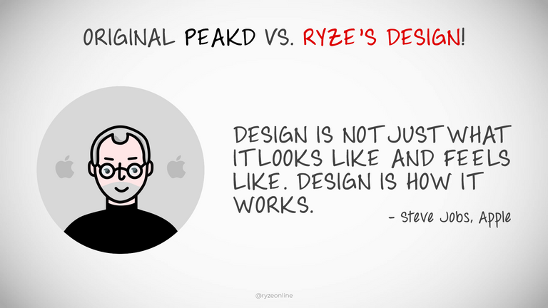
And with my sizable background in art direction, design, and UX/UI, (I ran a graphic & web design company for years, have done UI direction for big clients like Evan Carmichael, and have written 300,000+ words of copy on Hive in the last three months,) what I really love is a smooth, intuitive, fulfilling browsing experience for content. And I believe that’s what users are hungry for as well, though they don’t usually articulate it. For example, I remember the Firefox and Internet Explorer ‘browser wars.’ When Chrome launched with it’s clean, fast, intuitive interface, it quickly claimed dominance in the browser market. It put Firefox and Explorer to shame, because it was just a joy to use.*
*These days Chrome may have departed from this somewhat.
And I see Hive front-ends similarly. Hive is fairly new, as are its front-ends. And there’s room for a newcomer to step in and grab the majority of users, just by being easier and more fun to use. A great tool, like a hammer or a pen, feels great to use. It has just the right amount of features, not too many, not too few. It doesn’t draw too much attention to itself, and instead, focuses on empowering the user.
But even more importantly…
An enjoyable user-interface makes onboarding people much easier.
If something looks intimidating, with tons of buttons and widgets, people go into overwhelm. Yahoo’s search page was absolute chaos, then Google came along with the simplest, cleanest, most minimal search interface around, and blew Yahoo out of the water. Google had no problem onboarding new users because it was simply a joy to interact with. Visit a beautiful page with negative space, type in phrase, get clean search results. Voila.
*Again, these days Google may have departed from this somewhat.
The point is, I’ve spent a lot of time thinking about the power of UX, UI, and front-ends, as well as their power to attract and fulfill users who interact with them.
So I’ve taken the time to turn my thoughts into a partial redesign of PeakD.
Please keep in mind these are just some ideas and suggestions. Nothing is set in stone, and I’ve not discussed any of this with @jarvie or @asgarth. I haven’t even discussed it with @sjarvie5 , lol. This is not an official proposal. It’s not a command of what must be done. It’s just a dude, sharing some ideas, and hopefully it can be seen in a friendly, helpful, positive light. I just have a knack for UX/UI and a passion for improving things, and I hope it sparks something in someone.
So without further adieu, let’s dive in.
PeakD - MAIN FEED Redesign
Focus: A sleek, uncluttered, focus on serving up content to users.
Secondary Focus: Encouraging users to engage with content rather than blind-vote them.
Sleek Interface
To me, a great app empowers users well, while also being unobtrusive and out of the way. With my design here, PeakD’s tools take up minimal screen real-estate while giving the user access to all key features. This is done through a clean navbar at the top of the screen. Icons for user’s Home page, Explore, Communities, Feeds, are followed by an ever-present search-bar and a ‘breadcrumbs’ & filters section. Icons for Create, Messages, Notifications, PeakD Settings, are on the far right, and lastly... Profile settings are accessible by clicking the user’s avatar. These conventions are very similar to other apps, and will likely feel ‘at home’ with users. This minimal navigation puts all the focus on the content and feeds.
Clean Grid
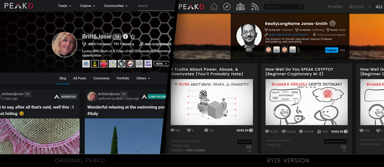
Each ‘card’ on the main feed now has a larger headline & thumbnail. Much of the ‘clutter’ was removed, leaving only a byline, date posted, action-menu, and an optional spot for reblogs / cross-posts. (I also chose a ‘pure’ grey scheme instead of PeakD’s original blue-grey, as it helps colors pop more, especially ‘blue’ links.) All other details are displayed once a user clicks through to the post. This encourages exploration of content on its merits, not it’s vote-counts, and discourages blind-voting.
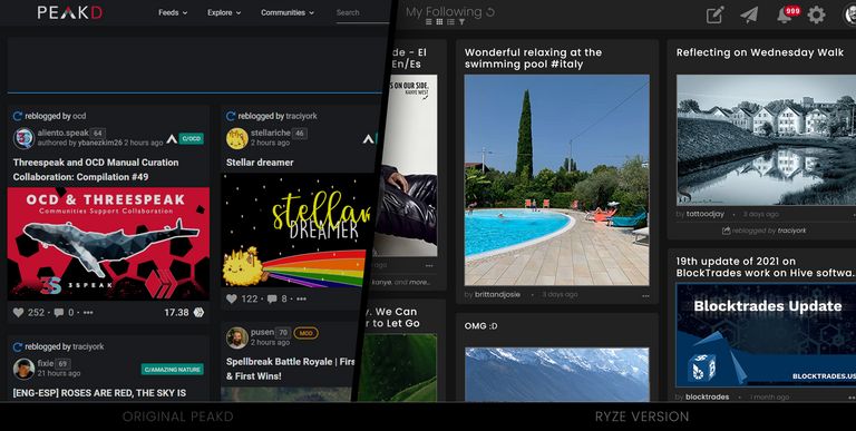
Engagement Encouraged
In my design, vote counts are still shown on user’s profile pages, search results, and other potential grids & feeds, but I believe the main feed is best judged on the merit of its content, not on huge vote-trail numbers or Hive earnings. If people want to see those stats, it’s best if they take the time to check out the content first, then be shown those stats after clicking through. This encourages users to click through on headlines, topics, and thumbnails that speak to them, rather than simply glancing at data, blind-voting, and moving on. YouTube’s main feed doesn't show like-counts and I feel Hive would benefit from modeling this. If encouraging people to actually click through and explore content to assess it’s value bothers people, we could instead show ‘views’ only, or the stats & numbers can always be added back to cards, as you’ll see in a screenshot lower-down this page.
PeakD - PROFILE PAGE Redesign
Focus: Highlighting the author’s content by condensing the box of biographical info.
Secondary Focus: More emphasis on author personalization with more space for the banner, avatar (profile photo), and grid.
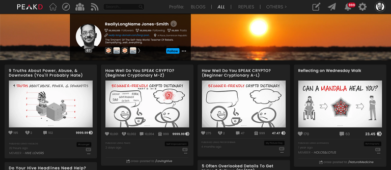
Compact Bio Box
Name, photo, follower/post count, website, location, bio, badges, follow button, and action menu... all in a beautifully compact, translucent black box. This allows people’s cover images to be far more impactful and easier to create, as well as letting their profile photo be bigger. Any missing features from the original PeakD have been moved to the two menus in the top-right (Settings Gear and Account Actions accessible by clicking the avatar in the top-right.)
Decluttered Data
Unlike the main feed above, the cards here show all the data from the old PeakD design (upvotes, downvotes, tips, comments, rewards, front-end, post-age, member-of, community/tag, reputation, cross-posts, reblogs, and action-menu... but it’s done extremely cleanly, with hierarchical font-weights and minimal flashy colors, making it easy on the eyes, and easy to know what is clickable.
PeakD - WALLET Redesign
Focus: Vital cryptocurrency info and account status at a glance.
Secondary Focus: A brief, simple education on what each currency is.
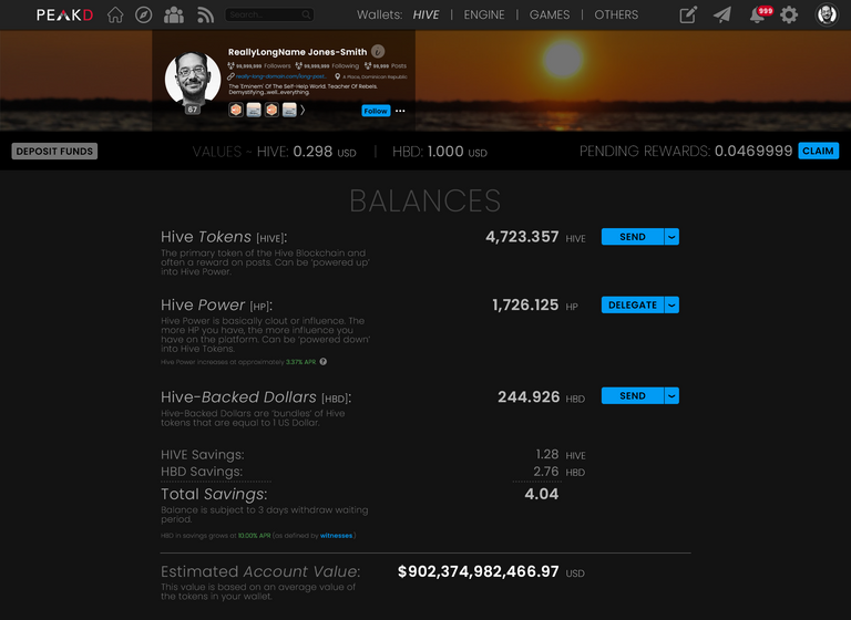
Intuitive Navigation
The same way drivers are comfortable with how brake- & gas-pedals are set up, users are comfortable with an application’s navbar at the top of the screen. They’re used to looking there for important information and actions. So I moved the various Hive Wallets to a menu at the top of the screen wallet screen. I also moved the stock ticker prices and deposit button away from the ‘right’ column on the original PeakD to a secondary bar just under the cover image. (The cover image has also been ‘dimmed’ slightly on this page, because the emphasis here is on the author’s account & crypto, not their personality or follower counts.)
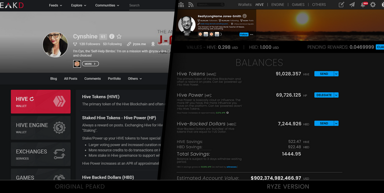
Organized Balances
I wanted to see my balances clearly and have an understanding of my account at a glance, so the PeakD wallet screen has been completely overhauled to be neat, organized, and aligned. This is a friendly screen that would be a pleasure to see and navigate, in my opinion, and a similar approach could be taken towards ‘Crypto Transaction History’ if one scrolled further down the Wallet page.
PeakD - POST Redesign
Focus: A pleasurable read and easy consumption.
Secondary Focus: Intuitive interaction and navigation of the content, author, and stats.
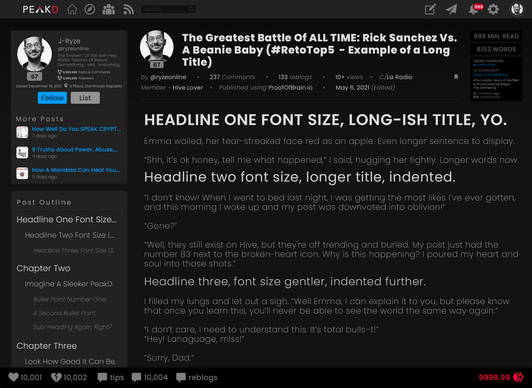
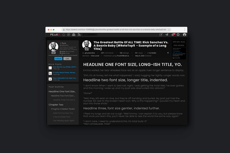
Two Columns
The post page is where a lot of PeakD’s value lives. This, presumably, is what people are here for. The precious, valuable, authored content. This content (hopefully produced by talented content-creators) is what people are using PeakD to see. So I gave the ‘body’ of the post the bulk of the screen real-estate. This lets the words be much bigger and more legible. It also makes the left-side of the screen a place for interacting with the author or article, which is a common design-convention that users are comfortable with. Plus, the footer has ample room for stats & voting, as well as a nicely ‘PeakD-colored’ rewards-value.
Visual Hierarchy
Headline 1 is bigger, brighter, and bolder.
Headline 2 is medium size, intensity, and weight.
Headline 3 is smallish font-size, brightness, and weight.
Etc.
This is mirrored in the post outline, with the addition of indentation for each headline-status, and clickable links are either bright white (ie: headlines) or blue.
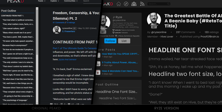
Easy To Read
All the above was done to draw the reader’s focus where it’s meant to be... the post, while giving them easy access to the other myriad information PeakD provides in a clean, efficient way.
PeakD - ACCOUNT MENU Redesign
Focus: A friendly central location for common account or profile-related tasks.
Secondary Focus: Intuitively encourage users to explore personal aspects of Hive’s blockchain.
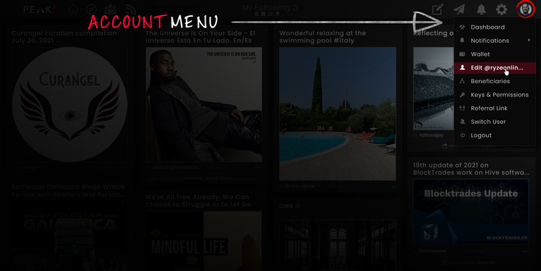
Friendlier
The Account Menu (or Profile Menu) pops up when a user clicks on their small ‘profile’ photo (or avatar) in the main PeakD navbar.
This menu has 8 options all focused on dealing with a user's account. Everything from their dashboard & wallet, all the way to their beneficiaries & keys. They’re written in a friendly font with icons featuring plenty of negative space. Highlighted options get a subtle ‘PeakD-colored’ bar with a bold white text.
PeakD - SETTINGS MENU Redesign
Focus: A friendly central location for PeakD & far-reaching blockchain settings.
Secondary Focus: Intuitively encourage users to explore far-reaching aspects of Hive’s blockchain such as Witnesses, Proposals, and other governance.
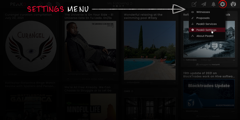
Separated
The Settings Menu (or Hive / PeakD / Governance Menu) pops up when a user clicks on the ‘gear’ icon in the navbar.
It has 5 options (so far) focused on overall Hive / PeakD functions. Things like Witnesses & Proposals on the governance side, and things like Services & Settings on the PeakD side. Most users will likely focus on the Profile Menu, but they’re likely to explore the ‘gear’ icon and dive into the Settings Menu at their leisure as well.
My redesign isn’t perfect.
It’s what I was able to whip up in a couple days' work. Proper UX design would involve split-testing, rolled out over weeks, for example. I also didn’t do anything for mobile design, which has quite different features and conventions (such as ‘hamburger menus’, and so on.) On top of that, I did ‘dark-mode’ only, because that’s how I personally use PeakD. But these details aren’t exactly rocket science to figure out. Any decent coder can play with the colors and CSS to swap the changes I’ve made into light-mode. A mobile UI designer worth their salt could be shown the desktop mockups I’ve made here and adapt it for mobile. There’s many pages I’d love to address, like Notifications and the Post-Editor. But the real issue isn’t the details of how 'perfect' my rough mockups are, the real issue is… is there a clear, tangible focus on making Hive a fun, easy, enjoyable experience with every click a user makes? And whether yes or no, can we do better?
Because the majority of posts I’ve written here on Hive have this theme running through them. How can we be better? How can we create better? How can we ryze up?
That was the message in my 9 truths about hive post. That was the message in my ultimate censorship guide post. That was the message in my hive kindness post. And it’s my message here. Like I said in my first line of this post. I love PeakD. I love the incredible, stunning, mind-blowing work the PeakD team have done. I can’t imagine the time, energy, effort, and lines of code that have gone into making it run so smoothly. I also feel that I’d love it even more if some talented UX/UI people gave it a design upgrade. A design upgrade won’t magically solve the massive marketing issues I’ve covered in-depth before , but I believe upgrading it to a friendlier, more intuitive design would go a good distance towards easier onboarding of newcomers to Hive.
Some may say, if it ain’t broke, don’t fix it.
And I get that. It’s a valid point. But it’s also a mindset that stifles growth and innovation. With a mindset like that, we wouldn’t have gotten iPods or Netflix, because CDs weren’t ‘broken’, and neither was ‘television.’ But taking the time to upgrade and elevate something often ushers in huge growth for it. Polish and detail are what set aside the average from the excellent, the good from the great. Regardless, like I said at the beginning, these are just ideas, meant to get people thinking about user’s experience here on Hive.
And even if PeakD isn’t feeling my ideas at this time, maybe @waivio , @leofinance , @ecency , or @proofofbrain will get some value from what I’ve posted, level-up their design, and impress us all with an improved Hive browsing experience!
What do you think?
Which version do you like best? The current PeakD, or the upgraded UX/UI I designed?
Anyway, thanks so much for reading, commenting, sharing, or even skimming. I appreciate you and wish you a fantastic day.
~J-Ryze
P.S. Tagging some Hivers who may be interested in this: @wil.metcalfe , @thoughts-in-time , @meesterboom , @nonameslefttouse , @crosheille , @phage93 , @mattclarke , @theycallmedan , @vikisecrets , @ybanezkim26 , @brittandjosie , and @sn0n . I’m also tagging a few artists, designers, and gamers as well: @enrique89 , @danielvehe , @charsdesign, @pusen , @trippymane. I’d love to know your thoughts and feelings on this, if you’re inspired to share.
P.P.S. All images (barring screenshots) created by me, with a bit of help from the amazing sites flaticon.com and envato.com.
We love people doing this and welcome it... and would happily give large votes and tips to anyone else that does this sort of thing.
Also let's schedule a video chat if possible.
Prior to this posting we were finally getting around to a ton of UX/Design changes that were long delayed because of some other things... so this is great timing as we already worked on many many of the things you mentioned in the post.
Yay! So glad you encourage this kind of thing!
I'd love to have a video chat, putting minds together often works wonders. @cynshineonline handles my scheduling, so I'll have her setup a Discord or Zoom call for sometime this week if that works for you?
And I'm thrilled to hear you've been doing UX work behind the scenes already, psyched for whatever you've come up with! :) 🙏
ok @cynshineonline find @jarvie on discord (or peakd chat) and we can do a discord or zoom chat this week. Maybe a recorded discussion on discord that we could share the post and maybe get a few other people live to share a few thoughts while we discuss pages.
Thank you! I'm on it. I appreciate it. I think it's a great idea to record it and get other's thoughts too. ❤️🙏
Looking forward to it, talk to you in about 1.5 hours, it's gonna be fun! 🙏
hey thanks for the tip. That was super nice. I appreciate it 🙏❤️
I use PeakD more than any other application on my iPhone and iMac. I love it, but of course I could see it growing much more.
I really like what you’ve done here. The sleek grid feed is user friendly and would encourage users to enter the posts more often. Our profile pages need buffs, I would enjoy profile photos to being larger. The header hierarchy on post view would be clutch. My favorite part is the new toolbar.
The PeakD team loves suggestions — They are hungry for them it seems. I’m sure they’ll enjoy this okay, it sure is setup ideally for them to. Nice work with your design.
One thing I’d say they need to keep that you took away (perhaps without realizing) is the 🎁 icon for tips.
Thanks so much @daltono ! I love that you seem to have taken the time to go through most/all my suggestions and comment on a few specifics that stood out to you!
It's encouraging to hear the PeakD team likes suggestions, I aimed to lay mine out in a high-value way, took some doing but felt like it was worth it, whether they get used or not, lol.
I believe I get the tips icon in, I've highlighted two examples in the screenshot below, but if we want the tips icon to be emphasized, more common, or front-and-center, I support that and it's easy to change/add/adjust in css afaik.
Anyway, thanks again for the kind comment, wishing you a great weekend! 🙏
It was fun.
On the tip icon, I only looked at the post to the left they didn't have any tips. Oops.
More tips = more transactions. I think that’s good.
For me as well!
And lol, all good, the icons are pretty subtle and easy to miss in all the data on screen. I agree, more tips, more transactions, definitely good. :) 🙏
This is very very true!! We get lots of bug reports or small feature ideas but rarely if ever do we get posts or videos with mockups and well integrated design ideas. So this is awesome.
Thanks for the mention, I did read through and I think your ideas are very good, as other users already said now's up to the Peakd team to have a read through and see what they think about it, I'm sure they'll contact you and put in place some of the improvements you highlighted here!
As many other users I too prefer Peakd over the other front-ends and almost all the functions available are definitely implemented better in Peakd (The editor particularly, I think it's the easiest to use and with the best UX) and although I do like Peakd and use it especially to create my posts I am currently trying to use mainly ecency for the points (I try to use the points and use the Boosts and Promotions, and I also use Google Rewards and everytime I get to 1 £ I usually buy the 500 points 😄) and I have to say that even if the UX and UI are not as good as on Peakd I do not mind it that much, I'm getting used to it I guess! But everytime I end up opening a post on Peakd I always feel the difference, it's just a better experience overall! I even have my signature with my blog's Peakd link 😄 but I use ecency LOL)
Good luck, I hope the Peakd team will be able to have a look here and contact you to implement some of the propositions you showed here!
Wish you a great day! 😎
My pleasure, and glad you liked the ideas. It'd be cool if PeakD used any of 'em, lol.
Very interesting experience you've shared here regarding Ecency. Technically, a savvy person could look at what I've done here and apply many of the changes to Ecency instead of PeakD. Do you know any of the Ecency devs? Are they able to recognize refined UX/UI? Would they benefit from what I've written here? Perhaps they could 'beat PeakD to the punch' on elevated-UI?
Anyway, definitely food for thought, and thanks for the kind words and wishes! Have a great day too man! 🙏
I do not know them and like you I'm pretty new here, main difference is that you are much more active than me and most likely have already connected and networked with many people, I'm too busy in my private life and I lack the time needed to be more active here and I haven't done anything remarkable really (I see you're actively trying to change bits here and give out new ideas almost everyday, and this is great! In my case not having the time to dedicate to the important stuff here on Hive for the time being I'm just simply blogging every now and then and I haven't looked into the more important stuff yet, I eventually plan to do something but you know how life is and at times I get too lost with personal stuff and life in general, we're all trying to get a bit of financial freedom and that takes time and energy, especially if you have a full-time job!
And also when I do anything I like to do it in the proper way, rather than doing something superficially I prefer waiting for the right moment when I'll have the time, energy and motivation to do it!) [Laziness 2.0 LOL]
Anyway all of those ideas are really well thought and I see you spent time on it and it deserves to be seen IMHO, I'm sure if any Ecency devs sees this will definitely like it and who knows they may want you to get on their team, if Peakd does not want the improvements then as you said you could try to bring them to Ecency and try with their team to become the better front-end and take the first spot instead of Peakd (Also just wanted to say, no hating on Peakd here, it's the best front-end as I said earlier and those ideas that we sharing here are indeed just ideas and I hope to not have offended anyone with this 😄)
It's a pleasure 😄 Thank you! 😎
All good, I totally understand. Everyone does what speaks to them or calls them, at the right time for them. I believe financial freedom is simpler than most people realize, but it definitely is a journey. :)
I also believe in doing things the right way, but it's also a balance. Sometimes it's rehearsal time, sometimes it's performance time, a balance of both is usually key.
Anyway, I'm glad you liked the ideas and are able to see all the time, effort, and experience I've put into them. Your votes, comments, reblogs, etc. are help increase it's visibility, so thank you.
Yep, it's all about helping each other #ryze up. Wishing you a great week!
Yes I'm still figuring stuff out ehehe
Thanks for the link, I bookmarked this comment and will make sure to check them out, I already had a look at the first link in the past and found it quite inspiring, I'll surely read through them all! Cheers!
Thank you and have a great week too! 💪😎
We both are! And my pleasure, glad you liked them / bookmarked them. Rock on, superstar! 🙏
I actually like the current design of peakd, maybe because I already got used to it, but I see potential to improve the homepage / splash screen that is shown when you click on the peakd logo or when new users visit the site to sign up. Have you seen that? I made some suggestions recently how the sign up page for new users can be improved:
https://peakd.com/@vikisecrets/re-peakd-qpcws5
Clicking the logo when signed in should not bring you back to the splash / sign up page in my opinion but reload the main feed in my opinion.
Thanks for sharing your insights! I have not seen that homepage/splash screen, but I usually feel most projects' landing pages could be improved. I'll gladly check out your suggestions, and I agree about logo-clicking-while-signed-in. Thanks for sharing! 🙏
Ok, this will take some time for me to fully review each suggestions 😄
But thank you very much for this post ...we'll get back for sure 😉
Heheh, totally understandable, it's a lot of UX to digest. 😃 I'm honored you stopped by and commented, thank you! 🙏
Ooohhh I love it. You made such a sleek, tight, clean version of PeakD. It looks really good. You put a lot of love into this and I hope others love it as much as I do! ❤️❤️❤️
Thank you kindly, I did put a lot of love into it, and I hope the same, lol! 🙏
🙏❤️
🙏
Hi @ryzeonline so glad you like PeakD and gave some design suggestions. That is awesome! @jarvie and @asgarth are so great at hearing suggestions and wanting to improve the site!
I totally agree, they promptly set up a discord chat, we discussed the changes, and then they made a post about it here asking for further input from the community. Very impressive! Thanks for stopping by and weighing in, very much appreciated and wishing you a great day! 🙏
Hi, @ryzeonline. Like you, I am a UX / UI designer and one of the things I have done during my short trip here at Hive is to test the browsers.
For example, Ecency is a friendly tool, which shows other things and you even earn points while you use it, but unfortunately, I have experienced errors in the navigation and even to be able to enter. It must be said that its design is very nice, but in the end, I feel that PeakD offers the best user experience and that logically has a huge weight when deciding to use it.
I read your post and although I must say that I do not agree very much with certain changes that you have raised here, I do agree with the evolution in certain aspects of the PeakD interface to make it more friendly, attractive, and intuitive.
I'm sure the incredible team of designers and developers at PeakD will already have fresh ideas for the upcoming updates and some of the ones you've raised here could be the starting point to improve this important tool for Hive. Thanks for sharing your vision about that my friend!
Hi @charsdesign ! I love that you've tested the various browsers and come to the conclusion that PeakD offers the best user experience so far. I feel the same.
I encourage and welcome everyone to have their own view and contribute their own ideas if they don't like mine. :)
I'm looking forward to whatever the incredible designers & devs come up with next. Thanks for your wonderful comment, my friend! Wishing you a great day! 🙏
I am a PEAK-D girl and PROUD of it, so thanks for the tag and using my account.
I think some might be good to add to the existing peakd we have now. And the fact that you made so many suggestions is great for the peakd team they work so hard hopefully they like the proposal
Hehe, I love your enthusiasm @brittandjosie ! And glad you liked. You're right I did make many suggestions here, and it'd be cool if the PeakD team liked all, or some, or even one of them. :) Thanks for the encouragement, you rock! 🙏
They always do ! They always ask the user base to give comments etc aren’t you in their server? If not the invites are in the room #server-invitations
I'm thrilled to hear it! And you know me and Discord, lol, I didn't even know their server existed. I'll swing by the room and check it out, you're so kind and helpful, ty <3 🙏
Great points man. And I'm right there with you, Peakd is my go to choice on the blockchain for creating and engaging.
I have to admit, there was a big learning curve for it when it was on Steem / Steempeak. It took me a while to learn all the bells and whistles, and to be honest, I don't use about half of what Peakd has currently.
To me, there is a lot going on and great for people who like all the extras. I love the feel of it, more than anything. It would be interesting if they implement some of those changes you described. Anything to make this blockchain that much better for the user, I'm a big fan of :)
Thanks, glad you liked them. PeakD is my go to as well, and I'm still learning it, lol. When a tool is jam-packed with features, it becomes challenging for people to discover & use each feature, kind of like an over-large swiss army knife. Refined, polished UX/UI is one approach to avoiding such things. Regardless, like you, anything that makes this blockchain better for the user I'm a fan of too! Thanks for sharing your insights! 🙏
Wow, you are truly a man of many talents. I love what you did here. Your suggestions are awesome. What I love most is what you did to the main feed design. I love how yours look and for the fact that it encourages engagements. The stats and all that can be shown later after the user click on the post.
I like your designs really, only that I do not totally like the wallet redesign look that much. Yeah, a little better than the peakd design but looking at it feels something missing or maybe it's because I am used to the peakd version..
These are still very awesome designs my friend. I think I should come for a UI/UX design online tutorials from you when I am on break from school.
Thanks so much, I consider myself a 'renaissance man', lol. :)
All good, there's plenty of room to polish things, the wallet design is just a rough draft, any ideas on what would might it better for you?
I'm glad you like most of the designs, I have a lot of UX/UI experience, so I'll do my best to share what I can. Thanks again for your comment and wishing you a great day! 🙏
Edit: I updated the wallet page in a reply to someone below, curious if it's any better for you?
same, i like peakd the most than the other sites it's more comfortable and very convenient
Glad you agree, and thanks for commenting! 🙏
You are welcome ❤❤❤
😁🙏
I like some of the changes you suggested, but one thing that doesn't seem to match my UX ideals is that black box over the cover image.... It looks clunky for some reason, Maybe if it were transparent or the fonts have a light black border glow to make them more readable over various colors.
Some good ideas here though, and good timing too, as I'm getting back into gear on working on my own hive frontend. ^>^ keep up the ideas!!
Sidenote and edit: I'm a mobile first user, so most of the suggestions don't really apply to me. Hahaha.
Glad you like some changes! I'll add a bit of background regarding the box. The translucent black box models the way YouTube overlays a black box on the 'timestamp' on their thumbnails. YT uses 80% black because it allows the timestamp be clearly legible no matter how cluttered or chaotic a user decides to make their thumbnails. Since Hivers have a tendency to upload all kinds of cover images, it seemed a prudent model to follow, but it isn't set in stone, and I encourage anyone who has better ideas to do it their way. :)
And I totally understand your point regarding mobile. I'm glad you brought it up, because it's definitely worth mentioning in our increasingly mobile world. Technically I could've done mobile UI mockups if I wanted, but I'd already redesigned multiple screens with huge attention to detail and had other clients to help, lol.
Anyway, for someone who's mobile-first, the fact that you commented at all is wonderful, and I really appreciate it. Psyched to see your Hive Front-End too! Perhaps some of the ideas here will inform or inspire your design. Thanks again, and wishing you a great weekend! :) 🙏
Currently it's a mess, but "works", https://personal.community but I'm back in the saddle and working on it again.
Your page would be : https://personal.community/?hive=ryzeonline
Oooohhhh very interesting! Looks like it has basic functionality done, seems fast, responsive. I imagine the code is fairly clean? Looking forward to where you take it! Perhaps some of the UI/UX points I made here will spark some ideas for you going forward? :) 🙏
Thanks, I'll let ya know when the next version is up ^>^
And clean code, about as clean as my 2 year old eating spaghetti code ^>^ hahaha, it was written as my first web project after taking a multi hear hiatus from web dev, I left the space when php was still the thing and nodejs wasn't a thing... So it's... A mess. Vanilla JavaScript with no frameworks per se.
Thanks, please do!
lol, ok, well even if it's not so clean, it at least ran smooth and responsive on my first glance, so I'll take it. Heheh. I remember php back in the day, and have dabbled extremely briefly with nodejs, but it seems like Vanilla Javascript got the job done for you so far, so... great stuff! 🙏
This looks SO good, wonder if the devs will see this!
Thanks, I appreciate it! In one of the comments here, Asgarth, a key PeakD dev said he's looking into it and will get back to me. :) 🙏
Fancy, if you've got the know-
how, perhaps they'll recruit u!
Thank you kindly! 7 hivers have contacted me for collaborations since I've been here, and I'm honored anytime someone feels like reaching out.
That said, I closed my graphic & web design company because it wasn't my main passion, so... we'll see, lol. Regardless, I share whatever wisdom, artistry, and teachings I'm able to here, to whoever is receptive. Hopefully it resonates. :) 🙏
Mufukin TOS at it again. Wassup man? I admire your ambition. Everyone has an opinion, in case you can't tell by the reaction from this one, yours is appreciated.
I'm an Ecency app user but I'm comfortable with the other fronts you mention, especially PeakD. UI, all that stuff is obviously first and foremost. We buy with our eyes. Change is good. Let me know if they use some or any of your ideas. Very nice dude. 👍🏿
I'd like to tweak their landing page. There's no content on the landing page. <-- Repeat. If a consumer heard about ryze and he's on a platform called PeakD, good luck finding him with that.
They'll see "Unique Foundations" and "Crypto Tips" but can't find that little clickable icon that says Content.
Haha, thanks man. I mainly offer insights and ideas to improve. And yes, everyone does have an opinion, I aim for mine to be more informed (and consequently more valuable) than most, but then people have opinions on that too, so it's opinions-on-opinions, lol...
People do indeed buy with their eyes, at least, predominantly, haha. Ecency has a pretty nice interface, and I totally understand why people gravitate towards it. In fact, the app is on my phone right now. :D I like to think there's a lot of UI-wisdom in general here, so perhaps the Ecency team may get something out of reading it? Anyway, Asgarth already swung by and said he'd look into my suggestions, so I'll keep you posted, and thanks for the interest!
Ahhh, interesting point about their landing page. What they have there is a decent start, but there's definitely room for improvement. (Especially your point about content. Perhaps a section for 'Influential Peakers' or 'Trending PeakD Posts'? idk.) Given Jarvie's response (or lack thereof?) to the first landing page I made (not sure if he saw the 3 other versions), I'm not super-eager to lavish my skills on any more just yet, lol. But I still love PeakD, respect all the work the team is doing, and I wish them ever-increasing success with their landing page.
P.S. You're not the only one who'd like to see it improved, I believe @vikisecrets made a new draft for that page already, but I'm not sure how it's progressing. :) 🙏
I been there a long time. Another fun fact about Ecency is they're real punctual on discord too. Good-Karma is the programmer, developer, whatever you call'em guy behind Ecency. Dudes response time smokes Amazon.
Don't be a stranger.
Well that's a very good sign. Hmm. This 'Good-Karma' chap sounds excellent. In this 'busy, noisy' digital era, keeping a good response time is laudable. Maybe I'll end up doing a similar thing for Ecency after all, lol. :)
(Update: The official PeakD account responded in a comment on this post encouraging my UX work here and proposing that they and I hop on a video call.) :D
Might be tricky since I'm pretty strange already, and getting strange-er all the time, lol. 🙏
Very nice to know. Thank you.
I'm encouraging you now to do what you've done with PeakD with Ecency, a comparison. And I encourage you to be brutally honest.
Edit. I insist you're brutally honest
(grin) I respect it, and I'm often brutally honest, much to others chagrin. You can get a taste of it in this recording of a chat in PeakD's discord server earlier today, lol:
He's always brutally honest hehe. It's one of my favorite things about him. But not everyone appreciates it LOL cough marketing post cough 🤣
If everyone said Bitcoin, Bitcoin, Bitcoin I'd assist it in one ear and out the other. When negative press starting surfacing however, '15 & '16... 👀
💖
Yay! 🤗
Your content has been boosted with Ecency Points, by @dandays.
Use Ecency daily to boost your growth on platform!
Support Ecency
Vote for Proposal
Delegate HP and earn more
Much appreciated! 🙏
Actually there is a "Content" section on the peakd landing page, but the problem is in my opinion that their is too much information on the landing page already.
My suggestion was to simplify the landing page a bit and make the hero image full-screen:
https://peakd.com/@vikisecrets/re-peakd-qpcws5
Thank you. Agreed, simplify. What I said was:
Ah, thanks for the clarification @vikisecrets and @dandays ... I also agree with both you here. :) 🙏
The rewards earned on this comment will go directly to the person sharing the post on Twitter as long as they are registered with @poshtoken. Sign up at https://hiveposh.com.
So cool, I voted. :)
I love Ecency. I choose Ecency.
😁
Jay's well-considered redesign of the PeakD user interface makes sense in many ways, and I think they would make for great improvements across the various front-ends we use on Hive. I'm not a designer, but I can see how they add value and bring clarity to the UX.
While there is truth in that, it isn't the whole story.
One consideraion of a rdesign which encourages more engagement is onboarding new members, Just as important is the retention of the new members who were just onboarded.
Even if a UI is clean, it still needs to be planned out to provide a superior UX. When the UX proves to be less optimal than expected, that gives a new member more incentive to stop using the UI and possibly even abandon Hive. The best examples of this situation involve searching and filtering: What good is the front-end if searching for content is a hassle?
"If it ain't broke, don't fix it" and strategic upgrades aren't mutually exclusive, and both current and proposed UIs can be in place until it is determined that the proposed UI is indeed better than the current UI.
We can say what we want about the policies in place at Apple. However, since the dawn of the iPod era, nearly everyone will agree that the design of Apple products is superior to the point of being legendary. That alone was enough to keep many users of Apple products in thhe fold. Something similar could happen with Hive if any redesigns are handled with care and consideration.
In the background as well is the perspective any potential outside investors have when they encounter Hive in any of its facets. They may not be expecting a UX like what's offered by the Big Tech apps, but they want an experience that makes them feel good about what they discovered during their research on Hive. They may have come for the profits and earnings, but they can say they stayed for the user experience.
Thanks for the kind words, @magnacarta ! I aimed for each change to add significant value/clarity. :)
I totally agree about your next points. There are opportunity costs, retention-aspects, and investor-facing aspects involved.
I have a few issues with Apple, but I agree with you, their design is usually a cut above in so many ways, and it shows, and it's a big reason why they command so much attention and loyalty. When I design something, I take a lot of inspiration from them.
Although I'm not sure why it posted 4x, I do appreciate your comment and insights, thank you, and wishing you a great day! 🙏
While trying to post my comment to your post I kept getting an error message indicating failure to post; I'm not sure why it was happening.
The wonders of modern technology.
UPDATE
I deleted the duplicate posts. Again, my bad.
Haha, all good, totally understandable, and thanks for cleaning them up 🙏
peakd is well established blogging platform on hive blockchain.i too liked its latest new design and easy to use feature but some little things which it lack behind is ,there is no mobile app made like how #ecency has. ecency also reward you some points which you can earn through posting, commenting, reffering etc and later that point use to promote your post .hope this feature will be sure available on peakd too.
I agree, PeakD is great! Perhaps they have mobile app & rewards on their radar, perhaps not, I guess we'll see! 🙏
we do... but we can also do so much with a mobile enabled site while we continue to do many more features for the entire platform at large. Then later do the app thing to get a listing in the app stores for the few features we can't do on a mobile browser... and we know it's important to be listed in the app stores because of how people think. (a mobile enabled site could be 3x better than the app but people will still weirdly choose the app... it's just how people are wired i guess)
I totally agree! Personally I'm fine with mobile-enabled sites, but like yourself, I understand "people's thinking" and why an app may be desired.
Anyway, great to hear this stuff is on your radar. And I'm glad it's not the number one priority at the moment, because I prefer laptops as a superior tool for 90% of my tasks anyway, lol. (I'm not 'most people', I guess.) :D 🙏
Like it
Thank you. 🙏
Hm, I need to try it. !PIZZA
@ryzeonline! I sent you a slice of $PIZZA on behalf of @heruvim1978.
Learn more about $PIZZA Token at hive.pizza (1/10)
🙏
I hope you do, and thanks for the pizza! 🙏
Nothing you have done remedies the problem that the fonts, logos and colours are ugly and the screen cluttered.
It's still complex and disproportionate with far too much going on to distract the eye.
I don't like it, don't use it and sadly, it would take a massive, ground up redesign to even make me give it another look.
I'm interested why you choose Peakd over Ecency? From both a UI and U point of view?
To each their own, I trust you use whatever front-end suits you best. :)
Despite it's clutter and suboptimal font, PeakD is the most responsive, bug-free, empowering experience I've had so far. I've written 300,000+ words on Hive in 3 months, and as a prolific content-creator, I'd say PeakD is best for this. (It also helps that it's currently the most popular front-end.) All the other apps I've tried had lag, bugs, or key features buried (such as grid-view, which YouTube and Instagram have made almost de rigueur) when I used them.
I hope that answers your question and thank you for commenting. Wishing you a great day. 🙏
I prefer the PeakD Wallet page the way it currently is.
Some of your other design changes have merit.
Thanks for your input. Does this version of the wallet page suit you more?
And I'm glad you feel other changes have merit. 🙏
I prefer the existing PeakD wallet page because it also shows far more information. Your iteration above has stripped all of this out. See the attached image.
I also do not understand why you've moved the deposit funds and claim funds into a tiny strip at the top. It appears lost.
This functionality is just as relevant as send / transfer funds and should remain grouped together as it currently is.
From the UI/UX perspective, similar and related functions should be grouped together for speed of access and to minimise confusion.
Hence why I like the existing design. It is a clear simple overview with all related functions grouped together and clearly accessible. It has a good work flow.
I do like what you are trying to achieve with your proposed design, but you need to include the missing features as marked out in the attached image, and as I said group the deposit and claim functions with the send / transfer.
Then you will have a winner of a UI/UX design.
I appreciate you taking the time to explain your view. Some of the features you've mentioned are already in my mockup, and the ones you can't see are just ones I didn't bother to mockup, since they're off-screen / below-the-fold. If you believe your approaches are better, it may be worth mentioning them over on PeakD's recent post, they are asking for feedback there. :)
All that said, a PeakD Founder invited me to a 90min. discord chat (it's on their profile & youtube channel), and I encouraged them to do whatever they feel is best, so I guess we'll see what direction they go with. Thanks again for contributing!
Link to the PeakD post please?
https://peakd.com/hive-163399/@peakd/future-of-peakd-design-and-a-discussion-with-ryzeonline 😁
Woooo! Thanks so much to the @peakd team for all the kindness, open-ness, receptivity, and the generous tipping / beneficiary-rewards. Very class and hugely appreciated. Everyone is very excited for what y'all come up with next. #TogetherWeRyze :) 🙏
I left some comments on the PeakD post of the audio call with you. I don't have much more to add beyond comments and recommendations. PeakD is a great platform, so any of these changes would only make it better.
Great work and thanks from one community member to another.
I saw, and totally appreciate them and this. Thanks for stopping by this post and checking out my UX contributions. I agree and am looking forward to what they do next. Wishing you a great day man! 🙏
These is a great post.thank you! I'm on it. I appreciate it. I think it's a great idea to record it and get other's thoughts and believe too. ❤️🙏
Thank you! 🙏
Woooo! The @pixresteemer effect is epic, totally appreciated. <3 🙏
Thanks, much appreciated! 🙏
😁🙌🙏