ACTION!!!
sometime in the 1990s a good old fashioned fight in a comic book turned into huge splash pages full of dynamic pin ups of a single captured pose often breaking through the very panels. too much of a good thing. they tried so hard for impact that they robbed the scene of it's very point...implied motion.
now...i don't have a whole lot of action in my stories because in horror and comedy the crucial thing is what happens before and after the violence. but from time to time, and with certain characters a fight is needed to solidify his/her credibility or cement his character. but, I am not here to give away story telling techniques, I have here to give away comic book illustrating techniques. so here is a correct way to imply motion...to lay out a physical confrontation...to present violence in am impactful way.
let's start with this simple two panel tier.
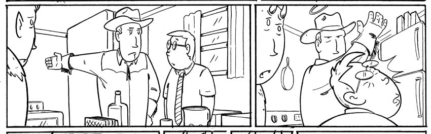
simple but effective. More motion and impact is felt here than in a whole annuals worth of splash pages. why? I'll tell you. set up. the first panel is motionless, the camera angle is dull, the background is unremarkable...the only thing you have to focus on is the hand. It is drawn waaaaay back. The readers eye is going deep into the world of that panel. The eye puts the reader behind all three characters. ONLY TO HAVE IT GET SLAPPED BACK OUT in panel two. ALSO look at the actual lengths of the two panels (I think I went over this before) A longer panel is perceived as taking more time than a short panel. So the long panel gives the eye time to pause and then the next panel being short and crowded seems to happen instantly. It's all relative get it? Its all a long tedious set up, every panel every page has a purpose, and every vanishing point has a purpose. You'll notice here that in panel one the background is a comfortable distance away, the refrigerator and ceiling lines are fairly unremarkable, but in panel two they are closer and have sharp angles to them that pull right into the swinging hand.
Now take a look at what is a fantastic page if I do say so myself
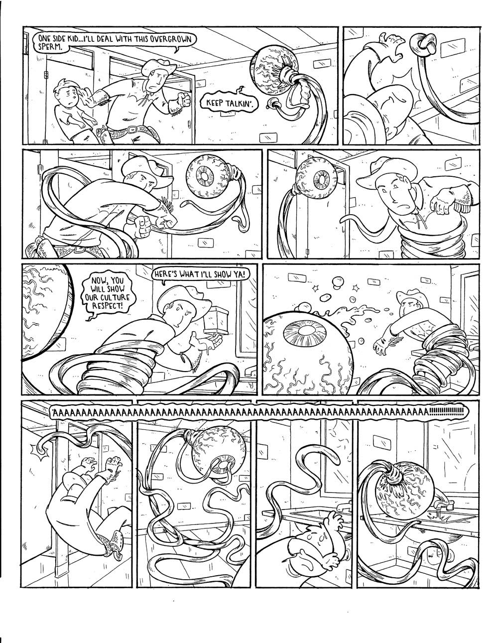
now let me break down why this works.
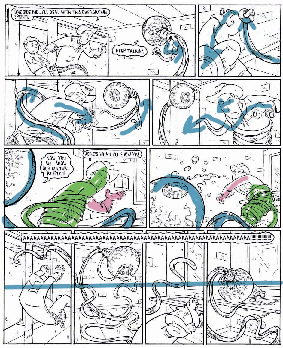
Panel one is an establishing shot...reminding the reader of the surroundings...building up some tension. there is not a lot of implied line work leading you into the next frame, and that is on purpose. The leaning forward of the cowboy and the motion of the tentacle subtly send the eye into the next panel. Again I want the reader to pause...to slow down, so that in panel two POW!
Panel Two and Three-short quick panel, with a drastic change in camera angle. Since this is a fight, and we want the illusion of continued movement, not just a pin-up, we need to start moving the readers eye around very quickly. All the major lines are circling around, moving the readers eye from panel to panel. (follow the arrows.) in fact in panel two and three the eyeball is back to back and could be perceived as simply, in a flip book sort of way, as turning it's "head" as you look from one panel to the next.
Panel 5 and 6. This is where the art of inking comes into play. In order to get the readers eye to go deep into the panel we have three distinct thicknesses of inked lines. The thicker the Line the more the image pops out and the closer it seems to be to the reader. The eye (blue) is really thick, even thicker than the border line, the tentacle and figure (green) is thinner but still thicker than the background and finally the hand is as thin as the wall and dispenser. the hand is perceived as being farthest away thanks in part to the line variances. so that BAM! in the sixth panel, after you have been looking nice and deep, an eyeball fulla soap is waiting for you first thing! The eyeball and soap is right up in your face thanks to the extra thick line really jumping out from the background. (now take a look again at the non colored arrow riddled version)...kinda neat huh?
the final series of panels is my own recipe. I needed a lot of stuff to be noticed that is also supposed to be going on at the same time. For the sale of the story and clarity of what is happening in the next page, some of the things need to be larger than others. For this reason, one long panel won't do. We need to notice the tentacle knocking the door open, we need to see the kid run off, the eye ball wincing in pain, and eventually washing itself off on the other side of the room away from the door that was knocked open. In order for this to be understood as happening mostly simultaneously we need all these panels to have a common connection. The scream breaks through the borders and ties them together...simple, effective.
BUT there is another element. The horizon line. (that would be eye level of the level of the camera)) Each panel has it's own set of vanishing points but they ALL share the exact same horizon line (blue), this keeps these panels from being a random mess of camera shots that make the eye feel like it's jumping around...because when the eye is jumping around the brain thinks more time is passing. Even more subtly, the words and the horizon line block off the screaming eye from everything else. An implied barrier is keeping the screaming eye the center of attention, even though all hell is breaking loose in the panels with tentacles, children and cowboys flying around.
So, there is that. a lot of implied motion in just one little page...and probably way to much thought. As always, this is an art not a science...some of this may have only worked because of some other element in here that happened on accident that i didn't even notice. Oh, I almost forgot in panel 6 there is a bunch of veins that are almost a mirror image of the soap squiggles hitting the eye. I don't know if that did anything for the flow but it gave me something to do with the veins besides hide a dirty word in them.
And now that I look at this page years after I drew it i realize that I forgot to draw Tex's Halo!
As always, homebase is here
https://www.arseniclullabies.com
NFT work here-
https://nftshowroom.com/arseniclullaby/gallery
https://makersplace.com/arseniclullaby/
Here are the other places to find me...my use of them is fluid, inconstant, susceptible to the whims and shifts of the paradigm
Torum-https://www.torum.com/u/arseniclullaby
Instagram- https://www.instagram.com/arsenic_lullaby_official/
twitter- https://twitter.com/arsenic_lullaby
bitchute- https://www.bitchute.com/channel/arsenic_lullaby/
youtube- https://www.youtube.com/user/arseniclullabycomics
The old soap in the eye move is easier with such a big target. I'm amazed at the ideas you come up with, but I also enjoy the peak behind the scenes. I'm sure good film directors take similar care in how they set up their shots, but you have to imply the movement and sense of time.
Nice breakdown! A lot - a whole lot - goes into the design of every page and every panel. It always impresses me just how much work and design there is, particularly when it's brought into the open like this.