Good day Hiveians!
Join me in analyzing the crypto markets!
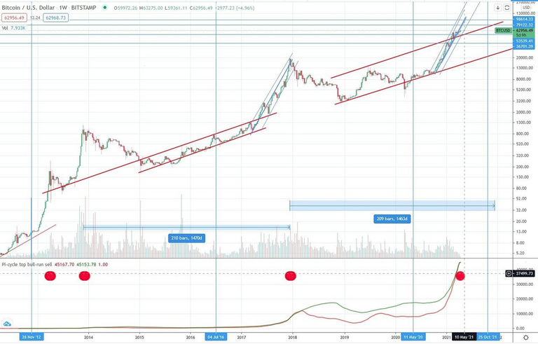
The Pi cycle Top indicator has been really good at hindcasting the last tops of the bull cycle.
However, recently it has also predicted the crash down to 30k of BTC. Therefore, it has proven to be a useful tool for forecasting as well.
So what happened when it "crossed" the last couple of times? Perhaps a closer look at this could give us further insight into the future market movement.
This is the market from 2012 to 2021. Notice how the cycle of 2013 had two crosses while the one in 2017 had a single one.
Zooming in more closely into this first range we can see what happened:
2013
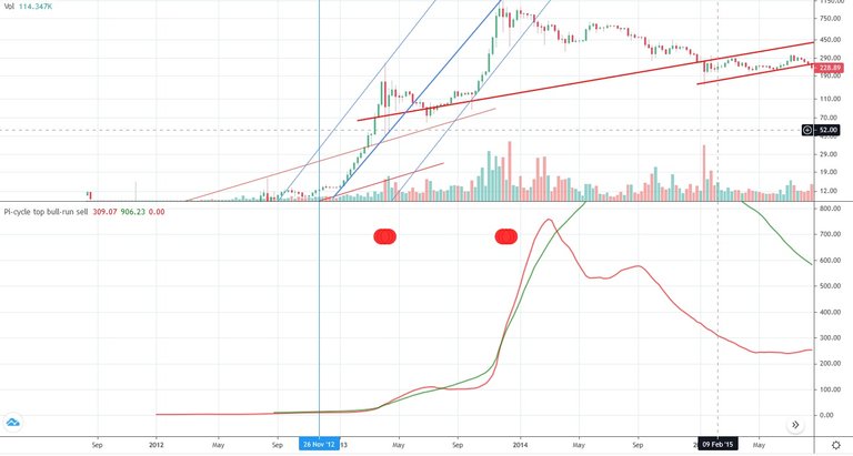
The orange line both times crossed the green one for several months. One could say that it crossed clearly. Also notice how the orange line after the first crossing didn't diverge very far from the green one.
2017
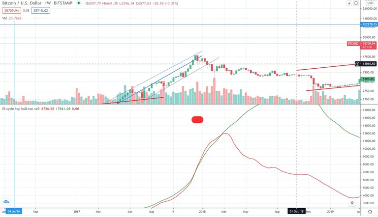
Here we only see one (major) crossing event. It looks very similar to the first one in 2013. It was also several months before the orange line crossed under the green one again, giving us once more a clear crossing event.
2021
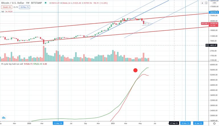
This time things look quite differently: The orange line barely crossed the green one. In fact, one could say that the two curves moved parallel to one another rather than there being a clear crossing. After only several weeks the orange line diverged from the green line again, but to the down side. Also notice how the slope of the green line has already began to decrease while the slope of the orange line has stabilized. Furthermore, the space between these lines is quite large while they are currently not moving further apart.
This is quite different to the other phases and most closely resembles the time before the second crossing event of 2013. In other words, I think there is a good possibility that we could see a repeat of a double crossing event like in 2013. The fact that the space between these lines is currently so large is very bullish as it leaves quite a bit of room for upwards movement. It would also be uncommon if we wouldn't see a more prolonged period of the orange line crossing the green line.
While this is only one indicator, and one has to look at others, it definitely looks like that there is at least the potential for much more upward movement.
As a general reminder: Please keep in mind that none of this is official investment advice! Crypto trading entails a great deal of risk; never spend money that you can't afford to lose!


Check out the Love The Clouds Community if you share the love for clouds!
Amazing... i have only be using moving average as indicator for this.
I love your analysis and which i can learn more from u. If u dont mind.
there is a lot out there (methods, indicators etc.) glad you found this helpful!