Multiply, Overlay, Soft light, Glow dodge, Colour...these are some of the many layer settings(modes) you can use when creating digital art.
I haven’t fully understood these different types of layer settings well enough to explain to you but I think I’m starting to be able to apply it to my artwork.
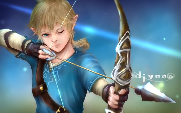
I’ve used all the layer settings I listed above to create this artwork. This is my first time using this many layer settings in one artwork and I must say I am excited to find out what I can do.
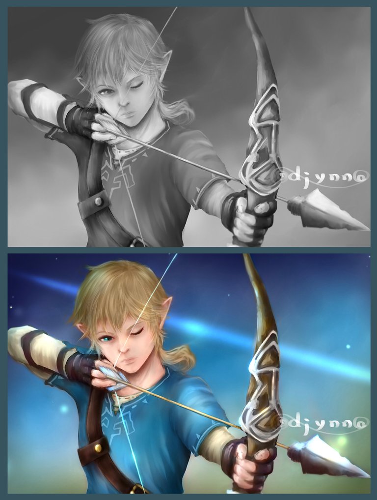
I created the grayscale drawing a little while ago. I am going to colourise it today.
If you would like to check out my grayscale drawing, HERE is the link.
First, I hid the background layer so that I could work on the character. Then I added environmental colours which are the colours that reflect from the ground (brown) and the sky (blue). I also added purple where shading was on the grayscale drawing and teal on the edge where the light hits the most. I used the Colour layer setting here. These colours were added on separate layers so that I can adjust the hue and saturation later.
乗算、オーバーレイ、加算発光、ラスター、ベクター、スクリーン...これはデジタルでお絵描きをする際に使うレイヤーのモードの一部です。
まだまだよく分からないことばかりで、それぞれのモードがどんな機能なのか詳しく説明できませんが、今回のお絵描きで少し使えるようになりました。
私のクリスタは英語で表記されていて、大体は分かるのですが、日本語表記が少々曖昧です。お許しください。今日は少し前にグリザイユ画法で描いたイラストに色をのせていこうと思います。
グリザイユで描いた際の投稿はこちら です。まずはキャラクターに色をのせるので背景は消しておきます。そして環境光をのせます。地面の反射を受ける部分に茶色、空の反射を受ける場所に青、そして影の部分に紫、光が当たって明るい先端の部分にティール(青緑)を加えました。
それぞれの色は、、、英語ではカラーというレイヤーモードなのですが、日本語で何と呼ぶが分かる方いましたら教えてください、、、を使っています。後で色調と彩度を変えられるようにレイヤーを分けています。
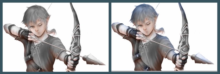
After the environmental colours were applied...I added local colour, the skin, the hair, and the clothes. These were again added on separate colour layers so that I can adjust the hue and the saturation later.
環境光の後は肌、髪、服など、これも同じカラーというレイヤーモードでレイヤーを分けて塗りました。
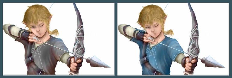
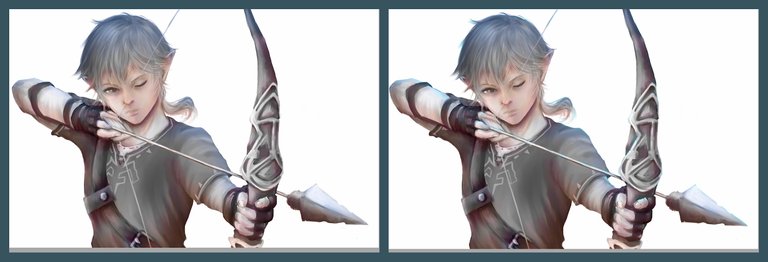
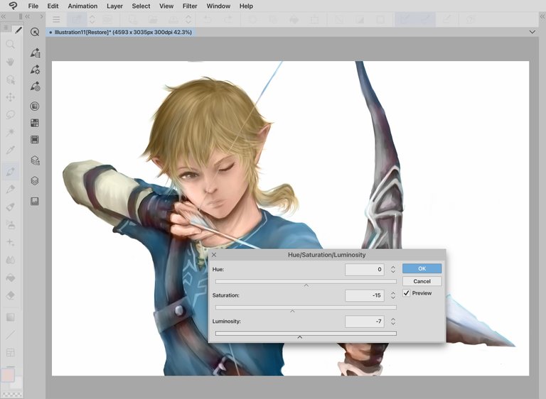
This is my first time adjusting the hue and the saturation on my artwork.
This is very useful because you don’t need to re-colour.
I adjusted the colour of the hair and the clothes.
実は色調と彩度の調整をするのは初めてです。
この機能があることは知っていましたが、使ったことがなく、今まで使ったことがなかったことを物凄く後悔しています。なんて便利な機能なんでしょう!塗った色が気に入らなかったらここで調節出来るので、消して塗り直す必要がありません。
ここでは髪と服の色を調節しました。
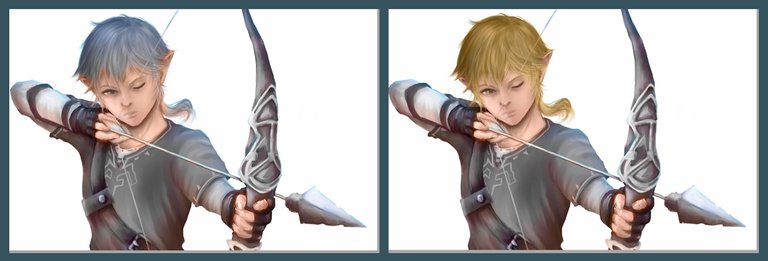
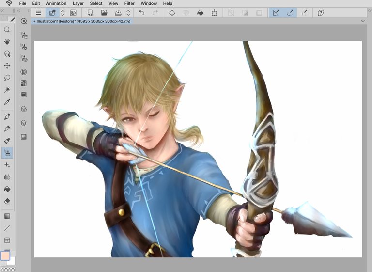
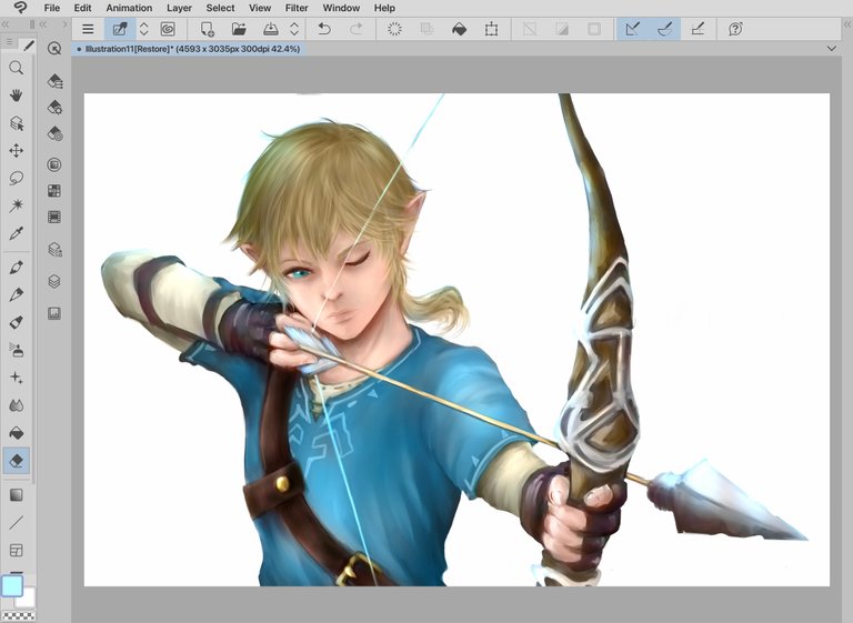
Many more different layers were used from here to complete the artwork. I couldn’t keep track of which screen shot was taken when but I used more Colour layer settings to add details, Soft light layer setting to brighten the face and add depth to the shadow. Glow dodge setting to make the bright areas brighter...and... Multiply and Overlay setting to...🤯🤯🤯 I think I used these layer settings to adjust the details of some area of the face and the bow.
I adjusted the hue and saturation of the clothes again to match the eye colour as well as skin and hair.
ここから先はさらにいろんなモードのレイヤーを使いましたが、どのスクショがどのレイヤーモードの物なのか、たくさんあり過ぎて分かりません。
カラーモードでさらに細かい部分に色をのせ、ソフトライトモードで肌の色を明るく、影の部分は影らしく、加算発光モードで明るい部分をさらに明るく、それからそれから...🤯🤯🤯...乗算、オーバーレイで確か、さらに細かい部分に色をのせて、再度、色調と彩度の調節をしました。
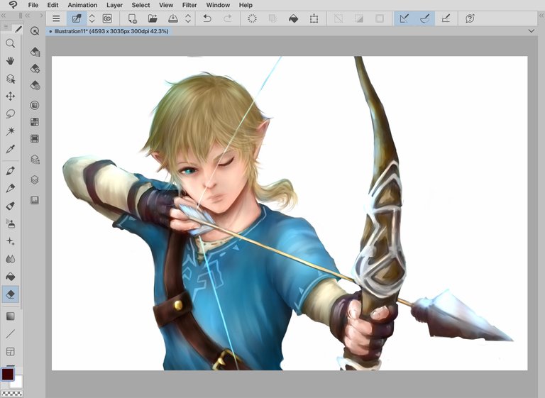
Finally, I colourised the background, added some lights and my artwork is complete.
Drawing in grayscale and colourising the grayscale drawing was quite interesting. I enjoyed both processes very much.
I hope to create more artwork with this style soon.
最後に背景にも色をのせ、光を加えて出来上がりです。
グリザイユで描いてから色をのせるという作業は、とても面白く興味深い作業でした。
今まで様々なスタイルでお絵描きをしてきましたが、これ良いかもです。自分にとても合った描き方なような気かします。
また頑張ります!
Tools used: iPad, Apple Pencil, Clip Studio, references
画材: iPad, アップルペン、Clip studio、ポーズなど参考

Now with the colored version, it turned out wow! I will definitely gonna try digital painting.
Thanks again for stopping by!
I was saying no way to digital drawing a few years ago. I'm so glad I tried it. I hope you can find it interesting as well.
Yeah, I have found it interesting but it seems to be difficult.
Very nice! The greyscale version was awesome, this is just level up! Good work Djynn!
Thanks again!
thats a useful post!
so am I... I can explain only some of them, but I can use them, and when you start trying these modes, you understand pretty quickly what are they doing and what quality they can give.
just one nuance: I bet a lot of users do not use photoshop for editing, they prefer to use different so called 'apps' with all sort of buttons / presets. they ofc will not find this info to be useful or easy to imply....
I guess some people prefer quick easy apps. I find it fun editing on my own ;)
Omg this looks amazing! Awesome job!
Thank you!!!
Congratulations @djynn! You have completed the following achievement on the Hive blockchain and have been rewarded with new badge(s) :
Your next target is to reach 11500 replies.
You can view your badges on your board and compare yourself to others in the Ranking
If you no longer want to receive notifications, reply to this comment with the word
STOPCheck out the last post from @hivebuzz:
Thank you!
You're welcome @djynn, keep going! 😊
やっぱり素晴らしい!
たくさんのレイヤーを重ねて、調整して、深い色調を作り出していけるのですね。
澄み切った青い色が美しいです。
弓矢を構えた緊張感が伝わってきます!
ありがとうございます!!!
2、3年前はデジタルでなんて描かないと言っていた私がこんなところまで来てしまいました。
実は絵を描く仕事をしたいと言っていた長女が諦めかけてしまっているので、こんなオバサンでも頑張れば出来るところ見せてくて頑張っていたのですが、色々とスキルアップするごとに楽しくて楽しくて😆
これからも娘たちに負けないように楽しんでいこうと思います。
なんと!長女さんへの励ましだったのですね。
@djynnさんの頑張りが@djynnさんご自身の楽しみにつながっているのが素敵です。
スキルアップしていくのは年齢にかかわらず快感ですよね。
きっと長女さんにも良い影響を与えていると信じてます!