Bienvenidos mis queridos amigos amantes del arte y artista.
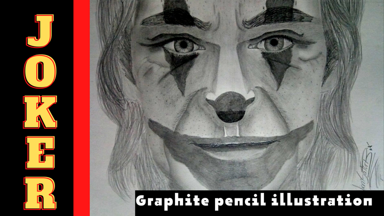
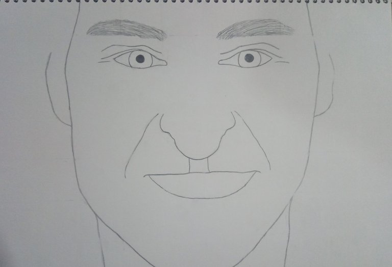
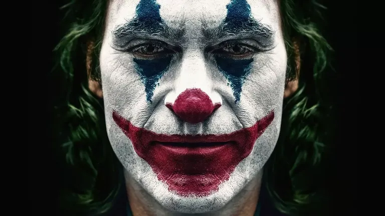
Si alguna vez has visto una película llamada The Joker este dibujo te recordará a esa buena película, en esta ocasión te presento un dibujo que realizado con lápices de grafito 2B y 6B de la marca prismacolor.
El estilo del dibujo es realista y me ha tomado 3 días en hacerlo debido a que he estado ocupado con algunas cosas en mi hogar, este dibujo también ha tomado su tiempo porque tome la decisión de difuminar mi dibujo solamente con pincel, ya que los algodones absorbían mucho el grafito de los lápices y me oscurecían mucho los dibujos.
Al igual que en la mayoría de mis dibujos, las imágenes que utilizo en referencia son sacados de una gran página de ideas y diseños llamada Pinterest.
Welcome my dear art lovers and artist friends.
If you have ever seen a movie called The Joker this drawing will remind you of that good movie, this time I present you a drawing that I made with 2B and 6B graphite pencils from prismacolor brand.
The style of the drawing is realistic and it has taken me 3 days to do it because I have been busy with some things at home, this drawing has also taken some time because I took the decision to blur my drawing only with a brush, because the cottons absorbed a lot of graphite from the pencils and darkened my drawings.
As with most of my drawings, the images I use for reference are taken from a great design and ideas site called Pinterest.
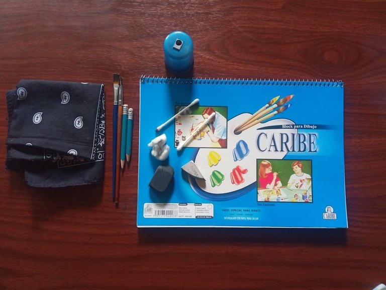
Los materiales que vamos a necesitar para elaborar nuestro dibujo son los siguientes:
*Un block de dibujo marca Caribe.
*Lápiz de grafito 2B y 6B
*Sacapuntas con depósito.
*Borrador.
*Pañuelo.
*Regla.
*Pinceles.
Como en la gran mayoría de mis dibujos, primero comienzo a llenar mi hoja de trabajo con cuadros de 4 centímetros de alto por 4 centímetros de alto, a esto se le dice efecto cuadrícula, esta técnica de dibujo se suele utilizar mucho para los dibujos grandes, posteriormente comencé a crear el boceto del dibujo.
The materials that we are going to need to elaborate our drawing are the following:
*A Caribe sketch pad.
*2B and 6B graphite pencils.
*Pencil sharpener with reservoir.
*Pencil eraser.
*Handkerchief.
*Ruler.
*Brushes.
As in most of my drawings, first I begin to fill my work sheet with squares of 4 centimeters high by 4 centimeters high, this is called grid effect, this drawing technique is often used for large drawings, then I began to create the sketch of the drawing.
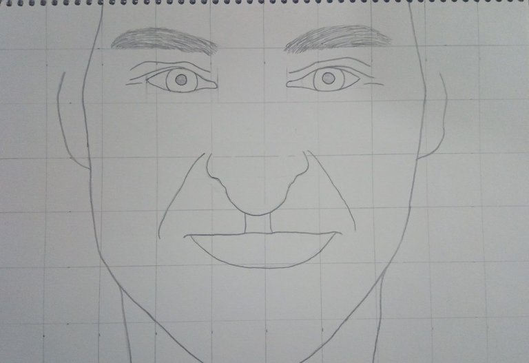
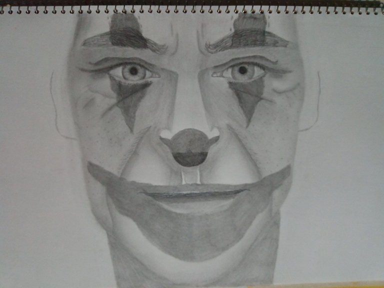
Seguidamente, comencé a eliminar las líneas que usé como guía para poder comenzar a trabajar con las primeras capas de valorizado en el dibujo.
Recuerden que, en mis anteriores publicaciones, al valorizar se le dice a la hora de “colorear” con lápices de grafito.
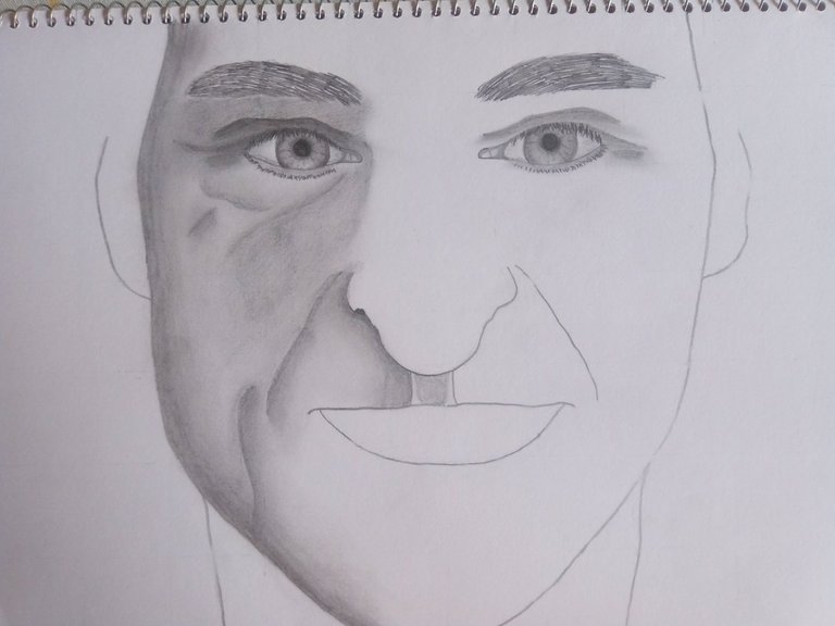
Honestamente, el dibujo no lo quería hacer tan igual a la imagen que use en referencia, ya que no me gusta hacer los dibujos tan iguales, prefiero tener algo propio, así sea un pequeño defecto, por lo que en este caso los ojos me quedaron un poco más abiertos que el de la imagen de referencia, se puede decir que está más contento que en la de referencia, ya que está un poco más deprimido, si has visto esta película sabrás el porqué.
Seguidamente, comencé a trabajar con el valorizado y difuminado de los ojos, comenzando con las rugosidades que se encuentran en la parte superior del ojo y por los laterales.
En la pupila, iris y esclerótica lo valoricé también, pero para poder hacer este tipo de difuminado tuve que usar un pincel de lo más delgado posible, por lo que tomo su debido tiempo, recuerden que los mejores dibujos son los que toman días en hacerlo, a menos que seas un profesional, aunque de igual manera incluso los maestros artistas se toman mucho tiempo en hacer un dibujo, lo digo por experiencia propia, cuando te toma días en hacer un dibujo quiere decir que lo estás haciendo bien.
Next, I began to remove the lines that I used as a guide in order to start working with the first layers of valorization in the drawing.
Remember that, in my previous publications, to valorize is called "coloring" with graphite pencils.
Honestly, I didn't want to make the drawing so similar to the reference image, since I don't like to make drawings so alike, I prefer to have something of my own, even if it is a small defect, so in this case the eyes were a little more open than in the reference image, you can say that he is happier than in the reference image, since he is a little more depressed, if you have seen this movie you will know why.
Next, I started to work with the enhancement and blurring of the eyes, starting with the roughness on the upper part of the eye and on the sides.
In the pupil, iris and sclera I also valorized it, but to be able to do this type of blurring I had to use a brush as thin as possible, so it took its due time, remember that the best drawings are the ones that take days to make, unless you are a professional, although even the master artists take a lot of time to make a drawing, I say it from my own experience, when it takes you days to make a drawing it means that you are doing it well.
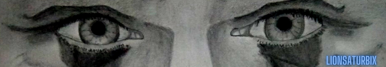
Podemos notar un poco más de cerca como me quedaron ambos ojos, la verdad que fue una experiencia muy emocionante a la hora de realizar estos ojos, al hacer un rostro y darle la expresión en la mirada no es fácil, ya que este personaje tiene que expresar algún sentimiento, por ejemplo en este dibujo, el cual expresa un sentimiento como de emoción con un poco de decepción, honestamente no es fácil agregar estas emociones en los ojos, pero con un poco de práctica podemos transmitir un sentimiento que hará que destaque en la gran mayoría de tus dibujos.
We can notice a little closer how both eyes were, the truth is that it was a very exciting experience when making these eyes, when making a face and giving it the expression in the look is not easy, since this character has to express some feeling, for example in this drawing, which expresses a feeling like emotion with a little disappointment, honestly it is not easy to add these emotions in the eyes, but with a little practice we can transmit a feeling that will make it stand out in the vast majority of your drawings.
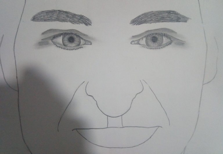
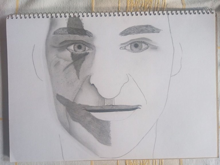
Posteriormente, comencé a valorizar el lado izquierdo del rostro, por lo que primero use el lápiz 2B para crear la primera capa de valorizado, seguidamente con la ayuda de un pincel comencé a difumar cada una de las partes que anteriormente había valorizado como los bordes del rostro, las profundidades de la nariz y la barbilla.
La parte de las arrugas que están cerca de los labios fue lo que más se me hizo interesante, ya que es la primera vez que dibujo rugosidades en un rostro, por lo que tenía que tener mucho cuidado con estas profundidades, ya que tenía que hacerlo lo más realista posible.
Al difuminarlo podemos notar rápidamente la diferencia, honestamente me encanto mucho este proceso de valorizado y difuminado, puedo notar que las practicas y el curso me han servido de mucha ayuda, tengo ganas de extenderme un poco más y dibujar en digital una vez más, ahora con la experiencia que tengo siento que mis dibujos en digital me quedaran mucho mejor.
También agregué una rugosidad de vejes por la parte de la barbilla, ya que según nuestra imagen de referencia lo tiene en ese sitio.
Afterwards, I started to enhance the left side of the face, so first I used the 2B pencil to create the first layer of enhancement, then with the help of a brush I started to blur each of the parts that I had previously enhanced such as the edges of the face, the depths of the nose and the chin.
The part of the wrinkles that are near the lips was what I found most interesting, since it is the first time that I draw wrinkles on a face, so I had to be very careful with these depths, since I had to make it as realistic as possible.
By blurring it we can quickly notice the difference, honestly I really loved this process of enhancing and blurring, I can see that the practices and the course have helped me a lot, I want to extend myself a little more and draw in digital once again, now with the experience I have I feel that my drawings in digital will be much better.
I also added a roughness of old age in the part of the chin, since according to our reference image he has it in that place.
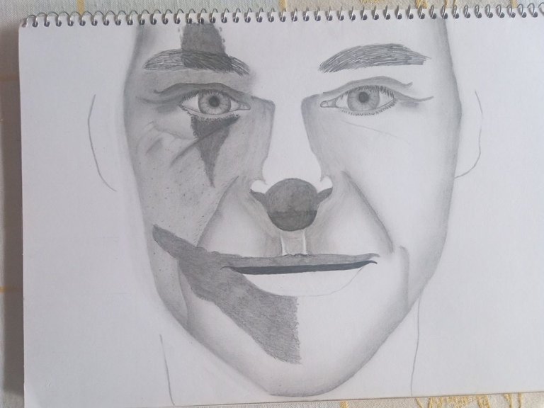
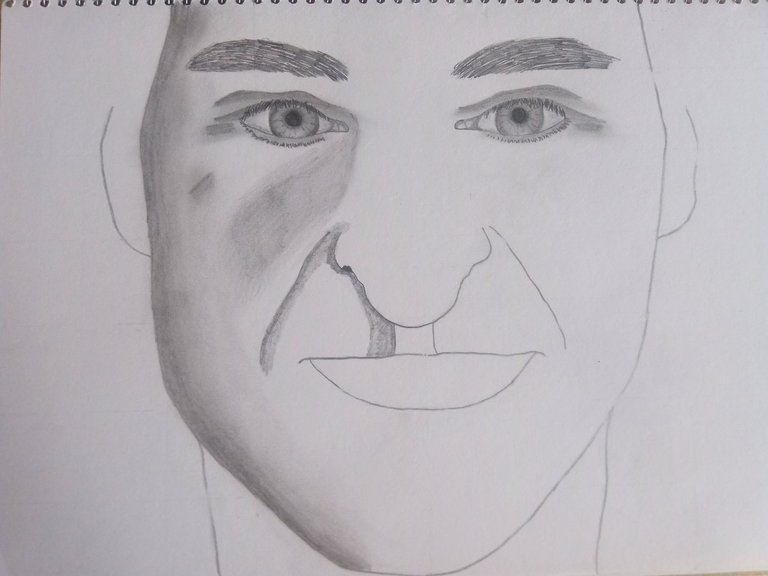
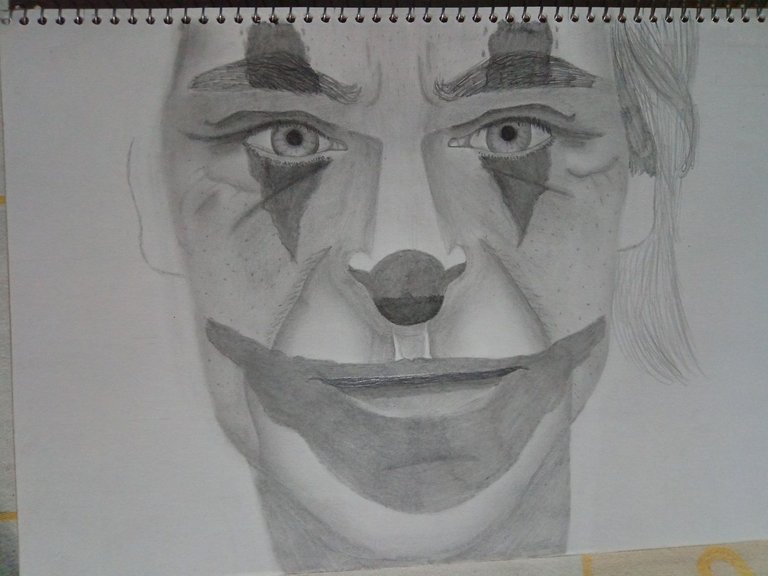
Luego de hacer este proceso de valorizado y difuminado, me había dado cuenta de un pequeño detalle que hacía que mi dibujo se observara un poco extraño, ya que pareciera que mi Joker había comido demasiadas hamburguesas y engordo mucho, por lo que tuve que recortarle un poco la barbilla y cachetes, ya que el Joker no es gordo, sino delgado, con la ayuda con el borrador pude borrar estas partes que ya había valorizado y difuminado, asegúrense de tener un borrador nuevo o que no esté vencido, porque de lo contrario te ensuciara el dibujo, lo menciono por experiencia propia.
También agregué las marcas de pinturas que tiene en el rostro, como en la parte superior he inferior del ojo, por la parte de los labios también tiene marcas de pintura, ya que este personaje sentía cierta atracción por los payasos, por lo que este se creía uno, aunque su trabajo en la película se basaba en ser el payaso de los niños.
Otra de las cosas que también agregue en mi dibujo, aunque no es nada fácil hacerlo, son las porosidades de la piel, ya que la piel no es del todo plana, sino que tiene porosidades al igual que todos los rostros del mundo, no es un dibujo anime lo que estoy haciendo, sino un dibujo realista.
Después comencé a trabajar con el lado derecho del rostro, valoricé la nariz y las arrugas, también le agregue las marcas de pinturas restantes y agregue las porosidades de esta otra parte del rostro.
After making this process of valorized and blurred, I had noticed a small detail that made my drawing look a little strange, because it seemed that my Joker had eaten too many hamburgers and got fat, so I had to cut a little bit his chin and cheeks, since the Joker is not fat, but thin, with the help of the eraser I was able to erase these parts that I had already valued and blurred, make sure you have a new eraser or that it is not expired, because otherwise it will dirty the drawing, I mention it from my own experience.
I also added the paint marks that he has on his face, as in the upper and lower part of the eye, on the part of the lips he also has paint marks, since this character felt some attraction for clowns, so he thought he was one, although his work in the movie was based on being the clown of the children.
Another thing that I also added in my drawing, although it is not easy to do, are the porosities of the skin, since the skin is not completely flat, but has porosities like all the faces in the world, it is not an anime drawing what I'm doing, but a realistic drawing.
Then I started to work with the right side of the face, I added the nose and the wrinkles, I also added the remaining paint marks and added the porosities of this other part of the face.
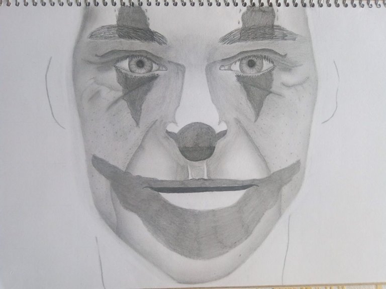
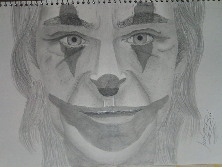
Otra de las cosas que acomode de mi dibujo es la nariz, ya que me quedo con la nariz un poco grande, como este personaje es delgado, la nariz también lo tiene, ajuste más las profundidades de la piel y las arrugas para hacerlo lo más realista posible.
Por último comencé a trabajar con el cabello, el mismo lo hice haciendo trazos un poco largos de diferentes posiciones para que se viera un poco realista, aunque debo seguir practicando con mi estilo de cabello.
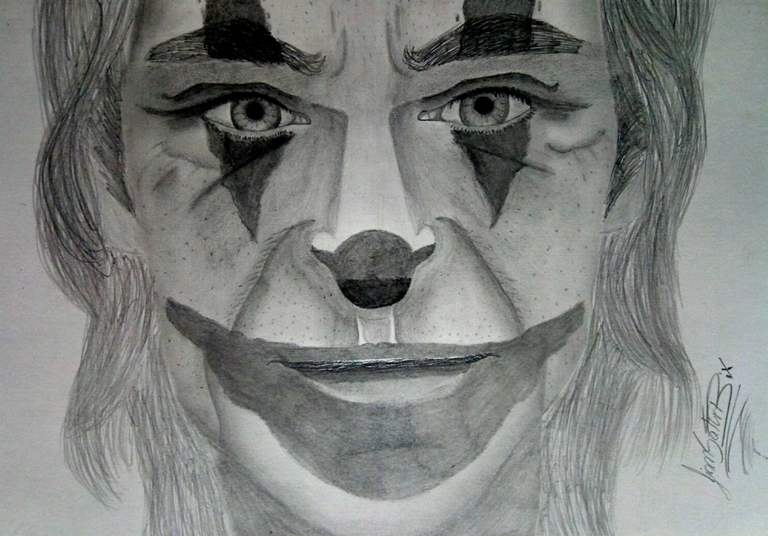
De esta forma pude realizar mi dibujo amigos.
Recuerden esta frase, no es necesario ser un gran maestro para lograr ser un gran artista, palabras sabias de un buen amigo que quizás muchos conozcamos.
Las fotos fueron tomadas con la ayuda de mi teléfono Bison X Designed By Umidigi.
La imagen de referencia se encuentra en la parte inferior de este texto, debajo de ella podrán encontrar la fuente de la misma, el cual los llevara a la página que utilizo para encontrar las imágenes en referencia que uso para dibujar.
Y Así finaliza la publicación de hoy amigos, espero les sea de su agrado y que hayan aprendido algo nuevo el día de hoy con mi publicación, hasta la próxima.
Another of the things that I adjusted in my drawing is the nose, since I have a nose a little big, as this character is thin, the nose also has it, I adjusted more the depths of the skin and the wrinkles to make it as realistic as possible.
Finally I started to work with the hair, I did it making long strokes in different positions to make it look a little realistic, although I have to keep practicing with my hair style.
This way I was able to make my drawing friends.
Remember this phrase, it is not necessary to be a great master to be a great artist, wise words of a good friend that maybe many of us know.
The pictures were taken with the help of my Bison X Designed By Umidigi phone.
The reference image is at the bottom of this text, below it you can find the source of it, which will take you to the page I use to find the reference images I use to draw.
And so ends today's publication friends, I hope you like it and that you have learned something new today with my publication, until next time.

![]()


Discord LionSaturBix#7545

Source / Fuente Castle of Castlevania
Source / Fuente Terra Blade of Terraria
Los separadores son de mi autoría, Las fotos fueron tomadas con la ayuda de mi telefono Bison X10 Umidigi , las ediciones del GIF son creados por mí.
The photos were taken with the help of my Bison X10 Umidigi phone, the GIF editions are created by me.
Programas que utilicé para crear mi diseño es este:
This is the program I used to create my design:
Gif y portada cortesía de Canva
Gif and cover courtesy of Canva
Traducido por Deepl

The rewards earned on this comment will go directly to the people( @lionsaturbix ) sharing the post on Twitter as long as they are registered with @poshtoken. Sign up at https://hiveposh.com.
Congratulations @lionsaturbix! You have completed the following achievement on the Hive blockchain and have been rewarded with new badge(s):
Your next target is to reach 500 posts.
You can view your badges on your board and compare yourself to others in the Ranking
If you no longer want to receive notifications, reply to this comment with the word
STOPTo support your work, I also upvoted your post!
Check out the last post from @hivebuzz:
Support the HiveBuzz project. Vote for our proposal!