For a little bit of fun, I was playing around with the Hive logo in Illustrator. As I have said earlier, I think it is a great logo that brings with it a lot of options for experimentation. It is square enough to create strong lines, "round" enough to be centered well and the hexagonal angles gives it the properties of an isometric projection and therefore a sense of depth.
But what is very cool is its ambiguity - and I don't mean it is of an unknown gender. It is a Necker Cube of sorts.
This is the basic shape of the Hive logo, but which surface is the floor, or does it have a roof? Is it solid or hollow?
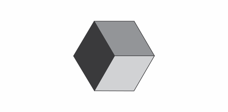
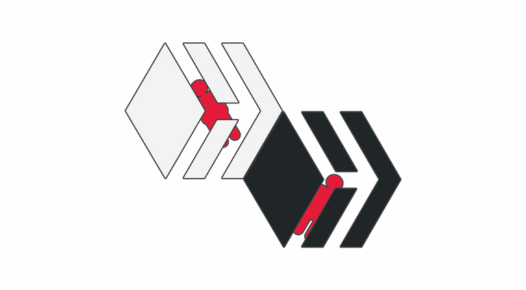
Depending on how you look at it or perhaps your eyes, the box is ambiguous as it doesn't define if the middle point is the closest to the viewer or the furthest away. In the next image, I have put a reference point to provide a sense of location. If you flick your eyes between the two, you will likely get what I am talking about.
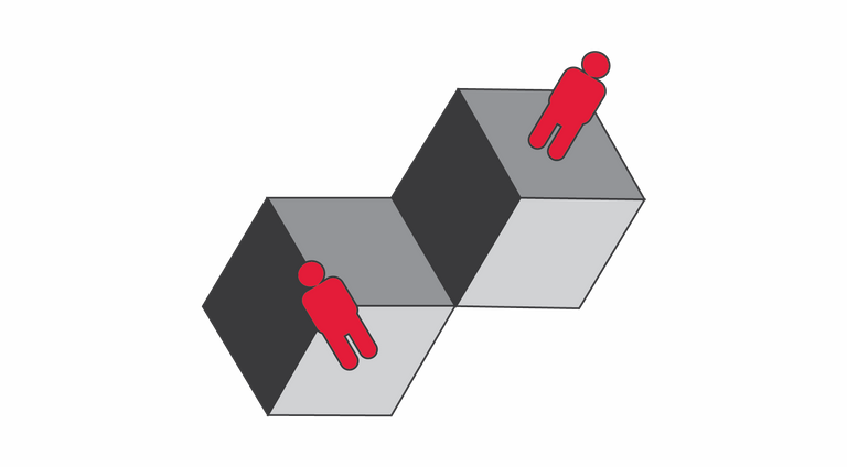
And here we have the same orientations with the Hive logo in place of the "solid" box, which may appear empty depending on which focus you use. I will go out on a limb and predict that most people see it as a solid box with a "roof", instead of the inside of a box with two walls and a "floor", but that could just be my eyes telling my intuition what others should see ;D
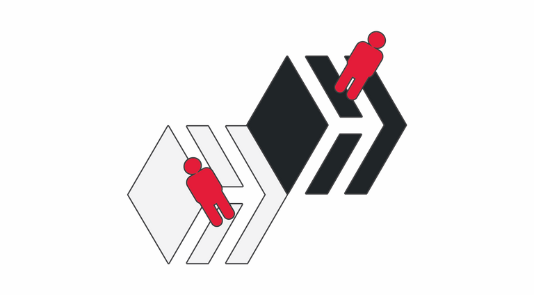
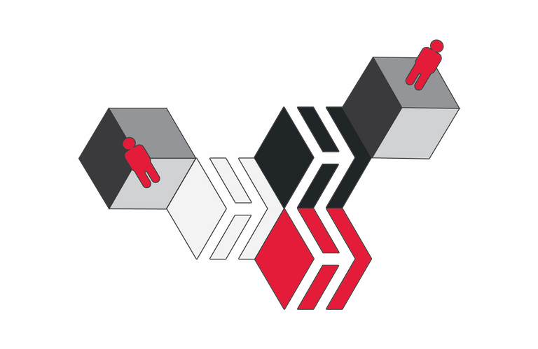
And at the bottom here we have trapped them both behind Hive bars - we have put one in the black box and added a floor to the grey, where there used to be no wall at all. We get the sense of looking "down" at one and "up" at the other. As said, I think it is a pretty cool logo that brings a lot of versatility for those with a little more artistic talent than myself to play with.
Playing around with it reminds me of my high school Graphics class, where I would sit at a drawing board with a T-square, set-squares and Rotring pens drawing projections by hand. One of the things I seem to be good at is building building in my imagination and orientating them as I choose in various dimensions. I think this is part of the reason I can see the potential in so many things, even if the current reality barely hints at it.
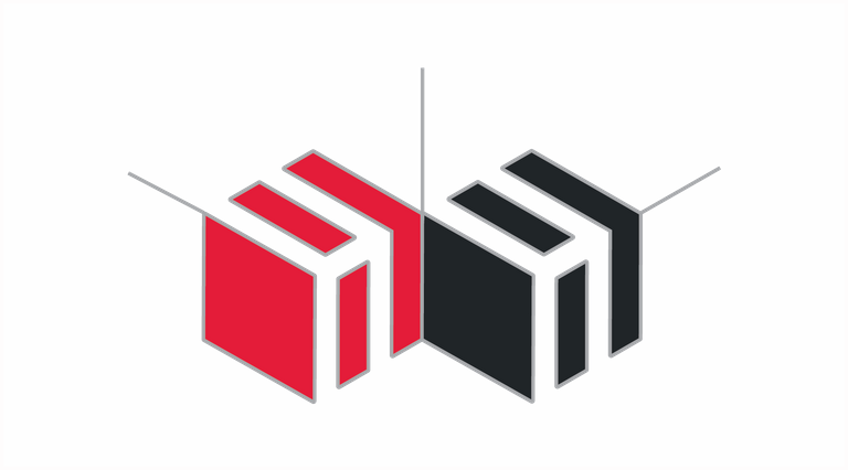
Change the angle by 1/12th, and it opens up another set of possibilities as it gives a change in depth that allows for it to be "places on a floor" or against a wall. Pretty cool.
Anyway, I like the Hive logo as it gives so much to work with and I had a lot of fun playing around in illustrator, something I haven't had the chance to do for a very long time. Hopefully, I am not the only one playing around with the logo and eventually, it will be a ubiquitous symbol known around the world for having the greatest community on and off a blockchain :)
Taraz
[ Gen1: Hive ]
Looks like you're having way too much fun with that logo XD It is rather versatile isn't it.
And you bringing up the stuff with the cubes is yet another reminder (because I don't see enough of these things -_-) that they wreak havoc on my eyes as I tend to see a lot of the things you're supposed to switch between simultaneously and it's a headache (basically your little indicator people are both standing on the floor and floating in space simultaneously) XD
Ahh tech drawing class. I hated it XD Only useful thing i got out of it was learning how to do perspective lines which I hadn't been able to figure out til about then (and to be perfectly honest up to the point where I started using 3d bases instead of just drawing, I still only ever dropped them in if there were buildings involved or I couldn't do it in my head XD)
I am able to choose which I see, which is kind of funny in some respects, off-putting in others :)
I work with a lot of engineers and technical designers. The older ones that used to draw manually tend to have a better spatial awareness and understanding than those who grew on 3d only. They have a better imagination for the workings of something,. I think it is because they have had to think through the process originally, whereas the CAD programs do a lot of the thinking for you.
I'll take your word for it, I don't think I know any engineers or technical designers, I barely know other 3d artists, and the ones I do know have no problems whatsoever with spatial awareness or figuring out how things work XP
I think there is a difference in the way something is learned and remembered, physical training seems to change the perception.
I just realized that until I saw your post I have not pay attention at all at the Hive logo. I just knew it was white and red and that`s about it. Thanks for the eye opener!
Symbols matter as they come to represent our meaning and affect attachment. Understanding a little of why and how helps us better control the affects they have on us, and the reactions to them.
Hive logo is indeed unique and awesome. Presently working on some animation with the Hive logo in After Effect. Hopefully I'll be posting them when I'm done too.
By the way, you did great with the illustrator.
Sounds good. BTW - I liked your intro post the other day =)
I have never used After Effects, is it worth playing around with for me you think? Time is always my issue for learning new things at the moment though... one day
Thank you ☺.. I invite you to check out my quarantine story. Who know? You might like it too.
Yeah, it's worth playing around with. I don't think, but I know it would worth it 😉. I'm also looking forward to learning Illustrator too someday. Honestly time hasn't been anyone's friend. We'll keep trying until we adapt. Looking forwards to seeing you produce something with After Effects 😀😉
Great post. Thank you!
Cheers
This is VERY fun to look at 👍👍
Glad you liked it :)
Red People, Mhm, Native Hivers.
And in Hive Red
Is that the exact color code? 🎈
you can find them here:
https://hive.io/brand/
Logo to logos