Hello group! The wait is over and I come to present the facades of the housing project which I have been narrating previously with some of its interior spaces. In this publication I will be talking about the concept, ideas and everything related to present the facades of this project.
Starting from the conversations and references of the client, knowing the order, their tastes, ideas and it is essential to respect and importance his artistic career in the criteria, since the client is a young person who works in the artistic environment. One of the criteria that he asked me to include was "a minimalist house" and without a doubt his references were in accordance with the criteria of minimalism. Also in the references I saw remarkable the taste of him in the rustic finishes, the gray tones and the wood.
Concept
• To take into account the beginning of the design of the facades, the function that exists in the spaces within the house was of vital importance, for this the internal spatial distribution was first developed.
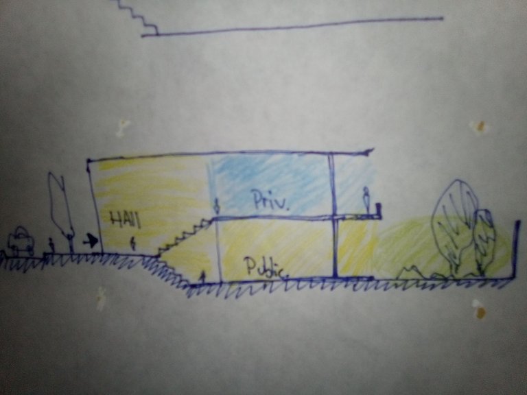
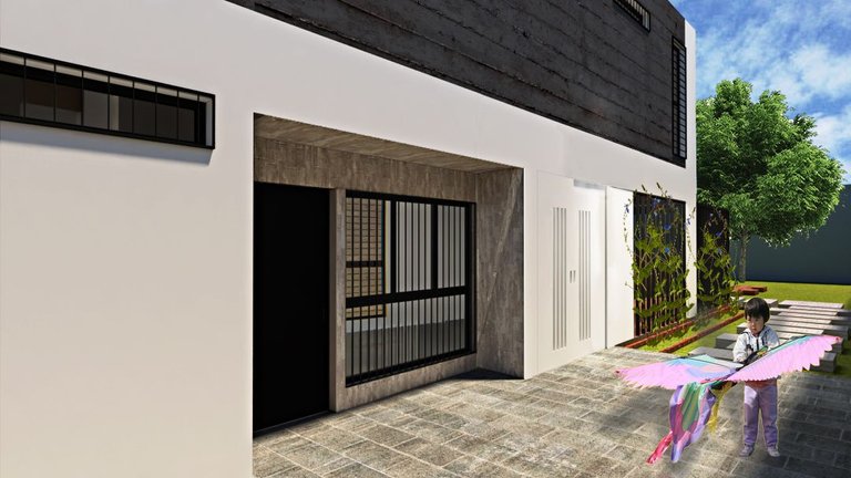
• The access of the house, which the idea of access was to generate at the sidewalk level (currently the access must descend from the street level) and since being inside the shelter of the house, I have an access hall that receives and contains the stairs which this space would function as a small mezzanine, then go down to the ground floor or go up to the upper floor. Also the idea of this half-level access hall is to reduce the costs of filling the ground since the current house is below street level, when I raise it for a direct entry it will generate filling, it should be noted that it also I studied the probability of making a space under this access but I would have to excavate to give me the heights so I did not consider it feasible in my criteria to reduce costs.
• A functional home with comfortable spaces and allowing the user to have space over time to make multipurpose spaces based on the existing approach, this taking into account that we make architecture for a delivery, but architecture will last a long time and its life internal will evolve according to its users and their use, so I wanted to be generous with the spaces projected. It is not a house with minimal measures, but neither is it a house with space for the largest furniture on the market.
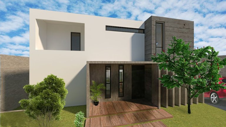
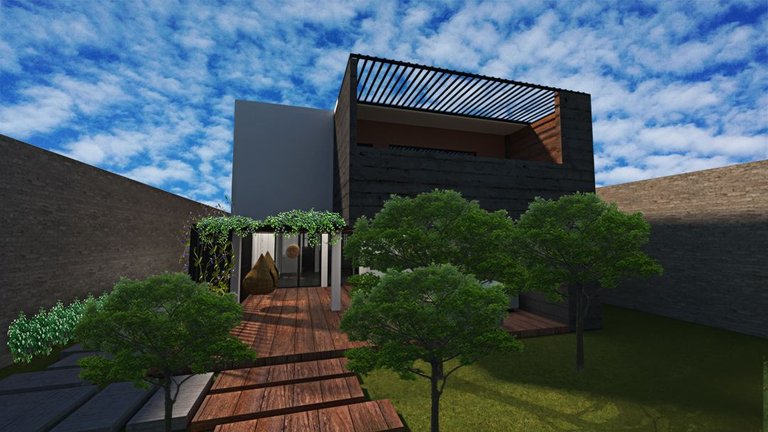
• The facades are moved so that the upper floor provides shade to a covered space on the ground floor.
• The solar orientation of the facades and their interior spaces was taken into account in defining how closed or open the façade would be, since the context of this house is in the tropics and as well as the sunlight is used in all spaces of my design, at the same time I must take care not to overexpose my spaces with light, making the user uncomfortable or turning much hotter spaces into environments full of steam. So in the most unfavorable orientations I have the East and West orientation in which I close myself more and generate elements to protect myself from the sun and at the same time allowing a modest permeability with the outside.
• The winds, all spaces get natural ventilation
Orientation and openings
I protect the facades by taking care of the window openings in the points where I must take care of the sun so as not to overheat their interior spaces, also due to the issue of privacy and intimacy that is sought in some spaces, despite that I always take care to have views available either in less or more proportion and take advantage of the winds when they can come with variations of direction.
Materials
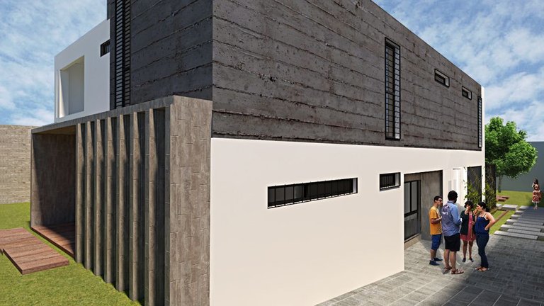
The aim is to use few materials for the facades in which they generate a dynamism and compositional game that works as an envelope for the façade and in the functional aspect helps the thermal insulation of the walls. The starting point for choosing the materials were the references of the client in which the minimalism that was proposed was ideal to be able to rationalize the materials in a very pure and creative way. It began with the facade painted in matt white, seeing how the house looked like a blank canvas, the textures and concrete finishes with two-tone microcement were added, which in the case when evaluating costs is also an alternative to use porcelain tile .
Shape
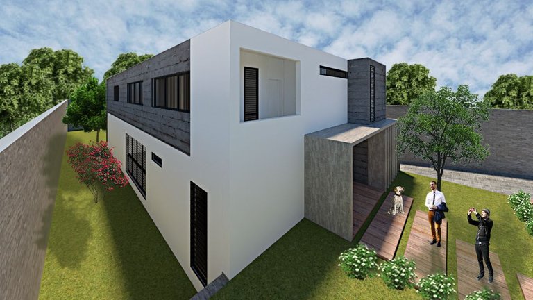
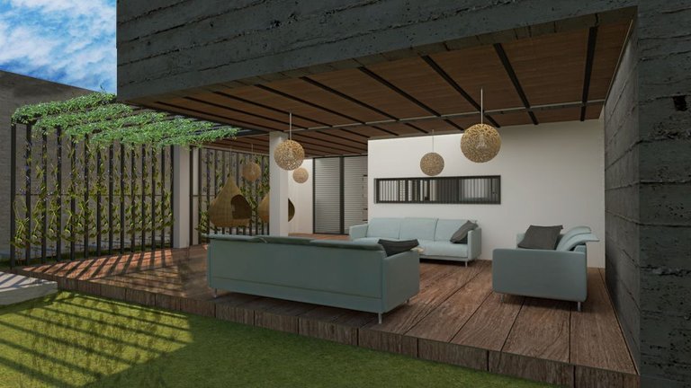
By dividing the private and public functions into two floors, it is decided that in the back part of the upper floor it acts as a sunscreen with a projection and in this way create a space for permanence on the ground floor, this covered space for permanence is semi-open and It is the transition space between the interior of the house and the exterior of the patio, which, as it has a semi-open space for permanence, works as a support for the activities that the client may allocate for the patio in the future. As a plus to this space, it can also function as an exhibition, meeting or conference space, a warehouse was also designed on the hidden side of one of the facades to be able to store items that may be needed for these activities and to support the maintenance of the patio and the pool.
The maximum height allowed in the construction regulations of the town is used, in the main facade despite the fact that I am 5m high, by generating a white L-shaped element, and the vertical sunshades give me a feeling that it was a lot larger. In the other facades if I can take advantage of the 6m of available height since the unevenness of the land is added.
A pure form was used to create spatial and visual continuity, while in the entrances a variety of elements are used to provide shelter, protect from the sun and rain and demarcate that this is where it is accessed is where the sensory walk that I try to generate with my architecture proposal.
Spanish
Mi proyecto de vivienda minimalista
Hola grupo! Se acabó la espera y vengo a presentarles las fachadas del proyecto de vivienda el cual les he ido narrando anteriormente con algunos de sus espacios interiores. En este publicación les estaré hablando del concepto , las ideas y todo lo referente para presentarles las fachadas de este proyecto.
Partiendo de las conversaciones y referencias del cliente conociendo el encargo, sus gustos, ideas y fundamental tener respeto e importancia su trayectoria artística en los criterios, ya que el cliente es un joven que trabaja en el medio artístico. Unos de los criterios que me pidió incluir fue “una casa minimalista” y sin duda sus referencias fueron acorde a los criterios del minimalismos. También en las referencias vi notable su gusto en los acabados rústico,los tonos grises y la madera.
Concepto
• Para tener en cuenta el inicio del diseño de las fachadas fue de vital importancia la función que existe en es los espacios dentro de la vivienda, para esto se desarrollo primero la distribución espacial interna .
• El acceso de la vivienda, el cual la idea del acceso era generar en nivel de acera (actualmente el acceso hay que descender desde el nivel de calle) y ya al estar dentro del cobijo de la casa, tengo un hall de acceso que me recibe y contiene las escaleras el cual este espacio funcionaria como una pequeña mezzanina, para luego bajar a planta baja o subir a planta alta. También la idea de este hall de acceso en medio nivel es para disminuir los gastos de relleno del suelo ya que al estar la casa actual por debajo del nivel de la calle, al yo elevarlo para un ingreso directo me generará rellenar, cabe destacar que también estudié la probabilidad de hacer un espacio debajo de este acceso pero tendría que excavar para que me den las alturas entonces no lo consideré factible en mi criterio de reducir costos.
• Una vivienda funcional con espacios cómodos y permitiendo que a lo largo del tiempo el usuario tengo espacio para hacer espacios multiusos partiendo en el planteamiento existente, esto teniendo en cuenta que nosotros hacemos arquitectura para una entrega, pero la arquitectura perdurara mucho tiempo y su vida interna evolucionará según sus usuarios y su uso así que quería ser generosos con los espacios proyectados, no es una casa de medidas minimas, pero tampoco una casa con espacio para los muebles más grandes del mercado.
• Las fachadas se desplazan para que la planta alta de sombra a un espacio techado en planta baja.
• La orientación solar de las fachadas y sus espacios interiores se tomó en cuenta en definir que tan cerrada o abierta seria la fachada, ya que el contexto de esta vivienda es en el trópico y así como la luz del sol se aprovecha en todos los espacios de mi diseño, al mismo tiempo debo cuidar de no sobre exponer de luz mis espacios incomodando al usuario o convirtiendo los espacios mucho más calurosos en ambientes llenos de vapor. Entonces en las orientaciones más desfavorables tengo la orientación Este y Oeste en que me cierro más y genero elementos para protegerme del sol y al mismo tiempo permitiendo une modesta permeabilidad con el exterior.
• Los vientos, todos los espacios obtienen ventilación natural
Orientación y aberturas
Protejo las fachadas cuidando las aberturas de las ventanas en los puntos en que me debo cuidar del sol para no sobre calentar sus espacios interiores, también por el tema de la privacidad e intimidad que se busca en algunos espacios, a pesar de eso siempre cuido tener vistas disponibles ya sea en menor o más proporción y aprovechar los vientos cuando puedan venir con variantes de dirección.
Materiales
Se busca usar pocos materiales para las fachadas en que estos generen un dinamismo y juego compositivo que funcione como envolvente de la fachada y en el aspecto funcional ayude al aislamiento térmico de las paredes. El punto de partida para escoger los materiales fueron los referentes del cliente en el cual el minimalismo que se planteaba era ideal para poder racionalizar los materiales de una manera muy pura y creativa. Se empezó con la fachada pintada de blanco mate , al ver como se veía es casa como un lienzo en blanco se añadió las texturas y acabados de concreto con microcemento de dos tonos, los cuales en el caso al evaluar costos también es una alternativa usar porcelanato.
Forma
Al dividir las funciones privadas y publicas en dos plantas se decide que en la parte posterior de la planta alta actue como protector solar con un volado y de esta manera crear un espacio de permanencia en planta baja, este espacio de permanencia techado es semi abierto y es el espacio de transición entre el interior de la casa y el exterior del patio, el cual al tener un espacio de permanencia semi abierto funciona como apoyo a las actividades que en el futuro el cliente pueda destinar para el patio. Como plus a este espacio, también puede funcionar como espacio de exposiciones, reunión o conferencias, también se diseño un depósito del lado oculto de una de las fachadas para poder almacenar elementos que puede necesitar para estas actividades y en apoyo al mantenimiento del patio y la piscina.
Se usa la máxima altura permitida en las normas de construcción de la localidad, en la fachada principal a pesar de que tengo 5m de altura, al generar un elemento en forma de L blanco, y los parasoles verticales me da una sensación de que fuera mucho más grande. En las demás fachadas si puedo aprovechar los 6m de altura disponible ya que se suma el desnivel que tiene el terreno.
Se aprovechó una forma pura para crear continuidad espacial y visual, mientras que en los accesos se emplean una variedad de elementos para dar cobijo, proteger del sol y lluvia y demarcar que aquí es donde se accede es donde empieza el paseo sensorial que intento generar con mi propuesta de arquitectura.
It's a pure joy to have our own project built in real life. The details are worth appreciating, I found our façade to be really interesting with different levels.
Good luck and have a great journey in your career:)
Thanks you
Thank you very much for this
Your content has been voted as a part of Encouragement program. Keep up the good work!
Use Ecency daily to boost your growth on platform!
Support Ecency
Vote for Proposal
Delegate HP and earn more
Saludos, la verdad me agrado bastante el desarrollo que llevaste, tiene unos detalles menores con profundidad pero asumo es problema del software mas que todo :P, igual esta buenisimo el post y muy bien desarrollado el concepto que deseaba el cliente :)
Hola saludos, gracias!
Que te refierew con detalles de profundidad?
Cómo anécdota que no estoy seguro si pueda ser eso que no renderizo en la máxima calidad, renderizo en calidad media (por los momentos) digamos que para ampliar la vida útil de mi equipo
Ah me refiero al detalle tridimensional que se ve un poco mal, como si la dimensión z de profundidad no estuviere bien configurada, claro no te se decir por que no soy de esa área, yo estudie mucho la matemática, fui a la universidad en carrera de matemática pura y si bien eventualmente la abandone por situación país fuera de mis manos, durante mucho tiempo me encontré estudiando geometría, para ser exacto pase cuatro materias de geometría obligatorias y dos opcionales que eran relacionadas a geometría, y pareciere desde mi experiencia, que no estas calculando bien la profundidad. Eso es todo xD
Capaz es una limitación del software y yo estoy hablando sobre detalles que están fuera de tus manos, de igual forma me encanto el diseño, muy modesto, hermoso y moderno.
Greetings friend @feiderman. Excellent description, excellent work. Go ahead, with professionals like you, our country will succeed. I congratulate you. Receive a strong virtual hug full of positive energy and lots of light.
Muchas gracias por tus palabras, bendiciones
Its so pleasant to see own project completion. Congratulation. I am sure you got sense of achievement as your design is great! Thanks for sharing!
Well done @feiderman ! We're happy to inform you that this publication was specially curated and awarded Runner-up in Architecture Brew #34. Congratulations!
Subscribe to Architecture+Design, an OCD incubated community.