We all are well aware of the importance of colours in every field. But rarely we know how polychormy and it's influence in architecture and interior designing.
For next few minutes I want to impart a different kind of perspective and information on colours in architecture with reference to Polychromy!

Must be wondering what actually Polychromy is?
It's a simple exercise of combining different colours into artistic way!
While reading the book called 'The Architectonic Colour' I pondered upon Polychromy term and though about why I never came across such term before, but it's better late than never.
I haven't read the book completely yet but figure out the presence of Le Corbusier's theories all rolled up to polychromy which led me to unfold various aspects.
.jpg)
.jpg)
The history of polychromy
It lies in 19 th century and basically it's about the colours, their usage in sculptures, art and architecture. The first presence was discovered in ancient Greek sculptures which had traces of colours in it which were faded by the time but still relevant.
Later architects considered the importance of chromatic colours in not only interior and exterior finishes but the materials itself.
Actually the Greek and Italian themselves had variety of chromatic colours hue from different period of time, initiating with dark, light and red hues and the bending towards green, yellow and basic colour palette with formation and inclusion of several others artistic styles with blend of colours not only on finishes but also on materials and later, world used it with different textures mixed with their cultural sentiments.
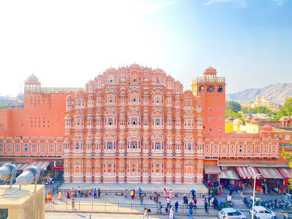
Fun Fact - Did you know Jaipur city was painted totally pink by then king to honour the state guest king of Wales.
Though it's not pink now but the most magnificent fact is that this city has a town planning by the king himself in a Vastu Shastra way! Many modern architects and students study about the city. I shall come up with another blog another time regarding the planning of this city!
Driving to the subject. Polychromy has a fair share of space in history but talking about twenty and twenty first century, Le Corbusier was the one to stretch this subject and bring in more than 5 points of architecture to the world.
I would like to be very open and honest here. I believe in his works and theories but polychromy i.e. art of using colours into architecture is universal. It's up to us however it is always good to know what experts in the field left us to study and create more out of what they did!
So, here splashing some shades of limelight on his works-

He coined the Architectural Polychromy's palette.
We are well aware of the typical colour wheel and the n numbers of colour palette that could be created from them and while designing architectural spaces colours plays a vital role and it's not easy to deploy a particular colour to a space as they may turn out to be good or total trash.
Spreading ones creative wings is great but knowing the possibilities and some already curated palettes are life savour in several situation! Isn'it?
A little back drop
Le Corbusier was actually approached by a company to curate wall papers and he ended up creating colour palettes back in 1932 which were set of 43 harmonious colours and later he added 20 more colours to it and created a 63 shades of architectural polychromy and these colours were best suited for him. Many buildings were designing and are still in use of the palette.

Src
Yup! These are the famous 63 colour palette for architecture.
Not just him and his company but many others followed this palette. Let me give a real life example,
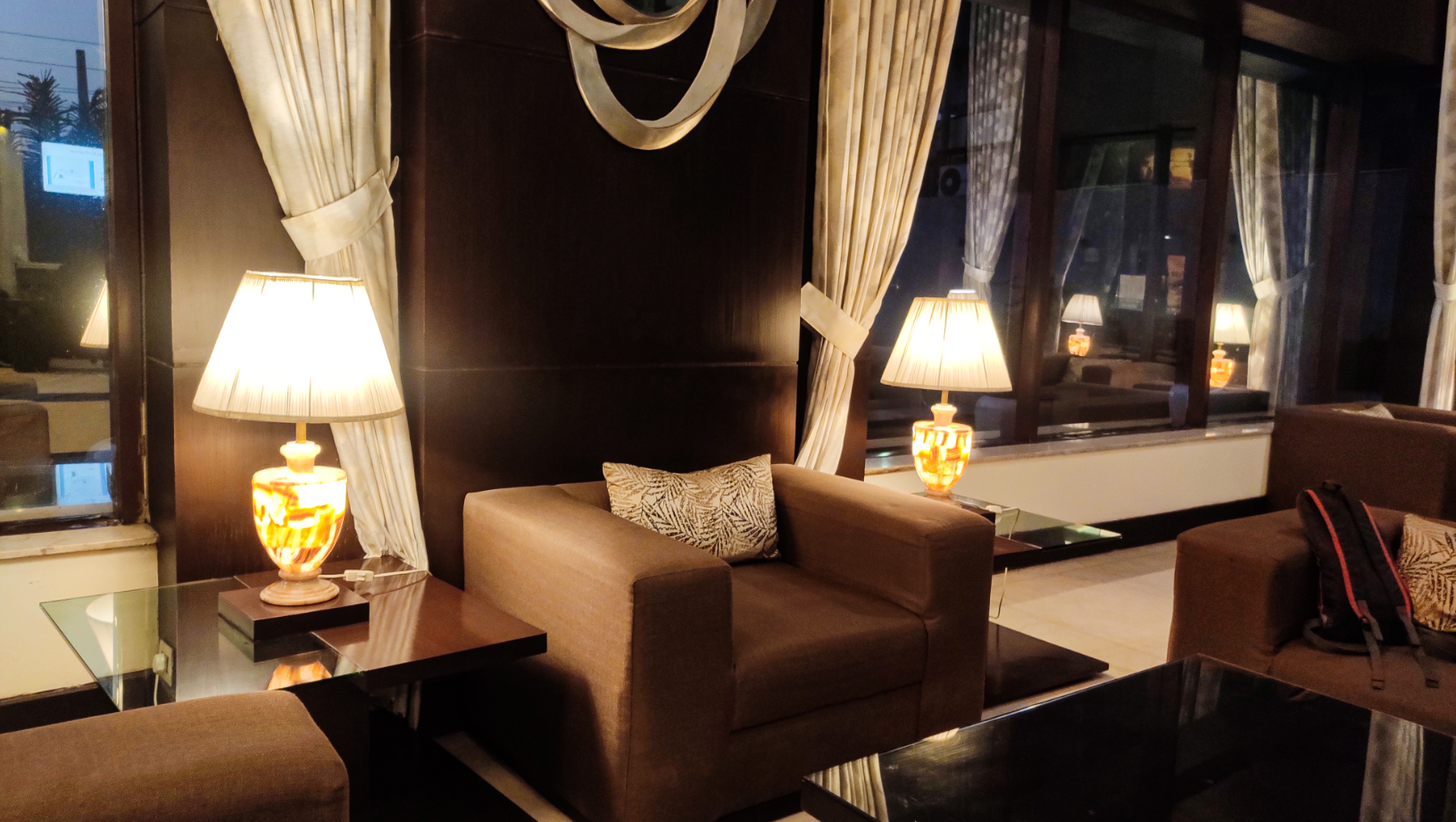
There's a five star hotel I visited where one of my friend adored the basic colour palette and left a remark that they are inspired by some famous architect's curated palette. Now I could totally relate the Polychromy of the place-
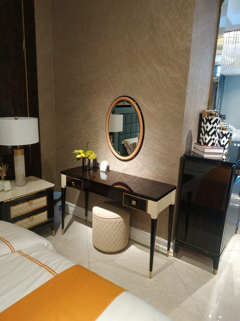
Not just every other color was included in the palette but typically-
2 x White
8 x Grey & Black
13 x Blue
9 x Green
4 x Ochre & Yellow
4 x Orange
8 x Red
8 x Red ochre & Brown
7 x Umber
(Exact number of colours is sourced from the lescouleurs site)
One could easily spot all the palette colours in the interior from bed sheet to furniture and walls.

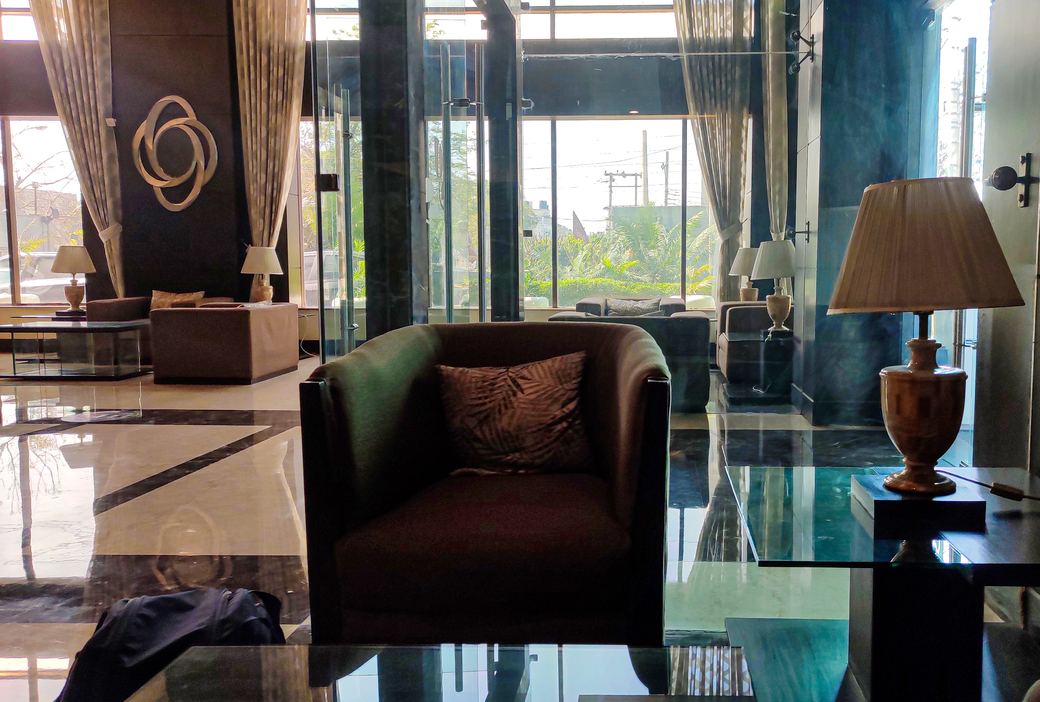
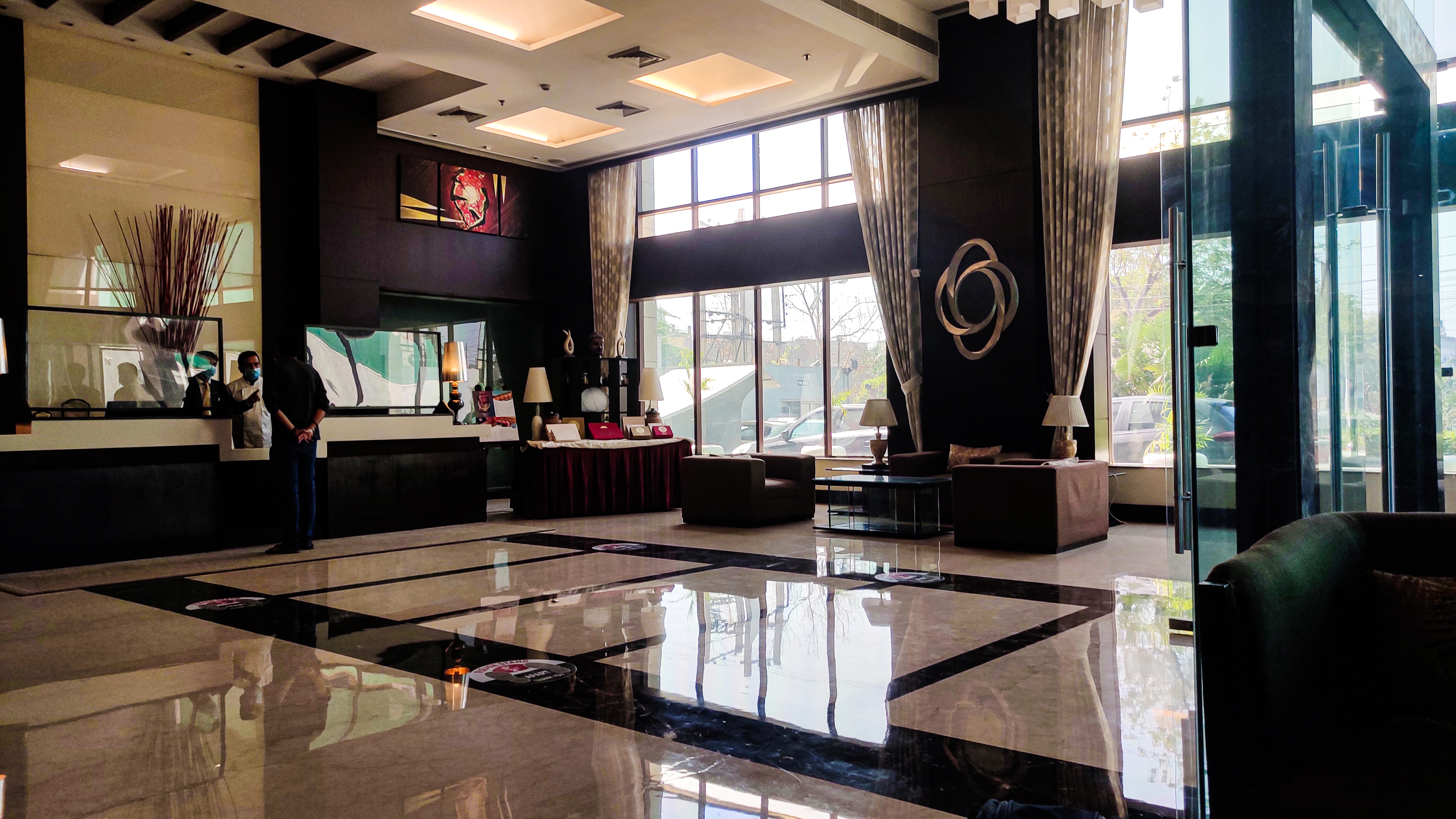
Play of Polychromy on emotions
We are all aware of how colours are connected to our mood swings, and how we feel as user experience is the priority of every design be it in medieval or modern times.
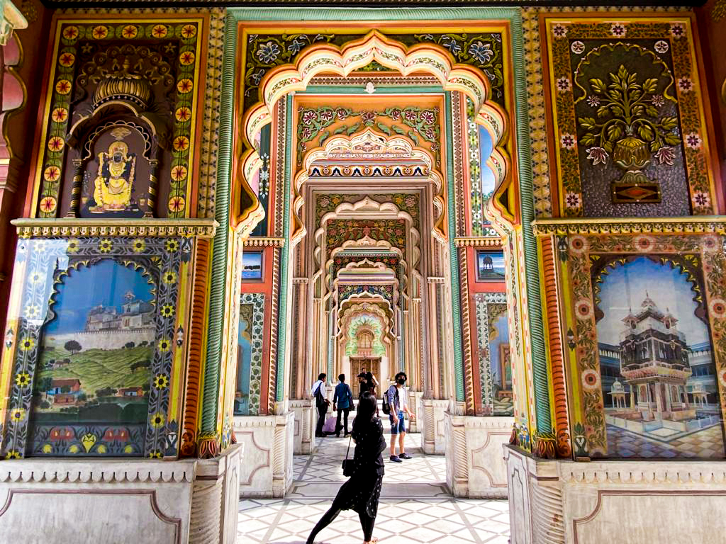
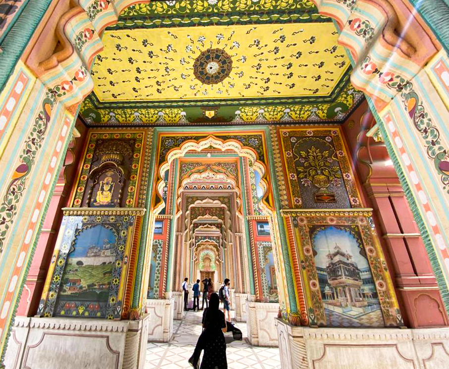
The deep colours with a tint of lighter one to bring in harmony and symmetry makes a perfect luxurious combination. I believe in colour family of brown and yellow.
As shown in above pictures, we can totally derive to the conclusion that this may be a 4-5 star hotel, which it is of course. so we behave the way we feel in the place hence the polychromy plays a vital role.
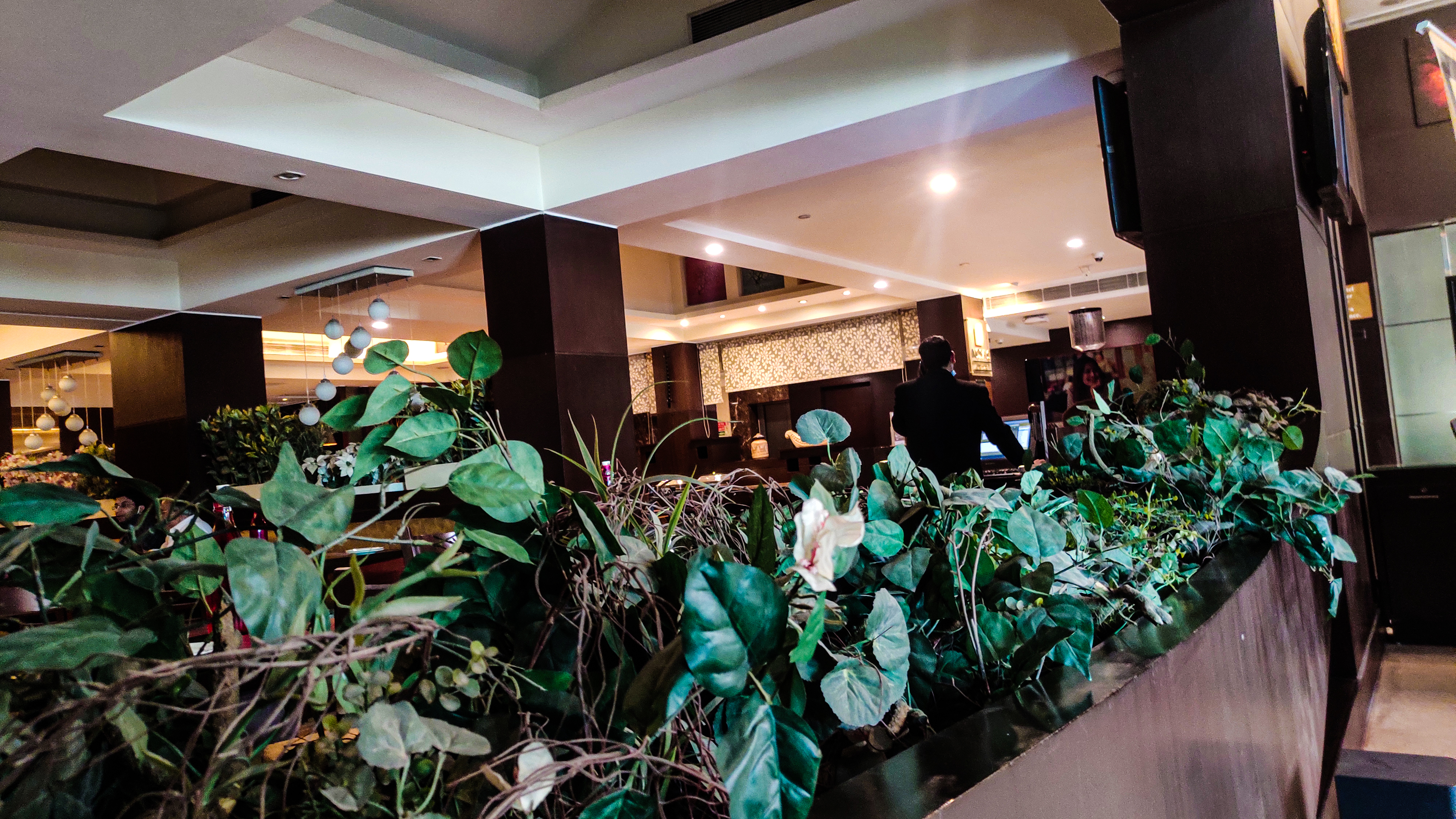
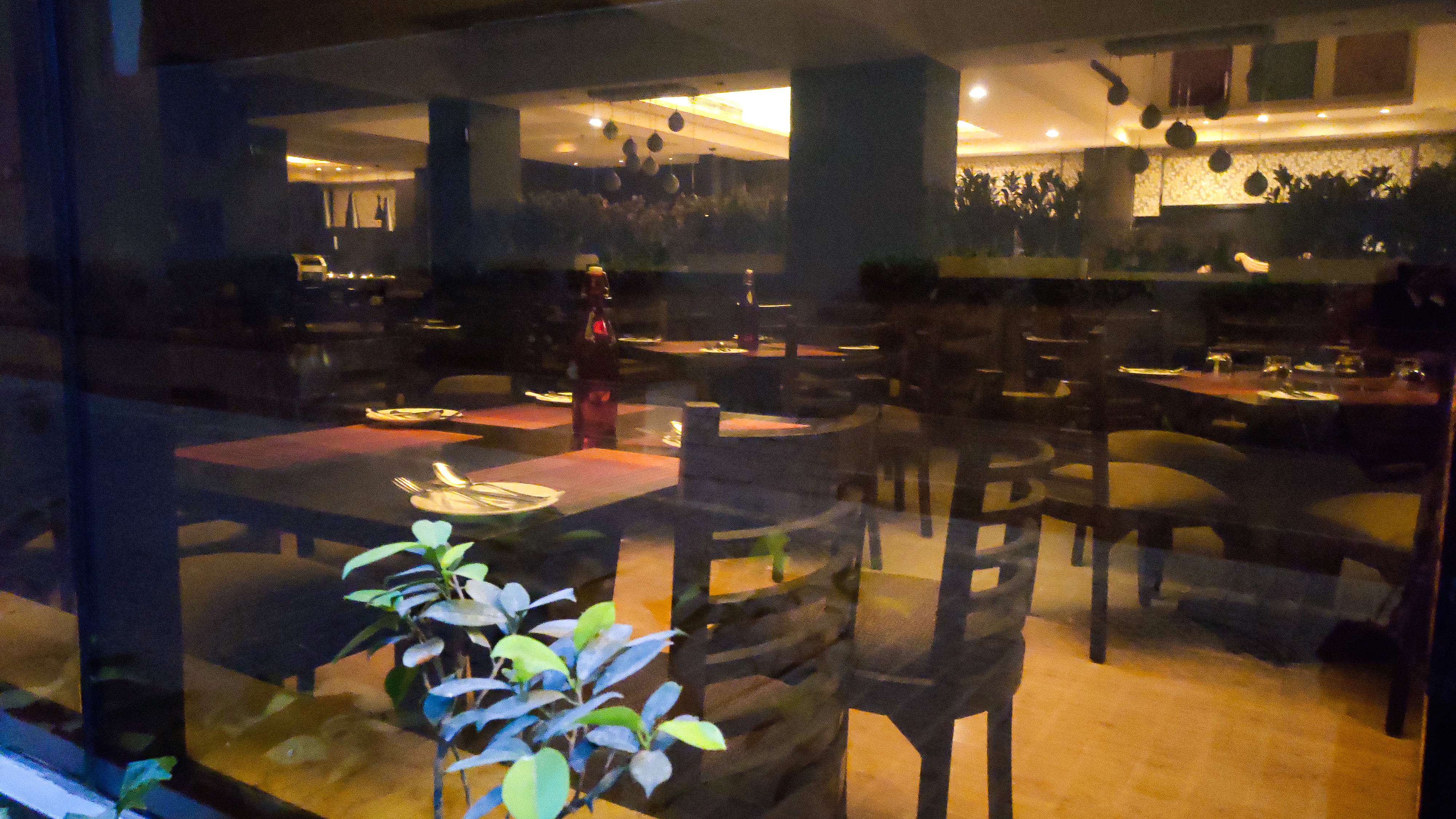
The planters made the place lively so is the addition of green colour. Each and every colour are derived from the palette. We as a designers can curate our own palette.
Do you have a few colour combinations which are your favourites? Or a typical colour which is your go to colour like mine is white.


Great post! I am making a mental note of the color palette that Le Corbusier created. He really was ahead of his time. Designing with colors takes great skill and intuition to achieve the right application. Taking guidance from the masters is a cool way to enhance one's skills.
Hi @discoveringarni, good to see you here. Thank you for wonderful comment. Actually true he was ahead of his time, his colour palette is amazing.
Colors plays a key role in achieving a certain mood in the design. A well-balanced and perfect contrast can boost the design of space. !discovery 30
So true! Thank you @juecoree for stopping by.
Keep flourishing!
I like the color combinations on this one, I think the color combination perfectly complimented each other.
Indeed it does. Thank you @afterglow for the appreciation. Hope you are staying safe!
You're welcome.
Oh i am amazing with projects
Thank you @feiderman for stopping by, stay safe and healthy!
The strong influences of colors are truly felt in architecture and design. Unless the person experiencing the space is color-blind, a built environment without the magic of colors becomes lifeless, dull, and unattractive. Thanks to Polychromy, ordinary areas are transformed into gorgeous habitats where our favorable emotions can flourish.
What set/mixture of colors would be the most challenging for you to work on within your projects @praditya?
Thank you @storiesoferne for your wonderful comment. Actually working with neon colors would be quite challenging as they may give a sudden class to the place or makes it total trash. It's really hard to figure out balance but its's interesting and challenging.
Thanks again, hope you keep flourishing !
Yeah, that's true. Neon colors especially the ones applied in lighting are sometimes difficult to adjust in terms of hue intensity and brightness. If not designed with the proper balance, the project may result in a disaster. Thank you for sharing your insights and have a wonderful day!
Hello friend @praditya I greet you with respect from Venezuela. Thank you for publishing this very interesting class on polychromy and its influence on design and architecture, truly fascinating. I liked the raised theme and the color palette. The different examples that you show in the photographs give a lot of light and information in this regard. In the post you leave a question, I quote: Do you have any color combinations that are your favorites? Or a typical color that is your favorite color like mine is white. end of quote. I must answer that yes, I like the blue of the clear sky. I love the trees, I am fascinated by the intense green of nature, the color palette of the flowers and the plumage of the birds, the vivid color of insects, such as multi-colored butterflies, I love to observe the different shades of the eyes of animals and people, I enjoy the rainbow and the northern lights and I am delighted by the starry sky and the intense yellow of the full moon, the different colors of the sand, earth, precious stones or the simple ones found on the road, cliffs, mountains , seas or rivers, the opaque or intense color of metals, the tonality of fruits and the artist's brush combining light and shadow with each color in his palette; Anyway, I love colors, I love life and I love light. Every day I thank God for my senses: sight, smell, taste, touch and hearing because with them I perceive life and enjoy existence. Friend, thank you for this moment of inspiration, thank you for your post. Receive a strong hug full of positive energy and lots of light and colors.
Good day dear @marcosmilano71 I respect and believe in your inspiration of colour palette from nature. It truely plays a vital role.
This platform and people like you have taught me the importance of simplest things like senses and nature as we should always appreciate it no matter what and be grateful for our existence with nature.
Thank you for your humble comment .
Hope you and your family remains blessed and happy, greetings:)
Amen my friend, amen. You have also taught me a lot. I enjoy reading your posts. Thank you thank you very much. Receive a strong hug of light charged with positive energy.
Polychromy is indeed great subject to ponder upon.
wonderful post buddy!
Thanks pal @sahiba-rana
This post was shared and voted inside the discord by the curators team of discovery-it
Join our community! hive-193212
Discovery-it is also a Witness, vote for us here
Delegate to us for passive income. Check our 80% fee-back Program
Well done @praditya! We're happy to inform you that this publication was specially curated and awarded the SILVER MARK in Architecture Brew #28. Congratulations!
Subscribe to Architecture+Design, an OCD incubated community.