ARTISTIC AND AESTHETIC ASPECTS
In Light Art Photography and Light Painting (almost), every colour can be shown with suitable lamps and spectral filters in (almost) every desired saturation and brightness. Some Light Painters are to be shown often tried possibly many colours in a picture without being aware of the effect of the colours on the eye of the viewer and the effect of the colours obviously to each other.
On the other side, there are Light Painting artists who work very strictly with complementary colours like the respected Pala Teth. If you always use complementary colours in a picture you cannot go really bad with it. Of course, it’s also a matter of taste. For example, I do not like certain colours and/or their secondary colours like violet and green.
In der Light Art Photography und im Light Painting lässt sich mit geeigneten Lampen und Farbfiltern (fast) jede Farbe in (fast) jeder gewünschten Sättigung und Helligkeit darstellen. Einige Light Painter sind oftmals versucht möglichst viele Farben in einem Bild darzustellen ohne sich offensichtlich der Wirkung der Farben auf das Auge des Betrachters und die Wirkung der Farben zueinander bewusst zu sein.
Auf der anderen Seite gibt es Light Painting Künstler die sehr konsequent mit Komplementärfarben arbeiten wie der geschätzte Pala Teth. Wenn man ausschließlich 2 Komplementärfarben im Bild benutzt kann man eigentlich nicht viel falsch machen. Allerdings gefallen mir bestimmte Farben und/oder deren Sekundärfarben einfach nicht wie z.B. Violett und Grün.
Like with many other aspects of Light Painting or also of Photography in general, Its good to know as many “rules” possible to be able to ignore them consciously.
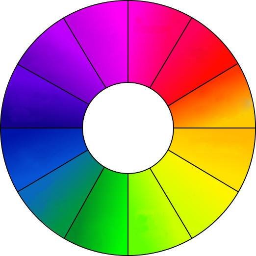
To me, it is absolutely clear that people perceive colours differently. The colour circle in the picture on the top of the page has certainly no general validity. Some people like some colour specific combinations which others might not. What most viewers of Light Painting might find “annoying” is the use of many “strong” colours in one image. If I take myself as an example, I find pictures in which strong red, strong blue, strong green and possibly still yellow and violet were used at the same time, not so pleasing even if they are well made otherwise.
Und wie bei vielen anderen Aspekten im Light Painting oder auch der Fotografie im Allgemeinen sollte man möglichst alle Regeln kennen um sie bewusst missachten zu können.
Mir ist durchaus klar, dass Menschen Farben unterschiedlich wahrnehmen. Der Farbkreis im Bild rechts hat sicher keine Allgemeingültigkeit. Es gibt bestimmt Menschen die andere Farbkombinationen als angenehm empfinden. Was aber sicher die meisten Betrachter unser Light Painting Bilder stört ist die Verwendung von vielen "starken" Farben. Ich jedenfalls mag mir Bilder in denen kräftiges Rot, kräftiges Blau, kräftiges Grün und womöglich noch Gelb und Lila gleichzeitig verwendet wurden nicht so gern ansehen auch wenn sie ansonsten gut gestaltet sind.

WHICH OPTIONS FOR COLOUR CREATION DO WE HAVE IN LIGHT PAINTING
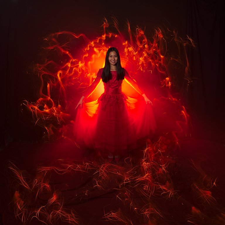
Have a look at the two images below. In the first, the light has a similar colour to the dress of the charming model. It’s very important with this kind of Light Painting to have a rather strong bright light source in the picture, otherwise, it looks very quickly flat and dull.
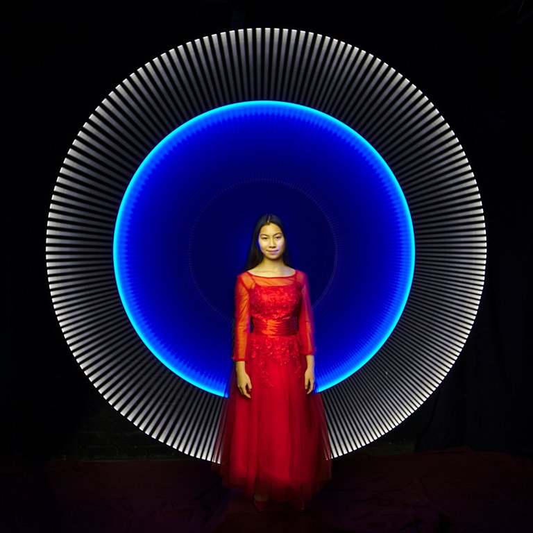
The second image is what I mentioned before on working with complementary colours. In the colour wheel picture on top of the post, the blue light is the complementary colour of the red colour of the dress. Though the blue does not correspond precisely compared with the colour Red in the colour circle, however, the effect of both colours to each other is still harmonious. The white external part does not disturb the perception of the colours. White colour can be always combined together with all colour combinations in Light Painting.
Ein Ansatz ist die Arbeit mit einer Farbe wie im Bild unten rechts. Das Licht hat eine dem Kleid des bezaubernden Models sehr ähnlich Farbe. Wichtig bei dieser Art von Light Painting ist, dass man einen recht starken Helligkeitsverlauf im Bild hat. Ansonsten wirkt es sehr schnell platt und langweilig.
Der zweite Ansatz ist die schon oben erwähnte Arbeit mit Komplementärfarben. Im Bild unten links ist das blaue Licht die Komplementärfarbe zum roten Kleid. Das Blau entspricht zwar nicht exakt der Farbe gegenüber Rot im Farbkreis, die Wirkung der beiden Farben zueinander ist aber trotzdem harmonisch. Der weiße äußere Teil stört die Wahrnehmung der Farben nicht. Weiß kann man immer gemeinsam mit allen Farben und Farbkombinationen im Light Painting verwenden ohne die Wirkung der Farben zu beeinflussen
ON LOCATION WITH MODELS
Working in locations where the background is more visible, is more difficult. Take as an example the pictures at the department store Görlitz below.
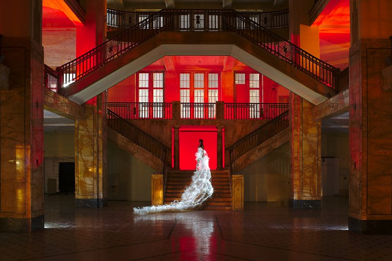
First of all, we couldn’t really do much from the street lights that affect the image cause of the big windows of the place. We had to use this light in the picture instead. Fortunately, this light was almost white.Here I have consciously chosen no complementary colour for illuminating the space, but one of the “natural” colour of the columns and a similar one for the floor.
For the dress, we would have had several colours to choose from. Either red like the prevailing part of the scene, turquoise as a complementary colour to Red/orange, or the white as we did in the end. A woman in a white dress has quite different meaning for the picture statement than a woman in a coloured dress.
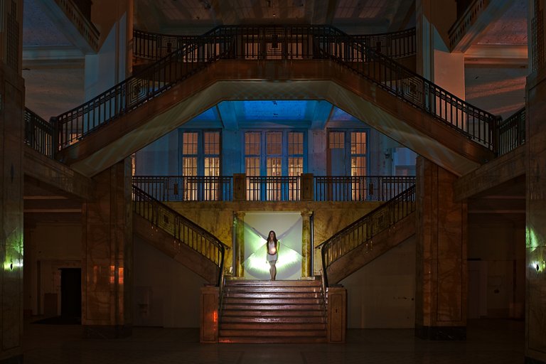
Schwieriger ist die Arbeit in Locations die eben nicht komplett schwarz sind wie z.B. im Kaufhaus Görlitz.
Zum Einen konnten wir gegen das Licht der Straßenbeleuchtung und des gegenüberliegenden Gebäudes welches durch die großen Fenster in das Kaufhaus schien nichts unternehmen. Dieses Licht mussten wir also ins Bild einbauen. Glücklicherweise war dieses Licht fast weiß.
Hier habe ich bewusst keine Komplementärfarbe zur Ausleuchtung des Raumes gewählt, sondern eine der "natürlichen" Farbe der Säulen und des Fußbodens recht ähnliche.
Für das Kleid hätten wir jetzt mehrere Farben zur Auswahl gehabt. Entweder Rot wie der überwiegende Teil der Szene, Türkis als Komplementärfarbe zum Rot/Orange der Szene oder das letztendlich von uns benutzte Weiß.
In the second image from Gorlitz Marla had a different approach.She used the natural colour of the building by illumination with a white lamp. Then she used a complementary colour to the available light this bright blue for the area above the model. The greenish light in the wings is rather unintentional and was caused by the colour of the iridescing material. But it fits from the brightness and saturation perfectly to the tender blue. Therefore the big windows were illuminated only by the orange sodium steam lamps of the road lighting.
In general, you will have a substantially more harmonious picture as a result if the number of the colours you use is limited from 1 to 2. especially when working with models. Too many, too garish colours could change the focus of the viewer from the real motive.
Beim zweiten Bild aus dem Kaufhaus hatte @marlasinger666 einen anderen Ansatz. Sie benutzte die natürliche Farbe des Gebäudes durch Ausleuchtung mit einer weißen Lampe. Bei diesem Besuch des Kaufhauses waren die großen Werbeleuchten am Gebäude gegenüber ausgeschaltet (Danke nochmal dafür Danilo). Somit wurden die großen Fenster nur noch von den orangefarbenen Natriumdampflampen der Straßenbeleuchtung angestrahlt.
Als Komplementärfarbe zum vorhanden Licht benutzte sie dieses helle Blau für den Bereich über dem Model. Das grünliche Licht an den Flügeln ist eher ungewollt weil es von der Farbe des changierenden Stoffes verursacht wurde. Es passt von der Helligkeit und Sättigung her perfekt zum zarten Blau darüber.
Grundsätzlich werde ich meist ein wesentlich harmonischeres Bild als Ergebnis haben wenn ich die Anzahl der Farben im Light Painting auf 1 bis 2 begrenze. Vor allem wenn mein Hauptmotiv ein Model ist. Zu viele, zu grelle Farben würden nur vom eigentlichen Motiv ablenken.
WITHOUT MODELS
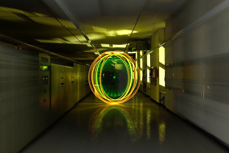
If, however, the main motive is a light figure as for example an Orb, you can use colours to direct the viewer’s focus. Of course, we should always pay attention to a nice combination of the colours, even if these two colours are not complimentary ones, like in the picture below with the yellow orb. If I had used here, a strong blue or lilac that might have not been a pleasing result.
Wenn allerdings das Hauptmotiv eine Lichtfigur wie z.B. ein Orb ist auf den der Blick des Betrachters gezogen werden soll kann man auch gerne mal tiefer in den Farbeimer greifen. Allerdings sollte man auch hier auf ein gutes Zusammenspiel der Farben achten, auch wenn es wie im Bild links dann zwei Farben sind die im Farbkreis nicht gegenüber liegen. Hätte ich hier allerdings noch zusätzlich ein kräftiges Blau oder Lila verwendet wäre vielen Betrachtern wohl schwindelig geworden... oder übel.
There is absolutely nothing wrong with experimenting with different colours. I don’t mean never use more than 2 colours in a picture. However, you should always pay attention to the effect of the colours when the first moment of joy by spinning a perfect Orb is over. To let work tried only the colours on you all the same as well the picture otherwise has become. Most people see the picture as a whole with all his strengths and weaknesses, they don’t really care about how technically perfect is your orb…
Es spricht absolut nichts gegen Experimente mit verschieden Farben. Es spricht nicht viel gegen die Verwendung von mehr als 2 Farben in einem Bild. Du solltest aber immer auf die Wirkung der Farben achten wenn der erste Moment der Freude über den perfekt gedrehten Orb vorbei ist. Versuche nur die Farben auf Dich wirken zu lassen egal wie gut das Bild ansonsten geworden ist. Den meisten Betrachtern ist der Aufwand für den perfekten Orb nämlich meist völlig Schnuppe, sie sehen das Bild als Ganzes mit all seinen Stärken und Schwächen.
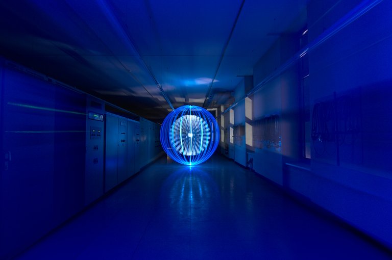
Apart from compatibility, there are more aspects of colours in the Light Painting. There is, based on the wavelengths, very difficult colours. Such a difficult colour is a blue. Blue “eats” the sharpness and depth in the picture and burns out very fast. In the picture above with the blue orb you can see it quite well below and on top in the Orb.
This picture had depth primarily by the additional zoom effect, and by the light of the windows. The sharpness of course, in this case, refers only to the Orb, cause the zoom effect is not sharp anyway.
By contrast, the long-wavy colours are rather easy to steer in Light Painting. Red becomes first orange, then yellow and then white.
Ungeachtet der Verträglichkeit gilt es noch andere Aspekte bei der Wahl der Farben im Light Painting zu beachten. Es gibt, auf Grund der Wellenlänge, sehr schwierige Farben. Eine solch schwierige Farbe ist Blau. Blau "frisst" die Schärfe und Tiefe im Bild. Blau brennt sehr schnell zu weiß aus. Im Bild oben sieht man das ganz gut unten und oben am Orb.
Tiefe hat diese Bild hauptsächlich durch den zusätzlichen Zoom-Effekt, und durch das Licht der Fenster. Auf die Schärfe kommt es bei diesem Bild eigentlich nur beim Orb an, durch den Zoom-Effekt ist ohnehin das Bild nicht durchgehend scharf.
Im Gegensatz dazu sind die langwelligen Farben, und Weiß, im Light Painting recht einfach zu steuern. Rot wird erst orange, dann gelb und erst dann weiß.
Stay tuned for the second part where I m gonna talk more about the meaning of the colours and the phycological effect they have on people.
WHAT IS LIGHT PAINTING?

LICHTKUNSTFOTO
If you like my art visit www.lichtkunstfoto.de for more Light Art Photography and informations about Light Painting. Join me on Flickr Twitter
For more great Light Art Photography, Light Painting and inspiration check these light painters: @marlasinger666 @fadetoblack @fastchrisuk @dawnoner @oddballgraphics @martbarras @stepko @rod.evans.visual @yo-hoho @maxpateau @gunnarheilmann @neilru75 @maximepateau @ryuslightworks @lightstabeu

WE ARE LIGHT PAINTERS
To help and support the LightPainters community here on Hive I would appreciate your delegation of HivePower. Any amount is appreciated. It does not require much to get started, we are happy for any gesture. @lightpainters
How to delegate?
Delegate 50HivePower, [50HP]
Delegate 250HivePower, [250HP]
Delegate 500HivePower, [500HP]
Delegate 1000HivePower, [1000HP]
All the Hive Power will help to upvote the artist's contribution as part of the LightPainters community.

Brilliant post mate. Really interesting stuff.
Cheers mate
Great article ;-)
Thanx for sharing with all of us!
Thanks 🙂
a great post, and extremely funny last picture. thank you, made me smile. I am glad you are not brainwashed and not a victim of the information war.
ps. it is a pity that you did not use #creativecoin tag for your post, it could bring you some extra curation and CCC tokens
Thanks. I don't watch TV for 30 years. So the chance of brainwashing isn't that great.
Another great article mate 👍😎
Thanks 🙂
Great post @lichtkunstfoto 👌🏻❗️
See you in part 2 😉❗️
Thanks 🙂
Das schönste Bild ist von mir, hihi
Ohne Frage 😊
This was some interesting info on color! I definitely think that some color combos are successful even if some people don't like them. However, thinking outside the box when it comes to color is a great way to spice things up. I couldn't agree more when you said you should know the rules... and then disregard them consciously. Thanks for sharing these awesome shots with us!
Thank you for reading and your kind words.
You're always welcome my friend!
The rewards earned on this comment will go directly to the person sharing the post on Twitter as long as they are registered with @poshtoken. Sign up at https://hiveposh.com.