Hey guys. Today I'm releasing the first version of a new project: Hived Scan. It's a complete rewrite of Hive DAO based on dhive, React, and Typescript.
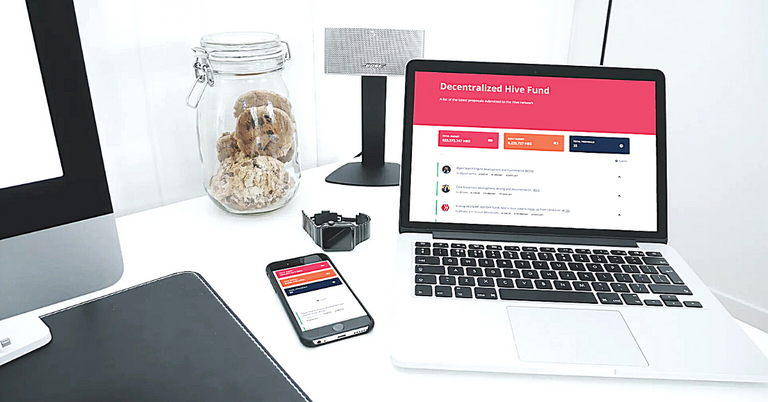
The main goal of the project is not Hive Fund though. My goal is to create an intuitive and fabulous explorer of Hive Apps that people would be eager to use for their daily needs. I know there are several Hive explorers already but they look quite outdated in terms of modern UI flows, feature set, and appeal for your eye. Thus, Hive Fund is the first App presented on Hived Scan. It is mobile-first, light, and super easy to consume.
Due to the workload, I can't dedicate full-time to this project but there are weekends and a couple of evening hours during weekdays that can fit into my schedule, so I think I can do significant damage to make this work.
Also, I'm sunsetting Hive DAO but leave it open source if you ever need it for whatever reason.
By the way, if you use hivedao references in your proposal post, make sure to change the link to the following format: https://hivedscan.com/proposal/0
Lastly, here's the project's resources:
- Website: https://hivedscan.com
- Github: https://github.com/dmitrydao/hivedscan
- Discord: https://discord.gg/eXxA5BN
Cheers to everyone and hello from rainy Turkey.
Great work! The only thing that seems a bit unintuitive to me is the upvote/support button.
There will be login, it will simplify everything. But right now it's just checking/unchecking the box for support and cast your vote with keychain : )
Oh yeah, for sure logging in will simplify things. What I meant was that the look of the support button didn't seem very intuitive for me - I wouldn't guess it's a button I can click on if I'm not already familiar with the idea of the DAO (i.e. that I can vote on proposals). Just purely visually something is a bit off and it doesn't quite look like an upvote button. My first guess was that it was more like a toggle to expand so as to see additional content related to the proposal. Does this make sense?
Hmmm, interesting feedback. Love it. What do you think will make it more intuitive for you and others (of course)?
More contrast - the color of the button can be a more contrasting color so it stands out as a button. For example there is very good contrast here: https://peakd.com/me/proposals
This looks amazing, good job!
I would love to see which proposals I already upvoted though.
working on it
Congratulations @dmitrydao! You have completed the following achievement on the Hive blockchain and have been rewarded with new badge(s) :
You can view your badges on your board and compare yourself to others in the Ranking
If you no longer want to receive notifications, reply to this comment with the word
STOPDo not miss the last post from @hivebuzz:
Great work, liking it a lot so far!
Thanks. Appreciate it
looks sleek :) great job
That was the goal, thanks 😁