Intro
Hey Hivers! The CBRS contest is spicy! In this post, I'll be sharing my entry for the competition, and also share my thought process that hopefully may help those who want to dive into the art of visual concepts. I'll be sharing how I approach a design before I start designing. I've used this method for all my clients to create powerful and valuable assets that can be used for a longer period. I've sub-divided this blog post into three sections, as I assume most just want to see my infographic, and a few might want to dive a bit deeper into what, how, and why I made it.
1. About the contest
2. Entry: Infographic
3. The thought-Process
Cheers,
Ruben
About the contest
Onboarding people on Hive is easy, but Hive can become quite a maze if you do not know about the blockchain. The old promise "blog and earn" is creating countless unique expectations that are bound and different for each individual. Explaining what Hive is all about, is a much more powerful way to introduce people to Hive. If they understand or think it is interesting enough, they will sign up themselves, without giving them a promise that they will earn if they blog.
While this promise may have worked short-term when attracting new users, it created a distant problem for the long-term, as those who did not earn by blogging became dissatisfied, and perhaps, even angry at the blockchain for making such untrue promises. As we can't argue with people who are taught to think like this, we can surely step back, and take a different approach. This approach can potentially increase the value and understanding of the Hive blockchain more patiently.
The contest hosted by ColdBeetRootSoup (CBRS)
The contest hosted by CBRS is shining a light on exactly that, and with a prize pool of 1,000 HIVE (at the time of writing valued at $450), it should attract at least more designers if promoted right on Web2 social media channels like Twitter, Instagram, and Facebook. While LinkedIn isn't a place to promote contests, perhaps someday we will find the opportunity to launch #web3jobs through Hive on Web2.
It has been a while since I saw a contest that takes participants seriously and is willing to pay a fair rate as a prize. The grand prize might have a higher impact on those who live in different ecosystems than Europe, but it surely does contribute to those in Europe whose rates lie around 50-70 Euro an hour.
At first, I was a bit concerned about the disclaimer, but I'm happy that they changed that. One comment led to a good talk with CBRS and I think all parties will receive exactly what they need. A fair chance to win, and fair use if an idea has won.
Check out the contest here.
Entry: Infographic
The Idea
I want to create an infographic that is easy to understand for developers, and will be learning more about the Hive blockchain-based network. The keystones that I will be used must be based on facts, as the tone of voice (and accurate information) is important. It needs to be easy, informative, and clear. Despite the information, I want to add a 2023 proof design, which means that anyone who sees this infographic from 2022-2024 won't be too concerned about the dating of release. So, the duration of this infographic lasts at least a year, or until major innovative changes broke the accuracy of the information on the infographic.
 |
 |
 |
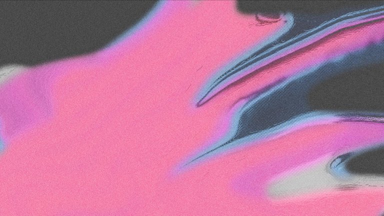
Personally, I love the subtle grain/noise in combination with the texture and a clear background. The pale neon colors pink and blue are inspired by the Hive colors red and grey. I'm happy, especially since I'm looking at a design that is entirely created from scratch (except for the Hive logo) and blended well together in the final result.
The thought-Process
There are a few things we need to understand before we can dive into designing. When working for a client, we always first work closely together and create visual concepts, that -then- will be rolled out into real valuable assets.
- The goal
- Understanding the project
- Target audience
- Tone of Voice
- Scalability
- Zoom in and out
- Choices
- Research: Design trends for 2023
1) The Goal
What is the goal? The goal is to introduce, but more importantly, on board those who are interested in joining and using the Hive blockchain. Infographics created, need to be used for Social Media, and/or for the website. Choosing between these two can change the preferred duration of the infographic. Read as: Social Media can be divided into divided categories; campaign, branding (and more). Whereas usage on the website is mainly preferred to increase brand awareness and it is required that it will be adding value to the foundation of the brand itself.
This raises two questions that will help us decide which way to go.
- Will we choose to contribute to brand awareness for the short-term (marketing/campaign)
- Will we choose to contribute to brand awareness for the long term (branding)
Which one will attribute the most to the Hive blockchain, right now? We have to keep in mind that there are three spots for winners, which will then be used on either the website and/or social media. This means that there will be at least three different styles that potentially will be exposed to social media and all these 'new people' we would like to introduce to the Hive blockchain.
2) Understanding the project
In this case, we don't have a client, but we have a contest that focuses on the Hive blockchain. It is important to understand what the project is all about or to understand aspects of the project (pick a topic). The better you understand the project, the more room you have to place yourself in your target audience and determine the tone of voice that you'll be using.
3) Target audience
So, what do we know about your target audience? Because the Hive blockchain embodies all sorts of areas of expertise and interests, it depends on what topic we are willing to address and highlight. Finding and understanding your target audience will help to skim off the unnecessary aspects of design, and can be transformed into an asset that speaks to its audience. This is also known as the attract strategy.
There is a saying that perfectly fits into this mentality: if you want to speak to everyone, you end up speaking to no one. I use this saying as a reminder not just for myself, but also to help my client understand the importance of narrowing things down and targeting specifics.
This was helpful when I created photographs for an All-In Hotel that had 5 different target audiences, we ended up creating photographs that illustrated the customer journey of all of these target audiences. It was a huge success.
While thinking about the target audience, I realized something and had to share this on Twitter.
This got a lot more complicated with just one good thought about what Hive is versus how we currently promote it. But on the other hand, it gives a lot of insight into how and what to implement in the infographic. Attracting developers to Hive is one of the most important things we should do right now in my opinion. Developers will make it possible to create more products on the Hive blockchain. If the products (dApps) are good, they then will attract more users automatically.
For the target audience, I've picked developers who are familiar with blockchain or are looking for a blockchain to build on. For this audience, their blockchain must have an attractive learning curve, enough existing data to use, an available community to ask questions to and to share ideas with, a low entry cost, and be welcoming. Their coding knowledge varies.
To develop an infographic that speaks for this audience I have prioritized keystones that represent Hive. I've had to ask myself the question what exactly is important to me, if I were a developer myself, looking for a blockchain to build on?
4) Tone of voice
Selecting a topic will determine the target audience, which will also determine the tone of voice, which you can use to create more defined, and more important easy-to-understand assets. For example, if our target audience is a developer, we have no worries to include the word JSON or Graphene to onboard our target audience.
While developers are usually also interested in learning other languages, or if they already do know the language, they would be pleased to see another opportunity to learn or share their knowledge. Simply said: we speak their language.
For content creators or investors, the tone of voice is very different as well. If your sole goal is to invest in a blockchain to get revenue, learning how to blog in a specific community wouldn't add value to the asset presented to an investor. And vice versa.
This is why knowing who to speak to is so important, so you know how to speak. And if you know how to speak, you can easier translate those words into visuals.
What are important keystones for Developers to know about Hive?
The ones that I can think of myself are the following;
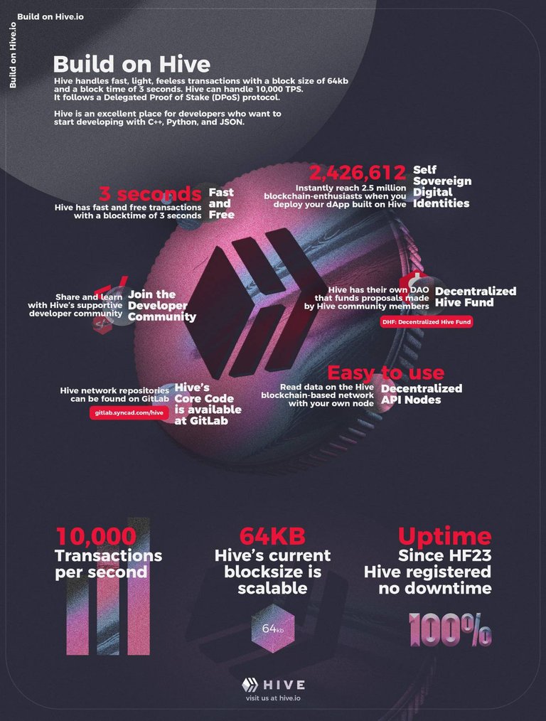
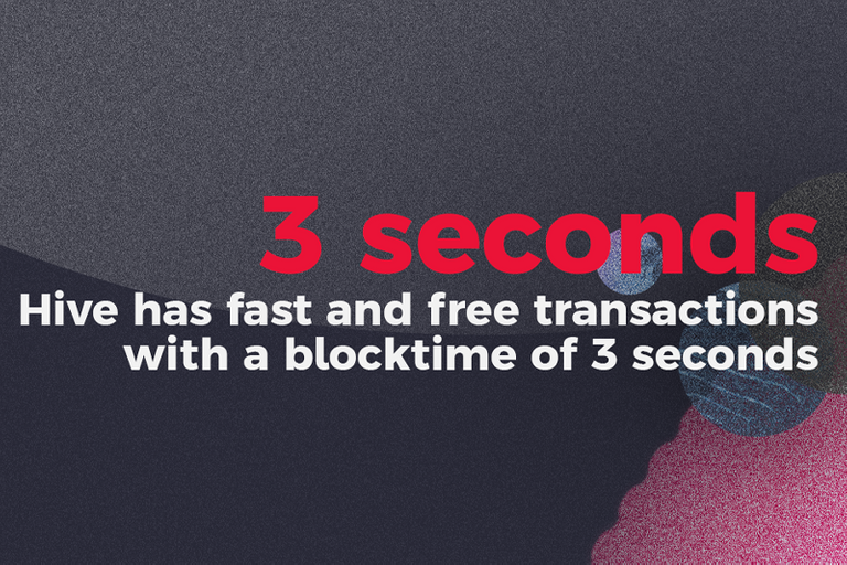
- Fast and Free transactions with a block time of 3 seconds
- dApps built on top of Hive can directly be accessed by 2.5 million accounts
- Share and learn with Hive's supportive developer community
- Make use of the Hive Application Framework to highly scale your dApp
- 2.5 million accounts that instantly have access to your dApp built on top of Hive
- DHF to support and potentially fund proposals made by the Hive community
- Hive uses resource credits that recharge over time to transact on the blockchain
While the last one is questionable if this truly is interesting for developers. Would resource credits truly make a difference point-blank? Free, fast, 2.5 potential million accounts that may use my dApp without even signing up, and there is a developer community, these are the things I came up with, but I'm not a developer (I used to code in AS 2.0 and a tiny bit of PHP a decade ago), so it would be best to ask a developer!
Since @arcange is both invested in developing and marketing (and pretty community driven) I asked him what he would consider points that are interesting for developers to know. He responded in less than 10 minutes, which was very kind of him as I assume he is busy.
- feeless transactions
- fast (speed is 3 secs/block)
- easy to use/develop
- supportive dev community
- no need to download the blockchain locally
- multiple (decentralized) API nodes you can use
- DHF to finance projects with added value for Hive
Well, would you look at that! I was glad seeing the points that I had in mind were on his list as well. Of course, questions arise when seeing his list of bullet points. Why is Hive easy to use or to develop? What exactly does it mean to not have to download the blockchain locally to start developing? Is this a USP? And where can I find these (decentralized) API nodes as a developer?
I surely need to dive into the technical side of Hive a bit more before adding these points to the infographic. If something is easy to use, one may wonder if it is also limited. I do not want to give the feeling that developing on Hive is limited (as I can only assume this is very much not the case) beyond a logical sense.
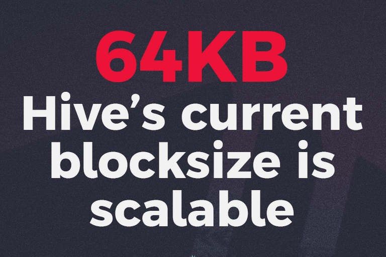
As I was struggling to find the information on Google about Hive's TPS, and most of the reports I found on Hive.blog itself were a bit too technical for me to wrap up in one sentence, I decided to give @Dalz a message on Twitter. He has been providing us with tons of technical reports about our chain that I've followed for some time. He was super kind and helpful. Most of the time, I'd like to avoid taking people their time, but I needed some help from a technical point of view. He shed some light and provided me with crucial information to translate (and change) the copy in the final design.
Finally, I asked @blocktrades to have a final look at the factual information on it. The only thing he would challenge is the 10,000 TPS as he hasn't tested it (Dalz had told me the same and explained that Posts and Comments are heavier than Votes (imagine the weight of JSON that allows creating accounts/tokens)). I wondered if you could stress-test the max TPS on the testnet provided by @deathwing. If anyone can like to test this... I think TPS is something that developers look at.
Turning these points into just one sentence each is quite a challenge as they need to cover the subject and trigger the reader. I'm sure the copy can be a lot better, so please; feel free to correct the copy of the final design!
5) Scalability
Alright, so you have created an asset that you think is amazing and unique. Scaling is where the real value comes in. In terms of dollar-spent for the client, as well as for the designer time-spent. If your asset can't scale, what value will it bring? If you can scale, it means you can use the same concept with different visuals for a longer duration. If you can't scale your design, it needs to bring a lot more value in a smaller window of time. Let's say, the average design can be used for 1 month until it loses traction and engagement, and is now part of the brand which will be visited by people who already know you. Let's say with a scalable asset, you can create up to 12 visuals, whereas with one that isn't scalable, you will keep only one asset. If you spend 1000 dollars on 12, and 300 dollars for one, you can easily do the math on which one will be a better investment. Even if the ratio would be the same, the momentum you will create is so much more valuable than the money spent: remember the goal.
6) Zoom in and out
All of this must have given you an idea of what to work on. However, how will things work out if we start combining everything? Can we easily transition our visuals to other aspects? Do we miss something to make it clear? Is the viewer able to navigate through topics? Can they easily store the information shown? We need to zoom out before we zoom in. And this... can become quite challenging when trying to zoom out on Hive. The opportunities and capabilities are endless and can become quite overwhelming. If we aren't overwhelmed, we aren't zooming out enough, if we are overwhelmed, how will we tie all the things together? This is why creating visual concepts before designing is so important when it comes down to creating assets that will bring high value.
7) Choices
The above though-process will cost us some time but will be so much more beneficial, as you pinpoint your focus and you did half of the brainstorming already. If you can visualize while you speak and or think, you already start creating elements in your head that you can use in your design. More important, you remove elements, which will give you more room to focus and think about the final design.
I'm just going to dump this graphic here, lie about it and tell you I made this today, just to prove my point.
I created this 6 months ago, but you can still use it today, and probably next year as well. It's considered to be new once you see it for the first time, and it's still usable when you see it for the first time. Right? This design will refresh itself once the viewer, and the user will write on top of it. This way, it will always be unique. Unless people with the same feelings and handwriting/font type will share it.
I'll be participating in this contest and by doing so, I will explore the possibilities of design to onboard new users on Hive, or how I would like to say it: to introduce Hive to people who haven't heard about it yet.
8) Research: Design trends for 2023
The current trends for 2022 are BOLD and NEON. But the transition towards the trends that will become popular in 2023 is gentle and subtle. Perhaps this has something to do with the global situation and horrific events that are affecting all of us globally. We see a move towards the use of lighter colors, yet still vibrant while adding pale colors as well. We also see more retro 90s-styled themes becoming more popular. The Cyberpunk boom in 2020-2021 has left its traces and has changed the way we want to see things. The blockchain and cryptocurrency projects and communities blew up in 2019. Combining these two is a powerful combination to visualize the infographics of the future.
Colors
I'll be using tints that are inspired by the main colors of Hive. This way, I can compliment the Hive logo if I use it somewhere in the design.
I'll start with the main colors of Hive for this infographic and use tints that are inspired. I'll try to find and add NEON and PALE colors to the design overall. Perhaps with elements.
Textures
I'll be creating my textures to increase the "bold" and "rough" look and feel of the infographic. I'm looking for grungy, or noisy textures to apply for extra depth.
First, I wanted to make my grainy texture. Which both serves as a layout feature, as well as it will serve as part of the upcoming trend in 2023. At the same time, it will give me a bit more depth, and I will have something to work with if I'm planning to scale the Infographic into more in-depth 'cards' for example. The 90s are going to be hot, so why not use some pale neon colors while we add it as a base layer to work with?
Fonts
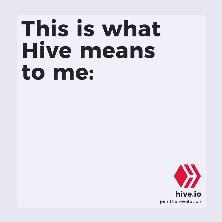
I'll be sticking with Argentum Sans Bold for the design, as I created the above "This is what Hive means to me:" asset. I'll try to play and experiment with alternative widths of the same font, and try to find a complimenting font that goes well with the design.
Additional Assets
I'll also be creating my assets (shapes/paths) that will complement the design overall. The important thing here is that it doesn't feel too overwhelming and is complimenting the design instead. These assets will make the design more balanced.
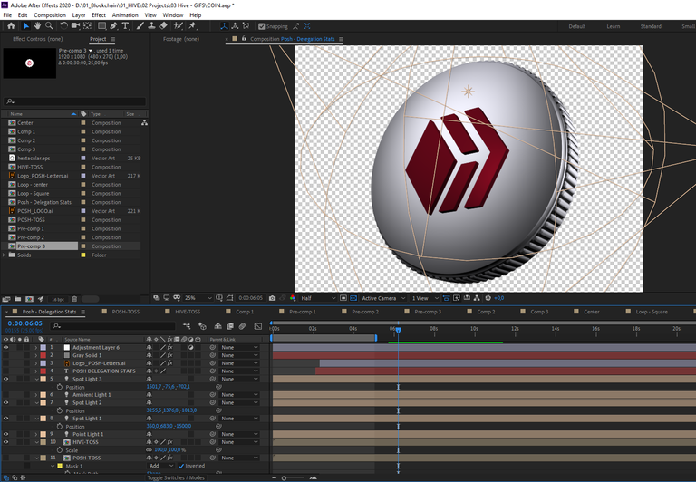
Remember the POSH coin animation I did? I knew I wanted to use the technique for other Hive-related coins as well. I scaled the composition to about 3000 pixels in width and height. Adjusted the lights, and rendered a transparent image. Which was somehow a pain in the ass to get right.
Whether we speak to developers, investors, creators, writers, businesses, and so on, it is undeniable that Hive has a cryptocurrency coin (HIVE). I wanted to implement this coin and blend it into the design.
Either way is saying the same;
- If you see the coin first: There is a coin behind the technology
- If you see the information first: Behind the technology, there is a coin
Like how I approach things?
All assets you see in this post are created since the launch of the contest. They are part of the thinking and design process that focuses on the scalability of elements and assets. You can hire me. I accept HBD for small projects. You only have to be on Hive and you can contact me on Discord on the OCD or official Hive server.
Got feedback? Please share in the comments below
I didn't intend to write such a long post to be honest just to let CBRS know I'm participating in their contest. But I end up sharing my thought process along the way and addressed important aspects of what could make or break a design. If you have any feedback, this is most welcome and appreciated!
Cheers,
Ruben

Follow me on Foundation | Follow me on Twitter | Follow me on Instagram
~~~ embed:1585219562265489408 twitter metadata:NDYxNDYwNzZ8fGh0dHBzOi8vdHdpdHRlci5jb20vNDYxNDYwNzYvc3RhdHVzLzE1ODUyMTk1NjIyNjU0ODk0MDh8 ~~~
The rewards earned on this comment will go directly to the people( @rubencress, @acidyo ) sharing the post on Twitter as long as they are registered with @poshtoken. Sign up at https://hiveposh.com.
@rubencress, you really amazed me with your entry and your thought process. I really enjoy the serious position you took time to describe and explain not only WHAT but also WHY! It is an Example entry for anyone who finds # Hive as their home and wants to make it even better and more visible to people around the world!
Absolutely stunning job!
Appreciate that a lot Artakush! Hive feels indeed as a home that I want to show to the world :D
Thank you thank you!
We did not expect such an Entry 😱 This is great work Ruben 😍
Bro! ... just came to read this ... you did really great with this piece you got ... Enough research and effort was invested into this .. Congratulations again bro .. well deserved too
This looks so amazing man. I can tell you really took some serious time to think this one out and create a stellar design. I hope you win the contest! I look forward to seeing other entries as well.
Oh man, I spend 4x4 hours on it I think from A-Z, so did spend a bit more time on it than planned, but love the final result. Let's hope so too! :D Thanks bro!
Your contest entry looks great and that brand you shared a while back looks wow.
I'm excited to see how this contest progresses.
All the best!
Amazing result and even more amazing post about it! Thanks for sharing all of those details with us dude! There is some great value in here for sure! Wish you good luck on the contest
Ruben, I think I might have to hire you.
Lets go 🔥!
Woah such a long, educative and intriguing article... I had a pause and went through it after sometime as the wordings are pretty lengthy.... you have done an outstanding job here in this post and both on the infographics... I love the full deets here as this would also serve as a guideline to some folks including me... thanks😍
Thank you very much for reading the entire article! I hope you got something out of it!
Oh yes!... I really did grasp a lot of information here...sure thing
Wow esto quedó más allá de lo BRUTAL!
This it's awesome desing and infographic! You are very talented!
Appreciate that @Nahupuku :)) tyty
Your welcome. I'm going to participate too. but i'm a Experimental painter artist and well i'm going to make an abstract stuff lol I supose very freak and bizarre I Guess :p
Nice! Looking forward to seeing your entry man, do you already have an aspect in mind to highlight?
Yes of course well take a look i'm freak experimental artist with midi and AI You can find a little bit of my freak links here in this answers of the coments:
https://peakd.com/hive-132595/@nahupuku/re-coldbeetrootsoup-rkfbdq
But i'm shure that Will be a freak desing. Of course not too much brutal like You one. I'm more a Windows 95 paint guy
Blessings talented friend
Great work!
Just found this infographic. I like it.