The @peakd team has added a stats page on their open projects work for Hive. As someone who is tracking stats on Hive this is of interest to me.
Not sure how many people are aware of it yet, but it has some nice options. Here is a short overview if you want to track some of the data using it.
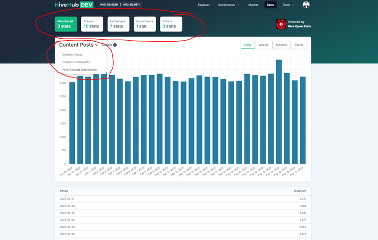
There are five category for the stats on top:
- Hive social
- Tokens
- Exchanges
- Governance
- Others
Each of the top five categories have a subcategory, that you select from the top right of the chart.
What I find useful is that under the chart there is the actual data that you can use if needed, or simply have a look at it.
The hive social has, number posts, comments, and rewards.
The tokens category is the biggest with a total of 10 charts. The most interesting for me here are the HIVE and HBD supply chart.
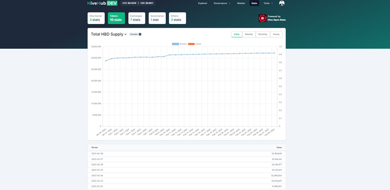
There is also data on HBD in savings.
In the exchanges chart there are seven categories, although I would say it’s a bit to much. If you dig a bit more into it, you can find the info about HIVE on exchanges.
The governance category has one chart, that are the daily amount of DHF payouts to workers.
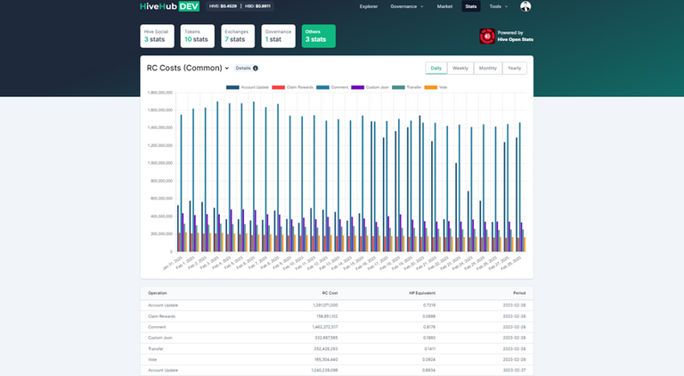
In the others category there is info on power up and power down, and then info about RCs costs over time.
Overall, a great initiative from the Peakd team to represents live data for the chain. Appreciated.
Representing data in a clear and simple way can be challenge. As always there is a room for improvement 😊.
Some of the charts can be confusing a bit and you need to be skilled to know what to look at, especially with more than one metric represented in one chart and the double axis value. Also I have seen some data inconsistency in the exchanges tab, but that might be temporary.
So, there you go. Another place to look for some of the live on chain data!
We would love to see some users take the open source data and make charts or give us mockup ideas for chart ideas. There is DAO money available to reward both of these efforts. We have a gitlab to interact or on our discord as well.
What exactly do you have in mind?
You can go trough my posts and have a bunch :)
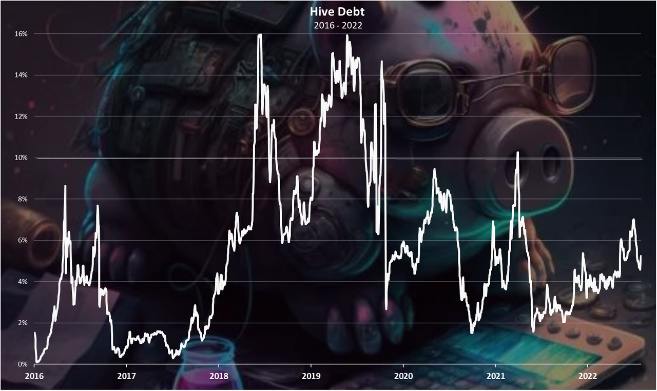
For example I would like to see the debt chart:
Hey, thanks for the great shoutout. :)
Yes, there is currently some data inconsistency for some of the exchanges, as it turns out some of them (especially blocktrades) have been doing social posting and conversions, and we're yet to take all of this into account when calculating their balances.
I stumbled on it while looking at the internal market. Pretty nice collection of information. As you, I thought it was probably underappreciated.
Thanks! That's an interesting and useful page!