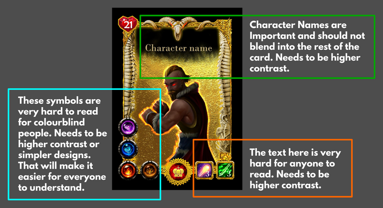
Thank you for the feedback. Please do keep in mind this is not the final product but is the core foundation of the layout. The bottom right will actually not have any numbers, the name will be in a better font and be curved/3d style. The bottom left icons, we agree, can be more visible and will act on this feedback.
Thank you for the feedback. Please do keep in mind this is not the final product but is the core foundation of the layout. The bottom right will actually not have any numbers, the name will be in a better font and be curved/3d style. The bottom left icons, we agree, can be more visible and will act on this feedback.
I think these are valid points. I like the way everything is already but your points are good ones to consider.