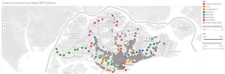
I'm looking at property again and I have a few criteria that unfortunately, I wasn't able to filter on the existing property platforms. Here's my criteria:
- Freehold
- Within 1.5 km from train stations
- TOP after 1995
Scraping Data Using Python
So, I scraped data of all freehold condos from a property website, being mindful of bandwidth, I spaced out the requests. The requests were then parsed with BeautifulSoup to get the relevant information like TOP, LNG, LAT, last transacted price etc.
Data Processing With Alteryx
Once I got the list of condominiums, I then needed to merge the data with the list of train stations and then calculate the distance between them. For this, I used Alteryx but you could probably do the same with Knime, Dataiku or just manually calculated with the LNGs and LATs.
Visualizing The Data With Tableau
I was keen to use Tableau's new multi layer feature. Previously, there were some limitations on the number of layers and how to set them up but the new multi-layer feature is pretty sweet, although you do need to make some modifications to the data.
The first is to create co-ordinates instead of just putting in the separate LNGs and LATs. It is important to note that the filters apply to all layers and so some dummy or placeholder values need to be created for null values in the other layer that get would get filtered out if you still want the values in that layer to show up.
You can check out the visualization here on Tableau Public
I'll be making some minor tweaks in the days to come but it is mostly done now. If you have any ideas for a data scraping or visualization project that would like to get done, please let me know.