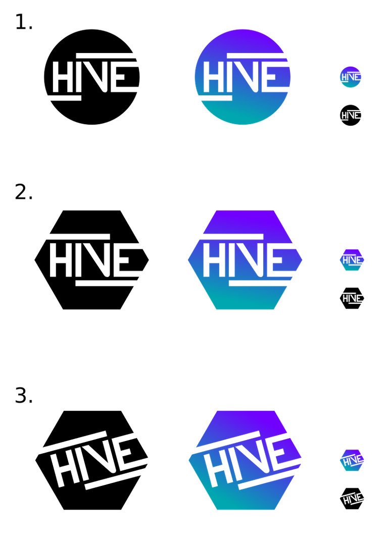
Recently @blocktrades wrote about Hive (here in the Comments), being the next Blockchain. I like the name and had an Idea. This is my Logo contribution. I made different versions in different sizes so you can see that it's even readable in small Size.
Edit:
Today they released the official Hive logo. Seems i was too late. xD
If anybody wants my Logo for their Hive project, just let me know. ;)
I made it as .svg just in case. ;)
Please use this Poll Link to vote for your favorite Design
https://dpoll.io/detail/@remotehorst23/which-logo-do-you-like-most
Thanks for participating! ✌
Edit:
Thank you @oneray for the idea with the honeycomb shape!
Edit 2:
A few notes why i made these changes.
The second and third logo was made a little bit different for a few reasons.
- I don't want to have something that looks like a half Swastika in the logo.
- You can see the Latin 4 better (this symbolizes that hive exists thanks to Justin and we went through hard times before we made hive)
- The Font of Logo Nr. 3 was rotated a bit to symbolize upward and forward movement.
- The Colors represent the old Steem growing into something new and modern.
- I didn't use yellow for a reason. If we use yellow, the perception would shift from tech look to something that has to do with real bees.
If the community likes it, i would like to donate that. Colors can be changed too. This was my first try and i simply didn't change it because i like how it turned out.
Also, i need to say that my Logo contribution is not official (yet). I just wanted to create something and i don't even know if Hive already has a logo.
The Community seems to be hived about hive! Check the #hive tag!
Here is a invitation link to the Hive Discord
Happy to hear your feedback and suggestions for the Logo. ✌
And as always:
I like the blue one the best. I feel it heralds back to our blue roots along with the fade to the teal. I'm not sure about the font but it's grown on me more as I look at it.
Great work!
Thank you for your Feedback! I will try another idea of a User here and will update my Post when im done. ;)
I created some other similiar Designs as well. Please use the Poll system (Link included) to vote for your Favourite. Would be glad to get a resteem too, to make the Polls more meaningful. Thank you.^^
🖖
I like 3.
Thank you. I voted for 3 too. But please be sure to use the dpoll system so your vote is count on chain. 👍
I would prefer a warm, honey-like color set in yellow/orange tones. Would fit to the brand :)
Because the picture that all Hivers(?) are like bees, collecting and contributing to a thriving crypto-hive - is huge!! Great possibilities for marketing.
I had the idea too, but this would be counterproductive for the tech look. The perception would shift too much in the wrong direction. We are a hive but we aren't beekeepers or so. ;)
But the colors can be changed anytime. Its more about the shape now.
The font type I would strongly suggest to change, it is not easily readable. Looks like "HNE". If smaller (like in a coingecko-listing) then it would be even worse.
Thank you! I was looking into that.
That's the size of Coinmarketcap Images. To me, that's good readable. Please keep in mind that you see the Name of the Listing too. If you know its Hive, you wont read it as HNE anymore. ;)
I will leave that decision to the top witnesses if they even want the logo. Then they can post about it, let the community give more feedback and suggest changes or do another poll.
Edit: I also heard similar feedback from other Steemians. I Probably try a few other fonts / designs soon. 😉
Maybe if you made the internal shape of a hive, it would look better. But the decision in the end is for the majority, if it really is a decentralized chain
Updated! Please vote. Poll link included. Thank you!^^
kinda reads HINE at first sight :/
Thanks for your Feedback. I probably make other versions too but i want to wait a bit what the community thinks about it.
Congratulations @remotehorst23! You have completed the following achievement on the Steem blockchain and have been rewarded with new badge(s) :
You can view your badges on your Steem Board and compare to others on the Steem Ranking
If you no longer want to receive notifications, reply to this comment with the word
STOPVote for @Steemitboard as a witness to get one more award and increased upvotes!
I like the blue and purple; but at first glance I read "HNE"
Thx for your Feedback!
Please Vote here so its being count: https://dpoll.io/detail/@remotehorst23/which-logo-do-you-like-most/
Yes the number 3...
Posted using Partiko Android
Thx for your Feedback!
Please Vote here so its being counted: https://dpoll.io/detail/@remotehorst23/which-logo-do-you-like-most/
Number one the colorful one. 👍💕
El número 3 se ve genial en azul :)