Most likely I'm not the most experienced art lover to share my opinion on the matter, but so far, based on what I've seen till this day, it seems to me that artists go through different phases in life and so does their art. This means that you can see a variety of styles over the years from the same artist. It's a normal process in my opinion as who on earth could stick to the same style for decades, right?
Earlier this week I showed you Erzsébet Kulcsár's leather series, which I called Moulin Rouge, because of the theme the artist presented us. It was an unusual set of artworks, made of leather, which makes it rare in my opinion and more valuable. If you haven't read my post, it would be recommended to do it before reading this post as you will understand better what I'm going to write about.
The peculiarity of this exhibition was that Erzsébet Kulcsár had a huge number of artworks exhibited, which was a wonderful thing, and what was even more wonderful was that these artworks were very different in style. When I'm saying very different, I'm not referring only to colors or themes, but to medium as well. In my previous post I showed you leather, today I'm going to show you paintings.
Similar to the Moulin Rouge collection, the paintings also had no title, so please feel free to think what you want, regardless of what I write about them. It's a good exercise for the mind I think.
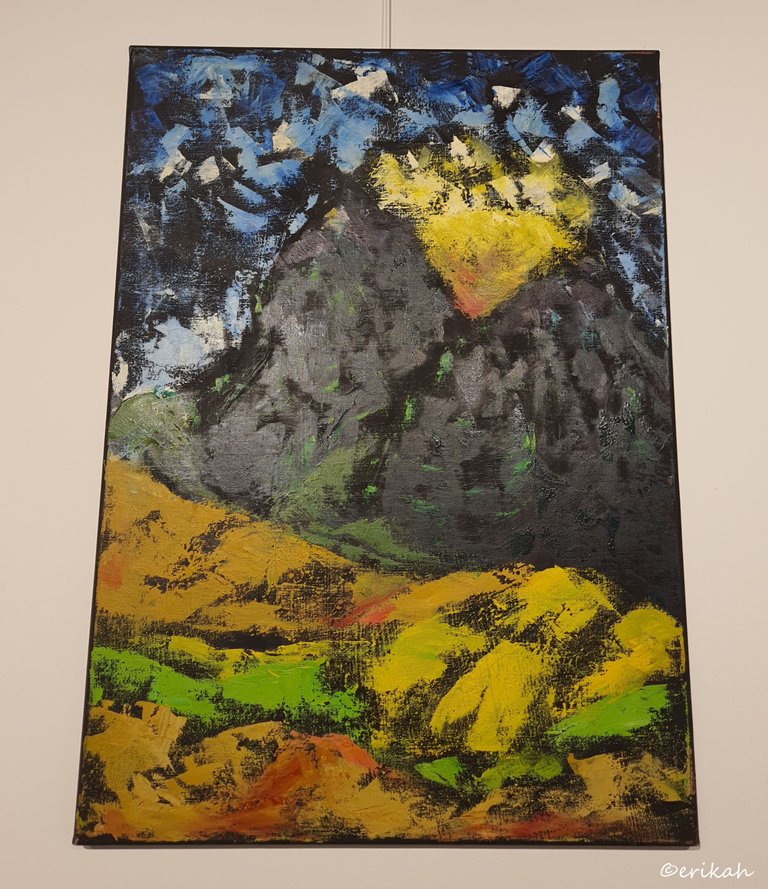
Some of the paintings were placed higher than usual, above my head, which caused the light to reflect on some parts of the canvas, making the black part shiny. Regardless, I see a nice landscape here, even though there are not clear and obvious mountains or clouds.
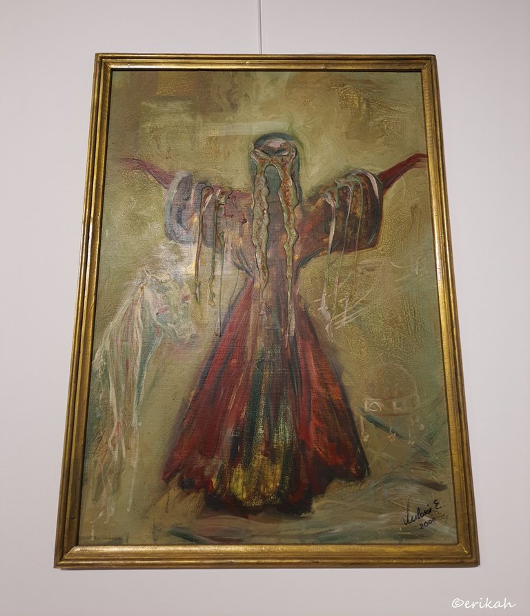
This was where I regretted not being taller or not having a ladder (yeah, the latter is a joke obviously). This was a wonderful one with a deeper meaning that it may seem at first. At a closer look you can see there's not just a lady in traditional clothe, but a horse and a crown on the right as well. Most likely it tells you very little, or nothing, because lack of knowledge about Hungarian history. For me, it became obvious, when I saw the crown. The crown looks very similar to Holy Crown of Hungary or the Crown of Saint Stephen as it is also called. The horse also plays an important role in Hungary's history so it makes total sense to see all these tree elements on the canvas.
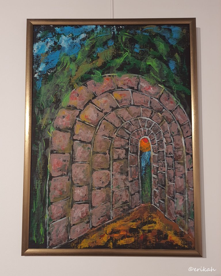
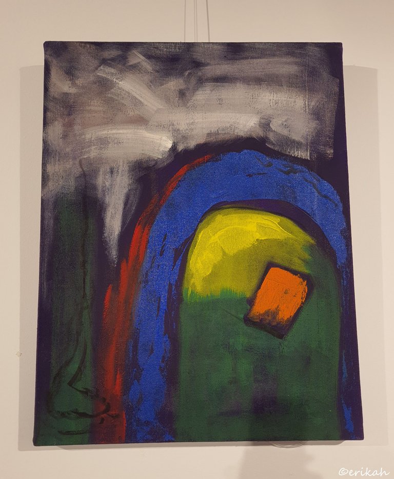
Right now I'm totally clueless about this. Light a the end of the tunnel? I have no idea.
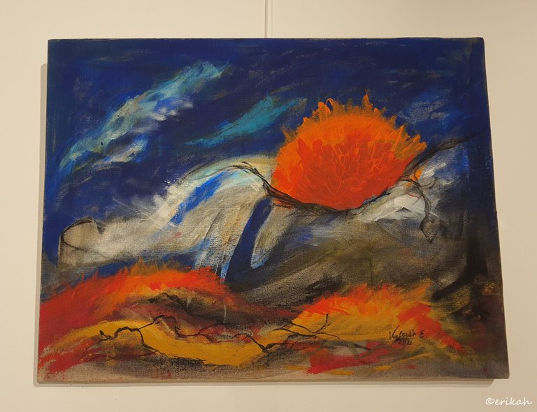
This could be a nice ad colorful landscape, where the orange ball could be the sun.
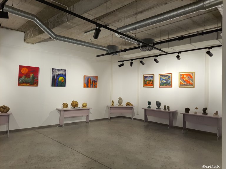
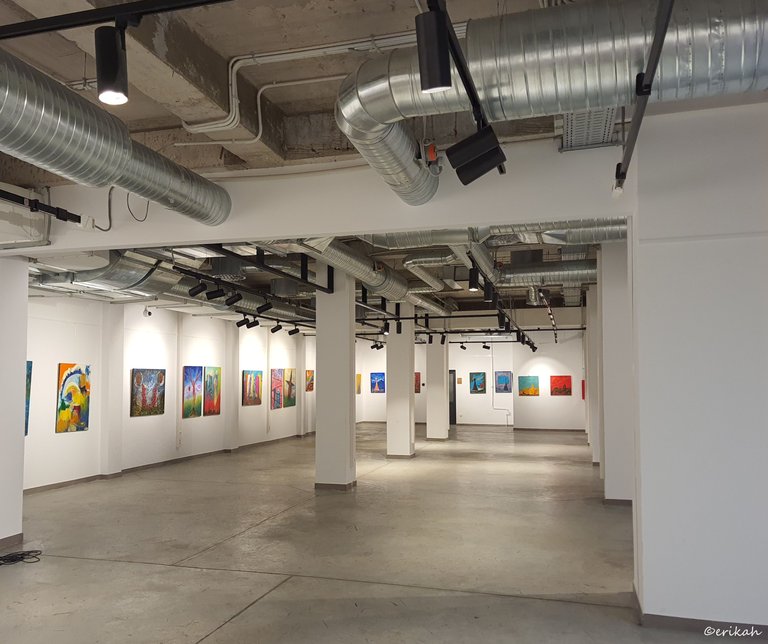
One of the things that became obvious right after stepping into this amazing gallery was the cavalcade of colors. I posted two photos at the beginning of my post, where you an see how colorful the paintings were. Strong colors you don't always see. It's not a problem in my eyes, on the contrary, it's nice to see something different from time to time ad this exhibition was different for sure.
Another one for you, feel free to tell me what you see here. Don't be shy, there are o wrong answers here, your guess is good as mine :)
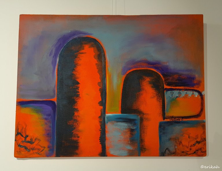
Maybe I can see a rough interpretation of the city (any city). Burning sky, the nice, orange sun and buildings of all shapes ad sizes.
You know what's funny? When I saw the painting about the lady, he horse and Hungary's crown, I was thinking thank God I have a good dose of knowledge about history and not only, because you need to know quite a lot to read these paintings. Like a kid, I was so proud of myself, the came these paintings and my pride got deflated as I can't really read them 😁 But it's fun to try.
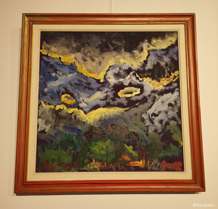
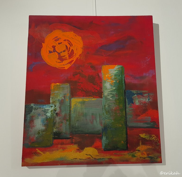
If I were to give a title to this one, I'd say Dangerous Weather. To me, it looks like when the Gods get mad at humanity and send bad weather down to Earth. It's quite intense, but I like it.
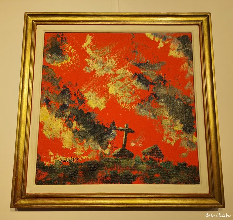
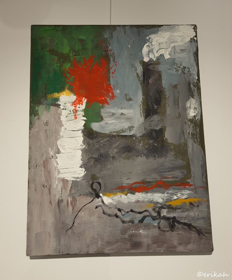
Here I truly regretted not seeing a title. Although the colors may seem too bright, this painting has a deep and religious meaning. I'm not religious, but I have a deep admiration for artists who can depict religious ideas in a nice way. Look at the cross and the burning sky. Back in the day when people were not as educated as they are now, every calamity, storm or flood for example was considered a punishment by God. Seeing such a burning sky, can mean no good as usually forecasts a storm.
Now you can see what I meant at the beginning of post, when I said this is a different style, nothing like the Moulin Rouge.
Feel free to give a title to the paintings or choose a favorite, or more.

If you're a newbie, you may want to check out these guides:
- Communities Explained - Newbie Guide
- Cross Posting And Reposting Explained, Using PeakD
- Hive Is Not For Me
- How To Pump Your Reputation Fast - Newbie Guide
- Tips And Tricks & Useful Hive Tools For Newbies
- More Useful Tools On Hive - Newbie Guide
- Community List And Why It Is Important To Post In The Right Community
- Witnesses And Proposals Explained - Newbie Guide
- To Stake, Or Not To Stake - Newbie Guide
- Tags And Tagging - Newbie Guide
- Newbie Expectations And Reality
- About Dust Vote And Hive Reward Pool, by libertycrypto27

I like the Door (my title 😀) reminds me of a painted door on an otherwise drab house or even street. Calls you in, grabs your attention. The doorframe is blue fyi if you are having trouble haha
I love how we see totally different things at times, but this is not a bad thing, on the contrary. I think the Door is a good title. Thanks for helping me out here 😁
I wanted to guess but I don't understand some of those arts. It twisted my mind thinking Lol
Lol, no worries, I've been where you are. Don't blame yourself.
I love arts but I don't have much knowledge about it lol
What emotional pictures! It seems that some of them are glowing.
I'm glad you see them like that.
The way you presented Erzsébet Kulcsár's diverse styles within the same exhibition is very thoughtful. It's intriguing how her art transitions goes from leather to paintings, showcasing a spectrum of themes and mediums. This is amazing!
She's definitely a complex artist, you'll see in my upcoming posts.
Wow, what a beautiful work of art, my friend, I was fascinated by some of the pictures in this post
Then my post wasn't for nothing :)
Bella mostra! Erzsébet Kulcsár non lo conoscevo. Opere comunque figurative, paesaggi dai colori di forte contrasto
Ciao @marcelloracconti e grazie mille.
Erikah, my friend, I really like these works, it reminds me of fauvism. The drawing itself doesn't have much weight, although each brushstroke is given deliberately, with a well-defined purpose... but the use of color is what fascinates me about this artistic movement.
However, this
It doesn't fit here.
The painting you posted above is indeed a bit different, but there were like 70 - 80 artworks exhibited and the style of the artist varied a lot, so maybe the order was not the best. You'll see the rest of the works soon and you can decide if it fits, or not.