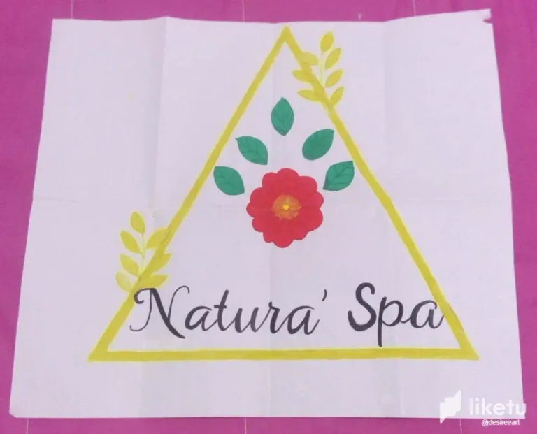
Original logo colored with markers
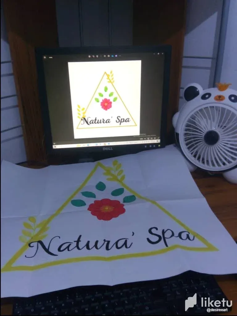
In coloring process
final coloring result
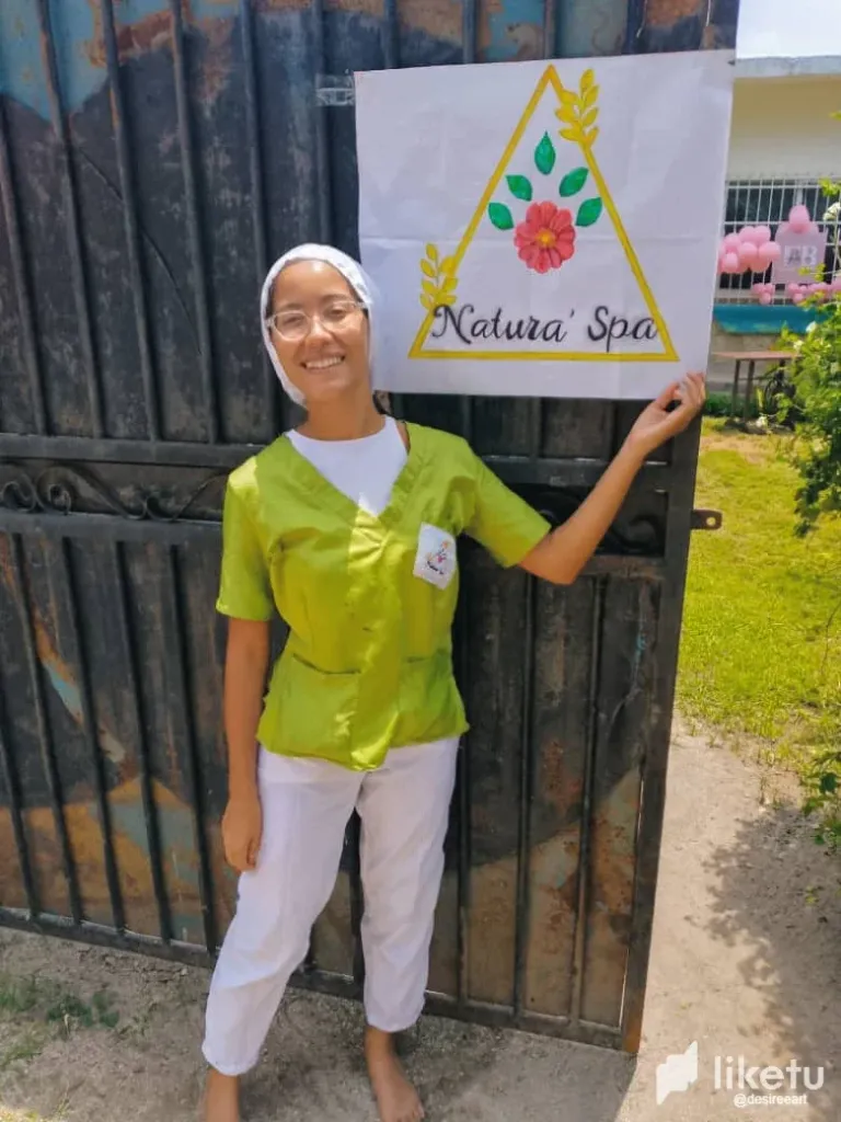
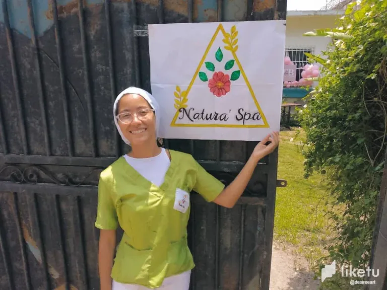
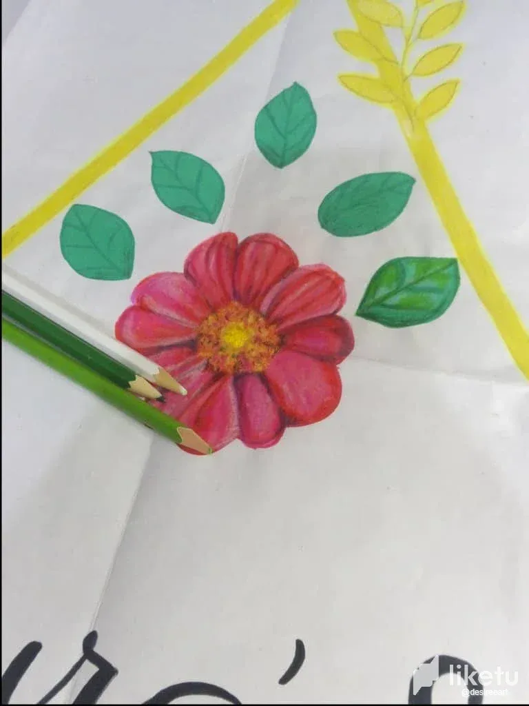
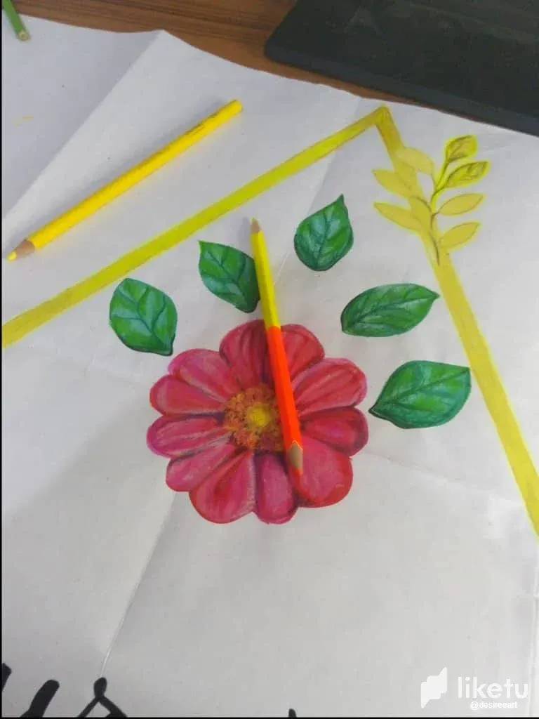
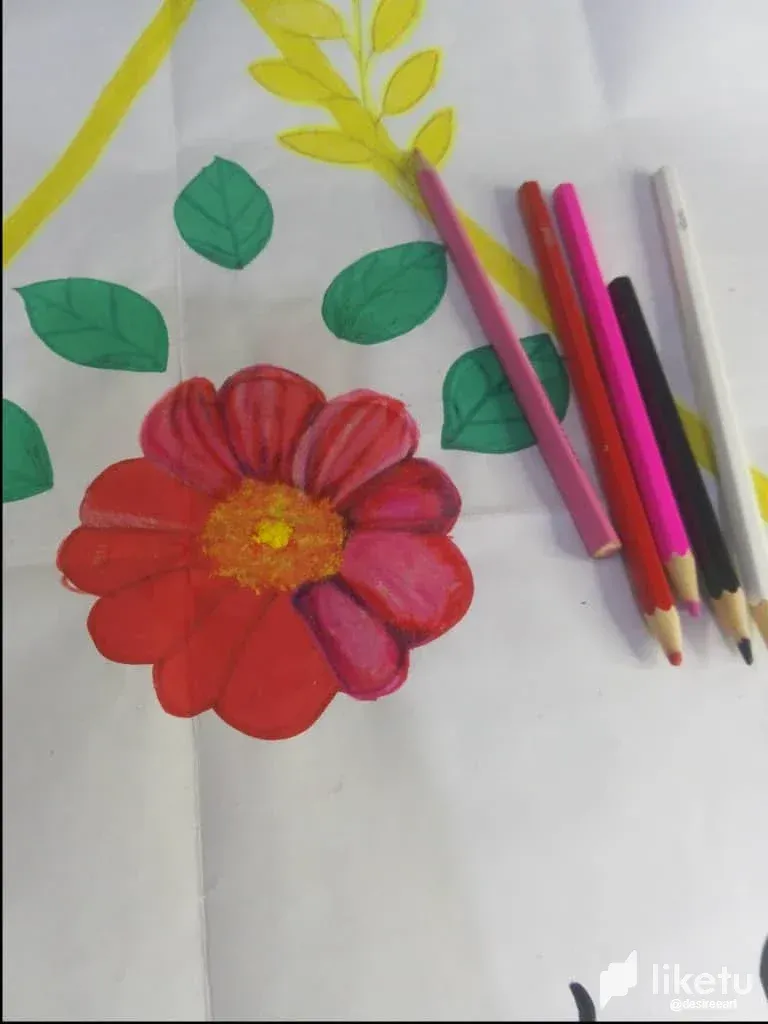
Today I want to share with you the transformation process that I carried out when recoloring the logo of the academy where I am studying, called Natura Spa. From the first moment I looked at the original poster, I noticed that the colors were very basic and lacked depth. The design was made only with marker, which gave it a flat and inconspicuous appearance. My goal was to give it a little more life, bring out the details, and generally improve its appearance. Looking at the logo, which consisted of a flower in the center with leaves and a yellow triangle around it, I could see the potential to improve it. The red flower looked very simple and textureless, while the green leaves also lacked details. The letters of the academy name and the yellow triangle that surrounded the design needed shadows and tints to stand out better. I decided to start with the flower, since it was the central element of the logo and deserved special attention. My idea was to use a richer and more varied color palette to give it depth and realism. For the flower, which was between red and pink, I chose a combination of pink, red tones, a little black and white. These colors allowed me to play with shadows and lights to give the petals a more vivid and realistic texture. First, I applied a base of red and pink, and then added touches of black for the deeper shadows and white for the highlights. The logo sheets also needed a makeover. Originally, they were colored with a uniform green marker, without variations or details. I used various shades of green, along with black and white, to give them a more natural and detailed look. First, I colored the leaves with a light green base, then added shadows with dark green and touches of black. Finally, I used white to highlight areas where light could naturally reflect...
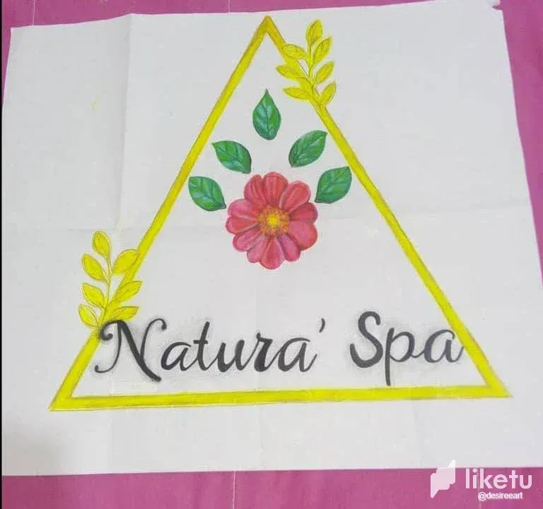
The result of this recoloring process was a golden logo, vibrant and much more pleasing to the eye. The extra details and textures I added managed to transform a flat design into one with depth and visual appeal. The central flower now looks more vivid, the leaves look more natural, and the letters and yellow triangle stand out much better. This project, although quick and easy, demonstrated how small changes in color and texture can make a big difference in the appearance of a logo.
Hoy quiero compartir con ustedes el proceso de transformación que realicé al recolorar el logo de la academia donde estoy estudiando, llamada Natura Spa. Desde el primer momento en que observé el cartel original, noté que los colores eran muy básicos y carecían de profundidad. El diseño estaba hecho únicamente con marcador, lo que le daba un aspecto plano y poco llamativo. Mi objetivo era darle un poco más de vida, realzar los detalles y, en general, mejorar su apariencia. Al observar el logo, que consistía en una flor en el centro con hojas y un triángulo amarillo alrededor, pude ver el potencial para mejorarlo. La flor, de color rojo, tenía un aspecto muy sencillo y sin texturas, mientras que las hojas verdes también carecían de detalles. Las letras del nombre de la academia y el triángulo amarillo que rodeaba el diseño necesitaban sombras y matices para destacar mejor. Decidí comenzar por la flor, ya que era el elemento central del logo y merecía una atención especial. Mi idea era utilizar una paleta de colores más rica y variada para darle profundidad y realismo. Para la flor, que estaba entre roja y rosada, elegí una combinación de tonalidades rosadas, rojas, un poco de negro y blanco. Estos colores me permitieron jugar con las sombras y las luces para darle una textura más viva y realista a los pétalos. Primero, apliqué una base de rojo y rosado, y luego agregué toques de negro para las sombras más profundas y blanco para los reflejos. Las hojas del logo también necesitaban una renovación. Originalmente, estaban coloreadas con un marcador verde uniforme, sin variaciones ni detalles. Utilicé varios tonos de verde, junto con blanco y negro, para darles un aspecto más natural y detallado. Primero, coloreé las hojas con una base de verde claro, luego añadí sombras con verde oscuro y toques de negro. Finalmente, utilicé blanco para resaltar las áreas donde la luz podría reflejarse naturalmente...
El resultado de este proceso de recolorado fue un logo dorado, vibrante y mucho más agradable a la vista. Los detalles adicionales y las texturas que añadí lograron transformar un diseño plano en uno con profundidad y atractivo visual. La flor central ahora parece más viva, las hojas tienen un aspecto más natural y las letras y el triángulo amarillo se destacan mucho mejor. Este proyecto, aunque rápido y sencillo, demostró cómo pequeños cambios en el color y la textura pueden hacer una gran diferencia en la apariencia de un logo.
For the best experience view this post on Liketu
Yeehaw! This blog post is like a colorful sunrise on the ranch! Keep shining bright with those artistic talents, partner! 🤠🎨