What do you get when you take a film emulsion and mix it with a healthy dose of acid?
If you answered Lomochrome Purple you'd be correct.
Brought to the world by the ever creative team at Lomography back in 2013, Lomochrome Purple takes the world as we see it a throws all the colors you recognize out the window. Inspired by Kodaks legendary Aerochrome Film, Lomography set out to create a film that created the similar color inverting effects of Infrared Aerochrome without the requirement of special filters. The result was this Barney meets blender mashup of color.
When I first learned of this film a few years ago I new immediately that I wanted to create a collection of urban shots using this film. I've been fascinated with Infrared photography for a while, and this would allow me a chance to experience the color changing effects without investing in a digital infrared conversion to my camera.
I purchased two rolls in 2020, tossed them in the freezer and took two years to selectively choose my days out exploring Vancouver with this film. Because this film doesn't have a set ISO like other films, I'd done my fair share of research trying to understand how contrast, ISO speed, and colors were affected by a given days lighting. After shooting the film in a variety of conditions I feel like I can safely share and recommend my prefer shooting conditions and style with this film.
Because Lomography Purple does not actually resolve infrared light, it instead takes the available light and shifts its hue far away from reality. You can see Lomography's description of the effect below.:
transformation, the spectrum’s sensitivity almost reaches infrared levels.
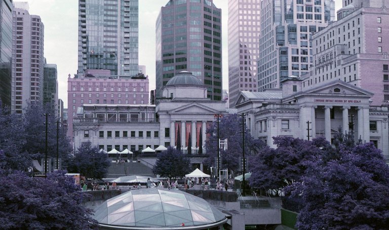
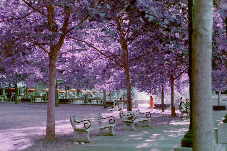
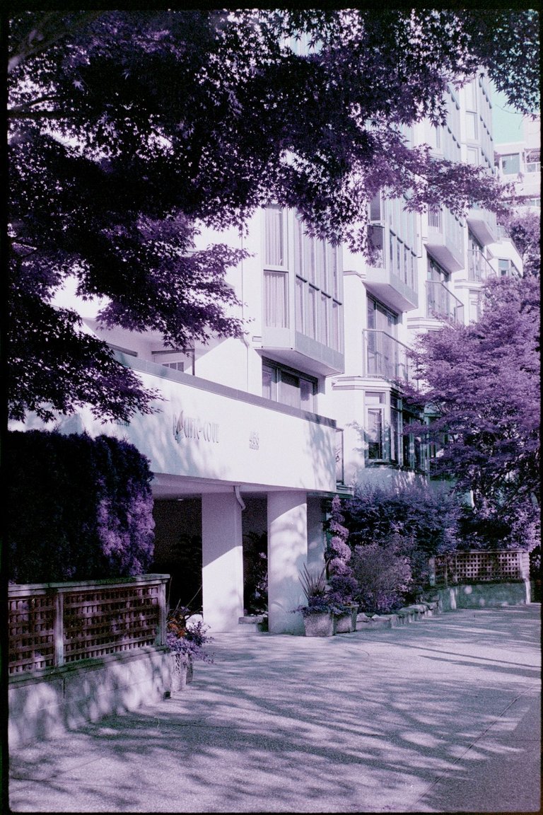
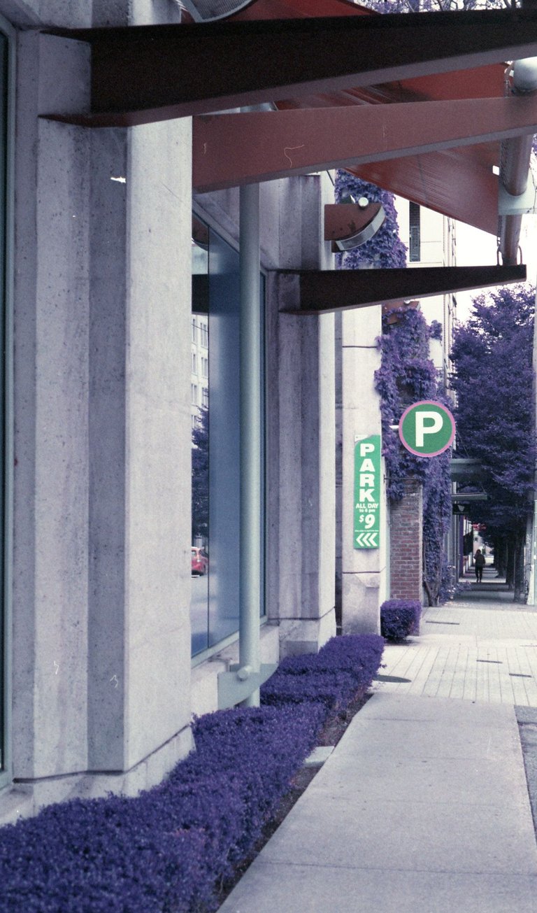
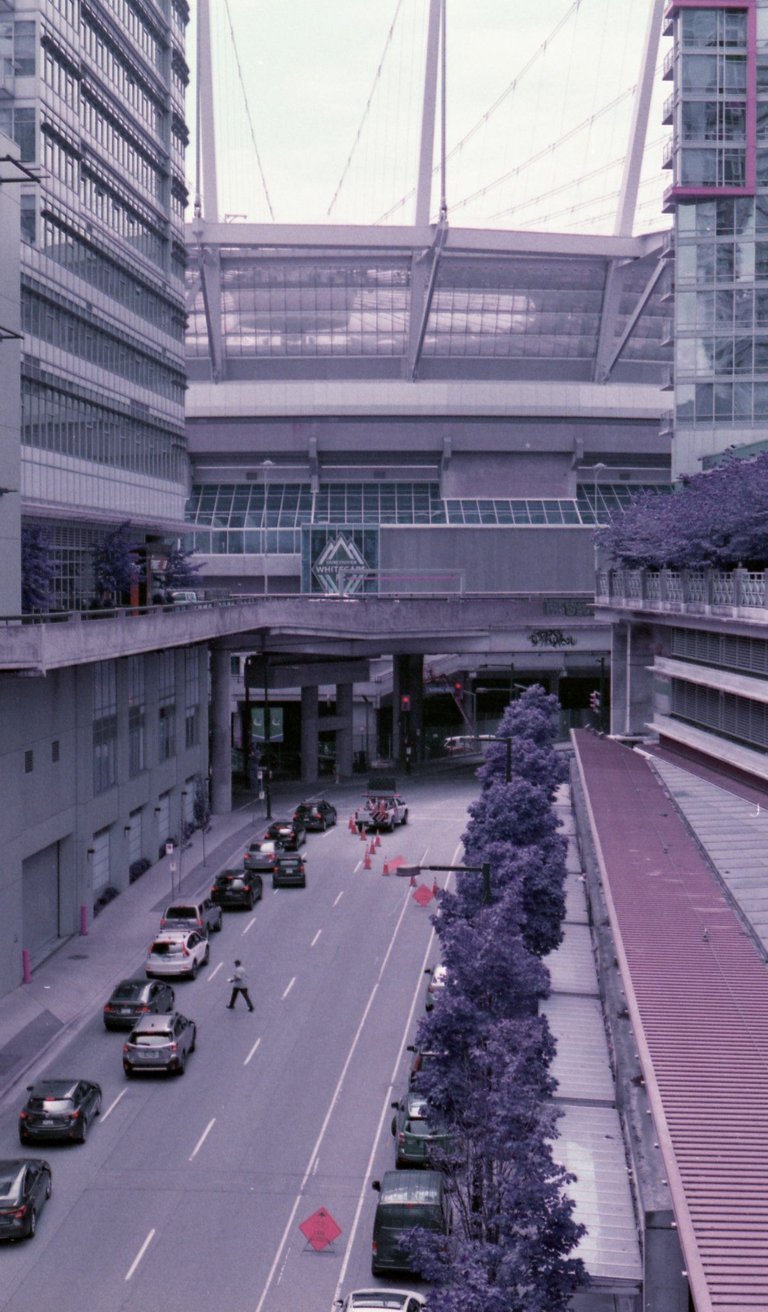
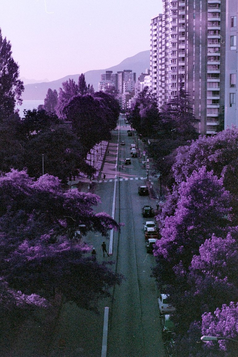
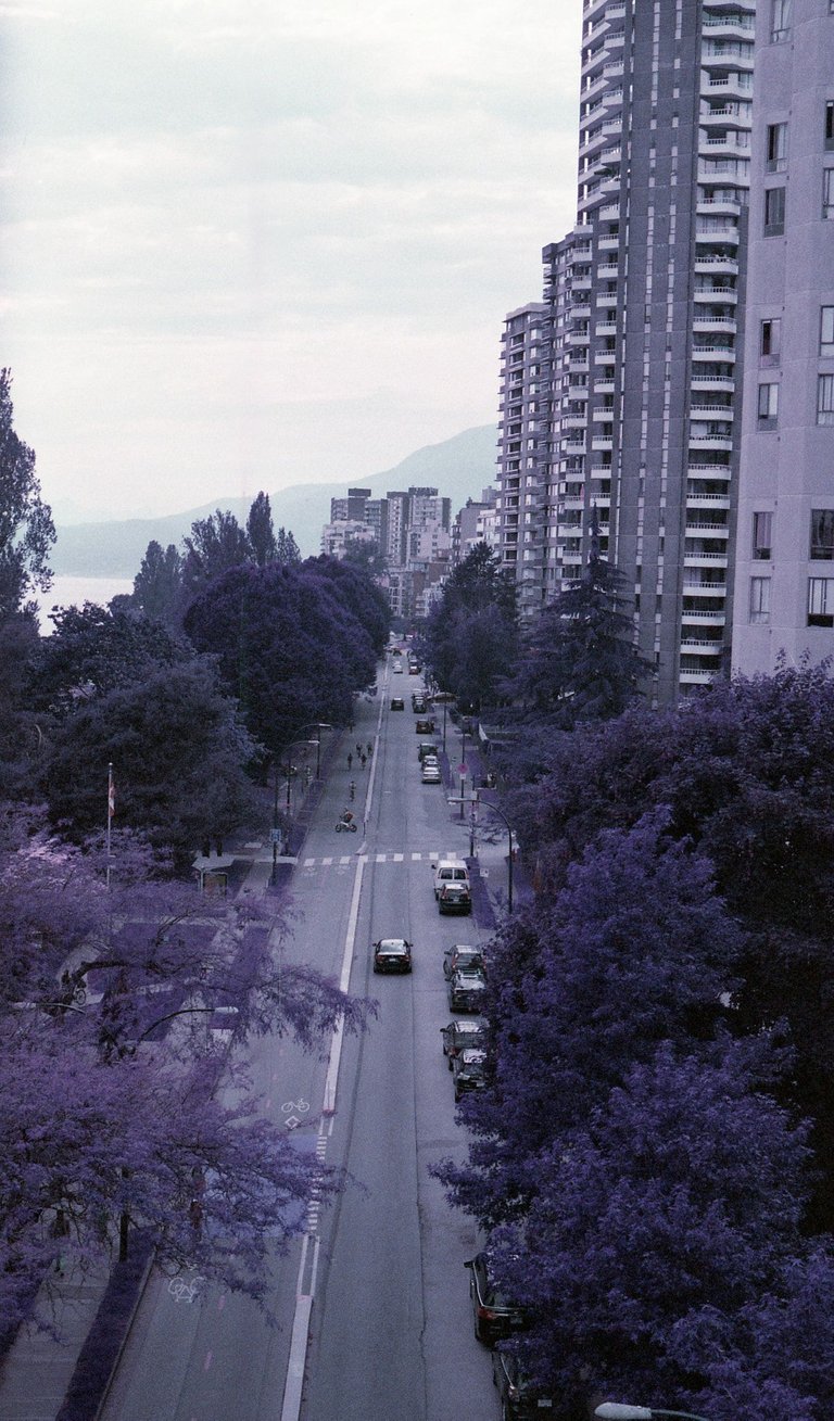
It is certainly an interest effect, and one I was excited to use in a series of images capturing some interesting green spaces I've found throughout Vancouver's Downtown Core.
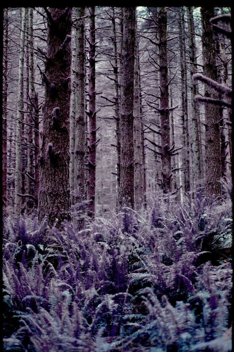
With my first roll I wanted to capture a variety of types of scenes. Some in complete shade, some in bright direct sunlight, and others that fell between the extremes. My first few shots were taken in a dark urban forest.
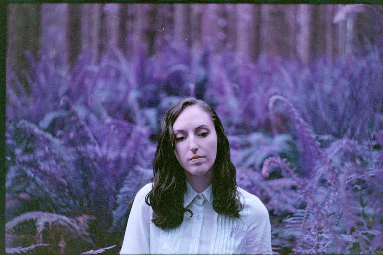
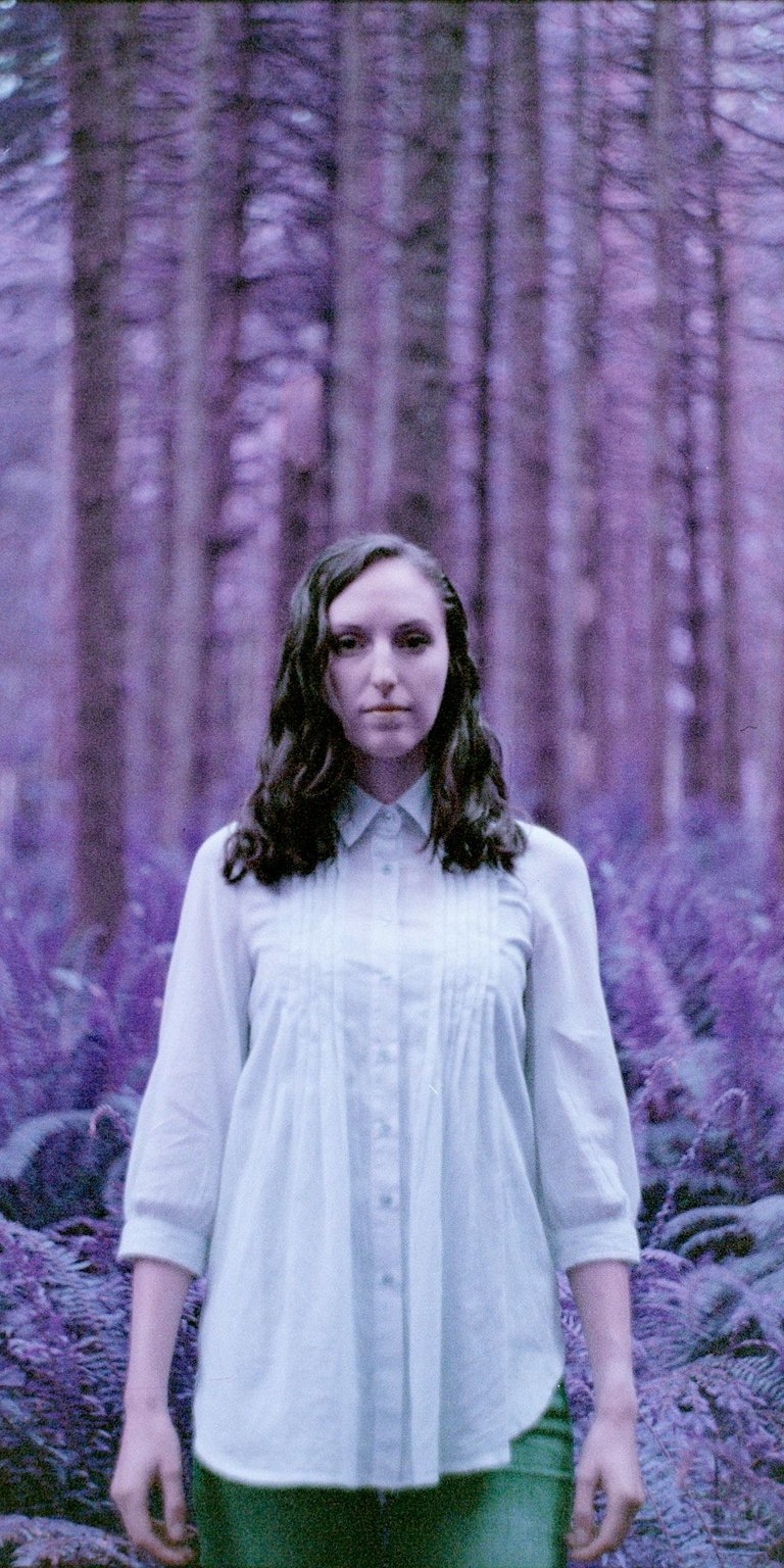
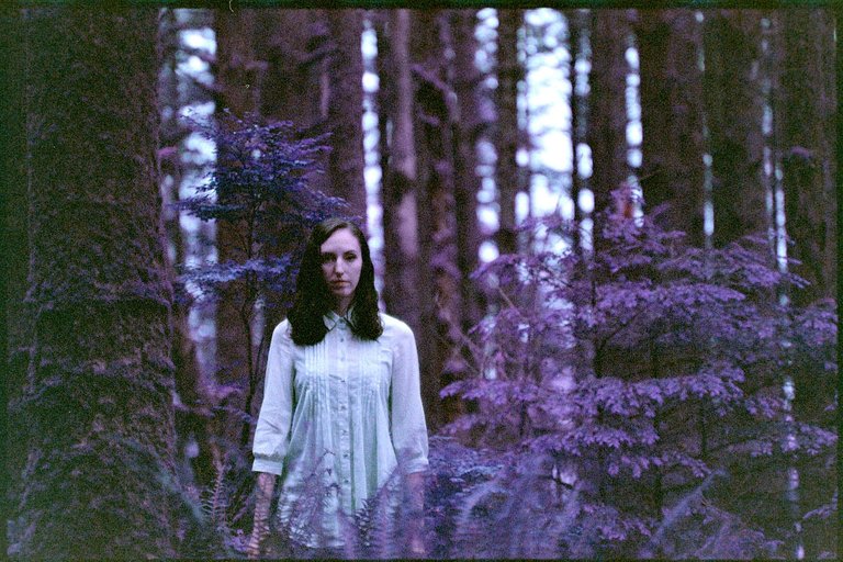
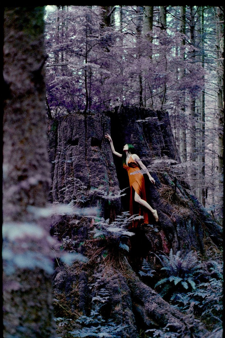
Online I had found an image taken where the photographer and subject mimicked the famous Gothic America painting on an overcast day using Lomochrome Purple. I decided if I was going to get any good idea of how this film resolved skin colors a portrait shot would be best. In the spirit of strange films I asked my partner to put on a collared top and stand in a small patch of ferns. I'd hoped to create an eerie uncomfortable image; similar to thow Alyssa and James are shown in the Netflix series End of the F***ing World.
With the film loaded we headed into the forest. I think we pulled of some great creepy images, and the alien purples really create an unfamiliar scene. I particularly enjoyed the dark teals captured in the shadows of the ferns.
 |  |  |
|---|
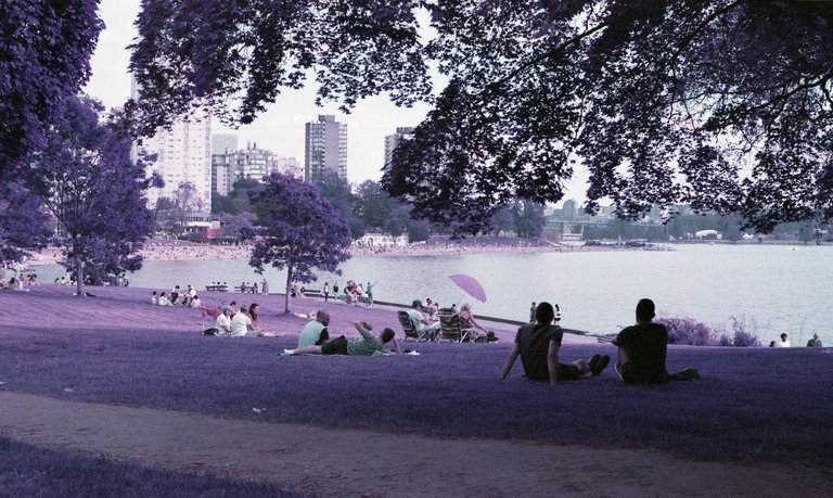
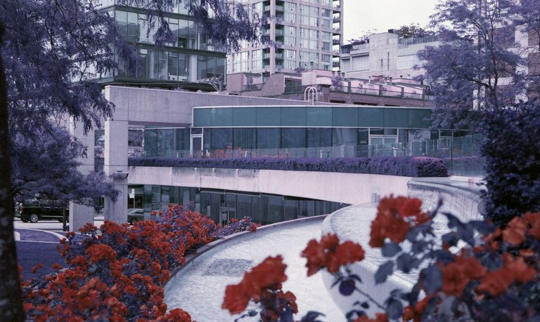
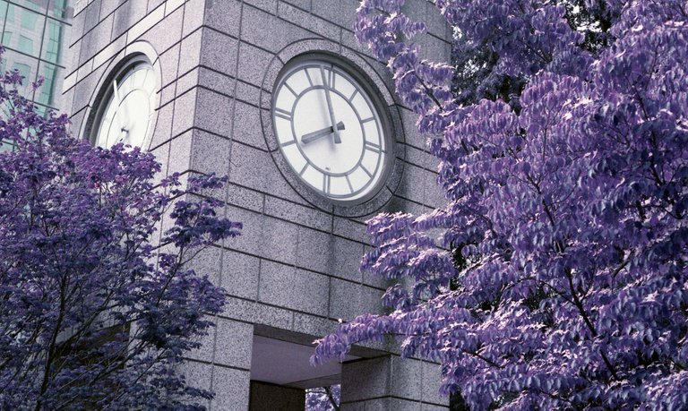
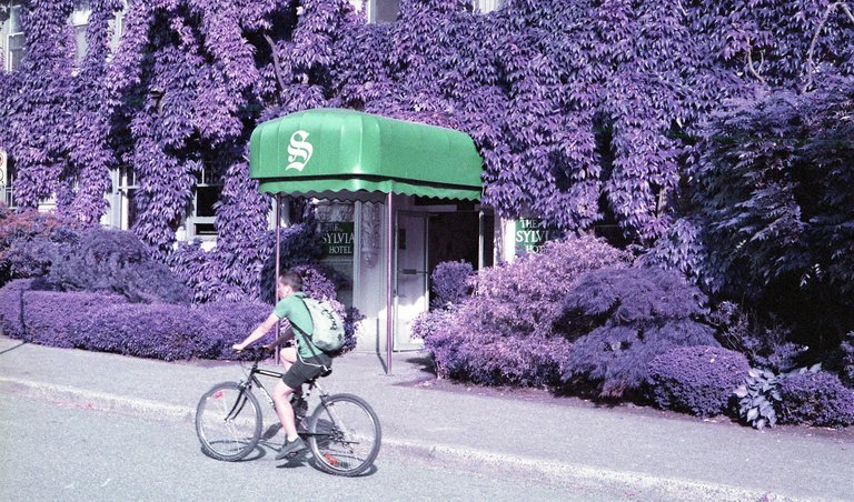
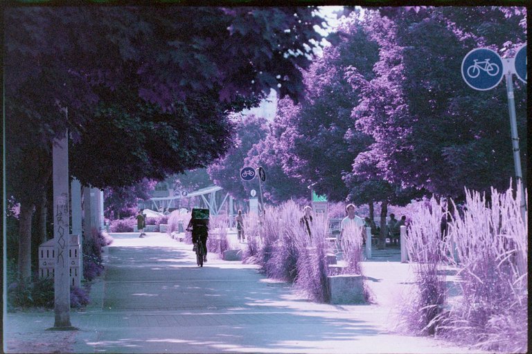
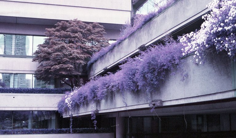
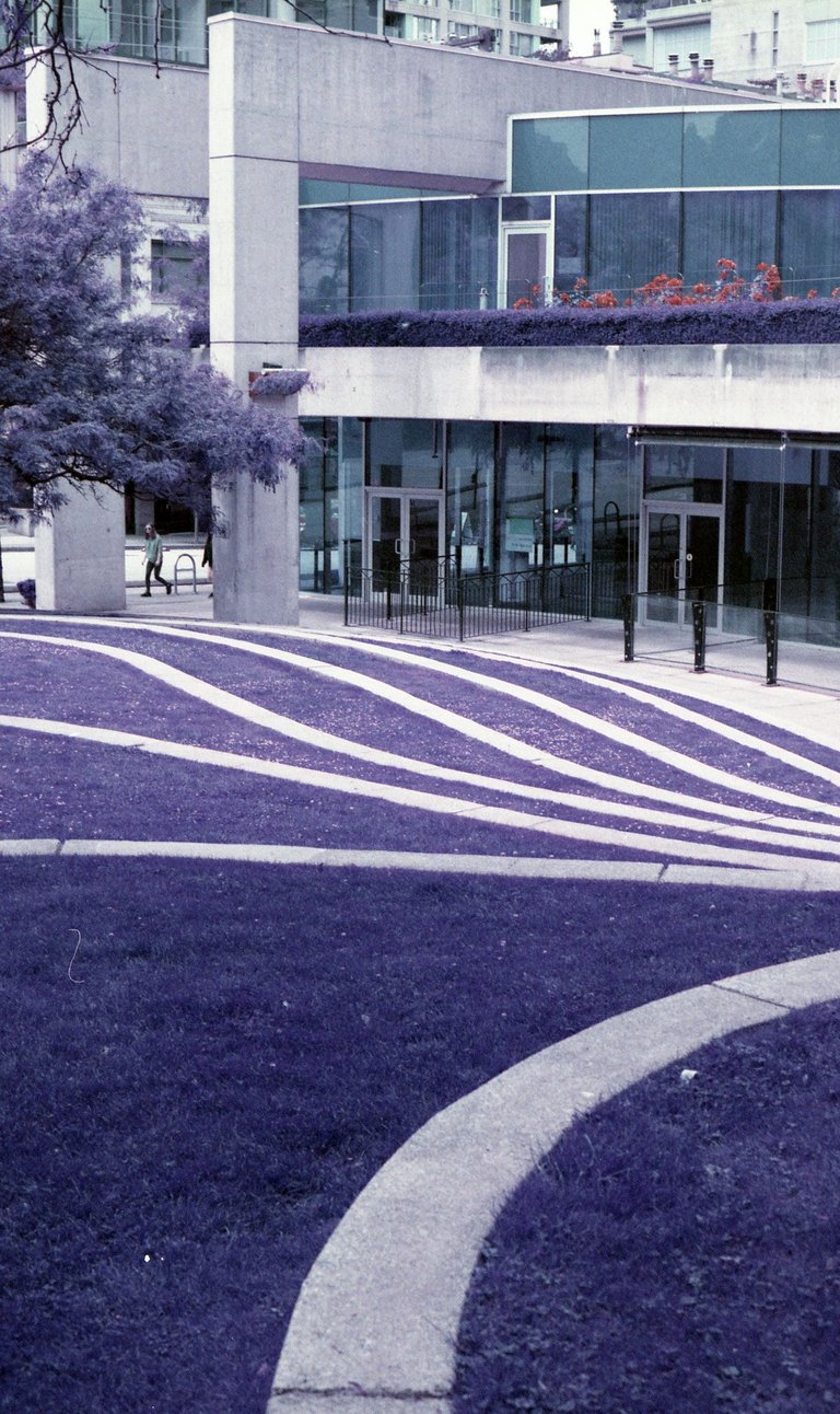
After shooting I headed for a long walk through the Downtown core to visit some favorite locations. I'd specifically scoped out some areas I knew had interesting foliage interweaved with the concrete jungle. These are some of my favorite results.
 |  |  |
|---|---|---|
 |  |  |
Recommendations and Lessons Learned
Picking the ISO
If you visit the web page for Lomochrome Purple you'll find the film listed at a confusing box speed of ISO100-400. And if you're familiar with film, your first thought is likely "why wouldn't they just have a single box speed?". And I don't blame you.
Lomography and other photographers have suggest that picking an ISO determines the amount of 'purple' that the image takes on. And while they're not wrong, I found that the type of light affected the colors much more than the ISO. Instead, I think its more conducive to think of the 100-400 range as a suggested range from Lomography to push and pull the film for effects. Similar to the way that a large group of photographers push Portra400 a stop or two to get the desired rendering.
 |  | |
|---|---|---|
| High Contrast - ISO100 | High Contast - ISO400 |
 |  |  |  |
|---|---|---|---|
| High Contrast - ISO200 | Low Contrast - ISO200 | Low Contrast - ISO400 | Low Contrast - ISO800 |
With my first roll of film I purposely used the first 10 frames to test varying exposures ranges, and shot the rest at ISO200. To save you the full read, this is the speed that I would ultimately recommend using for Lomography Purple.
How does direct light affect Lomochrome Purple?
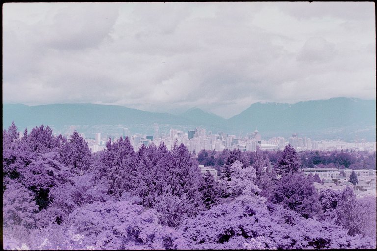
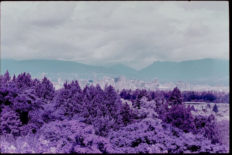
When I received my developed film from the lab and started scanning frames it quickly became clear how high contrast direct light affects the way this emulsion renders colors versus the lower contrast light on a rainy day.
Given the limited color palette of Lomography Purple I think the easiest way to discuss the effects of light is in the color vibrancy and hue variety found in this film. Where Vibrancy is the mixture of saturation and luminance, and Hue Variety the range of distinctly difference hues.
Low ISO - High ISO
Low Vibrancy - High Vibrancy
Less Hue Variety - More Hue VarietyLow Contrast Light - High Contrast Light
Low Vibrancy - High Vibrancy
Less Hue Variety - More Hue Variety
After looking through my collection of frames I found it was very clear how the images were being affected by the available light and given ISO. Looking at the darker areas of images I started noticing dark greens and teals sneaking into the image. This was extremely apparent at ISO800. Although I didn't set the ISO higher than ISO800, a few images underexposed at ISO800 showed even more vivid greens in the shadows.
When I turned my eye to the more brightly lit scenes taken mid the lack of color variety became quite apparent. Midday shots showed what felt like nearly dual-hue images - showing light purples and cyan only. With almost no shadow the scenes become dull with their lack of color depth.
And as to be expected the shadows and underexposed overcast shots showed deeper purples, but surprisingly rendered reds and deep blues better as well.
It was in noticing these interesting shadow colors that I realize pushing this film was likely the better way to go.
After seeing the results of the first roll I determined that more often than not I preferred the images shot at ISO200 on overcast days the most. The alien blues of the shadows may not be as intense and fun as they are pushed at ISO800, but they are still there and feel in control. And while the soft purples of pulling to ISO100 can be pleasing, I found the lack of color variety rendered disappointing. ISO200 and ISO400 became the sweet spot. So why suggest ISO200? Ultimately, it's because at ISO400 more often than not I found the deep purples too unnatural. I realize that's strange to say in the context of color film, but in the context of Lomochrome Purple the ISO400 shots just had too much saturation for my preferences.
Other than the alien shift of green to purple, for me the most interesting color change was the shift from deep blue to vibrant green. If I ever shoot another roll of Purple film, I think I'll make it a goal to seek out scenes with large amounts of deep blues and reds so that this films color rendering can fully show off.
Do you like PURPLE?
After shooting 50 frames of Lomochrome Purple, I can say without a doubt that this film is very purple. Way more than I had expected. Where this film shone was in scenes where high contrasts between primary colors (reds, yellows, greens, blues) existed, and in overcast to mid-day lighting. It was in these conditions that the stunning colors rendered by Lomography Purple were most interesting.
Although I likely won't put another roll of Lomography Purple through a camera anytime soon, if I did, I think next time I'd make it a focus to create a series of images shot in the same lighting types. This would bring more consistency to the rendered colors which I found to be the most difficult aspect to control of this film.
If you'd like to see the full gallery of images I encourage you to checkout the full gallery on my website here: Lomochrome Purple - Full Collection

Follow me on HIVE or checkout my work at these links below
Website: wwww.dyptrephotography.ca
Instagram: https://www.instagram.com/dyptre/
Twitter: https://twitter.com/dyptre
All images are owned and created by Dyptre www.dyptrephotography.ca
my understanding is that the infrared modified cameras also get the best results in the mid-day light.
concrete and trees give an interesting contrast. but i can see it used in weird portraits.
Ya usually infrared does work best during mid-day light. It allows for the greatest range of infrared light to hit the sensor. With Lomochrome Purple because its not true infrared though, it doesn't follow the same rules.