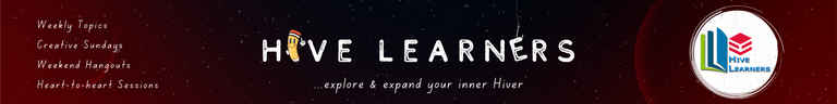
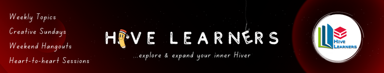
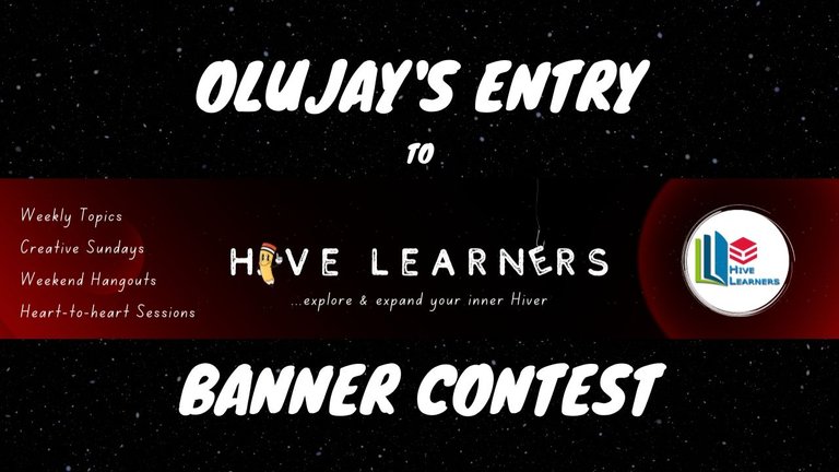
The Hive Learners community just hit five thousand subscribers, and to commemorate that, there's a contest to make designs for the community banner. This is my entry with the entire steps to achieve my designs.
The video is a more elaborate demonstration of everything I did to make the banner.
Making the background
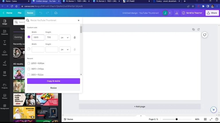
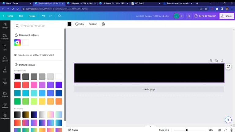
The required dimensions for the banner are 1920 x 245 px. Therefore, I started off by picking a default dimension of 1280 x 720 px and then resizing it to what was required, 1280 x 245 px. Next, I changed the colour of the background to black, as I was going for a space-like look.
I then started to introduce some elements. I searched for "gradient circle" and picked two kinds that I needed for the design. I resized them as I desired and then changed their colour.
Changing the colour isn't always straightforward with some elements. These elements, the "gradient cirles," are one of them. What I do in this type of situation to change the colour is to use the "Duotone" effects. From there, changing the colour is possible.
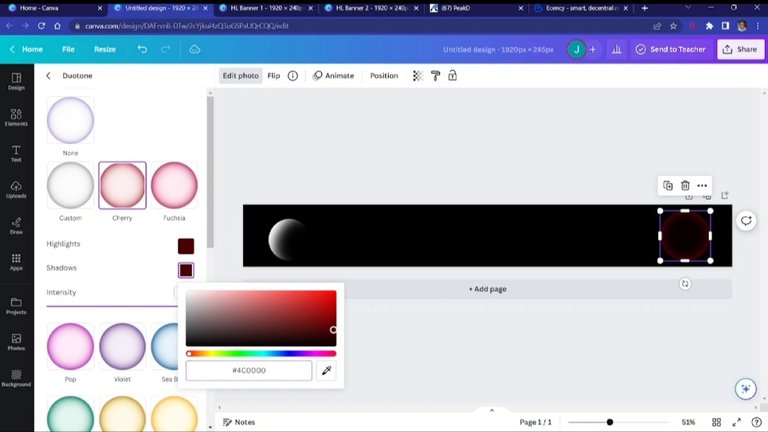
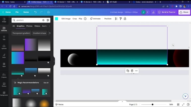
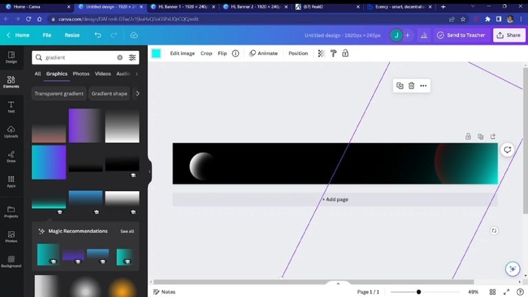
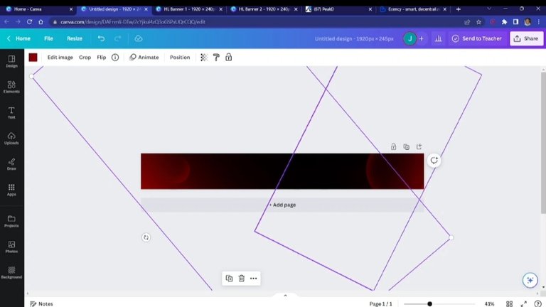
I needed the corners to have a lot more red, but in a smooth way. And so, I introduced another gradient element, but rectangular this time.
I then resized, changed the colour, and positioned it to achieve what I was looking for, making the corners a lot more red. At this point, this is the background I wanted to use to layer the rest of the elements.
Making the "Hive Learners" text
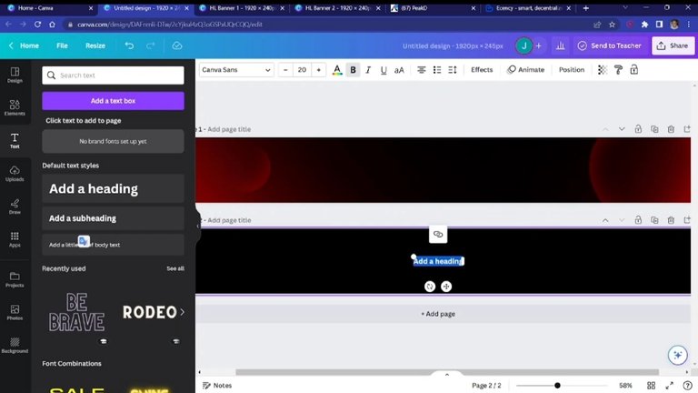
I could have just done this the regular way and just written the text, changed the font, and resized it, but I thought to spice it up a bit by adding some creative touches.
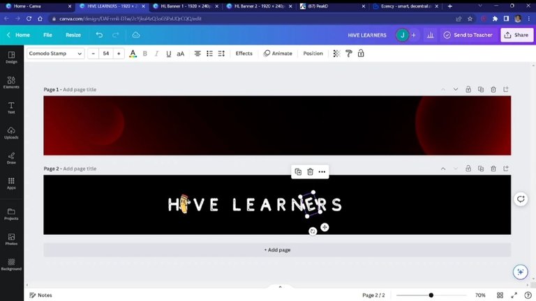
First off, I did the normal thing by introducing a text box. I wrote "Hive Learners" and adjusted it. I felt the COMODO STAMP font would suit my design as it wasn't too serious and also wasn't too casual, and so I used it.
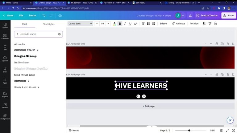
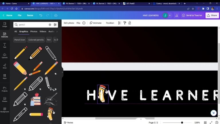
Now, here's where I try to be creative. I brought in a pencil from the elements tab and laid it over the letter "I."
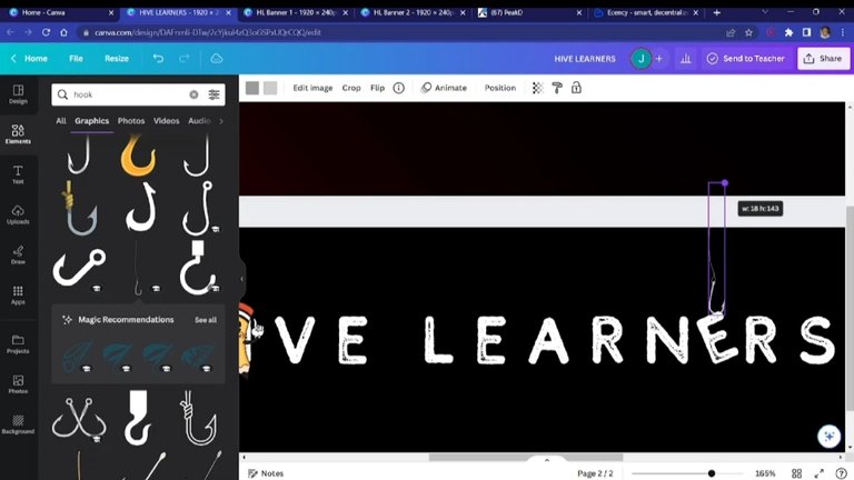
Nex, I took away the letter "E" from the entire text and replaced it with a space. I introduced the new letter "E" and rotated it a bit.
Afterwards, I brought in a "hook" element and lined it up with the rotated letter "E." That would give it a dangling kind of look.
Describing the community
I thought to make the banner speak about the community and what it is about in the most effective way, so I thought of the caption sub-title, "...explore & expand your inner Hiver." Because, well, that's what we do here in the Hive Learners community; we keep trying to grow as the community itself helps us to.
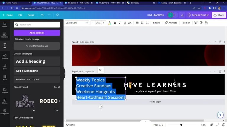
Next, I thought to include what we do regularly. There are weekly topics, creative Sundays, weekend hangouts, and our beloved Heart-to-heart sessions on Mondays at 4 PM UTC (link). I put them on the left side of the banner, selected my desired font (Canva Student Font), and adjusted their spacing.
Redesigning the logo
Okay. The logo is great, and I love it, but with the colours it has, I felt it wasn't going to pop on the dark background I made. And so I thought to implement something that would show its beauty.
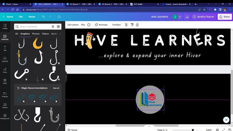
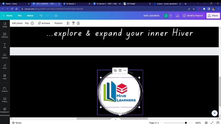
I introduced a circle and put the logo in the middle of it. And, then, for aesthetics, I added some fancy hollow circles to spice it up. I put it around the circle where the logo was and made it concentric. I joined them together to make a group to allow easy transpositions, and I placed them on the final design. And, also, I added some stars to the background.
Making variations
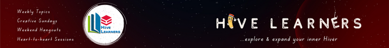
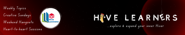
I wasn't exactly sure what would appeal to everyone. And, also factoring in the fact that (especially on peakd) banners appear differently on different devices—PC, mobile, and the like—I decided to make up some spins to see what works.
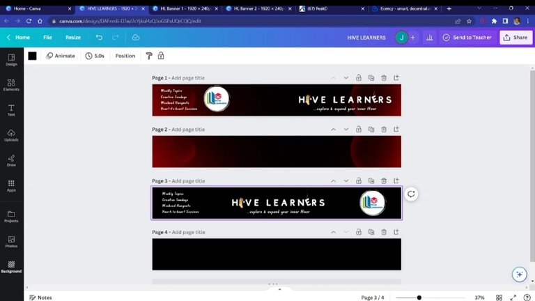
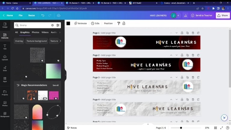
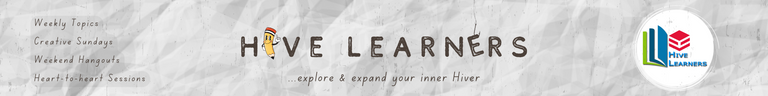
All I did was rearrange the elements to give it a different look, which will hopefully look nice. And, for experimentation, I tried a completely different background and changed a few other things.
Whatever the community leaders consider, if they like my work, they can have varieties from me to choose from.
Finally
But I realised in the end that I was working on 1920 x 245 px instead, so I resized it to 1280 x 245 px after everything. And here we go...
Again, the processes are more elaborate in the video up above. I made the designs and recorded the entire thing to show exactly what I did. Thank you for reading/watching!
▶️ 3Speak
Wow this is wonderful
Look at the way you even presented it, the details are impressive.
I like the colour combination of the banner more, it represents Hive learners very well (I mean it has the badge colours in it).
I'm sure you spent time and effort on this, well done!
And good luck in the contest.
Will come for more lessons, I want to design like you 👀
Nice video by the way.
It actually took a while to think of this design, but I am glad it turned out to be something that Merit likes. I am she does.
👀👀
Na trial-and-error be my scope
Thank you very much, Mer Mer, and for the ginger.
Lol come and teach me how to trial-and-error too 😂
Oya nau.
Fingers crossed for next Wednesday.
Haha okay
The banner looks simple yet amazing. The color and fonts seems perfect. Congratulations to the hive learners community for reaching 5000 subscriber's milestone, I wish them more wins..
#dreemerforlife
I appreciate that, man. I do believe in simplicity, though. I'm glad you like it.
Thank you!
How long it take you to complete this banner?
You are good. The banner looks just like the work of a professional.
Also, thanks for sharing that video so we can follow the process when we want to try out something similar.
Well done Jay.
#dreemerforlife
Uhmm...to be honest, it took me more than it should have to make it. It took me days to come up with the design concept, and it took 46 mins to make the video you see —crammed into 7 mins.
I am glad you found it useful, Jessy. And that you came around. Thank you.
Very lovely this is lit, i love the whole dark red background thing, and the idea of including what we do at the left hand side, its just unique, the rotary of the E thou makes it awesome, great work and time put into this i must say
Impressive observation and commentary, frredaig. I appreciate that you see the effort put into it. Thank you.
Who doesn't like good stuffs
Thank you for thanking me☺️
Assuming that I joined the contest, I would have competed with you and this pro work, right?🙈😄
Boss, you're certified in design.
It looks so good
Very hilarious, man. 😂
Rather, I'd say, if you had entered the contest, I would have been able to pick one or two things to learn. The entire contest was much of a learning process for me.
I appreciate the kind words, man. Thank you.
Wow, olujay is becoming a big pro in canva design. Good that you explained the detail in video form,that's a more practical way to understand better the steps you took. This nice jay, I can only imagine the time you spent designing this. Well done for your effort and good luck with the contest.
I love your concept 😍
The texts in there in the banners says a lot about HL community... you just unleashed your creativity man..😇👍
Good morning
I am only trying my best, Sweet Nkem. 😂
I guessed the video would be better, so I just made the recordiing as I was working. It took a while, though. Here it is, anyway.
Yes oh😁
I have been challenged a lot with many designs for different occasions, lately, but they have all allowed me to explore more and learn. I am thankful.
Thank you very much, Sweet Nkem.
The pleasure is mine jay 😍
When you are good then you are good no cap. 😊 Mehn this is topnotch, I love the process from the beginning to the end. Weldone brother
Thank you very much, man. 😂
I appreciate it.
This is a great tutorial bro and I love your designs. I did learn something new watching your video. The video has a different feel to just the picture tutorials. Thanks for sharing
#dreemerforlife
Exactly, the video is more immersive compared with the pictures alone. I thought about that and made it instead. I am glad you found it useful, man.
Thanks for coming around.
These is pour masterpiece, you did an amazing job here brotherly.
I guess pc as more tools than mobile, cause I'm just seeing some of these tool for the first time, or probably I'm the one who hasn't explore enough.
Keep up the good good.
Thank you for the kind word, man.
I don't think PS has more tools than mobile. These designs you see here were first done on mobile and completed there. I only remade them on PC for demonstration. So, yeah, I think everything is on mobile, too.
First thing first, I love how you explained in details the step by step in designing this logo. That was impressive 👏
Yes, to the logo... omo, this is so amazing. The logo is superb, I love the background color, so cool 😎.
You must have spent a lot of time on this and the result is so beautiful 😍 I wish you good luck in this contest, Jay.
I need to rewatch the video again, there are some things you did that catches my attention. It would help ✌️
I did spend quite some time on it, but that's how it is with most designs I make. I am used to it by now.
That you found this post useful, it makes me glad.
Thank you very much, Princess.
Of course, when one keeps doing something, it doesn't seem stressful because one is used to it. It's my pleasure, Jay.
Wow, this absolutely brilliant... I also learnt one or two things.
The end result is just superb, you've done a great job man.
I'll need to come for tutorials, cus am still a learner big time.
Thank you very much, man. 😄
I'm glad you found useful things in the video.
I may be sharing this kind of content once a while from now to share the little that I know.
Hmm did you just say little 😃😃
Obviously you know much more, big graphics designer. 🙌
I'll be looking forward to seeing your next graphics post.
Great ideas and design skill.
You did this with Canva, you re a geek oo.
I appreciate, man.
Thank you. 😄
Wawu... This post is well-detailed on how you created the banner and it is awesome!
Seeing how the changes occur and text appears with just a tap is a witchcraft technology as given to us(not for free though) nothing is for free😂😂😂.
Thanks for sharing and enjoy the rest of your day.
And a big congratulations to the #Hivelearner community.
I waltzed in from #dreemport and I am a proud #dreemer... Hehe, #dreemerforlife
Mz Waltzer
Everything with technology is witchcraft. 😂
Back in the old days, about a century, logos probably took weeks to create.
I'm glad you doing this post useful, Balikis. Thank you, and for your kind words, too.
One and only.☺️☺️
Yes oo, it would have. Omo, times have changed.
You're welcome Jay😊😊
Wow, I am impressed with the design and yes, this is creativity at the top level.
I use Canva but I get to learn new things that I can apply when working on canva again. The colour and every other thing is perfect, you did an amazing job.
Haha...thank you very much, man.
I am glad you found useful things in the video. I may just keep sharing things like this from time to time.
That is such a beautiful crafting, i never expected canva to deliver such an amazing work. I must say that you're really good.
Well done brother.
Canva is actually a really powerful tool, and its quite easy to work with.
I appreciate this, man.
Hey! You made a perfect entry to the contest. The idea of adding weekly activities on the banners is amazing and captivating. Good luck for the contest 🤞
I appreciate that, man. It was an entire learning process for me as well as challenging one.
Thank you.
I always commend designers whenever I see one. It isn't a piece of cake as it always seem. This is a well detailed content.
@olujay , well-done sir.
I should subscribe to your YouTube channel too, to learn more.
nice job incorporating a pencil in your design.
Thank you