In case you haven't heard, Leo Finance is redesigning from the ground their User Interface and they are asking the community's feedback because well, after all, it's all about providing us Lions the best user experience and Leo has been quite loud about taking the opinion of the community to always improve on every front.
I am part of the Leo Finance team but I am not involved in nearly 10% of what happens around in the ecosystem, I only contribute in the social side of the LeoVerse, so I'm taking this chance to make a post about what I think can be improved in the UI or implemented down the road.

I know the Full-Scale rebuild is about design, but as you can see in my thumbnail I have little to no experience in design, so I am just going to limit myself to explain the concepts, not the designs, I'll let someone else design these concepts.
News section
The Leo Finance discord is a great way to spread announcements or update the community on what is going on on every front of the LeoVerse, but discord announcements have a lot of cons: People mute role mentions, everyone and here tags, some users don't check discord that often, some Lions don't even have discord, and the fact that discord is the team's only channel to communicate updates, upgrades and general announcements is not ideal.
But what Lions always check and are active in, is the leofinance.io interface, so why don't we add a small icon next to the notifications icon where users get a drop down menu with the latest news?
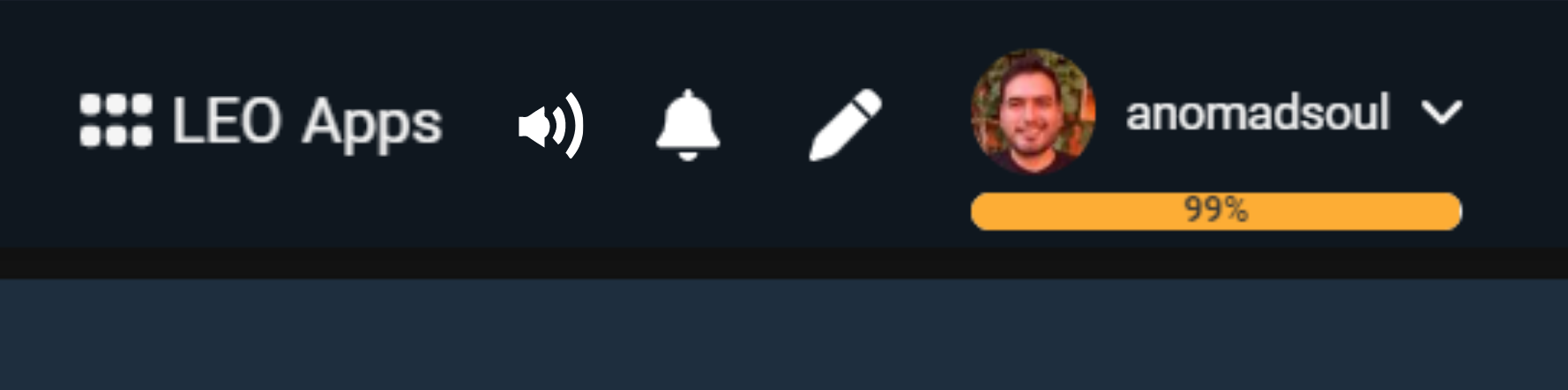
Now, in my opinion this is not meant to be a spammable section where the team should drop each and every announcement, but only the very important ones, perhaps twice a week, or thrice a week tops in order to encourage users to click the icon whenever the see it glowing.
Oh yes, it should be glowing instead of showing a number above the icon like notifications do. The reason for the glow instead of the number is to message the people that there won't be a +9 there, ever, giving this icon a sense of importance that only happens every once in a while and it is worth checking it out:
Lions will hardly ever see this icon glow, but they will know that when they do, there is something they just can't miss! Clicking on the icon will take the user directly into the post making the announcement - this makes it a pain in the ass for the developers because it would be a dynamic thing to code, or maybe there can be a specific account that only posts once or twice a week and whenever this account posts, the icon glows? @leo.announcements maybe?
Community Hubs
I have to be completely honest, I don't like very much the name Community Pages, it sounds basic-bitch-like or generic as hell, but if we name them as Hubs or Community Hubs it gives it a more official or serious name that also automatically gives the user an idea of what it is about: A place for users to discuss ideas, write in-depth analysis, engage in meaningful discussions and improve the ecosystem, not just a place to write about a project which is what Community Pages portrays.
Then comes the part of the User Interface. I know this part of the interface is improvised and as @khaleelkazi has mentioned before several times, the UI is sort of Frankenstein'd and I feel like the Community Pages part is the one that shouts this fact the most, so improving this side of the LeoVere is one of the most important ones if you ask me.
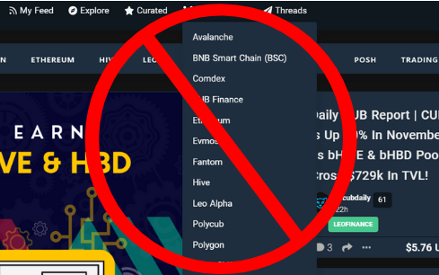
I don't like this, at all, and I don't want to trash talk the UI because I am probably a top5 hardcore Lion - maybe even top1?, so all I will say is that I saved the image above as ComPageNo.png, I guess that says it all.
But I do have an idea that might make the Community Hubs - and I will continue calling them Hubs because I do want that idea to stick and just like in the Mean Girls movie I'll use it until it becomes a trend, lol.
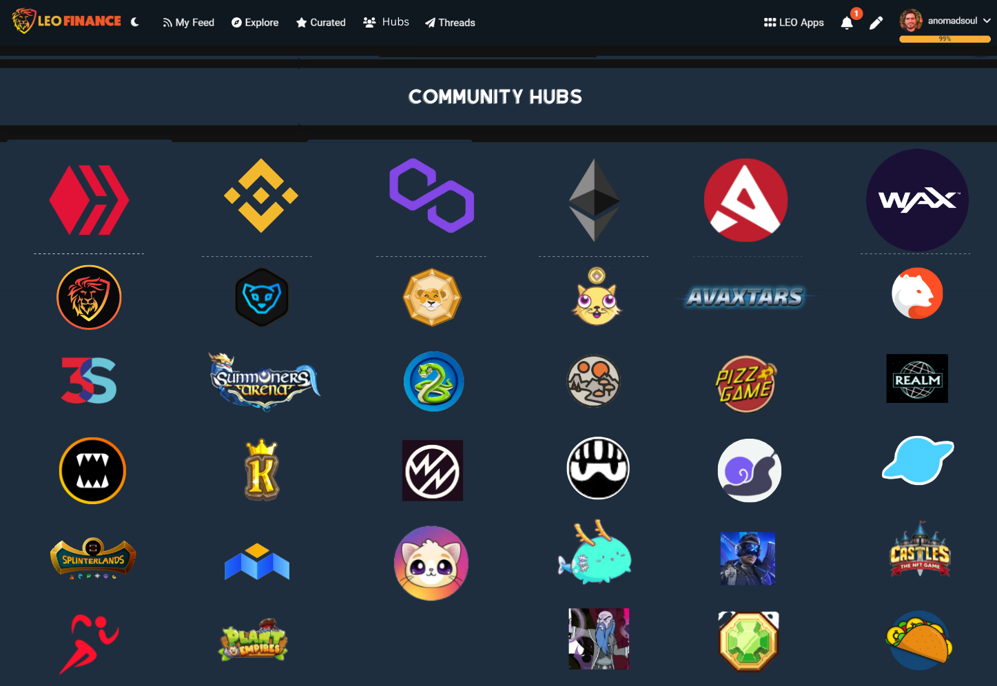
I saved the image below as ComPagesYes.png, I think that also express my opinion very clearly, but as I said, it is only an opinion:
The Community Hubs should have a separate tab that you access through the Communities section on the main menu. Should this section be called Hubs? A pro for this is that the shorter the word, the better it stays in the top of mind of the users and as I mentioned before, the word Hubs is way more serious and sends a clearer message of what the Community Hubs are about, whereas Pages makes me think of Facebook liked pages or something like that, but I might not be the common denominator, perhaps a thread by Khal where he asks the community what sounds better for the perception we want to give with the Hubs is the way to go, maybe Community Pages stays as the dearest pick of the community.
Since this Community hubs section I propose has a highly visual interface, the layout of the icons should be well thought of, which is why I propose something with the Blockchain Hub icons a little bit bigger than the specific project hubs, but always keeping the line of having a project Hub under it's main parent chain - like Polycub under Polygon, CUB under BSC, or Leo Finance under HIVE -, and the fact that you only use dotte lines under each blockchain, the user can intuitively understand what is going on here and that the browsing should be done vertically instead of horizontally but I am not a designer, maybe a little downward arrow under each chain is worth looking at?
Another con of having only icons is that it only allows users who know the project's icon to browse this easily, but a simple mouseover prompt solves this, and when a user hovers their pointer above the icons a small overlay description of what the logo represents including the name of the hub, perhaps the price of the native token, the ticker and pretty much any information that helps the user know what the hub is about and important info:
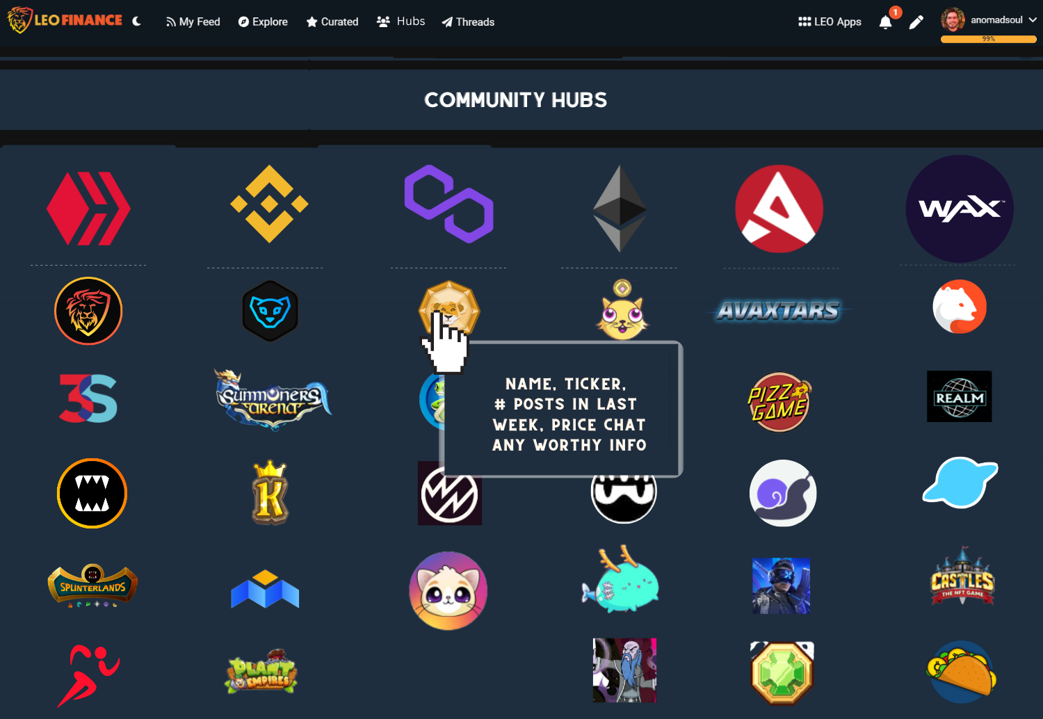
This way the user can browse the Hub section easily and know what the hell it is about. Perhaps even below the Community Hubs text on top, a small description of what this section is about like A place for users to discuss ideas, write in-depth analysis, and engage in meaningful discussions and improve the ecosystem.
The best part of having a vertical oriented browsing pattern is that we can always add more project Hubs without having to modify anything because the project will be added at the bottom. In order to avoid having to add another row for a project that is part of a blockchain that we don't have a specific row - for example, EOS. Once we add an EOS dapp to the Hubs, it doesn't make sense to add a specific row for EOS based projects because we would only have one and it would not only look weird to have just a dapp under EOS, it would also cram the existing rows so, we could have a miscellaneous row for projects made on top of blockchains that do not have their own row.
Blog section
I think this was mentioned before or maybe I just dreamt about it - yeah, I dream with the LeoVerse, maybe because there are days that I work around 8-10 hours straight on Leo stuff -, but on the Blog section of each Lion's profile, it would kick ass if we had a Long form section and a short form section, each with it's own scrolling bar so users can explore each section without both scrolling at the same time.
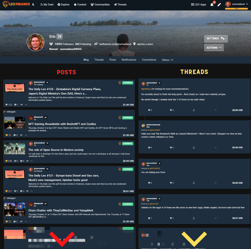
I thought of a cool way to showcase this - bear in mind I am not a designer, I'm sure this can be done in a more beautiful way - but this is just the idea. In order to tell the user they can scroll individually we can pixelate the bottom post and the bottom thread and here's where the best part comes:
Colors for Posts and colors for threads
Colors are a great way to individualize each section and also to give more of a personality to each form of posts.
In case you've been living under a rock, Leo Finance has two main colors: red and yellow. So what if we leverage this and we add some personality to each form of posting - which also leads to another idea below - so that users get used to seeing top level posts with a shade of red and threads with a shade of yellow, automatically letting Lions identify what kind of post they are looking at.
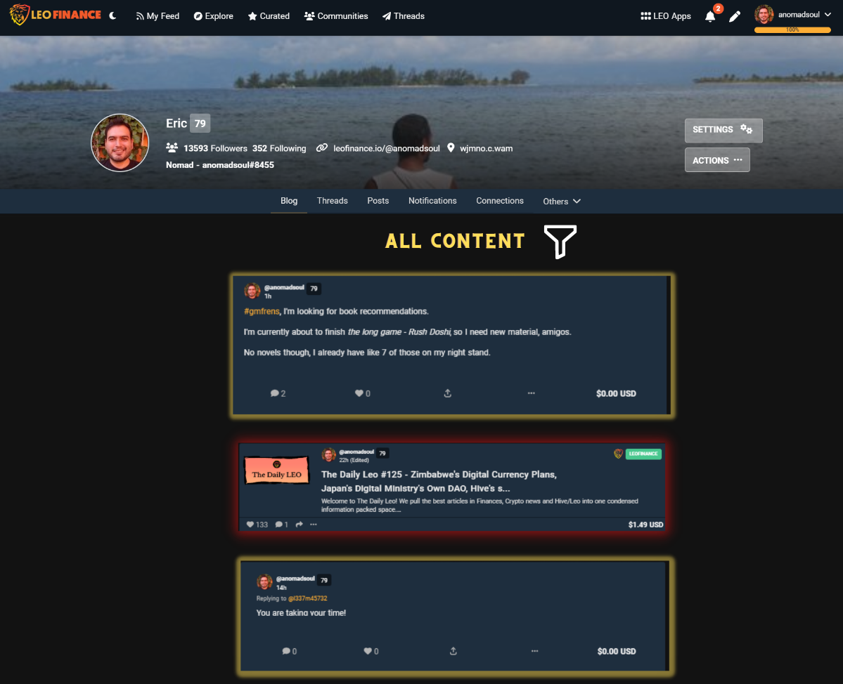
This way we can start creating an identity for the two forms of content one can find on Leo Finance, which in my opinion is a good way to prepare for bigger things where we prepare for the time when we add other types of content or when we decide to expand onto other formats - think if purple for video, green for content published on Community Hubs, clear blue for polls etc etc.
Notifications
There's nothing wrong with benchmarking good practices from sibling dapps built on top of the hive blockchain - or any blockchain for that matter - and I do believe that we don't need a separate tab or section for notifications, we can actually just emulate what ecency does and have an on-click drop down section for notifications where the Lion can filter the type of notifications they get.
The only thing I would change from how Ecency does this is that I wouldn't put all notifications as default because votes on Hive are way too much especially once a user gets a vote from a trail so, I would have the default filter with comments and big votes, not every single interaction a user gets, that way clicking the notifications icon will show you comments on your top level posts, replies to your threads, and big votes - shown in color so you automatically know where the vote or reply went to.
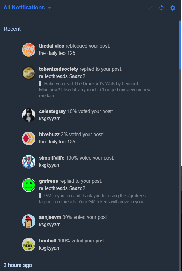
This is also a place where the colors play a huge role that we can expand on or exploit later down the line, if we use colors for the type of interaction and the Lion already knows what the colors represent then we have a smoother user experience where user intuition comes into play and after a few days any Lion will be able to navigate a blog section and notification section by just seeing the colors.
Tag section
I have to be completely honest and I'll be short on this one.
I don't like the tag section. This only takes up space and steals attention from the menu and the actual content.
If we want to give more highlights to the Hubs we should get rid of the tag section - the one on the top, but maybe also the one on the right that can be used to filer (or maybe just pretty that right section up).
We already have a curated, trending, created and hub sections, I think the tags on top below the navigation bar is out of flow, it shouldn't exist. Besides I have never used it and I haven't heard of anyone using it.
Gamified section next to Threads and Hubs
This part is for another day, not because I don't want to disclose it but because I don't know if its the road Khal wants to take Leo to, but having it in the backend architecture in case we do go down that road is a good practice.
Hint: I would love to see an Engagement League, a User Growth gamified: Path of the Lion, an LPUD Tournament, a Trading League and many other things that gamify the LeoVerse, but more on that later.
That's it from my side. After 3 hrs of writing and editing the post and a lot more hours thinking about what can be improved on the Leo Finance interface, these are my two cents.
Let me know your opinion on everything I state here, I hope you like it and I expect you to 1up me and improve my ideas.
If you are a designer, feel free to steal my concepts and make them beautiful and if we win, we can just share that part of the prize pool.
Posted Using LeoFinance Beta
~~~ embed:1588799602874253313 twitter metadata:MTQxNTE1NTY2MzEzMTQwMjI0MHx8aHR0cHM6Ly90d2l0dGVyLmNvbS8xNDE1MTU1NjYzMTMxNDAyMjQwL3N0YXR1cy8xNTg4Nzk5NjAyODc0MjUzMzEzfA== ~~~
The rewards earned on this comment will go directly to the people( @dragon-ti, @rzc24-nftbbg ) sharing the post on Twitter as long as they are registered with @poshtoken. Sign up at https://hiveposh.com.
I do like the name of hubs a lot better. Feels like those pages get hardly no action really. People mainly find the content from the front page only and through people they follow on leo. The hard refresh required to load new data has got to go though.
Posted Using LeoFinance Beta
It can feels like it will give leofinance more neat interface
Posted Using LeoFinance Beta
Despite the fact that bam new, I honestly feel the team should take a look at this and I think you need to really get involved more than ever before now.
This should really be put Into consideration
Posted Using LeoFinance Beta
Hubs is a much better name.
Posted Using LeoFinance Beta
I love the way you design the notification part because with this the community can engage easily and be aware of what is going on because discord messages are ignored based on the fact that people have so many messages coming from there and by the time good message shows it will be ignored.
Hub sound good and I love they you designed it, easy and user friendly.
Posted Using LeoFinance Beta
Wow this is impressively okay and should be put in consideration.
Posted Using LeoFinance Beta
I want Author to be directly able to post in community , instead of curator/Mod selecting it and putting it.
Mod can do reverse, remove unrelated content from community.
Posted Using LeoFinance Beta
I think sorting the notifications as per the comments, threads, posts would be a good idea. I think separating votes from the content notifications would be a good option.
I like the idea of the glowing News Section. Being one who often miss updates, it would be good to have it and be reminded each time I come to LeoFinance.
And your concept of the Community Hubs is cool!
It will be interesting to see what the devs and Khal would pick out from these.
Posted Using LeoFinance Beta
This is really awesome and I love the ideas you presented.
The idea of Community HUB and the logos with the hovering info is dope.
The notification for information is also a nice idea because not every Lion is in the Discord channel, and many also mute notification.
I also feel in the section of Blogs, there should be a section that will show personal write and not just about all reblogs. It's kind of tiring, going through others content in your blog section, when you're looking for your content.
Posted Using LeoFinance Beta
I like HUBS but if we intend to be a twitterkiller wouldn't be Spaces / Communityspaces a real nice grain of salt in their wounds?
I like the Announcements idea a lot.
I think I am going to write up my own wishlist :)
Posted Using LeoFinance Beta
I think a Leofinance News Section is a nifty idea. An easy to access archive like that would be helpful to keep us up on changes.
I think Communities should very customizable to make then unique. I also think the graphics should scream at you in color and artstry.
I think custoizable columns so communities could have commmunity news, community archives , contests and other unique touches unique to each community.
Posted Using LeoFinance Beta