I've used Photoshop on a fairly basic level for years. I'm not particularly keen on the software as I've found it to be too steep a learning curve and what I have learnt has taken me years. Only because I can't be bothered. Life is too short to teach an old dog new tricks.
And for years, I've shot lightpainting images where the name of the game is to shoot everything in one exposure with minimal or no image adjustments. I began to think I may be a bit of a Luddite, shunning this fangled new technology. Or maybe it was just plain laziness.
So this evening I saw a YouTube video explaining how to create a Photoshop preset and the colours caught my attention.
So for the last couple of hours I've been obsessed with creating presets. I've found that not every image works with a preset, in fact they look terrible, but the ones shown here are some of my favourite results.
If you've read this far, I'd be interested to know which colour Preset you prefer!
Note, all of the following images are shot by me.
Black
The thing that first caught my attention was a Black Preset. I found a YouTube tutorial with something close to what I was looking for and this was the first image I tried it on:
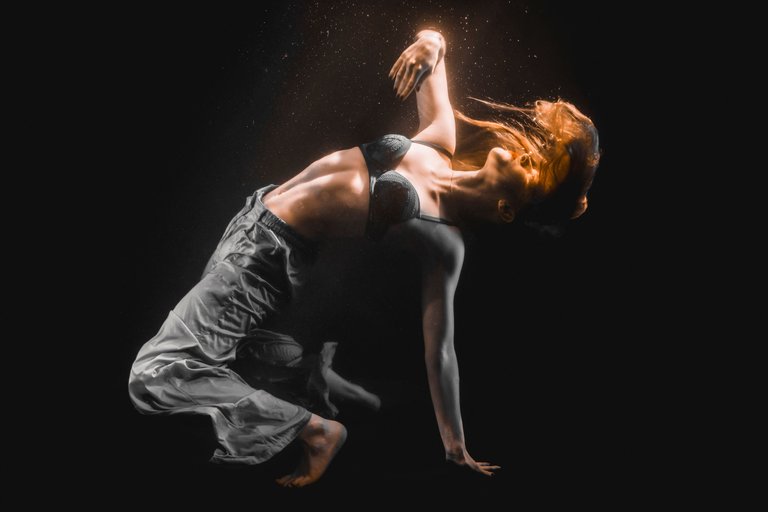
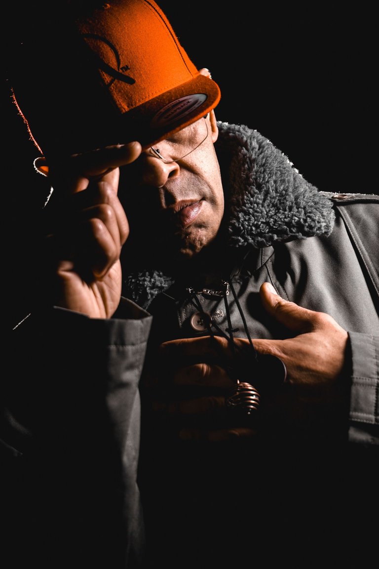
And another shot with MC Crystalise here:
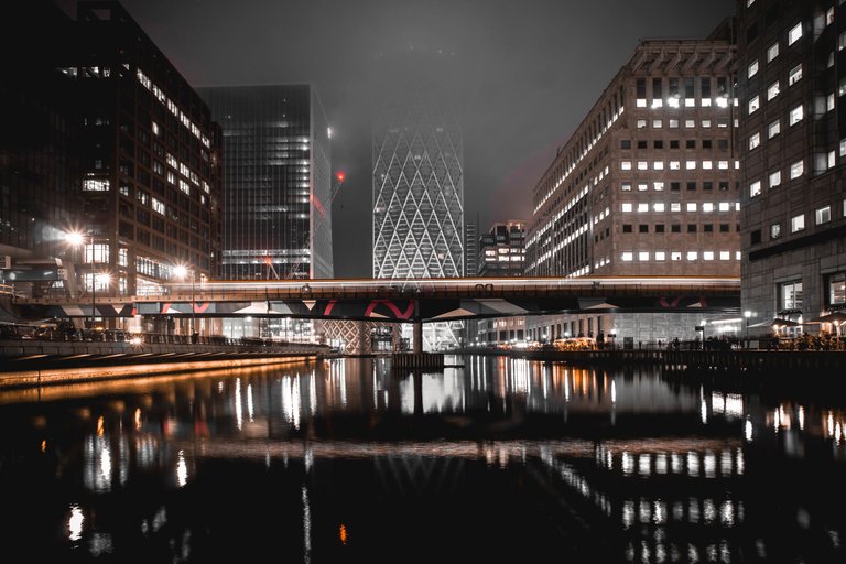
I then tried the Black Preset on a night landscape shot in Canary Wharf, London:
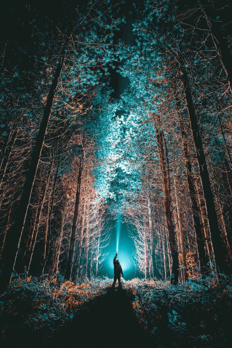
Teal & Orange
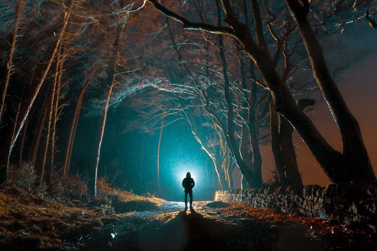
I followed another YouTube tutorial and saved a Preset and named it Teal & Orange. I started off by using the Preset for a night landscape shot in the rain:
I then used the Teal & Orange Preset with a shot of Neena:
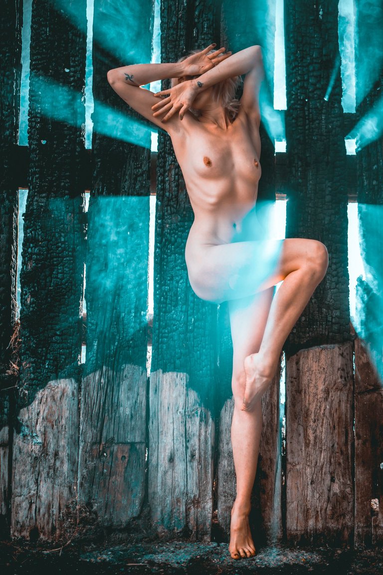
The Presets don't work with every image I've found where the effect is a little too strong. This shot though I found quite striking, something like an extreme example of the film stock, Kodachrome 64:
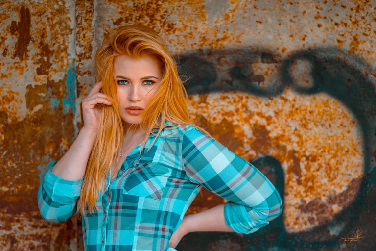
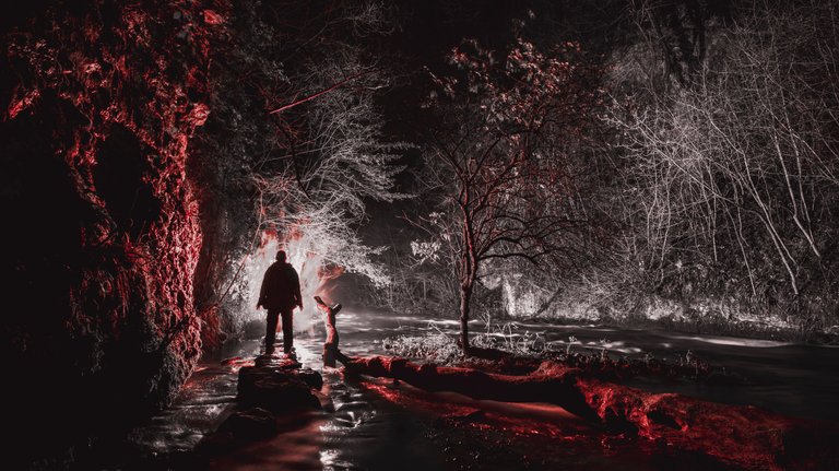
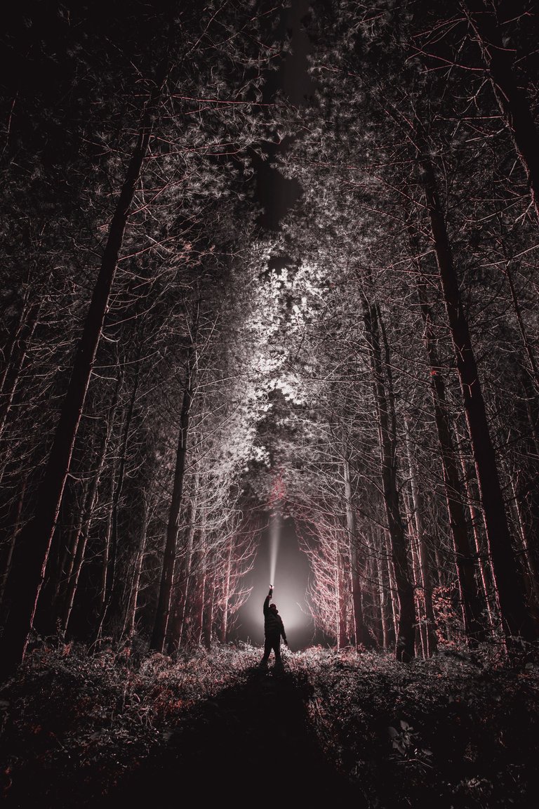
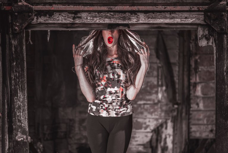
Red & Grey
Another Preset YouTube tutorial which caught my attention was the Red & Grey.
I found that this Preset didn't work with quite a lot of my images. But this night landscape shot looks freaky enough!
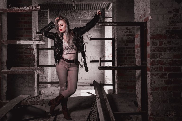
I've found the Red & Grey Preset to be quite subtle but striking at the same time. I can't work out whether it's the original image or the colours that make it striking:
The lipstick in this image of Neena stands out really well!
I liked this application of the Red & Grey Preset, so subtle:
Mixing it up
I decided to see what would happen if I applied two Presets, one after the other. First I applied the Teal & Orange then the Black:
About me:
I usually specialise in shooting lightpainting images but occasionally dabble in urbex, landscape and artistic model photography. I'm always on the lookout for someone to collaborate with; the social side of photography is always good!
Social Media
https://www.facebook.com/fastchrisuk
https://www.flickr.com/photos/fastchris/
Interesting to know more of Photoshop. You have good pictures here