ESPAÑOL
¡Mis panas Hivers! Aún no me he recuperado del cansancio por todo el trabajo realizado en estos meses en la preproducción de este gran evento en el cual he puesto cuerpo y alma... hasta hoy estuvimos cargando equipos de regreso a BackBeat Studio, y hoy comenzaré a editar el material capturado ese día y a hablar de lo que fue este arduo proceso de trabajo que ya por tercera vez logramos ejecutar de la mano de @bateristasvzla, @celf.magazine, BackBeat Studio, Ad Libitum, y El Centro de Arte Los Galpones.
Es importante resaltar el apoyo que hemos tenido por parte de los Hivers que se acercaron al evento a disfrutar de la buena música, tomar foticos, y dar difusión de este evento.
De igual manera quiero aprovechar para reconocer el apoyo que el año pasado nos dieran @theycallmedan y @aliento. Este año @guiltyparties se comprometió a apoyarnos también.
Este año al igual que los años anteriores, el diseño ha estado a mi cargo, al igual que la mayoría de los aspectos de esta celebración. Ha sido bastante difícil poder hacer todo cuando se tienen tan pocos recursos, pero nada como las limitaciones para buscar soluciones creativas.
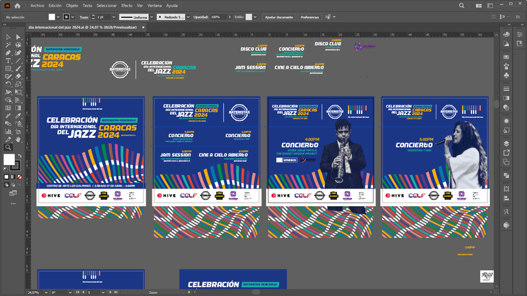
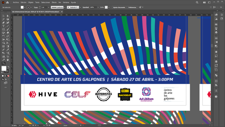
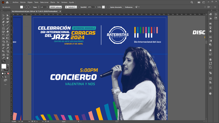
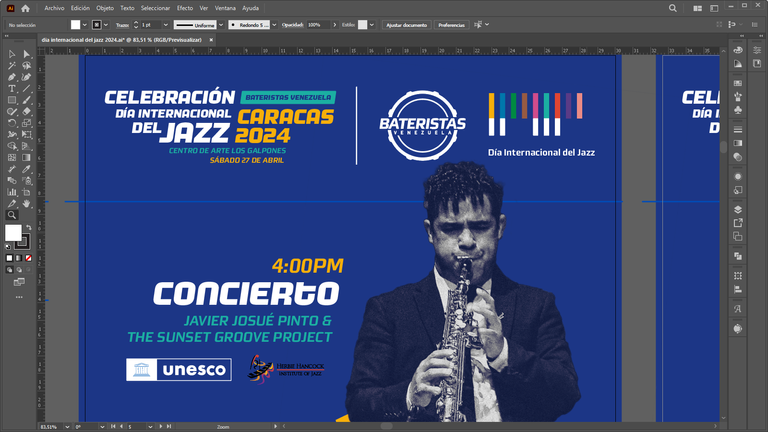
El diseño de este año quise que fuera mucho más vibrante y menos señorial que los años anteriores. Nuevamente realicé un reinterpretación de los elementos gráficos del logo del día internacional del jazz, creando una trama curvilínea que se asemeja a la forma superior del cerro el Ávila de la ciudad de Caracas.
Los colores resaltan la diversidad existente dentro del jazz y el movimiento fluido y variable de sus melodías.
El bloque de texto (logotema) de este evento busqué resaltar la palabra Jazz por ser la base de esta celebración, y al miso tiempo contrastar la fecha y el lugar con el color amarillo.
Para el tratamiento de las imágenes usé la desaturación y efecto de partículas/ruido para darle una textura más rica y contraste entre los tonos claros y oscuros.
Creé cuatro diseños en formato de relación 1:1 y otro 3:4 como afiche principal.
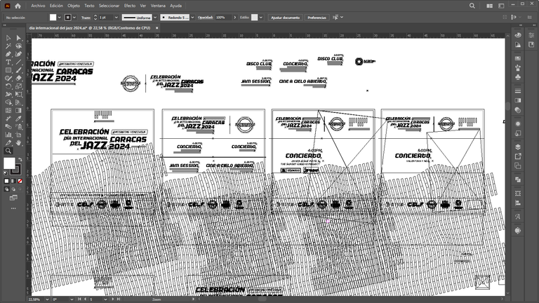
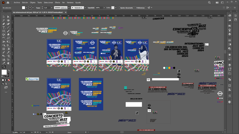
Aquí les adjunto algunas capturas de pantalla del proceso, y si tienen alguna duda o comentario me encantaría poder darles respuesta.
El diseño lo realicé usando Adobe Photoshop y Adobe Illustrator.
ENGLISH
My fellow Hivers! I have not yet recovered from the fatigue of all the work done in these months in the pre-production of this great event in which I have put body and soul ... until today we were loading equipment back to BackBeat Studio, and today I will begin to edit the material captured that day and talk about what was this arduous process of work that for the third time we managed to execute hand in hand with @bateristasvzla, @celf.magazine, BackBeat Studio, Ad Libitum, and the Centro de Arte Los Galpones.
It is important to highlight the support we have had from the Hivers who came to the event to enjoy the good music, take pictures, and spread the word about this event.
I would also like to take this opportunity to recognize the support that @theycallmedan and @aliento gave us last year. This year @guiltyparties committed to support us as well.
This year as in previous years, I was in charge of the design, as well as most aspects of this celebration. It has been quite difficult to be able to do everything when you have so few resources, but nothing like limitations to find creative solutions.
This year's design I wanted it to be much more vibrant and less stately than previous years. Once again, I reinterpreted the graphic elements of the International Jazz Day logo, creating a curvilinear pattern that resembles the top shape of the Avila hill in the city of Caracas.
The colors highlight the diversity within jazz and the fluid and variable movement of its melodies.
The text block (logotema) of this event sought to highlight the word Jazz for being the basis of this celebration, and at the same time contrast the date and place with the yellow color.
For the treatment of the images I used desaturation and particle/noise effect to give a richer texture and contrast between light and dark tones.
I created four designs in 1:1 ratio format and another 3:4 as the main poster.
Here are some screenshots of the process, and if you have any questions or comments I would love to answer them.
The design was made using Adobe Photoshop and Adobe Illustrator.
Y te invitamos a unirte en nuestro Servidor de Discord.
@camiloferrua! Your Content Is Awesome so I just sent 1 $BBH (Bitcoin Backed Hive) to your account on behalf of @celf.support. (1/5)
@camiloferrua! You Are Alive so I just staked 0.1 $ALIVE to your account on behalf of @ celf.support. (1/10)
The tip has been paid for by the We Are Alive Tribe through the earnings on @alive.chat, feel free to swing by our daily chat any time you want, plus you can win Hive Power (2x 50 HP) and Alive Power (2x 500 AP) delegations (4 weeks), and Ecency Points (4x 50 EP), in our chat every day.

$PIZZA slices delivered:
@celf.support(1/15) tipped @camiloferrua