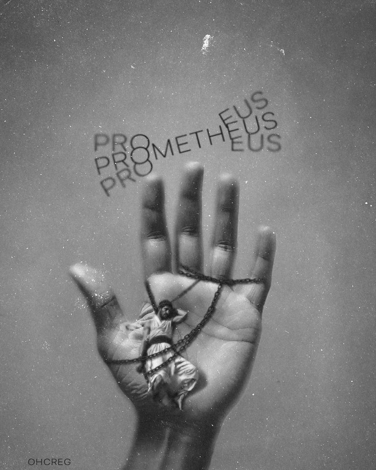
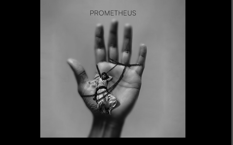
Hello Hive art community! Today I return since it's been a while since I posted here. I present to you a design inspired by Greek mythology of Prometheus, who stole fire from the gods and gave it to humanity. Starting from that idea, the movie Openhaimmer was also inspirational as it references him, and I decided to create this design depicting his punishment of being bound to a titan and regenerating after being devoured by an eagle.
¡Hola comunidad de HiveArt ! Hoy regreso después de un tiempo sin publicar aquí. Les presento un diseño inspirado en la mitología griega de Prometeo, quien robó el fuego a los dioses y se lo dio a la humanidad. Partiendo de esa idea, también la película Openhaimmer fue inspiradora ya que hace referencia a él, y decidí realizar este diseño en su condena de ser atado a un titán y regenerarse después de ser devorado por un águila.
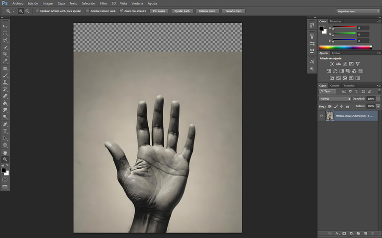
Parting from the hand image, I proceed to make some adjustments in black and white and superimpose the model who plays the role of Prometheus. Once the reference place is taken, I create a layer mask and invert it to then paint with white the areas where I wanted the subject's reflections and the chains to be shown.
Partiendo de la imagen de la mano, procedo a realizar algunos ajustes en blanco y negro y superponer el modelo que representa a Prometeo. Una vez tomado el lugar de referencia, creo una máscara de capa y la invierto para luego pintar con color blanco las zonas donde quiero que se reflejen las imágenes del sujeto y las cadenas.
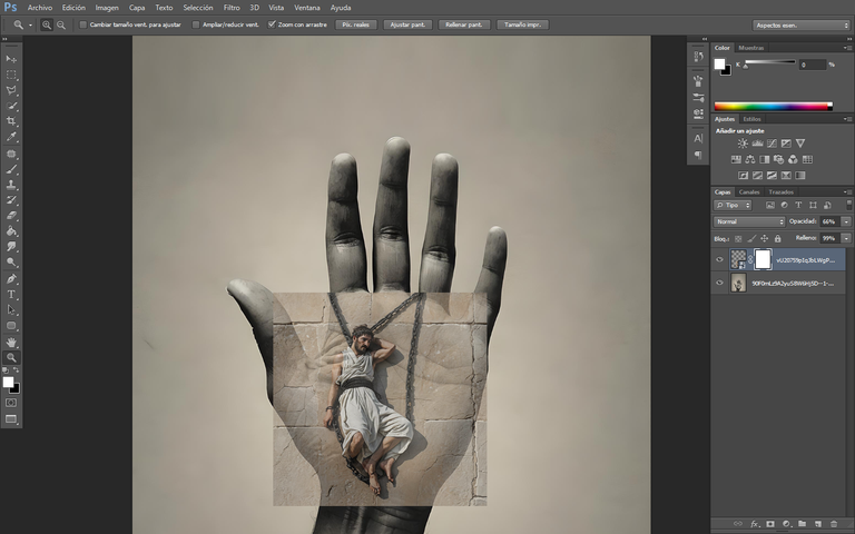
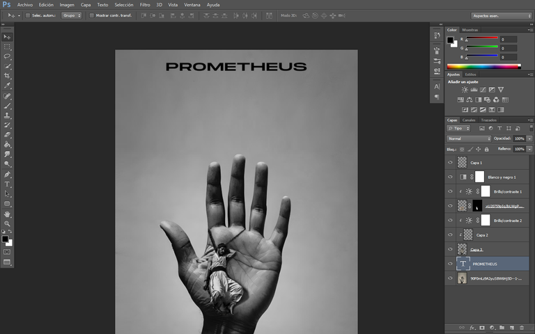
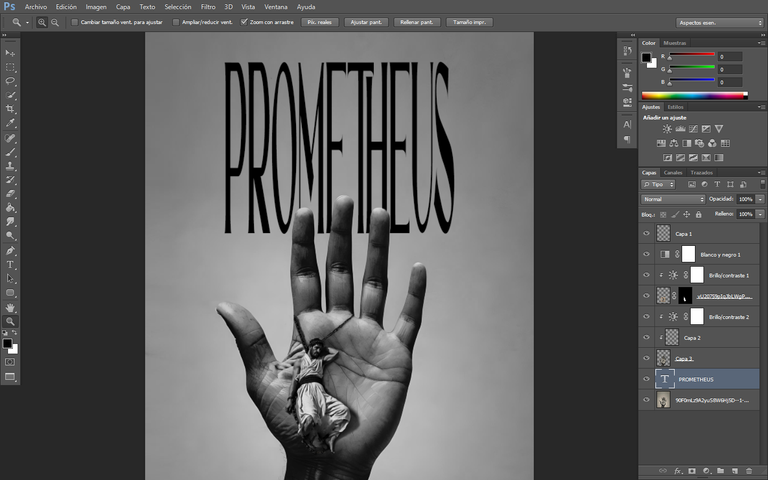
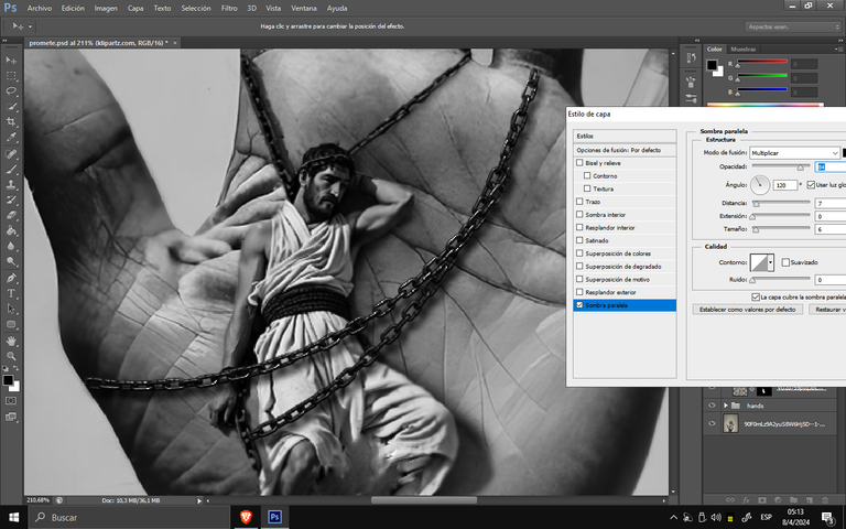
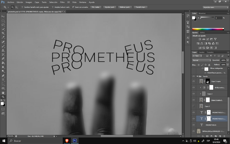
The title had its typography selection and method of application. I liked both options, so I tried to make it as minimalist as possible. But before moving on to the final process of the title, I decided to add more chains to the figure and, accompanied by shadows, I ended up leaving it finished on one side and moved on to give more shape to the design.
El título tuvo su selección tipográfica y método de aplicación. Me gustaron ambas opciones, así que intenté hacerlo lo más minimalista posible. Pero antes de pasar al proceso final del título, decidí agregar más cadenas a la figura y, acompañado de sombras, lo consideré completo por un lado y pasé a darle más forma al diseño.
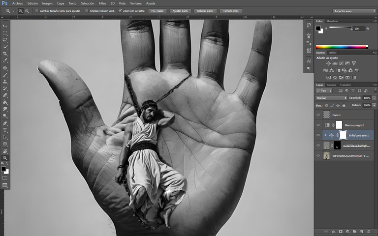
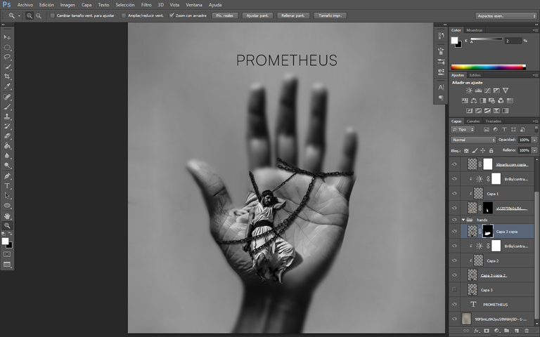
I decided to finish with blur details, separating the hand from the background and applying a layer mask to erase and adjust the blur in various areas of the hand and fingers, especially to see details and not overlook them. The title was selected with Satoshi typography and separated into 2 layers, removing its intertwined letters. Finally, I used noise and dirt textures. I hope you liked the design in conclusion, and we'll see you in the next post.
Decidí culminar con detalles de desenfoque, separando la mano del fondo y aplicando una máscara de capa para borrar y ajustar el desenfoque en varias zonas de la mano y los dedos, especialmente para ver detalles y no pasarlos por alto. El título se seleccionó con la tipografía Satoshi y se separó en 2 capas, eliminando sus letras entrelazadas. Por último, utilicé texturas de ruido y suciedad. Espero que te haya gustado el diseño en conclusión, y nos veremos en la siguiente publicación.
Photoshop
WACOM CTL 472
Font AI Style Cinematic
Oye que grandioso talento, te quedó genial 🌟👏👏👏
Muchas gracias 1😄
@tipu curate 4
Upvoted 👌 (Mana: 35/75) Liquid rewards.
Amazing work!
Thanks