Hi fellow Hiveians,
Today back with some more visualizations. I had to work really late on a conference call so while the engineers were doing their thing and I was listening, I figured I would play around with some Tableau data.

Better Descriptors
So in my last post, after reading it again, I realized I didn't do a good job as a data viz presenter to tell you what I was displaying! Let's improve that:
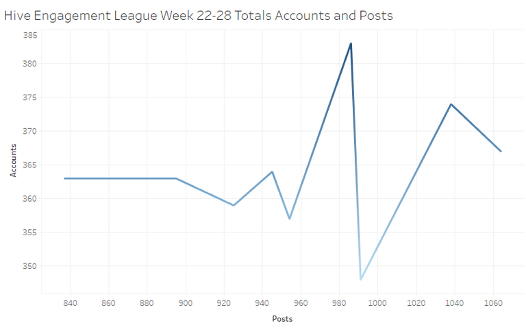
Accounts & Posts comparison.
This is an overall look at the totals that Asher includes in his posts. In this visualization, it is the total number of accounts who participated in that particular week of the league and the overall number of posts they made. What was cool to see is that some weeks had pretty consistent participation from an accounts perspective but the post counts went up.
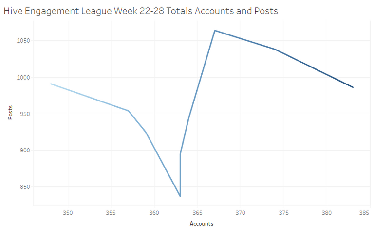
One of the things I find really cool is that displaying information differently for things like X and Y axis really makes a dramatic difference. The above image shows some interesting looking data but when I reverted the axes, all of a sudden it looks a hell of a lot crazier! The number of accounts that participated was low on one week, 348 accounts but the post count (991) was higher than other weeks with more participants, and was actually strangely enough, higher than the week with the most users! The week with 383 users only put out 986 posts but the week with 348 had more than that. Some people were pretty damn busy that week, it looks like! Things like this are why I have been having a lot of fun with Data Viz.
Double Dippers
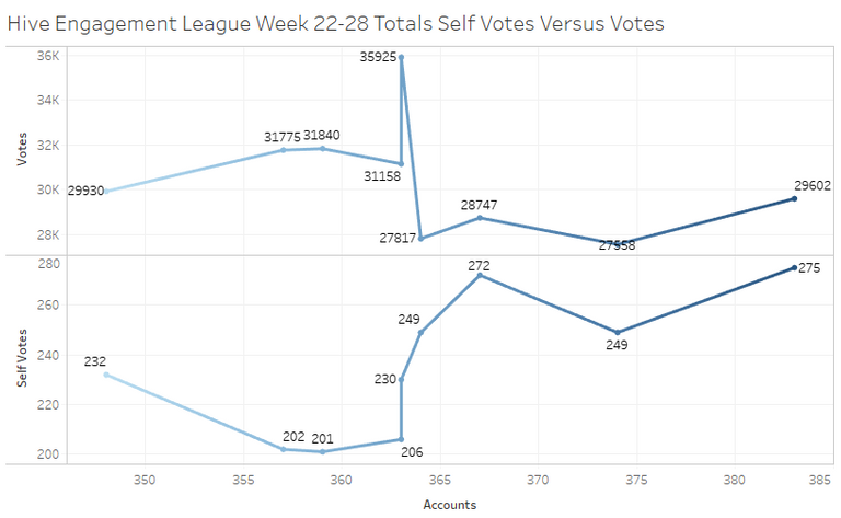
Self Votes versus Votes for Others
So the next thing I wanted to look at is the infamous double dipping of self voting. This one was one that is of particular interest to me. If we can visually see how we are double dipping like I see some people do, it might change some peoples behaviors a bit. I was comparing the votes that were outgoing to non-self accounts to votes that were cast for someones own posts or comments. What was sad to see was the really big increase in self votes at the end of the chart. I will try to figure out how to display it but I did want to indeed point out looking at the underlying data, the highest number of self votes, 275 was in week 22! The first week of the recorded data here. The least number, 232, was in week 26 so it was midway. I found out a way to show the numbers in the chart itself which I think is useful but could remove it. One of the big things we learned was that there is an importance between "Data Ink" versus "Non-Data Ink". That's a big thing in Data Viz, giving just enough information to not be overloading while at the same time conveying the message we want to see.
Character Limit?
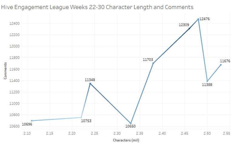
So I realize that this Viz post was mainly focused on line graphs but that's okay, for some of this stuff it's a pretty useful and prominent way to show some important pieces of information. Not a huge shock here but the more comments, the higher the characters. What was interesting was the highest amount of characters didn't correspond to the highest number of comments! It was actually the third highest comments that took the cake for the most number of characters.
Flowing Conversation
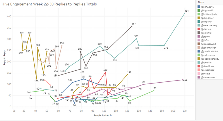
So getting away from the totals themselves, I decided to run with some other data that looks kind of wild in some ways. Doesn't that look like a toddlers drawing? It sure does look like our son's!
This measure was pretty cool and fun to see. How often do the people who are in the top 20 of the engagement league (had to narrow it down to top 25 since it was 40+ people, I kept it to those consistently in the top 20) reply to someone's reply? If they do, how often is it a unique person? Not surprisingly, Mary has taken the cake for the best ratio! Fantastic job Mary! There were some other really good numbers on there too though. Galen had some really great ratios there and sad to say my best reply to reply was 54 times in a week. I think the line graph shows really well how much variability we've got and I think that's great! Some weeks we are fantastic and others we take a bit of a break for one reason or another.

What do you think, do you like to see these types of visualizations? Do you want to see different types of displays that are not line graphs? I would love to know in the comments!
Did you enjoy this post or my other posts? Please consider following me for more! @cmplxty
Do you want to get paid, in crypto, for searching the internet? Try using and signing up for Presearch to earn some great crypto! I've currently got 1,528 PRE tokens, with a market value of $27.07. It doesn't sound like a lot but when you search using sites like Google you get paid $0! Join Presearch to break Google's stranglehold on the internet searches. If you'd like to sign up, use my referral link below and spread the word!
https://www.presearch.org/signup?rid=513043

Still using hive.blog? Upgrade! PeakD is a much better user-interface, gives loads more information at your fingertips and has some of the best developers behind it. Give it a try, go to www.peakd.com and see how much easier it is. You just need to use Hivesigner or Peaklock some of the most secure ways to log into other Hive frontends.
You can use my referral link to sign up through PeakD and I get to keep an eye on your progress and help you out! https://peakd.com/register?ref=cmplxty


Congratulations @cmplxty! You have completed the following achievement on the Hive blockchain and have been rewarded with new badge(s) :
You can view your badges on your board And compare to others on the Ranking
If you no longer want to receive notifications, reply to this comment with the word
STOPTo support your work, I also upvoted your post!
Shared on Twitter to the #dataviz folks!
hello dear friend @cmplxty good night
you're doing a great job, congratulations
I really like how the data looks.
I appreciate the great work you do to provide us with this information
have a great night
I'm impressed, really nice work! I have not used Tableau, and believe there is easy integration with powerbi?
Have you tried looking at scatter/bubble charts for XY axis charting?
Thanks Paula! I appreciate you stopping by to check it out! I value your response! :)
I’m not sure about power BI, I had to uninstall it in my work laptop because I needed specific access to use it and I’m not there yet as far as my learning. I tried to use it but since I wasn’t granted access to it, it screwed up one of the other functions of my laptop, I don’t remember if it was tableau or excel but one of the programs couldn’t run with it simultaneously.
I haven’t explored it yet but we did those in training! I will give a bubble chart a try tomorrow, I’ve been using it daily to get accustomed to it. I am thinking a heat chart too, especially since there’s powerhouses like Mary on there!
I’m also getting better with SQL at the same time but just in a work perspective. I’m going to download a free version soon since I can’t connect to hive with work software lol. It’s been a great amount of learning productivity for me lately!
If you do any type of Viz stuff, I would be honored if you cross posted it over here! I’m trying to build a little community of Viz enthusiasts!