Hello Steemians !
New Process, new topics ! For this one I’ll drive you through going from black and white to color and the power of Smart Objects !
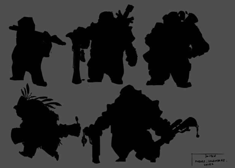
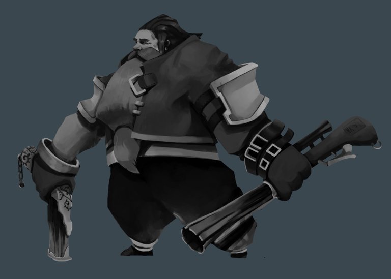
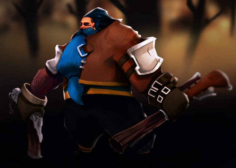
This painting comes from the last batch of “Legendary sniper dwarves” silhouettes (from Concept Art Sessions website). The silhouette was strong looking, reminding me some fierce grand’pa always looking for adventures and never surprised by anything.
Silhouette and Value painting
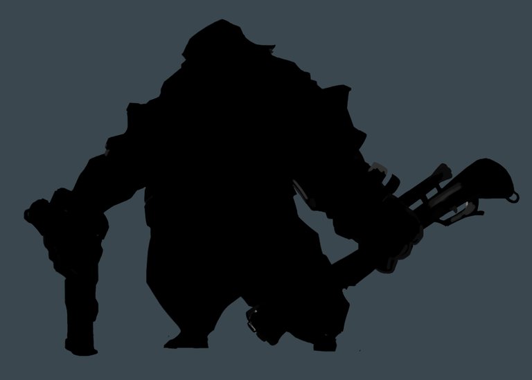
So I went with this silhouette :
What do you see ? I see a fearless Santa Claus ready to hunt
From there, I filled it with grey values, painting the flow of ideas in my mind. Silhouettes are awesome, your brain fills many gaps in your design even when there is nothing. About value painting, choose a key value (dark, neutral, bright) and focus on it. I try to keep everything readable and do better than the last painting. Which was dark as hell. So I went for something brighter and more balanced yet light values. I also knew my focal point would be the face so I tried to focus a bit more on it with brighter values there, opposite to the legs, darker to push some contrasts in there.
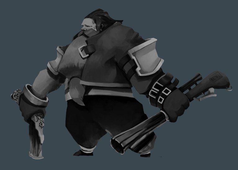
For a moment I liked the face without eyebrows but I told myself it was quite not compelling. So I added eyebrows and some details, painted the hairs and the beard pretty roughly. As I discovered the smudge tool fairly recently, I try to improve and explore different ways to use it (if you have insights about it feel free to share !). And so I used it to add some more “wild smooth hairs effect”. Below the before/after of the smudge tool (For further details about it, go read my last process tutorial).

Colors !
Now I like the values as they are, it is still the first pass as I will be correcting it until the end; but for now it will do. Time to go on with Colors ! This time was a bit bizarre I must say, I didn’t follow the convenient path haha...
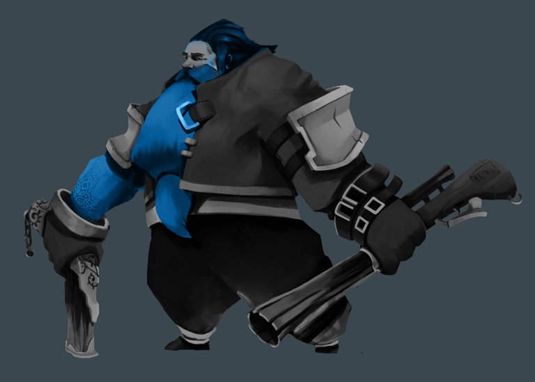
I tried red, it looks awesome but too Santa...
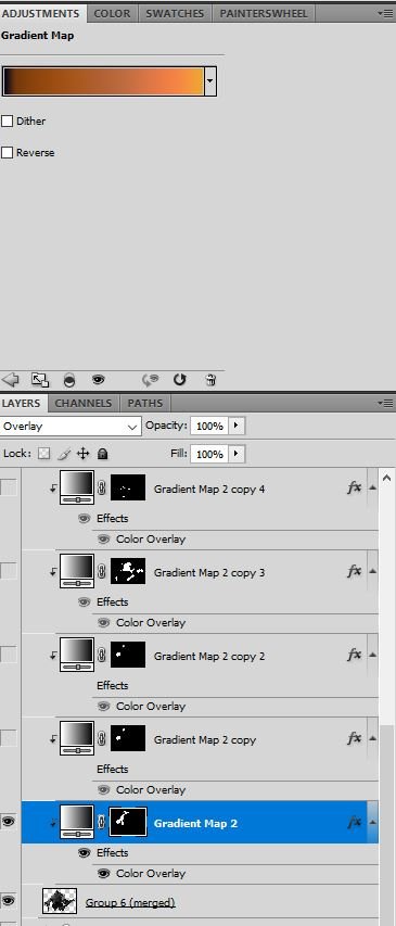
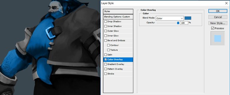
So. To get that vivid blue I added a Gradient Map (Adjustment layers => Gradient map) as a Clipping mask (alt + left click on the border between 2 layers, this allows you to paint only withing the shape of the layer underneath but on a separate layer).
I set up the Gradient Map on Overlay with a base gradient to it (For a smooth gradient, try to keep 4-5 colors as a progression. But it is quite useless here, my bad).
Why is it useless ? Because I add a Color overlay on top of it (double click on the layer => Color overlay setup on Color mode) And this basically overcome the gradient beneath it haha…. But the result was really nice I found so I kept it like that.
Masks are super useful
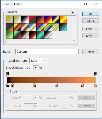
The 4-5 progression colors
Double click on your layer to get that window
Then, erase the parts you don’t want colored through the layer mask. Pretty easy eh ?, Repeat the process for as much colors you want and don’t stick with one color per asset (Pour more color juice in it, try things and see what works and what doesn’t =D)
Once I feel happy with my colors, I add 2 color fill layers, one on Overlay with a dark blue for the shadows (my main composition being orange-y brown, I like to put the shadows with its opposite color) and one light yellow or the highlights setup on Screen. This part, I set up basic lights.
Some color correction to pump a bit some colors and add more unity with the curves and level layers.
With this technique, you are free to change the color combination at anytime with anything you want in a short amount of time which makes it a prety powerful tool for concept artists and production artists. It also allows you to work on one thing at a time and organnize your workflow so it doesn't overcome you (as you first begin with the silhouette, then your values, then the color, you can ensure your values are on point from the very beginning instead of checking them every 10 minutes).
Background And Smart Objects
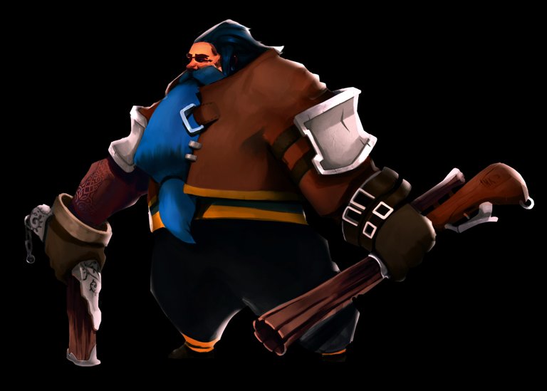
Now the character is mostly done. So let’s add a Background quickly. But the character is already taking all the space on the canvas and I didn’t want to lose quality by reducing it. How to do such a thing ? Use Smart Objects.
I actually learned that technique on Ctrl+Paint and it mindblowned me how easy it was.
To sum up quickly, you encapsulate your drawing in an instance, so the original painting stays untouched and you can move, stretch your image in your actual document without losing quality or changing your “real” painting. You can modify your painting through your instance and it will automatically update your image. (It will be clearer in the video link sorry haha).
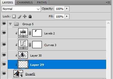
Smart Objects can be recognized with this small icon on the bottom right corner of the layer image
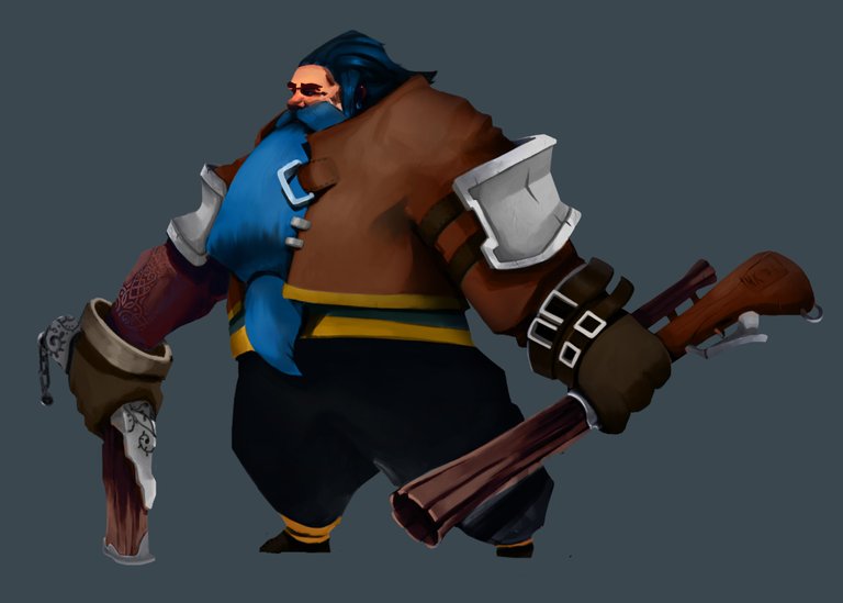
I used smart objects then. And I added the background (picked a random photograph with awesome colors and painted over it to catch the color palette).Then added a Gaussian blur and high pass to the painting. And done !
I hope it was useful to you guys, it was a little bit technical toward the end but I tell you, if you use photoshop a bit, these are pretty easy tips, easy to handle. The colorization part is extremely useful also to make games as you can change the colors very easily to fit the art direction.
Have a great week everyone ! Cheers !
wow!! excellent work of photoshop. upvote @alcy
thank you =)
@originalworks
Love it!
I never would have thought to start with a silhouette and then fill in the rest; that is a really good idea. great tutorial and great final product. I just haven't made my way into the digital world yet, but I'd like to and i'm sure when I do I will be using some of your tutorials. :)
Thanks man ! Coming from traditional will definitely be a big help also (saving steps over the ctrl-z shortcut x))
yeah, having the advantage of layers, the color selector (that alone will save me SO much time lol) and ctrl z will be amazing lol
Congratulations @alcy! You have completed some achievement on Steemit and have been rewarded with new badge(s) :
Click on any badge to view your own Board of Honor on SteemitBoard.
For more information about SteemitBoard, click here
If you no longer want to receive notifications, reply to this comment with the word
STOPwow..great tutorial @alcy i will try your method
thanks !
Nice job & progression shots
Wow @alcy, Thanks for this awesome tutorial! :D
My pleasure man ! Glad you liked it !