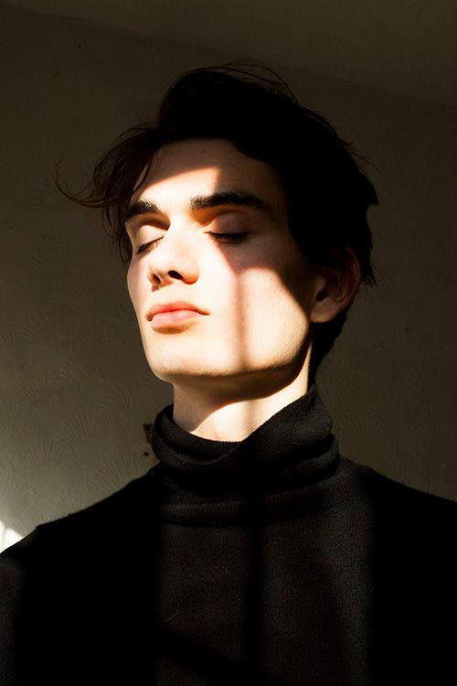
- ¡Hola de nuevo, preciosos viajeros! Para esta ocasión, quiero compartir con un ustedes el proceso y resultado de un ejercicio que estuve realizando, con la finalidad, justamente, de poner a prueba mis habilidades en tanto precisión a nivel dibujístico; así como de la técnica de pintura digital que empleé en el mismo. Para ello me valí de una fotografía en la que predominase un contraste de tonos altos y bajos como consecuencia de una iluminación acusada, que me permitiera estudiar la incidencia de la luz sobre diversas texturas, como también el efecto de esos mismos elementos en la oscuridad.
*P.D.1.: La entrada que están por apreciar no se trata de un tutorial, sino más bien de mis ganas de compartir con ustedes el proceso que llevo a cabo durante mis trabajos, y de esperar que quizá puedan serles útiles de algún modo. Comprendo que es la misma idea de un tutorial, sin embargo, aún con ello, repito, esto no es un tutorial. Podría extenderme en explicar el por qué, pero eso ya sería tema para una entrada que no realizaré, por motivo de que me parece que no les interesaría demasiado, pues es algo más bien personal.
*P.D.2.: Para este ejercicio utilicé algunos pinceles importados de Krita 3.1.3
Así pues, sin nada más por enfatizar, me dispondré a mostrarles el proceso que he llevado a cabo durante este ejercicio.
- Hello again, beautiful travelers! For this occasion, I want to share with you the process and result of an exercise that I was doing, with the purpose, precisely, to put my skills to the test in terms of accuracy at the drawing level; as well as the digital painting technique that I used in it. For this I used a photograph in which a contrast of high and low tones prevailed as a consequence of a strong illumination, which allowed me to study the incidence of light on various textures, as well as the effect of those same elements in the dark.
*P.D.1 .: The entry you are about to appreciate is not about a tutorial, but rather about my desire to share with you the process that I carried out during my work, and to hope that maybe they could be useful in some way. I understand that it is the same idea of a tutorial, however, even with it, I repeat, this is not a tutorial. I could expand on explaining why, but that would be the subject of an entry that I will not make, because I think it would not interest them too much, because it is something rather personal.
*P.D.2 .: For this exercise I used some brushes imported from Krita 3.1.3
So, with nothing else to emphasize, I will be ready to show you the process that I have carried out during this exercise.
1.
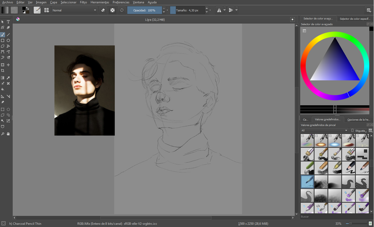
Lo primero que hice fue un esbozo de la figura, valiéndome para ello del pincel charcoal pencil thin (disponible en el menú desplegable de pinceles en all).
The first thing I did was an outline of the figure, using the charcoal pencil thin brush (available in the brushes drop-down menu in all).
2.
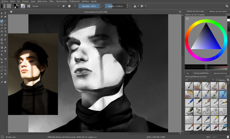
Seguidamente comencé a generar una mancha, en la que ubicaría los tonos en escala de grises. La escala de grises me serviría para, al momento de colorear, únicamente preocuparme por ello, no reparando demasiado en las texturas, tonos y/o volúmenes. Para este proceso utilicé el pincel bristles wet (importado de Krita 3.1.3).
Then I started to generate a spot, in which I would place the tones in gray scale. The gray scale would help me, when coloring, just worry about it, not repairing too much in the textures, tones and / or volumes. For this process I used the bristles wet brush (imported from Krita 3.1.3).
3.
Una vez hecho aquello, comencé a definir la escala de grises, aún con el pincel bristles wet, sin embargo ejerciendo una ligera presión sobre la tableta gráfica, pues el objetivo era más bien fusionar los tonos de la mancha, como también suavizarlos.
Once that was done, I began to define the gray scale, even with the bristles wet brush, but exerting a slight pressure on the graphic tablet, since the objective was rather to fuse the tones of the stain, as well as soften them.
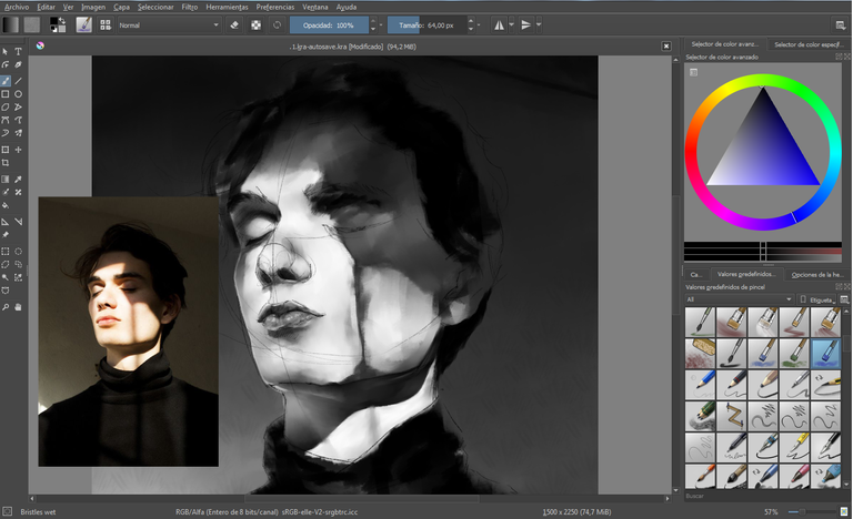
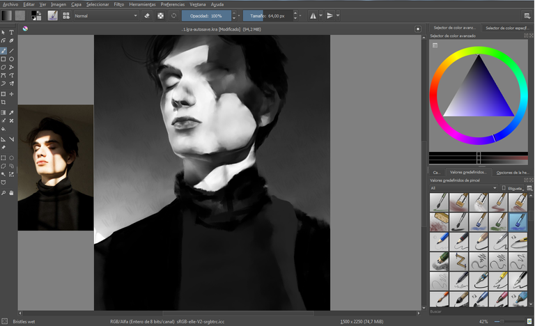
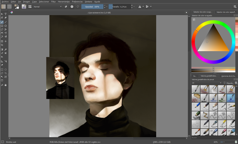
4.
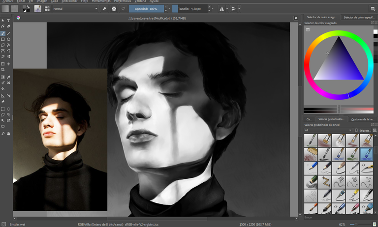
Antes de ajustar el color de la escala de grises, suelo duplicar la capa, con el fin de que haga la vez de una copia de seguridad por si preciso ajustar nuevamente el color, es decir, si decido que no es el más propicio, pero ya he avanzado en el coloreado.
Before adjusting the color of the gray scale, I usually duplicate the layer, in order to make it a backup copy in case I need to adjust the color again, that is, if I decide it is not the most favorable, but I have already advanced in coloring.
5.
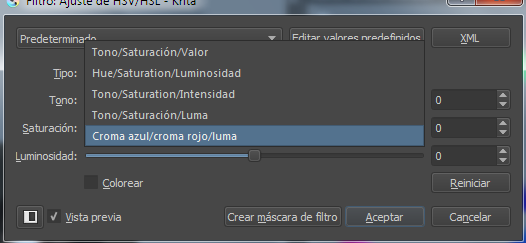
Para ajustar el color de la escala de grises presioné en el teclado CTRL + U > tipo > croma azul/croma rojo/luma > ajusté los controles manualmente > aceptar.
To adjust the color of the gray scale I pressed on the keyboard CTRL + U> type> chroma blue / chroma red / luma> I adjusted the controls manually> accept.

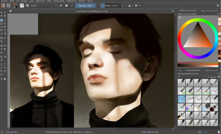
6.
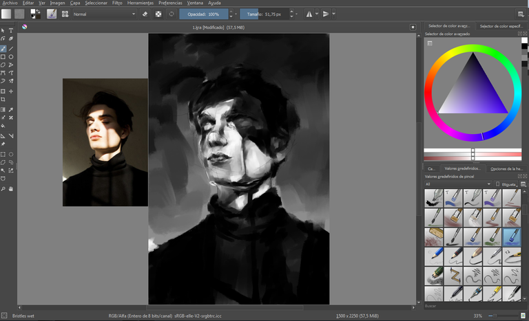
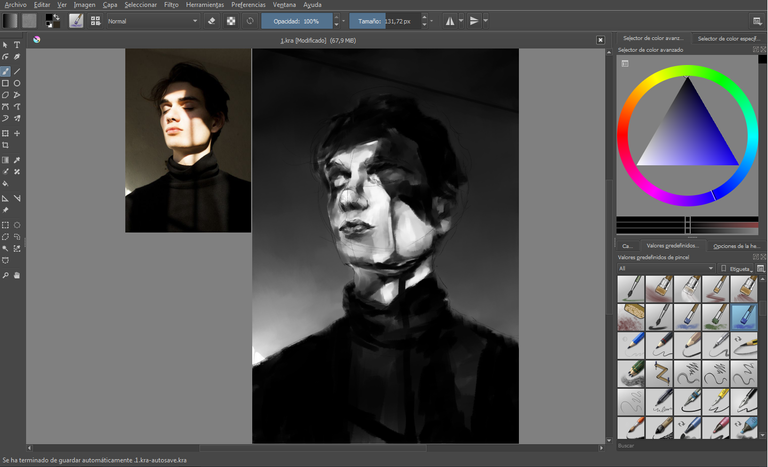
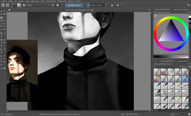
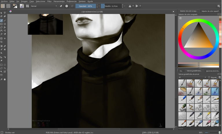
En una capa nueva, pinté la franela en color plano por no contar con demasiados matices, y bajé la opacidad de la capa.
In a new layer, I painted the flannel in flat color for not having too many shades, and I lowered the opacity of the layer.
7.
Con el pincel bristles wet comencé a añadir los colores de la piel, tomando como referencia los de la fotografía. Ya habiendo ubicado los colores, los fusioné utilizando la herramienta blender blur (disponible en el menú desplegable de pinceles, en all).
With the bristles wet brush I began to add the colors of the skin, taking as reference those of the photograph. Having already located the colors, I merged them using the blender blur tool (available in the drop-down menu of brushes, in all).
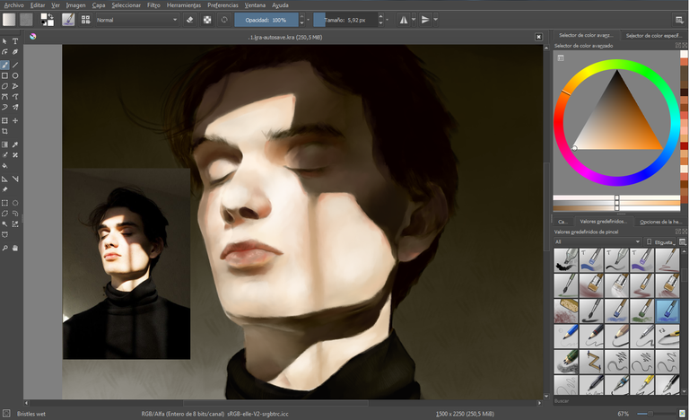
8.
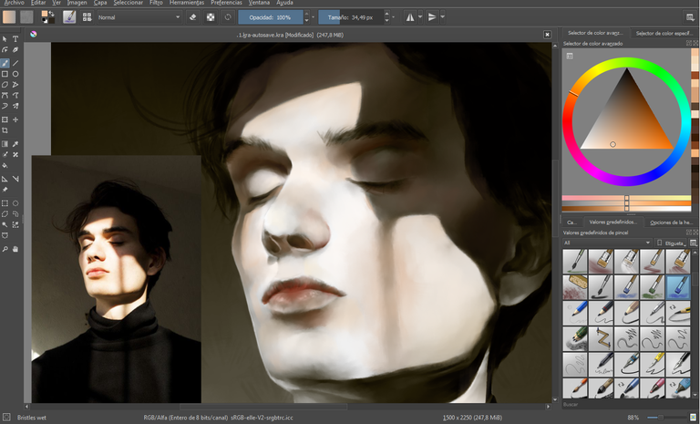
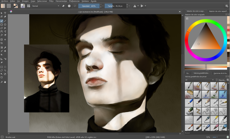
Finalmente, con bristles wet, coloreé el fondo.
Finally, with bristles wet, I colored the background.
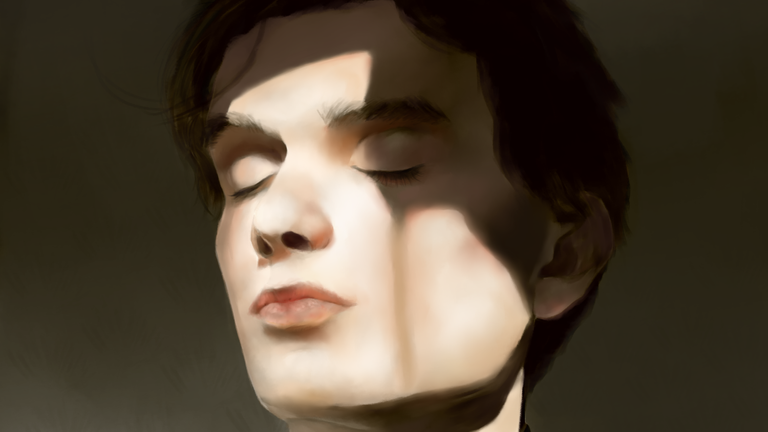
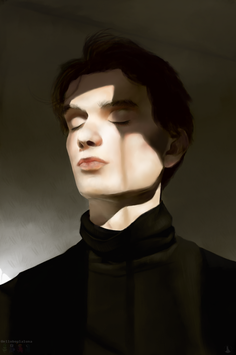
- Yyyy, aquí tienen la ilustración finalizada, viajeros. Durante la realización de este ejercicio aprendí algunas cosas valiosas que sin duda pondré en práctica para mis siguientes ilustraciones. A saber, la realización de diversas texturas, así como el efecto visual que se genera en un paso brusco de luz a sombra sobre distintos elementos. En fin, gracias por leer hasta el final, recuerden que continuaremos subiendo entradas de este tipo, e intentando siempre mejorar. Comentarios, dudas, y sugerencias, son bienvenidos. Se despiden con mucho amor, abrazos y azucarillos, el Lobo y la Luna. ¡Buen viaje!
P.D.: La ilustración fue realizada en el software Krita 4.1.5
- And, here's the finished illustration, travelers. During the realization of this exercise I learned some valuable things that I will undoubtedly put into practice for my next illustrations. Namely, the realization of various textures, as well as the visual effect that is generated in a sudden passage from light to shadow on different elements. Finally, thanks for reading until the end, remember that we will continue uploading entries of this type, and always trying to improve. Comments, doubts, and suggestions, are welcome. They say goodbye with love, hugs and sugars, El lobo and La luna. Good trip!
P.D .: The illustration was made in the software Krita 4.1.5
Tumblr
Deviantart
Attribution 4.0 International License"
Copyright @elsll - All Rights Reserved
<3
Dear Artzonian, thanks for using the #ArtzOne hashtag. Your work is valuable to the @ArtzOne community. Quote of the week: Art, freedom and creativity will change society faster than politics. -Victor Pinchuk
<3
Very nice portrait work, @elsll :) The step by step explanation is done well, as usual, and I love how you capture the feeling of warm light upon the skin very nicely with this picture :) Beautiful image !
Thanks for staying with us and for your words!
This post was shared in the Curation Collective Discord community for curators, and upvoted and resteemed by the @c-squared community account after manual review.
@c-squared runs a community witness. Please consider using one of your witness votes on us here
<3
Congratulations @elsll! You have completed the following achievement on the Steem blockchain and have been rewarded with new badge(s) :
Click here to view your Board of Honor
If you no longer want to receive notifications, reply to this comment with the word
STOPGuao! Me encantó el resultado final, haces que parezca muy sencillo.
¡Muchas gracias! Realmente no es tan complicado.
Es genial poder ver tu proceso. Excelente trabajo.
¡Gracias!
Hello @elsll, thank you for sharing this creative work! We just stopped by to say that you've been upvoted by the @creativecrypto magazine. The Creative Crypto is all about art on the blockchain and learning from creatives like you. Looking forward to crossing paths again soon. Steem on!
<3