I really am in love with the concept of windmills. Those giant structures had been used by different countries to produce electricity in a sustainable way. I think countries should support this type of movement.
Anyhow, the first time I saw modern windmills was two years ago when we were having our Christmas vacation in Iloilo. Our first stop for that vacation was Bacolod City as the airport of our city was our point of entry. When we arrived in Bacolod, after a day, we travelled to Guimaras. I admit, it is one of the beautiful provinces which is an island that I travelled to.
During our entire trip across the province island of Guimaras, I saw a lot of windmills. I was very fascinated of how humungous it is and what sound those windmills make. I then imagined how those giant wind mills in Ilocos look like. I fancy those windmills because they located near the coast line -- the same with the windmills that I painted.
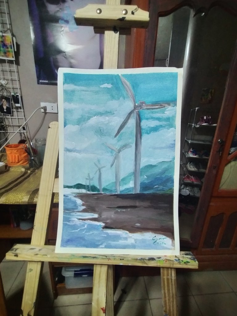
Of course, the source of the painting that I made was from a free reference page over Facebook. I downloaded the photo a long time ago so I forgot who shot this serene scene.
As for the medium, I used gouache painting and a 300GSM watercolor paper. I would like to suggest that in using paints especially the water based paints, it would really be nice to use thick papers. Also in painting, it would be nice if you use washi tape or a clear nice tape for the borders. It would not just only make your work very sturdy when trying to put it on a surface, it would also make your work neater. Having an easel is also a good idea, but at some point I would not suggest it when you try to paint something and the paint is so wet. You would understand what I meant as we go on the process of our painting.
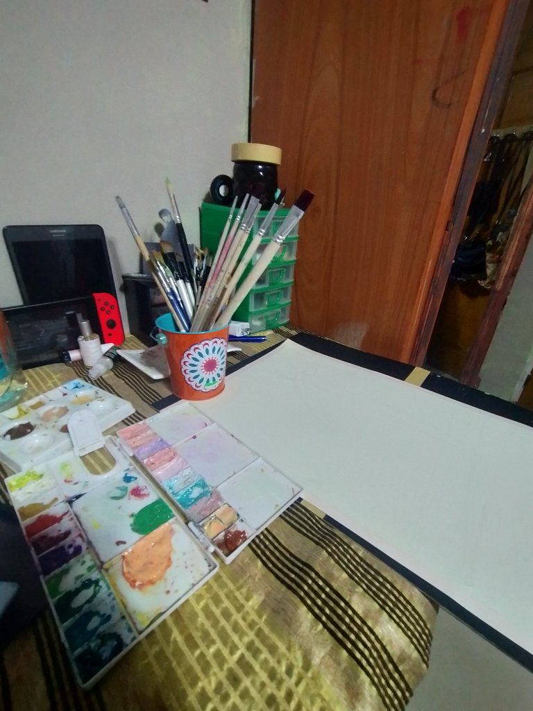
For preliminary actions, I decided to put two 1/4 illustration boards together so that the watercolor paper that I would be using as a medium would have something hard to lean. I have come to prepare myself on the idea that the paint when watered down would drip on the watercolor paper.
On the other hand, you can see the palette that I used. I first wanted to set a direction for my painting that is why I used this modified palette. Later on, I would be using the bright and vivid color of my Himi Miya Gouache paints.
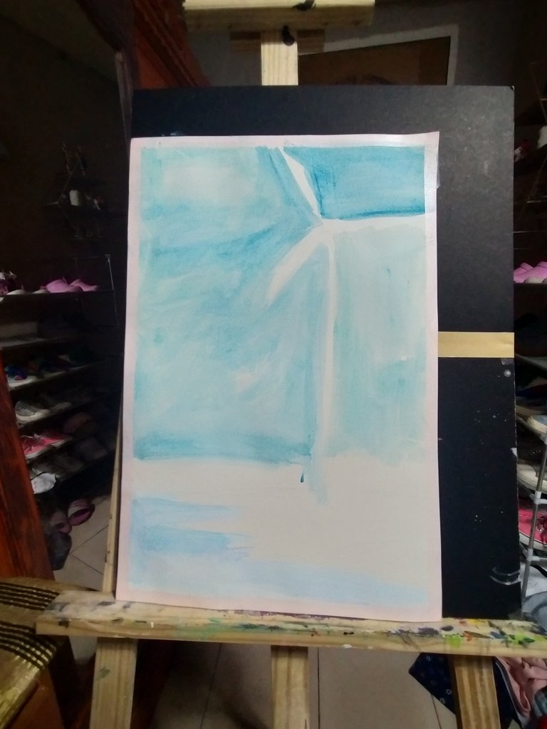
It may not be obvious on your screen but I used a mechanical pencil with 0.5mm lead so that I would not have a hard time when I would start painting. I then used the phthalo blue but it has been watered down so that I could identify the skies and the sea on my medium. On the other hand, it would also help me out visualize my work -- telling me as to whether or not on some portions I would opt for a lighter or darker blue.
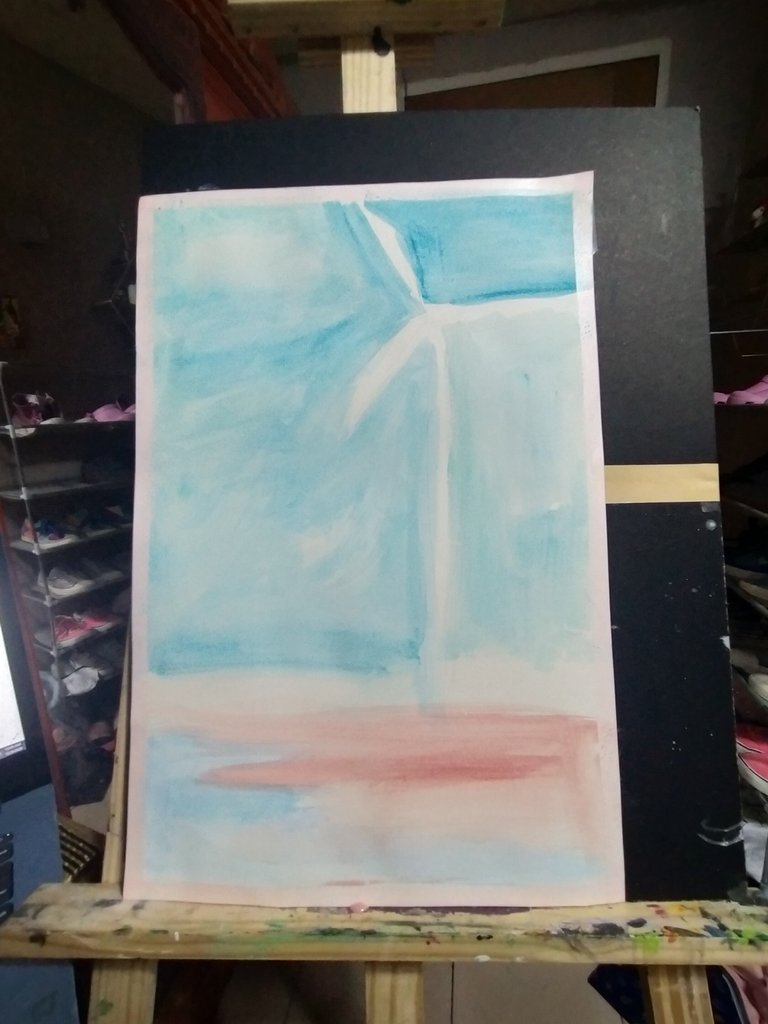
And then I painted the land with reddish brown, but as you can see, it has also been watered down. As much as possible, I wanted to take it slowly so that in the long run I would avoid omitting errors such as wanting to create certain portions of my work. Although it is possible since I am using gouache as my medium, it would be better to be sure or have a calculated move.
I painted a portion of the land, particularly on the upper region with darker brown since I wanted varieties of colors to be seen in this work of mine. As you can see, I also started painting white for the waves on the sea. These would represent the foam caused by the waves. Other hues of blue has also been included and purple as well to create an artistic look on this artwork.
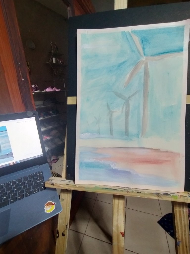
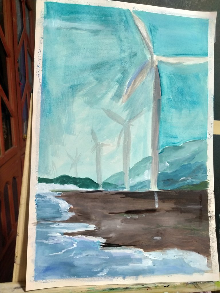
The windmills have also been painted preliminarily with grey and a bit of brown. As you can see, the skies above has also been painted with a bit of darker blue. I was really hoping that somehow my work would not end up flat.
I continued on painting some areas of the sky with darker shade of blue. Some of the windmills, I also painted it with grey that has a hint of black with it so that it would look darker. On the other hand, it is given that when objects are far from our eyes, it should look lighter, that is the reason why I decided to leave the windmills that were far to be lighter instead of darker. A darker shade of brown has also been used for the land. Later on, you would see a lot of progress that is going on with this artwork.
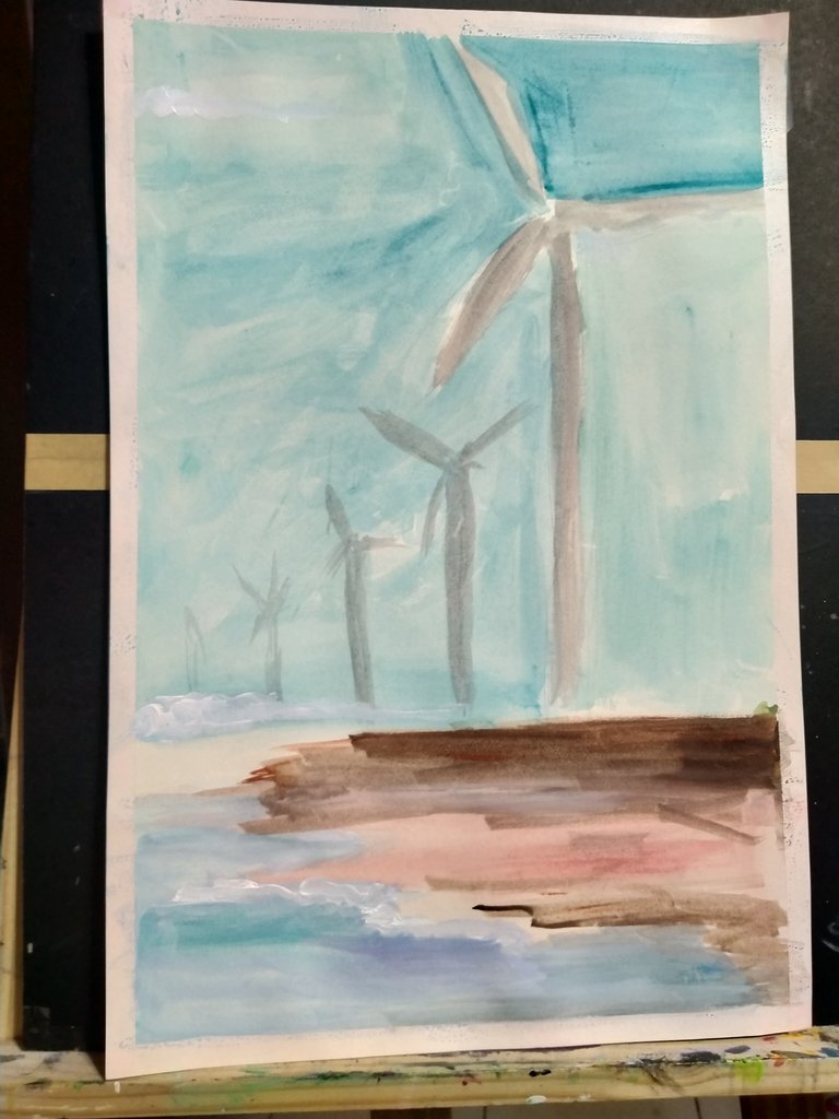
And so I decided to make the land darker since the windmills were not set on a sandy short. Waves has also been covering the sides of the land that is why I decided to put more whites on it. I made sure though that it would not be flat white as the depth for my work, particularly on the waves would be gone.
Since there are mountains behind the windmills, I decided to paint mountains too. As mentioned the nearer the object is, the vivid its color should be. So with this work of mine, the nearest land mass is darker that is why I chose dark grey. It then becomes blue and then later on turns to a lighter blue green object (still referring to the mountains found at the back of the windmill).
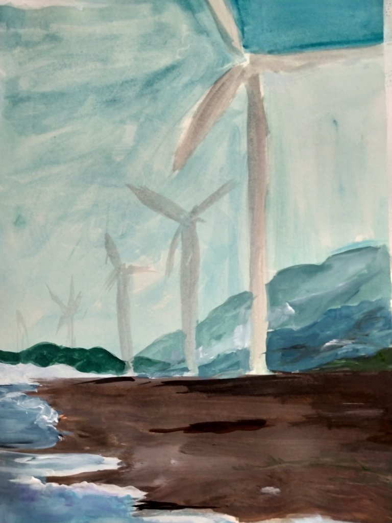
This is the closer image of my work. You can see I have added more details on the land, as well as I have added a mountain on the left portion of the painting with clouds on it. Basically, the painting looks cold meaning the temperature is cold as well -- meaning the place is a bit foggy.
As I have mentioned awhile ago, I was afraid that I would end up having paint dripping on the watercolor. The white paint, as an accent, for the windmill dripped. I was like, OH MY. But I was able to solve it just by smudging some water on the surface.
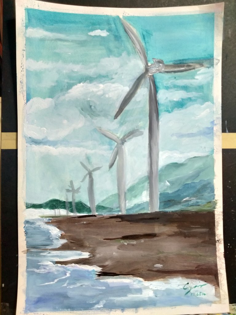
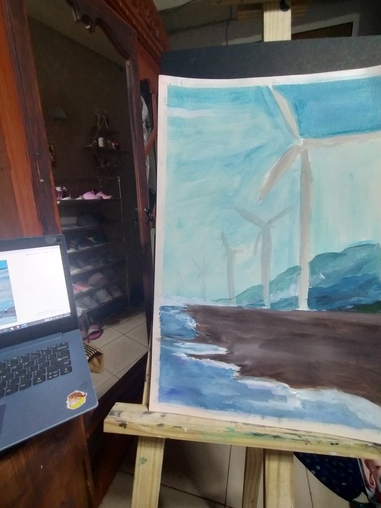
Fastforward! I got to add clouds on the skies. I did not only used blue but also a variety of blue. On the upper portion of the sky, you could see a hint of green. The clouds are not flat white as well. I made sure to make it look somehow realistic by adding hues of white (mixing white with different shades of blue, grey, and even green). I also added three more windmills at the back but I made sure that the color becomes less vivid and its distance from each other is shorter.
Since the land looked so dark, I decided to make it a bit brighter just like in the reference photo I was using. I mixed light brown and cream with some whites. I also decided to add few more details on the mountains at the back.
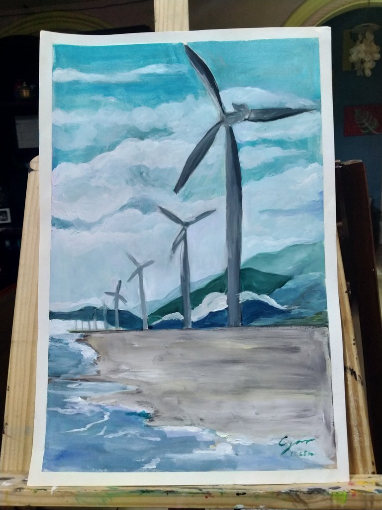
I know this artwork looks simple but it really took me awhile because I was trying a different approach -- avoiding my work to look flat like my usual practice. And then I took off the clear tape after putting my name and the date stamp on my work. It felt so satisfying.
Last January 5, I then gave this work of mine to Auntie Fe so that she could frame it and hang it in her room.
As always, I am very thankful for your never ending support on my blogs. Have a great weekend ahead of you.
Lots of love,
Johanna Gail

She loves to work as an art teacher during summer -- sharing her expertise in art to young minds. She also loves to tutor students and make learning worthwhile. On the other hand, she works as a young leader in various organizations such as the Young Centrists Union. She also volunteers in one of the chapters of JCI or Junior Chamber International.
She always dreamed of creating her dream art studio and wish to inspire young minds to be more creative.