
Hello guys, Welcome to my page. Recently I make logos for local brands, this is one of them. This is an order from @fararizky for her project @indonesia-center. I feel so honored that she trusted me to make the logo for her project, Thank You.
In April @fararizky have a meeting with me and asked me to make a logo for her page, besides talking about her project she's also talking about Steemit, and her words made me back to Steemit (I used to be almost non active for about 6 months).
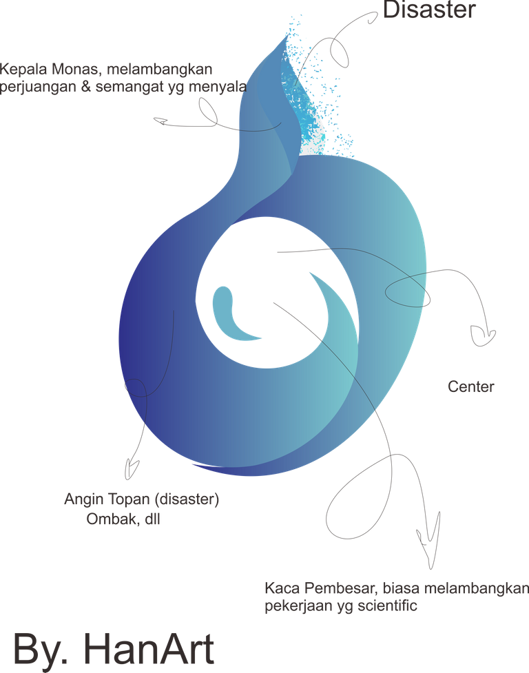
It takes me sometimes to find an idea for this Logo, as she wanted the Logo could represent research, economy, politic, social, etc which cause turmoil and disaster, in short it's something which will bring impact to a lot of people.
When we think about disater, automatically we will think about healing and peace, so at first I was thinking what, what will represent about pain and peace at the same time. Monas came to my mind, Monas or Monumen Nasional (National Monument) is a 132M (433ft) tower in the central Jakarta, symbolizing the fight for Indonesia's independence. So Monas alone already describing tons of thing.
This Logo describing :
- Indonesia
- Peace
- Healing
- Growing
- Research
- Turmoil
- Balance
- Boldness
- and many more, well, I don't really like to show what I think over my work, I'd love to listen about what come to your mind when you see it ^ ^
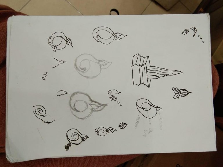
In the picture above you can see I started by hand sketch, trying to find the best Idea about Monas. Then I think I need to make the disaster looks more obvious, also I need to Include research in the logo. so I draw that circled logo, and finally make up my mind for the last thing I sketch.
Next I work in making the Logo using CorelDraw, after I'm sure about it I showed it to @fararizky, and then we discussed and fixing some parts and finally we finished.

But, before I picked up blue as its color, I've tried many other colors, red, representing fire, yellow representing light and sunshine, black representing chaos. But then I think I need something more, something soft, and then Blue came up to my mind, as Blue often desribing peace and calmness also healing.
After I show it to @fararizky she asked to make the shattering pieces colors like aurora, but I happen to change all the logos to be purple and a mix of some colors, just like aurora because a misunderstanding. But finally I get what she meant, and here is our final work.
That's All for today ^ ^ see you
Ps: If you wonder what is Indonesia center feel free to visit its page @indonesia-center
Thank you very much for everything. Let's see what will be our next project 😊😊
Can't wait to see you're in action 😉
I love the logo, thanks for creating it for Indonesia Research center, one of my lovely projects.
Thank you very much 😊
I'm who should thanking @fararizky since she trusted me for something this big
Thanks for using eSteem!
Your post has been voted as a part of eSteem encouragement program. Keep up the good work! Install Android, iOS Mobile app or Windows, Mac, Linux Surfer app, if you haven't already!
Learn more: https://esteem.app
Join our discord: https://discord.gg/8eHupPq
This post was shared in the Curation Collective Discord community for curators, and upvoted and resteemed by the @c-squared community account after manual review.
@c-squared runs a community witness. Please consider using one of your witness votes on us here
Nice logo design, @hananan :) It's easily catching the eye, and I like the colour and form ! Im glad you decided with the blue at the end, I think it's the one that works the best :)
They said blue will never fail you in design 😁
Anyway thank you 😊